please include status messages/tooltips
| Affects | Status | Importance | Assigned to | Milestone | |
|---|---|---|---|---|---|
| Application Indicators |
Won't Fix
|
Undecided
|
Unassigned | ||
| indicator-application (Ubuntu) |
Won't Fix
|
Wishlist
|
Unassigned | ||
Bug Description
In the wiki page of status menus (https:/
"Like other menus, status menus do not have tooltips"
Well, the former is not true. In Ubuntu, the Application, Places, System menus do have their own tooltips. So does Network Manager and the date/time applet. They all show important information in tooltips, without the need of further interaction.
The main reason for the report is Transmission losing a feature. When using the systray icon, i can easily check transfer rates by hovering the pointer above it. With the new status menu, i have to click to open the menu, one other to open the window and the third to close it again. True, this can be reduced to one by including the rates in the menu - but it's still a click.
I'm sure there are other software too, where using a tooltip is the most efficient way to show the most often needed information.
So I'm kindly asking you to reconsider your plans with(out) the tooltip. I think usability should be above dogmatic considerations like menus not having tooltips.
| tags: | added: wishlist |

| David Iwanowitsch (dav.id) wrote : | #1 |
| Changed in indicator-application: | |
| status: | New → Confirmed |
| Charles Kerr (charlesk) wrote : | #2 |
https:/
> As a last resort, it may be necessary to add a first item to the menu that is always insensitive, where the text of the item conveys the information that the tooltip previously did.
It's difficult to belive that this is a serious suggestion. This is an *awful* idea, especially for a new tool that's supposed to be improving usability.
| Andrew Starr-Bochicchio (andrewsomething) wrote : | #3 |
This leaves the current panel in a very inconsistent state. Every other item, including menus, currently provides tooltips (i.e. GNOME menu, network manager notification area icon, GNOME panel clock, show desktop applet, workplace switcher).
Also confusing is that the proposed Freedesktop spec that this work seems to be based on includes support for tooltips. (org.freedeskto
[1] http://
| Chow Loong Jin (hyperair) wrote : | #4 |
I believe the official reason for dropping tooltips is because they want to make these application indicators more similar to menus. But, as I had already mentioned on #ayatana sometime back, when designed like this, the application indicators act more like toolbar icons that have drop-down menus rather than the menus you see at the top of each of your windows. The result of that discussion/
2010-02-23 03:42:44<jono> tedg, can you have a tooltip for the app indicator icon?
2010-02-23 03:42:49<jono> that seems sane to me
2010-02-23 03:44:07<tedg> jono: Not for Lucid. I imagine we'll reopen the discussion for Meandering Marmot. I'm not against them. I'm just not sure they're required. With the new placement the Fedora guys did they're not as annoying on menus, so that helps a ton.
2010-02-23 03:44:35<jono> hyperair, so why don't we discuss this for Lucid+1? we are a bit late in the cycle to do this now
2010-02-23 03:44:36<tedg> jono: I think the two features "up for discussion" right now for M is scroll wheel and tooltips.
2010-02-23 03:44:38<jono> does that sound ok?
2010-02-23 03:44:48<hyperair> that sounds fine.
| Vish (vish) wrote : | #5 |
- rb-info.png Edit (31.5 KiB, image/png)
To add to the list of items which are less usable due to not having tooltips"
- Volume indicator: Volume icon used to have a tooltip indicating the volume level , note that the volume can be "boost" ,ie i can set the volume to 150% and this information was visible in the tooltips as "Volume output : 150%"
But this 150% can now *not* be displayed anywhere unless i open the sound preferences window and view the slider. [The slider in the app-indicator can only display the slider upto 100%]
- The current Rhythmbox song info isnt sufficient notice[screenshot attached] that only a part of the info is displayed [would be a separate bug probably] but displaying /all/ the info in the dropdown would make the item too huge which is not ideal. Note also the inconsistency in the notify-osd info and the rb app-indicator info.
And the previous rb tooltip had information about the song position too. [iirc] This can be prevented if the tooltips were used instead :-)
| Changed in indicator-application (Ubuntu): | |
| importance: | Undecided → Wishlist |
| status: | New → Confirmed |
| Matthew Walton (matthew-matthew-walton) wrote : | #6 |
What bothers me about not having tooltips on these items is discoverability - tooltips are a superb way which people will be familiar with to discover what something is for without having to click on it. It's all very well to say click on it and look at the menu, but randomly clicking on things is, historically, not a good idea if you're uncertain about what those things will do.
| Jud Craft (craftjml+ubuntulp) wrote : | #7 |
The issue seems to be that indicator icon information is not immediately available on mouseover.
Instead of a tooltip, why not just automatically open the menu on mouse-over, similar to KDE's panel menus in OpenSUSE?
It would mean that any indicator icon automatically reveals its options and info on mouseover, and it doesn't require a tooltip. Mousing away could close the menu.
That's a much different interaction than previously discussed, but it would also solve the "show status immediately" problem.
| Rafal-maj-it (rafal-maj-it) wrote : | #8 |
Please bring back the tooltips, why break something that works?
| Chow Loong Jin (hyperair) wrote : Re: [Bug 527458] Re: please include status messages/tooltips | #9 |
On Friday 19,March,2010 08:14 PM, Jud Craft wrote:
> The issue seems to be that indicator icon information is not immediately
> available on mouseover.
>
> Instead of a tooltip, why not just automatically open the menu on mouse-
> over, similar to KDE's panel menus in OpenSUSE?
>
> It would mean that any indicator icon automatically reveals its options
> and info on mouseover, and it doesn't require a tooltip. Mousing away
> could close the menu.
>
> That's a much different interaction than previously discussed, but it
> would also solve the "show status immediately" problem.
>
That would solve the show status immediately problem, but it would result in a
potentially large menu showing up. This can pose problems especially for people
who seem to be less proficient at wielding the mouse. I know people who can
continuously trigger my screen's hot corner for Compiz's scale feature multiple
times in a row, and that is a screen corner. Think about how many menus they'll
spawn if they accidentally hit the top of the screen where all the application
indicator icons are instead.
--
Kind regards,
Chow Loong Jin (GPG: 0x8F02A411)
Ubuntu Developer
| Changed in indicator-application: | |
| status: | Confirmed → Won't Fix |
| Changed in indicator-application (Ubuntu): | |
| status: | Confirmed → Won't Fix |
| Jeremy Nickurak (nickurak) wrote : | #10 |
This is pretty aggravating here too. A small icon can only theoretically convey a relatively small amount of information, and at a low level of detail.
Many apps provide much more detail through use of tooltips. A little bit of text, a few numbers, a temperature or a status...
It's easy, it's a pattern virtually everyone understands, it's unobtrusive, and doesn't cost anything.
Dropping this is a big loss.
| Mathieu Pellerin (nirvn-asia) wrote : | #11 |
- A tooltip displaying the name of currently playing song is needed for Rhythmbox application indicator (I'm glad to see disabled menu displaying current artist + song was added in the latest version but that requires a user click and displays the rest of the menu which takes some visual space)
- A tooltip displaying volume level (in dB and/or %) is needed for Volume indicator; the 3 curved lines isn't a great visual feedback for users especially while changing volume using scroll wheel
- A tooltip displaying the completion % of torrent files is needed for Transmission application indicator
- A tooltip displaying the currently connected wired/wireless network will be very practical if network-manager is ever ported to indicator-
- ... and the list goes on, and on, and on ...
I get that part of the idea behind the indicator-
| Mark Shuttleworth (sabdfl) wrote : | #12 |
Hi folks, Jono asked me to provide further clarity on the absence of tooltips. I marked it wontfix after a conversation with the reporter on a separate mailing list and didn't realise there was an ongoing dialogue here.
First, this is by design and not by accident. We may have a difference of opinion as the better behaviour, but the designed behaviour is not to show tooltips. Perhaps I will take a different view in future, but for the moment the decision is not to show tooltips on indicators.
Tooltips are a common device, but don't add an equal amount of value when used in different places. They also introduce potential problems: their rendering can be ugly and they can encourage "scrubbing". They are often poorly phrased and introduce additional translation requirements.
In the panel, where there are a relatively few icons and particularly little churn (the icons that are there, are there most of the time), it's my view that the benefits do not outweigh the costs, and so we'll turn tooltips off in Lucid for application and system indicators.
Tooltips are more appropriate inside applications, for example on toolbars where you can have an almost infinite variety of symbols, and may rarely see many of them. I think we could work on making them more useful and more attractively rendered there, and revisit the question of tooltips in the panel at another time.
I understand that there will be objections to this. We are taking something away. "Less is more" is a well established principle. We may be taking the wrong thing away here, but it's worth the experiment, and I'm also open to hearing *your* list of *better* things to be taking away :-)
| Casey J Peter (caseyjp1) wrote : | #13 |
Less is more? By adding clicks to get necessary information? example: transmission to get information on up/down byte count. By scrolling the mouse up/down to adjust volume?
I'm thinking that the law of unintended consequences is rearing its ugly head here.
By thinking "less is more", you've added complexity to what WAS simple and very convenient. Personally I'm not thrilled about this change at all, but as a linux user, I'll just dump the gnome panel for the Avant window manager which has excellent tool tip support.
My 2 cents as I was a bug reporter on the transmission information loss with this "simplification".
| Mathieu Pellerin (nirvn-asia) wrote : | #14 |
Mark, making things worse as a result of making changes for the sake of changing is also a well established consequence of the "less is more" principle ;o)
The whole system tray was a mess for many years and I raise my hat to the Ubuntu team for making drastic changes to try and bring order to chaos.
That being said, I find it hard to see any negative impact with leaving the tooltips available on application indicators as it is not taking any visual space by default nor is it displayed unless you trigger it by hovering over icon. It might prevent some developers from finding other avenues to display information (such as the disabled menu items to display song info in the Rhythmbox indicator) but my guess is that leaving tooltips on until devs (both within and outside of the Ubuntu world) transition to other methods is better for the end-user ATM.
Also, I think the poorly phrased tooltips & translation requirement argument is bogus. Only very few symbols are universally understood. While removing few extra strings from translation workload, your also removing critical context the interface which helps users identifying the understanding of an icon that might not be meaningful in his/her society.
| A. Tombol (atombol) wrote : | #15 |
Hi Mark!
Just to clarify it: it wasn't me with whom you have this issue discussed.
I (and hope the others too) accept that you have the right reasons to ban tooltips, but you must also accept the fact that with this move you also take away functionality.
Rapid info gathering is important for some of us, and having to click on icons ruins the whole point. For now, it's just another step in the long way of Gnome taking away features :P
And to be constructive too:
Why not using Notify-OSD instead of tooltips? It's coherent, renders nicely, can show all the information needed and it's Ubuntu's own invention.
Cheers
| Vish (vish) wrote : | #16 |
Hi Mark,
Having appropriate-
But, the problem here is not that we dont understand what the icon is, rather that we are loosing other information that was being displayed quicker/easily.
As mentioned earlier in comment#5 , there isnt a way to display volume 150% in the volume indicator other than adding a new item apart from the volume slider. [if we add the tooltip as an item, it would be unnecessary when the volume is less than 100%, slider is sufficient there.]
RB indicator has lost the playing song position and the album ,bringing all this info to the indicator maybe a little too much in the drop down indicator, but it is an information that was easily presented earlier but many will [or I will] miss now.
Already the RB indicator menu changes size too often depending on the artists/song title, this erratic behavior can be avoided if we move the song info to tooltips.
As was the transmission torrent speeds,and other info ...
To reduce tooltips ugliness , we could make them predictable and do > http://
Less is more for sure. But how little do we want? ;-)
| Scott Ritchie (scottritchie) wrote : | #17 |
I'll admit that losing efficiency is my main concern. Knowing that I have exactly 50 minutes vs 1 hour 20 minutes of battery life left is rather important to me, and now I need multiple clicks to do that. But that's already been mentioned above.
There's a bigger issue here of accessibility. As I understand the tooltip information is used heavily by blind users with screen readers. I don't know what the experience is like for them, but I imagine the added inconvenience is way more than the two extra clicks at different ends of the screen I now have to make.
| Tiago Silva (tiagosilva) wrote : | #18 |
I came across with this bug report via Melissa Draper's mournful (and correct) blog entry.
Basic human-computer interaction FAIL.
| Benjamin Humphrey (humphreybc) wrote : | #19 |
Stumbled here from Melissa's post also, and I completely agree. This is a bit shit.
| Abhishek Dasgupta (abhidg) wrote : | #20 |
Quick workaround script which I have bound to a key
to get the time remaining stuff
#!/bin/sh
timeremaining=
notify-send "$timeremaining" "before the juice runs out"
| Bordi (borderlinedancer) wrote : | #21 |
> 2010-02-23 03:44:07<tedg> jono: Not for Lucid. I imagine we'll reopen the discussion for Meandering Marmot. I'm not against them. I'm just not sure they're required. With the new placement the Fedora guys did they're not as annoying on menus, so that helps a ton.
What ever it'll be, i'll vote 4 "Mysterious Mushroom". :D
| description: | updated |
| Adam Porter (alphapapa) wrote : | #22 |
A Long Term Support release is definitely not a valid field for experimentation. Imagine marketing to a corporation an LTS release that has whimsical, experimental, user-disapproved UI changes, and telling them that if they buy it, they'll be stuck using the dysfunctional UI for five years. (Does that make anyone else think of Microsoft and Vista?)
If Ubuntu wishes to experiment with removing tooltips or other major UI elements, they should publish a PPA and ask for testers, and put up some test systems at their conferences and ask attendees to sit down for a few minutes and give their input. At the most, they should roll out the change in an alpha or beta release and gather serious feedback before making a final decision for the final release.
I use Kubuntu anyway (which is a whole 'nother sob story of decline; still using Hardy here because subsequent releases are all fundamentally broken), but it's attitudes and decisions like this that will probably send me back to Debian before long. I say this sadly, because I used to be fond of Ubuntu and encouraged other people to use it, and I'd really like to see Ubuntu start making wiser decisions again.
Mr. Shuttleworth, please do not turn into a free-software version of Steve Jobs, killing this or that on a whim just to give it a try, unwilling to compromise for the greater good.
| Greg Merchan (gregory-merchan) wrote : | #23 |
Mark,
I think I know what you're going after with this change, but reading your comment freaked me out. I think you left too much unsaid.
Isn't the idea to make the indicator icons themselves more indicative of the information that has thus far been clear only through tooltips? Aren't you trying to fix the problem of the uninformative icons? Please, just say that!
I know there are other problems being addressed too, but getting rid of the tooltip crutches seems to aim at reconditioning the icons.
Thanks
| Jan Nekvasil (jan-nekvasil) wrote : | #24 |
Dear Mark and Ubuntu design team,
please, reconsider Your decision to remove indicator's tooltips completely, at least for LTS release. I know that You are doing Your best to remove visual visual cruft from Ubuntu desktop, but this is serious loss of functionality for lot of people. Removing them as a necessary step _before_ there is a better replacement seem counterproductive to me and possibly will generate lot of negative attention after final release. Imagine all that reviews pointing at this issue as an obvious fail. The always disabled menu item showing the current song for Rhythmbox is mere a workaround, abusing the whole purpose which are menus for (selecting an action, not displaying an information). It's far more worse than tooltips itself.
In worst case scenario, this step can (with other controversial UI changes in Lucid) lead to lose of the favor of the geeks, which are nowadays still the main group spreading the Ubuntu amongst users (family, colleagues, friends), at least here in Czech Republic. These people are usually very passionate about software they use and recommends, and can generate lot of bad fame for Ubuntu. You are not obligated to answer for Your decision to them in any case (Ubuntu's development isn't a democracy), but they are the force which's opinion must be taken into account if You mind the popularity and good name of Ubuntu.
LTS release should not (unless I'm deeply mistaken) be the place for introducing such a controversial changes, even they are mean to be some kind of preparation for better things that will come in non-LTS release. It's hard to hold Your breath for three Years.
Thanks for Your work and visions
Jan Nekvasil
| Paul Gear (paulgear) wrote : | #25 |
Hi Mark,
I echo Jan and others' comments: the LTS release is not the place to do this, and there must be a way to restore the backwards-
I fully sympathise with your concern to bring consistency and better integration to the desktop, but throwing out functionality that people rely on every day is flat out *disrespect* for your existing users. (The same goes for gratuitous change like moving the close button from the right to the left.)
Regards,
Paul
| jhfhlkjlj (fdsuufijjejejejej-deactivatedaccount) wrote : | #26 |
Bah, you know, tooltips should be done away with, anyway. I've always hated them.
| Tomas Šiaulys (tosi) wrote : | #27 |
In my opinion, tooltips are really useful. I really hate it now when I have to click to just see what song is currently playing in Rhythmbox or to find out how much battery life is left.
I fully agree with Melissa & others that this is a loss of functionality and that we shouldn't be working for software...
Also, doing experiments in LTS release is... odd, to say the least. I don't think it fits well with what's been said in LTS description: https:/
Best regards,
Tomas
| Bernhard (b.a.koenig) wrote : | #28 |
Is this also intended that the notification area has tooltips (cp. network-manager) but the indicator applet has not? This inconsistency might surprise end users even more than the absence of tooltips.
| Brian Rogers (brian-rogers) wrote : | #29 |
Agreed. I'm not too invested in the outcome of this bug report myself, but it is odd that the indicator applets are the only things without tooltips. Everything else has a tooltip saying what it is and/or what it does, even the Applications/
| Colin Kern (kernco) wrote : | #30 |
I understand Mark's reasoning IF tooltips are only used to tell me what something is, which seems to be an assumption Mark is making. On an application's toolbar I might need a tooltip to tell me what various buttons do, but I don't need a tooltip to tell me what the volume control or rhythmbox icon are in the panel.
But I think what's missing is the fact that often these tooltips for panel items present additional information that would otherwise require clicking. Take Rhythmbox, for example. The tooltip can tell me what song is playing. Right now, if I'm working on something and want to quickly check what the current song is, I have to click on the Rhythmbox icon to pull down the menu which displays it, then click outside the menu to focus back on the application I was working in. With a tooltip, there is no clicking and the application I'm working in never loses focus.
| Bernhard (b.a.koenig) wrote : | #31 |
Agree with Colin here, in current lucid beta 1, the tooltips show exactly for those panel items where they would not be necessary (menu, time and date). But the tooltips were removed for those panel items where they actually would be useful, here especially rhythmbox, volume, and battery applet.
| Drew Snellgrove (forkinme-deactivatedaccount) wrote : | #32 |
Colin largely sums up my feelings on the matter as well as my interpretation of (what I see as a flaw in) Mark's perspective. Tooltip information is something that I check not just daily but several times per hour and include:
-Which WIFI network I'm connected to (I have to juggle a couple at work)
-The currently playing track in Rhythmbox
-Estimated time remaining on my battery
-Audio output percentage over 100%
What makes this especially aggravating [every ten minutes] is the latter two, which as others have explained are NOT available with a simple click at this time.
There are ways to beatify and improve tooltips (example here: http://
Requiring several clicks and refocusing is ADDING to interruption and user interface clutter, not reducing it. The real consequences of this change are PRECISELY CONTRARY to the intended consequence. Yes tooltips are used poorly in some instances. A targeted approach to beautification and alignment with purpose is certainly due but mass removal is the completely wrong approach to the problem. I understand that it's too late to beautify and target tooltip issues individually but it isn't too late to leave them in place. To top it all off an LTS release when Ubuntu is at the height of its technological polish is absolutely the wrong place to leave such a glaring wound in the individual user's experience.
| renbag (renbag) wrote : | #33 |
Tooltips are causing problems in certain cases, like "sticking on the panel when they shouldn't", as described in https:/
| Bernhard (b.a.koenig) wrote : | #34 |
@Renzo: I hate that bug you quoted just the same, it's actually the main reason I'm using metacity. The problem with lucid beta 1 is that it removes the useful tooltips but keeps the annoying ones. Bug 356702 would still be present here because the window switcher tooltips are still there.
| Luca Ferretti (elle.uca) wrote : | #35 |
Just two little notes
1) Extra info for audio volume
In gnome-volume-
2) Tooltips are better then grayed menu entries for a11y
The approach used in Rhythmbox (see image by Vish in comment #5) is good only for non-visually impaired people. You can't focus grayed menu items, so screen readers will be unable to expose this extra info to visually impaired people[1]. AT-SPI infrastructure should be able to access to GtkTooltips content with no extra effort. Of course, for the sake of a11y, other solutions could be explored, like add the extra info directly to the icon: for example, giving focus the Rhythmbox indicator icon the screen reader could automatically speak something like "Rhythmbox indicator, playing Share the Software by Jono Bacon", or the message indicator could say "3 new emails, 4 unreaded chat replies" and so on. But I suppose this will need some work in libindicator infrastructure and APIs (currenly libindicator is very poor in a11y support, see poor and misleading keyboard navigation support)
[1] maybe orca could do something using flat review mode, but running flat menu mode while navigating a menu should be a real non-sense
| toogreen (toogreen-hotmail) wrote : | #36 |
I must say I agree with a lot of the people complaining here... I do not like this change at all. It brings a whole new lot of problems we didn't have before. For example I like Rhythmbox's previous behavior that you just needed to click on its status notification icon ONCE and it brings it up, then if you click again it hides it. Now we have to make so many unnecessary extra steps because we need to click on it to see what was previously in the tooltips.
Anyway I really don't mind change and innovation, for example although It felt a bit weird the first time I tried the window buttons on the left, I can live with it and get used to it. But this tooltips business is a whole other story. I use tooltips quite a lot and I feel they save me a lot of time and clicks. Now I must say I feel quite frustrated without them. I was wondering if I should upgrade my main desktop to Lucid yet, because I generally like pretty much everything in Lucid so far, the look, the way empathy is integrated, etc. But then this tooltip BUG makes me seriously reconsider. Karmic is now running rock-solid on my desktop and behaves almost exactly as I want it to, so I guess I might actually stick with it for a while unless this decision is reverted.
I'm quite disappointed and I think this is a major mistake. I'm not against testing this in the future however (with hopefully some kind of alternative-
| Bilal Akhtar (bilalakhtar) wrote : | #37 |
Hi Mark,
I request you to reconsider this decision. Most of the Ubuntu users are used to tooltips in the panel status indicators and this is what they would be expecting in lucid. Also, lucid is expected to be the best ubuntu release since Warty. Users of Ubuntu like me want it to be the best release in every way and I think that most of us would hate to see those golden tooltips go away.
Lucid will also see many users migrating from Windows. All latest versions of Windows do have tooltips in icons in the tray, and such users would feel that Ubuntu is "less matured" when they would not find any tooltips in the panel indicators.
And, there is the concern about LTS. Many corporate users are expected to stay on Lucid till 12.04 LTS comes out. Please do not remove the tooltips in this release!
Cheers,
Humble Ubuntu User in Saudi Arabia.
| Evgeny Kuznetsov (nekr0z) wrote : | #38 |
The only question I have about this controversial decision is: how do I switch tooltips back on so that the behaviour is normal again? The only valid argument about moving buttons was that it was relatively easy to move them back into appropriate place by setting it in gconf (they should have stayed where they belong in the first place, but well, I don't mind Mark's experiments as long as I can keep on working the way I see fit). Is there a way to revert this new setting?
| renbag (renbag) wrote : | #39 |
@Bernhard: I agree with you. The indicator tooltips are certainly more useful than those in the workspace switcher or window list applet. So, why remove the good ones and leave the annoying ones? I think that there must be a careful evaluation of what is the best thing to do here.
| max (maxozilla) wrote : | #40 |
Tooltips should not be removed, particularly from a Long-term release. This is an accessibility issue. It should be possible to know what icons indicate quickly and easily.
Furthermore, I note that one of the argument seems to be to "reduce clutter". But tooltips are not cluttering the screen - they only appear when you want them to.
I am opposed to this bad decision and I hope that tooltips will not be removed. At the very least, put it to some kind of vote to the Ubuntu community.
| kikl (kilian-klaiber) wrote : | #41 |
I like streamlining, but I wouldn’t want to remove the tooltips alltogether. The tooltips are only displayed if you hover above the respective button. So intitially they are invisible, which is good. A complete novice, who doesn’t know anything about ubuntu, may value the tooltips a lot. However, they do become superfluous clutter if you are accustomed to the interface.
Here’s my suggestion: Keep the tooltips, but monitor the user actions. If a user uses a certain application very often, say each time, the computer is booted, then it is safe to assume that he knows the purpose of the tool. Then stop displaying the tooltips for these tools. Keep the tooltips for tools, which are not used often. This has to do with the idea of an automatically customised interface.
Since the panel is used on a regular basis, the tooltips should disappear quite fast after the initial install… So maybe removing them by default would not hurt any regular ubuntuuser. But, for someone who is a first time user – and we want many more of those, right? – these tooltips do make a difference! Please consider!
| James Putt (jamesputt) wrote : | #42 |
What are people's thought's on a.tom's suggestion of using notify-osd?
With this approach they could be classed as confirmation bubbles ("confirming" the status of the system represented by the menu icon, or is that stretching it a bit?) triggered by mouse-hover (as opposed to mouse-in). "Status" might need some definition. I don't know if there'd be an appropriate bubble for every menu either.
(Just to clarify, talking about tooltips for indicators here)
| Jan Nekvasil (jan-nekvasil) wrote : | #43 |
I see the possible use of notify-osd as the replacement for indicator tooltips as a splendid idea. The content which are we now missing is obviously not the tooltip itself (that means short description what the icon does) at all, but the application's status, propagated trough the (misused) tooltips.
Pros:
- all content placed at the same, consistent place.
- bigger, well formated, easy to read
- does not mess with the cursor
Cons:
- ?
THIS could be the next great thing in Ubuntu experience (and I'm very excited about that idea).
| Bernhard (b.a.koenig) wrote : | #44 |
Con is that such a pop-up would be a bit more intrusive than a tooltip. It might be OK though if you set some delay before it pops up while hovering over the respective icon.
| Jeremy Nickurak (nickurak) wrote : | #45 |
Except of course that if it's triggered by a user action (hovering the
mouse over an icon), there's a notification potentially on the
opposite side of the screen, away from where attention is currently
focused. A big intuitivity loss from tooltips, in my opinion.
On Fri, Mar 26, 2010 at 08:59, Jan Nekvasil <email address hidden> wrote:
> I see the possible use of notify-osd as the replacement for indicator
> tooltips as a splendid idea. The content which are we now missing is
> obviously not the tooltip itself (that means short description what the
> icon does) at all, but the application's status, propagated trough the
> (misused) tooltips.
>
> Pros:
> - all content placed at the same, consistent place.
> - bigger, well formated, easy to read
> - does not mess with the cursor
>
> Cons:
> - ?
>
> THIS could be the next great thing in Ubuntu experience (and I'm very
> excited about that idea).
>
> --
> please include status messages/tooltips
> https:/
> You received this bug notification because you are a direct subscriber
> of the bug.
>
--
Jeremy Nickurak -= Email/XMPP: <email address hidden> =-
| James Putt (jamesputt) wrote : | #46 |
On 27 March 2010 04:33, Jeremy Nickurak <email address hidden> wrote:
>
> Except of course that if it's triggered by a user action (hovering the
> mouse over an icon), there's a notification potentially on the
> opposite side of the screen, away from where attention is currently
> focused. A big intuitivity loss from tooltips, in my opinion.
Yes that could be painful. Though I am assuming a default setup where
hopefully (!) a string of indicators doesn't stretch right across the
panel. It wouldn't be fun to need to move your focus from side to side
every time, even if you are expecting the bubble.
>
> On Fri, Mar 26, 2010 at 08:59, Jan Nekvasil <email address hidden> wrote:
> > I see the possible use of notify-osd as the replacement for indicator
> > tooltips as a splendid idea. The content which are we now missing is
> > obviously not the tooltip itself (that means short description what the
> > icon does) at all, but the application's status, propagated trough the
> > (misused) tooltips.
> >
> > Pros:
> > - all content placed at the same, consistent place.
> > - bigger, well formated, easy to read
> > - does not mess with the cursor
> >
> > Cons:
> > - ?
> >
> > THIS could be the next great thing in Ubuntu experience (and I'm very
> > excited about that idea).
> >
> > --
> > please include status messages/tooltips
> > https:/
> > You received this bug notification because you are a direct subscriber
> > of the bug.
> >
>
>
> --
> Jeremy Nickurak -= Email/XMPP: <email address hidden> =-
>
> --
> please include status messages/tooltips
> https:/
> You received this bug notification because you are a direct subscriber
> of the bug.
| Jan Nekvasil (jan-nekvasil) wrote : | #47 |
@Jeremy Nickurak: That's a good point. And multi-display configuration must be taken in consideration too.
| Marck Robinson (marck) wrote : | #48 |
We consider tooltips a core feature, they fill a unique role because they are never in your way and only pop-up if you hover, implying you want to see them.
Information that is automatically there when you need it and never there when you don't is about as perfect as user interaction can get.
The guidelines assume a vary narrow set of use cases. Consideration needs to be given to vertical applications that take full advantage of the framework allowing enterprise users enjoy a satisfying user experience. We are in the enterprise market, so our expectations go beyond a few simple social networking applications.
There is a subset of on-demand information that must be extremely quick and easy to access, have minimal disruption on the work-flow, not have a time-out (you can leave them up as long or as short as you want) and be intuitive to get to. There is simply no better option than a tooltip. They fill a unique role that has no equivalent. They also do not clutter up the user interface or the menus, which the work-arounds would require.
Is there any way that tooltips can remain available as a configuration option?
I'd also like to request that core features not be removed just before an LTS. Experimentation is great and innovation is critical, but LTS is about stability based on what we've innovated so far.
| engellion (p-chapman) wrote : | #49 |
Hi Mark. Please change the Bug Status from "Won't Fix" to "Will Fix".
I am not a geek. I'm just a regular PC user, who wants to get things done on their notebook, with as little fuss as possible. I love the new default themes - including the buttons on the left. But, I will be sticking with Karmic for a while, just to keep ease access to my status indicators - battery life for a road warrior is a primary one. The mono icon just doesn't do it for me.
Being able to see, that I have "1 hr and 15 mins" of battery time left by simply hovering over the icon is quick an elegant - particlulary when I am just about to begin a presentation. With out this feature, I would have to do 2 mouse clicks to see the actual time in hrs/mins remaining. As it stands in Karmic, 1 click gives me only a percentage.
So my vote is for you to keep "status indicators" as toolips on the panel. The icon should tell the rest of the story - no need for tips about what the icon stands for.
Cheers,
Paul Chapman
| Nikolaus Filus (nfilus) wrote : | #50 |
Want to have them back - I use them frequently too. Some examples:
- Mozilla Tray: count of unread mails
- Update manager: available package count
- Dropbox: x files to sync
- Network Manager: Network connected and signal quality
- Pulseaudio: selected profile and volume level
@Mark:
If something is broken or inconsisntent, it's not a solution to hide it - fix the source aka read as: fix the phrases and rendering
| Oliver Joos (oliver-joos) wrote : | #51 |
I desperately miss the tooltip of master volume! :'-(
My argument for "tooltips everywhere!":
Tooltips are most valuable for newbies. And the more tooltips there are, the more users get aware of them. If all but the most important tooltips are removed, users won't wait anymore on every widget, because most of the time nothing happens.
In short: tooltips only make sense if they are common enough.
| Alan Lord (theopensourcerer) wrote : | #52 |
This is a bizarre decision.
I noticed the removal of the tooltips last week and was confused and annoyed. It now requires several clicks to get to information that was readily available just by hovering.
I think I understand the idea to simplify and reduce but this is breaking something which was never broken IMHO. If you don't like where the tooltips appear or how they are rendered then as someone else mentioned earlier on, surely the *right* thing to do is to provide the same functionality (with hover) but display the information using the notification tool. That would work nicely (as long as there is a way of prioritising events to be displayed if there is a queue).
Having to click is a retrograde step IMHO.
Lucid is starting to look like a bit of dog's dinner in the design dept.
| Roger Hunwicks (roger-tonic-solutions) wrote : | #53 |
I would like to add my voice to those asking for the previous behaviour to be reinstated.
I can see the place for "less is more" in terms of removing screen clutter and user interactions that do not "add value". Tooltips that tell you what something does seem to be a candidate for this and the argument for self-explanatory icons is strong.
However, as a previous comment says, there are very few universally understood icons, and something that is an obvious icon to me might not be in another culture.
Given that the "clutter" only appears at the users request, I would rather have a few redundant tooltips than have a group of users unsure what an icon is for and with no easy way to find out.
I think that where tooltips are actually providing status information rather than "what am I" the case for reinstating them is even stronger. The ability to check on the status of some aspect of the system without focusing away from the current application is an important interaction for many users. In my case, like many others, it is minutes of battery life remaining. If we can find a better way to provide this information, without requiring more clicks or changes of application focus then great, but please can we wait until we have found a better solution before removing the 90% solution we already have.
Finally, doing this in a LTS seems a high-risk strategy to me. I can see that we don't want the LTS to be stuck with an obsolete user interface paradigm and that increases the pressure to introduce some things that might have benefited from being introduced in Lucid+1 (where they could be dropped in Lucid+2 if they don't work out). However, I am also worried that if we introduce things in an LTS then there will be a great deal of reluctance to go back to the old way even if the new way doesn't work out.
| A. Tombol (atombol) wrote : | #54 |
Mark Shuttleworth's blog post on the issue:
http://
just a sidenote:
today we reached the 100 affected people count
| Gaurav Kumar (gaurav-b-kumar) wrote : | #55 |
All I want is the option to change it back to the original functionality. Changing defaults is all well and good, but removing the ability to change them to what users want (Even if those users are few in number) is a bad thing, in my opinion. As was stated above, one of the arguments for button placement was that it wasn't hard to change back. As soon as I know that that can be done for my much-missed notification tooltips, I'll be satisfied. Even hidden as a gconf value, I'd appreciate it.
From my understanding, Linux has been about choice, and even though the look and feel of Ubuntu has changed very, very much over the past few releases, an important point is that it has always retained the ability to be changed back. That stopped first with the new non-interactive notifications (Which I opposed initially, but grew to appreciate; They're quite beautiful and unintrusive) and now these tooltips.
| A. Tombol (atombol) wrote : | #56 |
The best thing would be if they provide an indicator-
| Mathieu Pellerin (nirvn-asia) wrote : | #57 |
Part of the problem here (to devs: correct me if I'm wrong) is that this bug is not about turning the tooltip switch back on but rather add code into indicator-
That requires more effort/time, but is well worth it (as the comments above pretty much raise a unanimous "get the tooltips back" opinion). It should be done ASAP so it can make it for Lucid final.
| Bernhard (b.a.koenig) wrote : | #58 |
Yeah, since the new indicator applet has no tooltips atm, they would have to be added somehow, and nobody has done it yet. Maybe this is a better explanation than the philosophical twists about why "less is more". :)
| Andrea Ratto (andrearatto) wrote : | #59 |
I change the volume and the lcd brightness by putting the mouse on the indicator, scrolling up or down and reading the tooltip.
This is fast and usable. How would this work without tooltips?
| Bernhard (b.a.koenig) wrote : | #60 |
Dunno about brightness but scrolling now works for volume. Has nothing to do with tooltips though.
| Mathieu Pellerin (nirvn-asia) wrote : | #61 |
Bernhard, what he probably meant to say is that while scrolling does work now, the poor visual feedback (I have to aggressively scroll 4 times before the icon loses a line next to the speaker) makes it harder to use. It's very much possible that people will conclude scrolling isn't working anymore because of this.
| Oliver Joos (oliver-joos) wrote : | #62 |
@Mathieu: this has been fixed for the official gnome-volume-
As far as I can see the new indicator-applet is not yet ready for the masses. Apart from the slow wheel issue and the missing tooltips, it is also unusable in a vertical panel. I prefer the well-proven gnome applets. (And I ask myself, why would someone reimplement all these?)
| sonicuaw@gmail.com (sonicuaw) wrote : | #63 |
Tool tips are used all over the place, like everyone else has said its way to provide information about something running. It should always be left up to the user to want to see me _NOT_ forced. That just makes my blood boil when I find out a software manufacture thinks they need to change something that has been around FOR EVER just to they think improve something that is working and _NOT_ causing systems to crash. PLEASE LEAVE THE TOOLTIPS alone and fix something that actually is cause problems for new users.
| madbiologist (me-again) wrote : | #64 |
I agree with Colin Kern's comments in comment 30.
I don't need a tooltip to tell me what an icon in the panel _is_ (as long as the icon has been properly designed to be self-explanatory). However, often these tooltips for panel items present additional information that would otherwise require clicking.
Mark Shuttleworth's argument about introducing additional translation requirements does not apply in all cases - numbers and symbols are universally understood. This applies to the abovementioned volume % and Transmission up/down transfer rates and Transmission % complete of torrent files.
Also, an LTS is not the place to be making these sorts of changes.
Finally, as a few other people have said, I want to know how I can change this behaviour back to how it was previously. And if the worst occurs and tooltips do not return in Ubuntu 10.10 I do not want my change reverted when I upgrade - IIRC this is against Debian's human-computer interaction guidelines.
| Marck Robinson (marck) wrote : | #65 |
As some have mentioned, knowing what an icon in the panel is does not require a tooltip. However, that isn't always true.
The icon may sometimes make it clear what the application is, however, there are many cases where that isn't true.
1. I have 6 configurations of eclipse for different development configurations. These are non-trivial to set up, so having the quick-access buttons on my panel is awesome, but of course I need the tooltips to make sure I'm clicking the right one.
2. I have 3 servers I connect to regularly to do maintenance. So the maintenance application icon is repeated three times, the tooltips tell me which server it will connect me to.
3. I have both the remote desktop viewer and terminal server client on my panel. I never remember which is which, but lucky for me I have a tooltip that nicely pops up in a few seconds to help me remember.
There are other examples, but the point is that the assumption that a "well designed icon is so obvious that a tooltip is redundant" is simply not valid.
| madbiologist (me-again) wrote : | #66 |
Awesome examples Marck! Bring back the tooltips!!!
| Matej Moško (gnaag) wrote : | #67 |
is there any proposed idea on this? I really want to vote.
| Irishbandit (irishbandit) wrote : | #68 |
Could we at least have a volume indicator in the sound applet so that when we click on it, it will show a number or percent of how loud the sound is set on? The bar is fine but I would like to see finer information. Something similar to what is shown in the pavucontrol application.
| Bilal Akhtar (bilalakhtar) wrote : | #69 |
Why is SABDFL and the other members of the Ubuntu development now quiet on this bug? There is still some time left for Lucid to come, and these people still can bring the tooltips back.
| Mark Shuttleworth (sabdfl) wrote : | #70 |
Bilal, we're still subscribed, but the decision has been made and won't be changed for Lucid so there is not a great deal to be gained from spending time here. The team is mostly focused on open issues for Lucid, with some effort going into the Maverick planning too.
| Bilal Akhtar (bilalakhtar) wrote : | #71 |
Thanks SABDFL for the info.
Okay, then. I think its too late for getting the tooltips back into Lucid. But has anyone in the Ubuntu development team got any proposal to get them back in Maverick?
| fondle-em (mcribbb) wrote : | #72 |
I had assumed the missing tooltips were a bug. I can't believe y'all did that on purpose. If it really is too late to fix it for 10.04, please reconsider this madness for 10.10. This wasn't broken; now it needs fixing.
| Reuben Thomas (rrt) wrote : | #73 |
As a result of the tooltip removal there is now one piece of information I cannot find anywhere: the current battery charge while I am on AC. If I click on the battery indicator it tells me how long I have left to charge until the battery is full, but it does not tell me how long I would have left if I unplugged the machine now. This is often useful information when I am considering whether I can take my laptop off AC and carry it around the flat, or whether I need to leave it on charge for when I go out later in the day.
Yes, I can get this information by using a command-line script (such as the one I used to use to power an OSD battery indicator before I switched to the GNOME desktop), but really...this is a classic case of Ubuntu removing perfectly working functionality without having a replacement. (In this case, the obvious replacement would be to add the information to the menu, but I agree with many commenters above that having to click on an indicator to get frequently required information sucks).
| Anish (anishmangal2002) wrote : | #74 |
I have been using lucid-beta2 for the past week or so and find the missing tooltip an annoyance.
This is particularly accentuated by the fact that nearly every other icon in that area has informative tooltips integrated, eg. sound, network, date. Further, nearly every app that has an icon in that area boasts of meaningful tooltips.
| Martin Wildam (mwildam) wrote : | #75 |
Oh no, another bug, the community wants to be solved and Mark is simply ignoring it. This is disappointing and frustrating.
Be careful not to loose all those who want to get things done for winning a few dummy users. BTW: You will not find a way to get a really stupid person to figure out the computer stuff. Sorry.
| Willem Kan (wrkan-deactivatedaccount) wrote : | #76 |
In addition to that: I just tried out Fedora 13 beta and it looks really nice.
I may or may not decide to vote with my feet...
_______
Een netbook met Windows 7? Hier vind je alles dat je moet weten.
www.windows.
| Martin Wildam (mwildam) wrote : | #77 |
I switched from Fedora to Ubuntu about a year ago because of several flaws in Fedora - especially mobile internet was simply impossible to get to work - at least for me with my modem. Other applications I liked to use were not in the repository, sound problems with Skype - should I continue? - Maybe that all got fixed but a year ago Ubuntu was IMHO the clear favorite.
In the meantime I am also actively participating in our local Ubuntu community meeting once a month. Did a brief research for something comparable for Fedora or RedHat without success. - I think, sooo easy - at least for me - it is not to switch.
| cbsim (cbsim) wrote : | #78 |
Really miss the tool tip volume percentage in Jaunty.
| Frederik Elwert (frederik-elwert) wrote : | #79 |
As others, I’m not against change in the systray thing. And I don’t want to complain about a change just because it is a change. I just request answers to these simple questions:
1. How do I know the current charging (percentage) of my laptop battery?
2. How do I know the exact volume (percentage) of my speakers?
For the latter, one might argue that it isn’t really important to know the exact volume. I’d like to know, but maybe I just need to get used to it. But for the former, I really think it is relevant to know the charging state of a battery. I think tooltips were a nice way to show this information, but I’m wiling to learn. I am, though, far less willing to set that information completely aside.
| Tom Jaeger (thjaeger) wrote : | #80 |
On 04/27/2010 04:33 PM, Frederik Elwert wrote:
> As others, I’m not against change in the systray thing. And I don’t want
> to complain about a change just because it is a change. I just request
> answers to these simple questions:
>
> 1. How do I know the current charging (percentage) of my laptop battery?
This is bug #539912. The state of affairs there is basically: The
design team hath spoken; the percentage can't be included in the menu
because the hopelessly inaccurate remaining time estimate is already
taking up too much space.
| Sense Egbert Hofstede (sense) wrote : | #81 |
At the Ayatana mailing list a discussion is going on in preparation of the upcoming Ubuntu Developer Summit in May. I would advise the people interested in this issue to take a look at this discussion -- start of the thread at <https:/
| Steven Lavoie (f14maverick) wrote : | #82 |
I use the battery % tooltip constantly to see how much battery charge I have. Now I must click on the battery indicator, then click on the time remaining, then scroll down to find the percentage of battery power left, then close the window to get back to what I was doing.
Even if the tool tip was as cluttering as Mark says, it was still a better solution to my needs than having to interrupt my workflow.
Ubuntu changing things is not a problem, but locking me in without the option to have what I need like a mac is downright infuriating. I use Linux precisely because of the liberty and choice that, until now, came with it.
Mark's argument for reducing clutter by removing tool tips is bogus and inconsistent. There are tool tips allover lucid's design that I don't particularly care about. Hover over any portion other than the useful battery, mail, and volume, and you'll get a tool tip. Even the sef-explanatory "Applications" "Places" and "System" have tool tip descriptions. It's on every window tab, simply repeating information that is right in the title. I could live without those tool tips, but the tool tips that used to give me dynamic and important data are now gone to reduce visual cruft? That's not just inconsistent and unpopular, that's evil.
Tool tips are used precisely because they don't clutter. They only show when you tease them out with the tickle of a mouse cursor. Mark, please, even if you disagree with me, can us users at least have a choice in the matter by giving us a setting?
| Perky (perkyspam) wrote : | #83 |
Please bring back tool-tips asap :)
It's never too late! (indicator-applet update?)
I agree with all posts above, removing tool-tips in the Indicator applet is a pain and introduces many more inconsistencies as mentioned above (there are tool-tips on everything else - including 'Applications').
Although Mark you have stated it's too late, it's still interesting to see how many people disagree with the loss of functionality so much that they have taken the time to write here.
+1 for keeping this bug open and creating a fix in the form of a package update :)
| Alan Lord (theopensourcerer) wrote : | #84 |
This is a broken change. Hover over NM and other icons in the notification area that are used by apps you do not control directly and you get Tooltips.
If you will not add it back as default, at least provide a configuration option so that *we* can.
| Jeremy Nickurak (nickurak) wrote : | #85 |
Some time ago, the decision was made to remove icons from menus.
If consistency with "menu-like" behavior is a priority for the indicator-
1) They shouldn't have icons, they should just be text.
2) Their contents shouldn't have icons, or sliders for that matter (as in the case of the volume control).
If those are acceptable deviations (and they're HUGE deviations from the normally expected behavior of a menu), I'd expect that tooltips are a sufficiently small deviation, given that:
1) There's no other proposed way of getting at some of this information
2) Other "menu" objects, especially the main application/
| Marck Robinson (marck) wrote : | #86 |
There is a difference here. Removing icons from menus is more of an aesthetic change, removing tooltips removes functionality that users depend on.
I'm crossing my fingers hoping it won't be long until the tooltips are restored.
| Bilal Akhtar (bilalakhtar) wrote : | #87 |
Is there a GConf setting to bring these tooltips back? I just upgraded to Lucid, and are missing them. Now, there is no fast way to see how much my battery is charged. I have to click the battery icon, click the "Laptop Battery Charging" button, and then scroll down the list. The percentage is written at the bottom of the list.
| wollombi (wollombi) wrote : | #88 |
@Mark Shuttleworth.
Honestly, I completely disagree on this matter. The tooltips in question actually increased usability and provided desirable functionality to things like volume control and battery status. Now, we have *some* panel applets, apparently blessed by you and whatever process you use to bless them, and others that don't at all. This is an inconsistency in the interface. Yet you chose to remove them....why? To look more like a Mac? There is no value in that.
Ubuntu can be beautiful AND functional. Yet, in your quest for (Steve) "Jobs-hood", you have taken away elements of functionality AND configurability away from users over the last 18 months or so. It should not be this way. Linux can still be attractive to new users while remaining the OS of *freedom*. It is that freedom which draws your users in the first place. Let's face it...both Windows and Mac are already pretty, so that is never going to be a value proposition. Pretty matters only inasmuch as the OS in question doesn't look like trash. It is a combination of usability and *choices* in that usability that always have been the value propositions of Ubuntu, and Linux in general, and changing that cannot achieve your dream of making Ubuntu, or Linux for that matter, the OS of choice for the "average" user. I understand that you want to make it usable for the "never used Linux before" crowd, but you can do that and still leave the options for more advanced users (perhaps in an "advanced" settings section or tab), and everyone is then happy.
You state that "less is more" is a well established principle. Perhaps it is, but even more well established is, "If it isn't broken, don't fix it." You and your team would do well to heed that principle when deciding what to change or remove. Currently your decisions appear counter-productive, in that you are actually driving users (and possibly customers) to other distros. Is this really the road you wish to take?
Please restore the tooltips. Sooner is better. Thanks,
| Casey J Peter (caseyjp1) wrote : | #89 |
well put @wollombi,
And yet another of many reasons I spend more and more of my time with Arch and less and less with ubuntu these days.
| gennaker (gennaker) wrote : | #90 |
I understand the intent to simplify the UI in any and all areas possible. We all want Ubuntu to be as accessible as possible -- especially to new users. But the loss of instantly-available data from the indicator applet absolutely ruins workflow. Those of us on netbooks check battery percentage constantly. It is now necessary to click twice and scroll through the detailed power statistics to find % remaining.
I also add my voice to those calling for restoring tooltips to this vital panel. Until then, I plan to move back to Karmic.
| Geoff Bache (geoff.bache) wrote : | #91 |
Another user here who thinks this is a big loss.
| elleP (pelle-quicknet) wrote : | #92 |
Good to see I'm not the only one who thinks this is an annoying bug
| Omer Akram (om26er) wrote : | #93 |
Hmmm, people maybe annoyed by not having tooltips but one thing that I have
discovered is that you have to wait 1sec(maybe a few pico seconds less) on
the icon for the tooltip to appear (network manager) but when you have to
direct and click like the menus it takes only 0.5sec maybe less depending on
the speed of person my case is a netbook but it can be faster when using a
mouse. I used tooltips most of the time when I did not wanted to click on
the application icon because that would open the whole window but with
indicators there is (for me) no need of tooltips at all as clicking on the
icon wont open the window and will provide me a with the little but precise
info about the app. Think.....
| Marck Robinson (marck) wrote : | #94 |
Tooltips do not take input focus away from your current work flow, clicking the application icon does. For example, I can leave the tooltip up monitoring information the entire time I write this response.
The only time tooltips aren't the best approach is for mobile devices where the mouse is replaced by touching and there is no "hover" equivalent. I'm afraid that the motivation for this change may be a misguided effort to sacrifice desktop capabilities in hopes of a unified approach for mobile devices.
A simple fix to satisfy everyone is to allow applications to register an information/status panel and have the GUI show it according to user preferences. The user then decides if the information/status panel shows in the top part of the menu or as a tooltip. This creates no extra application development effort since only one object is being created and managed and it gives users the information in the manner they most prefer.
Does that not sound like a win/win?
| Matej Moško (gnaag) wrote : | #95 |
I pray for tooltips to come back every day I turn on the computer. I still miss them very much after a month of using lucid. Even though I have got used to indicator-applet. This one thing makes me angry more and more. I have switched to linux also because I am able to modify it if I dare and still it is idiot-proof. Why there is no way to turn indicators on??? At least through gconf. You are allowed to design Ubuntu for lames, however please allow advanced users to make their daily work more comfortable.
The shortening of features in gnome was so strong that it forced people to switch, are you daring to do the same thing for ubuntu?You are not forced to turn off useful feature if you don't like them. You can simply hide them. For now I am in the state of looking for more useful distro for upgrade to my lame friends. Just because ubuntu is becoming more and more difficult tu get used to.
| Bilal Akhtar (bilalakhtar) wrote : | #96 |
Mark Shuttleworth's comment on this issue on AskMark in OpenWeek Lucid:-
<akgraner> <bilalakhtar> QUESTION: What are your opinions on Bug 527458 (https:/
<sabdfl> i've commented on the bug, for anyone who wants to read the thread there
<sabdfl> in short, i think tooltips are most often a disaster
<sabdfl> because there is a slot there, people put stuff in it
<sabdfl> even if they don't have to
<sabdfl> so we end up with a whole lot of really crap and useless tooltips that just clutter up the interface
<sabdfl> and because they have tooltips, they don't do the extra work to think through the most important info to convey in the underlying asset
<sabdfl> because hey, you can just stuff all the detail in a tooltip!
<sabdfl> i've done it myself, in the past
<sabdfl> i'm ashamed
<sabdfl> but i'm cured
<sabdfl> and so no, i don't think the tooltips will come back
<sabdfl> but it's a 90% certainty for me, perhaps someone will convince me otherwise
<sabdfl> but they'd have to convince a few other people, who might convince me :-)
| Susanne Schlensog (sschlensog) wrote : | #97 |
I agree with most comments here. An LTS release is NOT the place for radical changes. An LTS release that slows down my workflow is indeed a bad decision, because I have to stick with it for 3 long years (if I'm in need of a stable release). Mark, don't get me wrong: I appreciate new ideas about usability and reducing clutter, and I agree that sometimes things just needed to be done. But still...coming up with UI changes (like buttons on the left...and so on) and usability changes (like indicators without tooltips or indicators that burden me with scrolling through menus to letting me perform a certain action) is a bit too much - especially for an LTS release.
You may think that we will get used to it, and maybe we will. Maybe we don't see the big picture behind all this. But maybe you're just a little bit to rough with the users and...maybe a bit too eager. Please consider what we are thinking about it. You're SABDFL, it's still in your hands.
| lizardmenke (lizardmenke) wrote : | #98 |
Although I understand the angle of chafing on effort and the beauty risk, for my netbook I really miss the battery tooltip (minutes or % left).
| Marco Trevisan (Treviño) (3v1n0) wrote : | #99 |
How could be usable a volume applet without a tooltip when you're using the scrolling wheel over it for changing the volume level?! It could be fine removing them when they're redoundant, but there are some cases where they are really needed!
| Alex Wauck (awauck) wrote : | #100 |
I think the most compelling use case for tooltips (aside from the battery indicator) is the music player. I like to be able to quickly see what's playing, without having to click on anything. Granted, this isn't a problem for users of Docky, which can support such tooltips for Rhythmbox's dock icon, so maybe something along those lines would be the best way to deal with that issue. That doesn't help the battery indicator situation much, though.
Furthermore, KDE application indicators have tooltips, and I don't think they will be willing to change that, so supporting tooltips for GTK+ application indicators would help from a consistency standpoint.
| Dimitri John Ledkov (xnox) wrote : | #101 |
There are plently of dashboards which can overlay IP, up/down link
sppeds, memory/processor usage, current song, date etc.
Banshee shows NotifyOSD notifications when new song starts playing
with song & artist.
And I personally have gnome-system-
information about the system.
I haven't yet found tooltips usecase in my workflow.......
| Dmitry Tantsur (divius) wrote : | #102 |
Terrible. Ubuntu begins to dissapoint with such "decisions"...
Tooltips are "must-have" at least for NM, Audacious and Transmission.
Dmitrijs, what will you do if you want to know what song is playing right now? OSD won't help you.
| Jānis Kangarooo (kangarooo) wrote : | #103 |
Who even considered that it needs to be changed? As we see here new changes are bad. First a voting needs to be. I also have wanted a lot things to be changed witch will be more usefull then this topic but they wont be changed until voting aprooves ppl need that change. (also some things can bee seen without voting that need change- if cousing at least one problem but if some thing will be changed for all users that needs to be voted othervise new feature to stay for only developer) Done
| Alexey Kotlyarov (koterpillar) wrote : | #104 |
Ubuntu is estimated to have 12 million users. 144 are affected by this
bug.
| Alan Lord (theopensourcerer) wrote : | #105 |
@Alexey, That is not correct.
144 people know how, or can be bothered, to register their opinion. You cannot possibly know how many individuals are affected; unless you can travel the entire globe and ask every single human being of course.
| Omer Akram (om26er) wrote : | #106 |
@Alan most people dont even care :-)
| Alan Lord (theopensourcerer) wrote : | #107 |
On 06/05/10 17:58, Omer Akram wrote:
> @Alan most people dont even care :-)
>
I'm amazed how so many poeple seem to know about what everyone else thinks.
How do you *know* most people don't even care? I don't know that.
Al
| Jānis Kangarooo (kangarooo) wrote : | #108 |
#104 Thats right. already 144 have reported this affects them. And thats not small number couse everyone is not in LP so they cant post this affects them too. Also as we know this affects all transmission users so thats not only 144.
And even with less affected bugs are being fixed.
First of all 144 is a very large percentage of people who are here in launchpad representing users who are not here so even more users are affected. Also only thouse who use Transmission are affected by this bug as this bugs description is about transmision loosing an option so thats even bigger percentage of transmission user reprezentators and as we know everyone who has updates and has transmision is affected by this bug.
So basicly what Alexey Kotlyarov wanted to say is this bug has many affected people and bugs with even less percentage of user reprezentatives who are using LP are beeing fixed.
Thank you :)
| Omer Akram (om26er) wrote : | #109 |
Here is the reason: my neighbour and a friend who were using Karmic I
updated them to lucid the next day as lucid came out. I meet them often
daily and ask about how is lucid they mention other problems but never
mentioned the tooltips :-)
How do you *know* most people don't even care? I don't know that.
>
>
| Jānis Kangarooo (kangarooo) wrote : | #110 |
About "clutter"
i dont have clutter so i dont need clutter extension.
Thouse who are cluterly can either install cluter container or it can be activated or deactivated duh. or was it impossible by design or law of god to make like that?
| Bilal Akhtar (bilalakhtar) wrote : | #111 |
@om26er,
One thing that you should know is that most of the users may not have noticed it, since a few indicators in lucid DO have the tooltips (for example, network-manager). In such a case, one cannot assure that a person is affected by this issue or not. Also, you must know that EVERYONE doesn't know that this is not a mistake, but a decision. I ignored the missing tooltips once, but when I got to know that it was done on purpose, I marked myself to be "affected" by the bug and subscribed myself. Now, I do want this issue to be solved. Maybe your neighbors haven't yet noticed it, or they are simply ignoring it.
| Marco Trevisan (Treviño) (3v1n0) wrote : | #112 |
Bilal Akhtar, well network-manager's applet is not technically an indicator, that's why it has the "old-school" tooltip.
But I agree that many people doesn't notice that or just think (like I did) that a such NEEDED feature was just disabled by mistake or because of the immature development of the indicators...
I however agree that the tooltips are not useful in touch-based devices, but... Why not just make it optional? Underlining to developers that the tooltips can't be used for providing vital informations, but just as an help in some configurations!?
| Perky (perkyspam) wrote : | #113 |
@om26er,
As an interesting experiment, would you be able to ask your neighbour in a friendly manner if they miss any of information in the tooltips?
Just because they haven't mentioned it yet, doesn't mean it doesn't bother them. Perhaps they are prioritising the 'other problems' you mentioned they were having with Lucid.
Also, is it possible that they don't use the applications that many of us here use (e.g., Rhythmbox, LottaNZB, Transmission, Battery applet, etc.)?
I too signed up to this not just because of the missing tooltips, but the fact that such a (IMO poor) decision could be made without consent of the masses. I think it is wrong to take functionality away assuming that the entire population either does not use it or will get over it. Surely you must agree that not being able to configure something totally goes against being Linux.
I think the indicator applet will be good eventually, but not until it is configurable so we can enable the tooltips and perhaps change the spacing.
| DSutton (dsutton) wrote : | #114 |
Theres nothing in this comment that you haven't seen if you've already read this far, but I'm writing it because it important that our SABDFL and others know how widespread this issue is.
I first encountered this issue when i discovered that i could no longer click on Rhythmbox for the convenient minimize-to-tray functionality, and I could no longer hover to see media information. I figured it was a bug that was due to lucid being in-development, and it would soon be fixed. When I discovered that the problem was even worse with the elimination of the tooltip for the battery indicator, i started looking for the bug report. I was amazed when I arrived here and found out that this important functionality was being intentionally thrown out because a few programs might abuse it to create clutter. useful, important, easily accessible information is not 'clutter', and the new set of steps, which I must now perform to obtain the information that was previously easily available, go against everything I learned in the UI design class at my university.
To me, it is much more of a problem to loose important functionality in important applications that it is to see abused functionality in some accessory applets. (I almost wonder if Mark Shuttleworth has used the new interface in a situation where he is unsure if his battery will die in the middle of his work, on hardware where hibernate is still hit-and-miss.) However, I realize that the definitions of 'important functionality' and 'abused functionality' are different to different people, which is why the most upsetting thing to me about this is the lack of a choice. I would be OK with this change if theres was an option to go back to the old behavior, or even an assurance that no option was available yet, but someone is working on it. I might even work on it myself despite my horribly poor understanding of the inner workings of Ubuntu. However, to simply tell us that the decision from The Top is that "Its gone and thats that" is a very bad move. I used to think Ubuntu was great because it combined the customizability of Linux with the user experience of other mainstream operating systems, but this and other non-configurable changes that are forced on users by the executives in the name of progress may lead me to reconsider that opinion.
I originally came to Ubuntu from Windows because I wanted control over how my computer behaved. I was tired of The People at The Top telling me what my software could and could not do. I'm not saying Canonical is as bad as M$, but its a step in the wrong direction.
At the top of this page I've marked myself as affected because this bug-not-a-feature not only affects how i interact with my computer, but also how I view Ubuntu and the way I represent it when i recommend it to others. The Ubuntu community on launchpad is probably not as big as the Ubuntu community other places, but this may be the closest we come to a vote on this issue, and in that case every vote counts. If you feel as I do that the user should have a choice, please take the time to create an account and click the green "Does this bug affect you?" text at the top of the page to let His Ben...
| madbiologist (me-again) wrote : | #115 |
@104, 105, 106 and 108 - An old political maxim is that 1 letter = 200 votes, meaning that out of 200 people who care about an issue and will vote you in or out of parliament because of your stance/action/lack of action on that issue, only 1 will write to you about that issue.
| madbiologist (me-again) wrote : | #116 |
So that's 29600 people who dislike the removal of the tooltips.
| Nicholas J Kreucher (kreucher) wrote : | #117 |
make that +200
29800 and counting...
As said above... totally useless and annoying workspace switcher tooltips, but no battery indicator tooltip?? This is absurd.
| Oliver Joos (oliver-joos) wrote : | #118 |
And another +200.
Ha! That makes 30000! Do I win something? An extra tooltip??
| Dimitri John Ledkov (xnox) wrote : | #119 |
you can have a 2gb ubuntu one account ;-)
*and* a virtual cookie =)
On 7 May 2010 10:18, Oliver Joos <email address hidden> wrote:
> And another +200.
>
> Ha! That makes 30000! Do I win something? An extra tooltip??
>
> --
> please include status messages/tooltips
> https:/
> You received this bug notification because you are a direct subscriber
> of the bug.
>
| Mark Shuttleworth (sabdfl) wrote : | #120 |
Guys, please don't get into a tit-for-tat about who's opinion is more
valid. 144 users registering interest in a bug is very significant.
That's valuable feedback, and it is appreciated.
I know there are are strong opinions on the subject, and debate is
valuable. Please conduct that on the forums, or in the blogosphere. I
hate to see bad publicity but I encourage people to debate this issue
publicly nevertheless, even though at least half the people in the
debate will be unhappy :-/
But a bug tracker is not the right place for he-said-she-said,
tit-for-tat point scoring. Gathering facts is useful, and the more we
keep the content of this bug about those, the more valuable it is. So
please just resist the urge to reply if baited, or to bait someone else.
Mark
| Mark Shuttleworth (sabdfl) wrote : | #121 |
On 07/05/10 10:18, Oliver Joos wrote:
> And another +200.
>
> Ha! That makes 30000! Do I win something? An extra tooltip??
>
Wow, it's like this is a democracy or something :-)
| Chow Loong Jin (hyperair) wrote : | #122 |
On Friday 07,May,2010 10:03 PM, Mark Shuttleworth wrote:
>
> Guys, please don't get into a tit-for-tat about who's opinion is more
> valid. 144 users registering interest in a bug is very significant.
> That's valuable feedback, and it is appreciated.
>
> I know there are are strong opinions on the subject, and debate is
> valuable. Please conduct that on the forums, or in the blogosphere. I
> hate to see bad publicity but I encourage people to debate this issue
> publicly nevertheless, even though at least half the people in the
> debate will be unhappy :-/
>
> But a bug tracker is not the right place for he-said-she-said,
> tit-for-tat point scoring. Gathering facts is useful, and the more we
> keep the content of this bug about those, the more valuable it is. So
> please just resist the urge to reply if baited, or to bait someone else.
How about a poll on ubuntuforums.org? That should show the general preference of
the Ubuntu community, at least within those who do have an account there.
--
Kind regards,
Chow Loong Jin
| Dimitri John Ledkov (xnox) wrote : | #123 |
On 7 May 2010 15:03, Mark Shuttleworth <email address hidden> wrote:
>
> But a bug tracker is not the right place for he-said-she-said,
> tit-for-tat point scoring. Gathering facts is useful, and the more we
> keep the content of this bug about those, the more valuable it is. So
> please just resist the urge to reply if baited, or to bait someone else.
>
> Mark
>
Bug #1 started the trend =)
ubuntuforums & brainstorm sure but I think this bugreport turned into
Special Interest Mini-Mailing list already =)
| Oliver Joos (oliver-joos) wrote : | #124 |
On 07/05/10 14:04, Mark Shuttleworth wrote:
> On 07/05/10 10:18, Oliver Joos wrote:
> > And another +200.
> >
> > Ha! That makes 30000! Do I win something? An extra tooltip??
>
> Wow, it's like this is a democracy or something :-)
>
Sorry for my sarcasm. I read so much about the topic that sometimes I
loose the seriousness it deserves. I really hope for a solution to
satisfy both parties, mainly because I think the issue is an example for
similar decisions in the future of Ubuntu. It's about simplicity vs
freedom of choice - a true challenge for Opensource.
I'd like to thank you Mark, that you tolerate (and read!) these comments
in your bug tracker although this bug has already been marked as "Won't
fix". Your presence helps a lot to keep confidence in Ubuntus future and
to stay serious in such discussions.
For people like me who cannot understand why valuable tooltips are gone
I recommend to read
http://
helped me to understand the other point of view. And there we could also
leave comments that do not fit here.
| netman74501 (netman74501) wrote : | #125 |
The battery indicator is not an "ignorable" icon! I think it is a stupid idea to have everything menus. If the application is not "notifying" you then what is it doing when you hover over it and it shows useful information? Your just making me have to click more! STOP IT! I like Ubuntu but, I am going to have to switch to something else if I can't have my tooltips. At least have an option to enable tooltips...
| Jānis Kangarooo (kangarooo) wrote : | #126 |
now it 152x200=30400
but in LP and ubuntu situation is this correct?
as i said in #108 all who have transmision on 10.04 are affected by this. so maybe even more? do we need really to get some statistic precise until this bug is taken searious till fixed?
| Jānis Kangarooo (kangarooo) wrote : | #127 |
#121 eh what do you mean by that? if u didnt know as i can see here is democracy. yesterday was mothers day and europes day. also yesterday was Soviet soldier celebration 65 year aniversary for what they did in berlin to city and to woman on that day. Also that was start to occupieng countrs.
So thats the opposite of democracy. So im really confused couse now it looks that democracy heres not working. What is helping democracy to work?
| Dimitri John Ledkov (xnox) wrote : | #128 |
On 9 May 2010 23:35, Kangarooo <email address hidden> wrote:
> #121 eh what do you mean by that? if u didnt know as i can see here is democracy. yesterday was mothers day and europes day. also yesterday was Soviet soldier celebration 65 year aniversary for what they did in berlin to city and to woman on that day. Also that was start to occupieng countrs.
> So thats the opposite of democracy. So im really confused couse now it looks that democracy heres not working. What is helping democracy to work?
>
#121 was a gentle reminder that Ubuntu Project has a Self-Appointed
Benevolent Dictator For Life similar to Python, Perl and other
projects.
This is one of the pillars Ubuntu community is based on. In doesn't
matter how many people will "me-too" this bug =)
See
http://
This has nothing to do with "real-life" =)
| Perky (perkyspam) wrote : | #129 |
#124: Thanks for the link, but I don't think the owner of that blog is active in that post anymore :/
Shameless plug: You can find a battery panel applet (with tool-tips!) here: http://
| Martin Wildam (mwildam) wrote : | #130 |
- screen060.png Edit (35.7 KiB, image/png)
Trying to get constructivity back in this thread:
I can understand and agree to the intention to reduce system tray icons.
The reason why the system tray came up was (from my understanding): Some applications run continuously and "pollute" the task bar as they occupy a lot of space while not being of interest most of the time. Only in certain event cases they are needed. Some of them have a status or display notifications from time to time and others are just kept there to have them in memory for later faster reuse. That said: I definitely do NOT like the approach done in Windows 7 (displaying everything in the task bar whether it is really started or not). The approach of Windows dealing with the system tray by letting you simply decide which Icons you want to be displayd always and which only if something happend (or even never) I like better.
Samples: Skype should be running always so that co-workers can reach me when I am online. However, I am not interested in that application yet. When an event happens I want to see it and if I double click on an incoming call I get (and want) that particular event/window in the taskbar as it gets a current task (the call or chat). I also want to have Shutter running in the background because on startup it takes a while to load the plugins. As I do need Shutter often, but then just for two or three screenshots, I like having it in the notification area even if it never displays any notification or status. KeePassX is also an application I need running in the background because it offers the CTRL+ALT+X hotkey posting login data to my web forms but never displays notifications or status.
So far so good - System tray good idea. Problem with that is twofold:
a) A lot of applications consider themselves to be so important to add themselves to the system tray. Under Windows I have seen a lot of graphic or notebook touchpad drivers adding themselves to the system tray which is completely stupid because you configure those to match your preferences and then never touch it again (maybe you don't touch it neither that first and only time because you go with the defaults). Fortunately it is not so bad under Linux.
b) Due to the fact, that with the rising of social networking and plenty of Instant messaging tools + social networking sites the amount of interesting background applications rises.
Solution-Attempt:
The idea to collect all those messages within a generic notification system is very good: I also don't go to different news websites for years and only use an RSS reader. So having a similar type of syndication is good. I agree with Mark and his team that something should be done to solve the problems by creating a single notification system.
But the important thing that is overlooked IMHO: You need to differ between time critical messages plus applications/status you simply want to have "at hand" and other just "FYI" type messages. If my laptop battery goes empty in a few minutes then this is a high priority information that is more important for me that - let's say facebook friends chatting me. Also a time critical information can be if Ubuntu One finished syncing because I might want to shutdown m...
| Dimitri John Ledkov (xnox) wrote : | #131 |
- mockup-system-menu.png Edit (56.7 KiB, image/png; name="mockup-system-menu.png")
- mockup-system-menu Edit (6.3 KiB, application/octet-stream; name=mockup-system-menu)
On 11 May 2010 09:58, Martin Wildam <email address hidden> wrote:
> Trying to get constructivity back in this thread:
> I can understand and agree to the intention to reduce system tray icons.
>
> The reason why the system tray came up was (from my understanding): Some
> applications run continuously and "pollute" the task bar as they occupy
> a lot of space while not being of interest most of the time. Only in
> certain event cases they are needed. Some of them have a status or
> display notifications from time to time and others are just kept there
> to have them in memory for later faster reuse. That said: I definitely
> do NOT like the approach done in Windows 7 (displaying everything in the
> task bar whether it is really started or not). The approach of Windows
> dealing with the system tray by letting you simply decide which Icons
> you want to be displayd always and which only if something happend (or
> even never) I like better.
>
> Samples: Skype should be running always so that co-workers can reach me
> when I am online. However, I am not interested in that application yet.
> When an event happens I want to see it and if I double click on an
> incoming call I get (and want) that particular event/window in the
> taskbar as it gets a current task (the call or chat). I also want to
Not gonna comment on skype cause due to poor quality I boot into Mac
to use skype.
> have Shutter running in the background because on startup it takes a
> while to load the plugins. As I do need Shutter often, but then just for
> two or three screenshots, I like having it in the notification area even
> if it never displays any notification or status. KeePassX is also an
Here shutter needs to be running as a service/daemon. Can you keep it
open on another virtual desktop and assign global shortcuts to do
screenshots?
> application I need running in the background because it offers the
> CTRL+ALT+X hotkey posting login data to my web forms but never displays
> notifications or status.
>
Similar to shutter.
> So far so good - System tray good idea. Problem with that is twofold:
>
> a) A lot of applications consider themselves to be so important to add
> themselves to the system tray. Under Windows I have seen a lot of
> graphic or notebook touchpad drivers adding themselves to the system
> tray which is completely stupid because you configure those to match
> your preferences and then never touch it again (maybe you don't touch it
> neither that first and only time because you go with the defaults).
> Fortunately it is not so bad under Linux.
>
> b) Due to the fact, that with the rising of social networking and plenty
> of Instant messaging tools + social networking sites the amount of
> interesting background applications rises.
>
> Solution-Attempt:
> The idea to collect all those messages within a generic notification system is very good: I also don't go to different news websites for years and only use an RSS reader. So having a similar type of syndication is good. I agree with Mark and his team that something should be done to solve the problems by creating a single notification system.
>
> But the important thing that is overlooked IMHO: You need to...
| Martin Wildam (mwildam) wrote : | #132 |
On Tue, May 11, 2010 at 12:04, Dmitrijs Ledkovs
<email address hidden> wrote:
> Here shutter needs to be running as a service/daemon. Can you keep it
> open on another virtual desktop and assign global shortcuts to do
> screenshots?
Don't understand, what you mean. I don't know if I could assign
shortcuts to a daemon and how the daemon could respond to them.
>> One finished syncing because I might want to shutdown my laptop (already
>> late to leave the office) and access that data later at home.
> File a bug against Ubuntu One. Cuase the only way to know that it has
> finished syncing files right now is to check the emblem on the file.
Don't see why to file a bug - it is ok that way. - Or do you mean it
should send an OSD message when finished (not sure if it doesn't do
that already)?
> We have NotifyOSD for those (and higher priority notification do push
> in front of chat notifications) the problem is that they fly away.
Yeah, that's the pitty with those - if I look away for 10 seconds
because getting a bite to eat or respond to a question of a collegue,
I already miss that. That's why I do not really consider those
messages.
> With your proposal it looks like each app should be able to create
> app-indicator on the fly and remove it after the message has been
> dealt with.
Yes, something like that. Keep the icons all in one menu (like the
me-menu you mentioned) but in message case show the icon next to the
menu separately. - Just an idea - TBD.
> Or have what you propose a "system menu" (similar to sound menu, Me
> Menu and Messaging Menu). But this system menu should not be visible
> unless it has some items to deal with.
Yes, but the menu should be visible always - so that I can click on it
also to look at the last messages (newest maybe on the top and on the
lower end a "more..." entry as last). If there are new messages the
menu should have another color (maybe yellow instead of gray) and the
new entries should also have that icon in front - just similar to a
mail inbox).
> Alternatively instead of adding yet another IndicatorMenu we can abuse
> the system menu / me menu =)
Please don't remove the system menu - that one is essential. The
me-menu could be iincorporated in the notifications menu by clicking
with the right mouse button as I consider the me-menu basically
configuration (beside the status message). That said, it does not take
more space than previously when the user name was displayed next to
the system menu icon. So I would keep it as a separate menu.
>> example if currently a syncing error that gets retried in a minute and
>> only if 3 retries failed then drop the sync error with a higher
>> priority). If then the user can decide for each application with what
>> priority a notification popup or sound should appear and for which only
> IMHO bad idea.... inconsistent and you will spend more time
> configuring then finding this useful.
In general for such questions: Everything should be configurable but
the defaults should be good to fit 90 % of what the users prefer. But
don't forget that interests or jobs of people might by very different.
There might be support- and sales guys doing mostly email, ...
| Dimitri John Ledkov (xnox) wrote : | #133 |
On 11 May 2010 13:13, Martin Wildam <email address hidden> wrote:
> On Tue, May 11, 2010 at 12:04, Dmitrijs Ledkovs
> <email address hidden> wrote:
>> Here shutter needs to be running as a service/daemon. Can you keep it
>> open on another virtual desktop and assign global shortcuts to do
>> screenshots?
>
> Don't understand, what you mean. I don't know if I could assign
> shortcuts to a daemon and how the daemon could respond to them.
>
I meant to have the app loaded but without any notification
icons/windows anywhere.
For example gnome-do. When you autostart on login it is loaded into
the memory but there are no windows and icons for it. It simply
instantly appears on keyboard shortcut.
Similarly for the e.g. shutter app for your frequent usecase and slow
loading times. You should be able to autostart it without any icons
anywhere and when you need it you can either click on it's icon in
your panel or press shortcut to bring it up.
You can configure custom shortcuts to launch any app.
>
>>> One finished syncing because I might want to shutdown my laptop (already
>>> late to leave the office) and access that data later at home.
>> File a bug against Ubuntu One. Cuase the only way to know that it has
>> finished syncing files right now is to check the emblem on the file.
>
> Don't see why to file a bug - it is ok that way. - Or do you mean it
> should send an OSD message when finished (not sure if it doesn't do
> that already)?
>
Upto you. I didn't personally have any problems with knowing whether
ubuntuone is synced or not.
>
>> We have NotifyOSD for those (and higher priority notification do push
>> in front of chat notifications) the problem is that they fly away.
>
> Yeah, that's the pitty with those - if I look away for 10 seconds
> because getting a bite to eat or respond to a question of a collegue,
> I already miss that. That's why I do not really consider those
> messages.
>
+1
>
>> With your proposal it looks like each app should be able to create
>> app-indicator on the fly and remove it after the message has been
>> dealt with.
>
> Yes, something like that. Keep the icons all in one menu (like the
> me-menu you mentioned) but in message case show the icon next to the
> menu separately. - Just an idea - TBD.
>
>
Have you looked at the png mockup I did? It is attached to the
bugreport.... don't know if it was mailed or not though.
>> Or have what you propose a "system menu" (similar to sound menu, Me
>> Menu and Messaging Menu). But this system menu should not be visible
>> unless it has some items to deal with.
>
> Yes, but the menu should be visible always - so that I can click on it
> also to look at the last messages (newest maybe on the top and on the
> lower end a "more..." entry as last). If there are new messages the
> menu should have another color (maybe yellow instead of gray) and the
> new entries should also have that icon in front - just similar to a
> mail inbox).
>
This starts to sound like RSS reader or GWibber =) shall we make our
desktop just tweet those and read it via messeging menu?
Actually why can't it be part of the messaging menu? Create one more
entry "System" and add those under there. Jus...
| Dimitri John Ledkov (xnox) wrote : | #134 |
To sum up this bug report
We have a few places to stick additional information
1) New Indicator - "notification menu"
2) Power button indicator
3) Me menu
4) Messaging menu
Everyone who is subscribed to this bug:
What infomration are you missing in the current desktop?
A few things already identified
1) Time left until battery charged
2) UbuntuOne syncing, up-to-date, failed
Anything else?
| A. Tombol (atombol) wrote : | #135 |
3) Transmission transfer rates
as mentioned in the bug description
| Martin Wildam (mwildam) wrote : | #136 |
- mockup-tabs.png Edit (13.9 KiB, image/png)
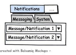
On Tue, May 11, 2010 at 19:36, Dmitrijs Ledkovs <email address hidden> wrote:
> I meant to have the app loaded but without any notification
> icons/windows anywhere.
But I also want to be able to activate it by clicking - not only by hotkey.
> Have you looked at the png mockup I did? It is attached to the
> bugreport.... don't know if it was mailed or not though.
No, it wasn't - now looked at it. I like the 3 and 4 where in 3 the icon should have a different color than in 4.
The messages should appear already on hovering however, not only when I click the menu.
> This starts to sound like RSS reader or GWibber =) shall we make our
> desktop just tweet those and read it via messeging menu?
Yes - The output from Gwibber could be simply taken and shown in the messaging menu.
> Actually why can't it be part of the messaging menu? Create one more
> entry "System" and add those under there. Just a thought....
I like the draft from Mark quite good - the one you linked.
> "system
> menu" or if we can it put those inside the power button menu and add a
> menu item there "View system messages..." to see history of those.
That would be cool.
> the "system menu" is the one that doesn't exist yet =) and I'm a bit
> of a minimalist, when there is nothing to report we shouldn't be
> adding anything to the interface.
I thought you meant the menu with the power off icon to be the system menu.
> I don't think me-menu is good for this. First of all you cannot have
> secondary click on any of the indicators (established design, right
> click currently brings up gnome panel applet menu) And me-menu has
> relationship to what's about "me" and not about any other disasters
> that can happen.
I also created a mockup using tabs in the menu - could that be an option? That would be a catogorized notifications menu then (see mockup-tabs.png)
> You could have shortcuts to your applications & applet/shortcut to
> "show my desktop" with netbook launcher running on the desktop.
I don't put anything on the desktop - the desktop is burried away usually.
> So shortcut to show desktop & click huge icon for app can be quicker
> then precisely hitting small icon on the panel.
And then restoring the windows again. - For me clicking on the small icon is faster.
> You need to measure time for the whole action & how hard is it to
> remember it (muscle memory). E.g. emacs has shortcuts which are
> two-three and sometimes four keys combos and it is very efficient and
> can do a lot. You are probably a vim user it has it's advantages as
> well but I personally type most of the time and not switching modes.
For things I use very often I can also remember longer shortcuts but a lot of things you use just once a week or so. Hotkeys then must be easier to remember.
| eagsalazar (eagsalazar) wrote : | #137 |
Saying you don't need a tooltip because it is a menu is like saying you shouldn't get a speeding ticket because you were wearing a clown outfit while going 90mph in a school zone (actually a really good analogy)
Look, I see now the fundamental issue is this nonsense with making these things menus. Why? They are apps. Why are you revinventing the wheel? Boredom? Not enough to do? These changes add nothing.
Please see (and follow) the HIG:
Right click => menu
Left click => show/hide main app
Double click => default action (like play/pause for example)
Tooltips.
This is nuts. Really a huge step backward in usability all around.
| Dimitri John Ledkov (xnox) wrote : | #138 |
> Please see (and follow) the HIG:
>
Are you referring to the out-of date Gnome HIG which hasn't been
revamped for Gnome3 yet?
The HIG is good but remember it is Guidelines not a Law.
> Right click => menu
> Left click => show/hide main app
> Double click => default action (like play/pause for example)
> Tooltips.
>
>
> This is nuts. Really a huge step backward in usability all around.
>
My mom&dad have a lot of troubles to understand difference between
left click, right click & double click. When I guide them over the
phone to fix something i always tell them "the OTHER click" to get
their attention to do right click.
Also my mom does double-click on everything "to make sure it always
works" cause she doesn't understand that on the desktop icons she
needs to double click, in the web single click, in skype mostly single
click, but to call in skype double click.
It is confusing.
About tooltips - they cover information. And it's hard to see which
item exatly tooltip belongs to. and tooltips cover other icons as well
making you miss information again!
It has been marked as "won't fix" so please stop suggesting readding
tooltips or providing solutions which go against current AppIndicator
spec.
Currently we are trying to identify missing information, whether it is
important and how to represent it in the new desktop design.
| Marck Robinson (marck) wrote : | #139 |
The reason that many of us don't want to let this issue go is because all of the justifications to remove tooltips don't make up for the loss of functionality that can't be replaced.
Hover based tooltips are a powerful model that play a much needed role in a pointer based UI:
- they do not take input focus away from your current work as click operations do
- they do not invoke any pop-up windows that need to be managed or closed by the user
- they have no time limit and will stay open as long as the cursor is over the icon, even while you work in another window
- they are safe and are not overloaded with an action that also runs things (like click).
Hover adds a great deal of comfort for the user. Anything can be harmlessly examined without fear of making it do something. For new users this is especially important. Clicking on an icon to learn more about it will often run it, which is not what you want. Hover is the natural "what is this?" action.
Why not simply manage tooltips better? Move their information around according to the type of system. Pointer based systems could use tooltips while touch based systems could have long-press pop-ups or menu captions. Let the user decide when to disable them, move them, even theme them. They are essentially information / status objects. Let's be creative about what an information / status object can do, where they can show and then "show as a tooltip" is simply one of the options.
I think what is getting people worked up is that any software designer can see a number of solutions where we accomplish the "less is more" objective, address all tooltip concerns and encourage creativity without having to tell users who love tooltips to take a hike. As a result, the current decision is sort of a slap in the face.
I'm not saying that Canonical doesn't have the right to do what they want with their distribution, I'm just questioning if it is the right thing to do.
What is wrong with a win/win solution?
| Dimitri John Ledkov (xnox) wrote : | #140 |
- tooltips-bad.png Edit (14.0 KiB, image/png; name="tooltips-bad.png")
On 12 May 2010 23:28, Marck Robinson <email address hidden> wrote:
> What is wrong with a win/win solution?
>
See attached screenshot of a loss/loss situation
1) What's the time & date? (I'm hovering over the date/time applet)
2) Is my sound muted, low or high?
3) Do I have any pending messages in the messaging menu?
4) Which user is logged in?
When asked to "click on the envelope icon" users do search with their
mousepointer while they do it (e.g. first time users) they will hover
over the icons while searching for the right icon the tooltips will
hide the items they are searching for leading to frustration.
In this context all the indicators have about the same significance
and all of them are the same size. Tooltips on the other hand are much
larger in size and cover more than one indicator. When your mouse
pointer is in the indicator area it is area of high interest and users
should be able to see all indicators and nothing should hide any of
them.
Also thing about visually-impaired and/or people with reduced motor
skills / poor hand-eye coordination. The time it takes to get to the
icon will be less than tooltip popup delay which will increase the
effort to get to the indicator. And even with legacy notification
icons you still click more on it (left, right, double) then hovering
over them.
| Perky (perkyspam) wrote : | #141 |
> My mom&dad have a lot of troubles to understand difference between
> left click, right click& double click. When I guide them over the
> phone to fix something i always tell them "the OTHER click" to get
> their attention to do right click.
>
You will now have to describe the icon to click on (assuming that you
are guiding them to an icon they are not familiar with). Previously,
tooltips provided a way of identifying the item you wanted them to click
on. Now it is more like - click on everything until you find x. Or,
click in the (describe where the indicator applet is) and move your
mouse around until you find x.
> Also my mom does double-click on everything "to make sure it always
> works" cause she doesn't understand that on the desktop icons she
> needs to double click, in the web single click, in skype mostly single
> click, but to call in skype double click.
>
How does this fit in with the original request for bringing back tooltips?
> It is confusing.
>
> About tooltips - they cover information. And it's hard to see which
> item exatly tooltip belongs to. and tooltips cover other icons as well
> making you miss information again!
>
Yes, they temporarily cover information with the information you want.
I think you're wrongly assuming that users are dissatisfied when they
accidentally put their mouse over the Indicator Applet. If this is the
case, is there evidence to show that taking tooltips away is the best
way of dealing with this? A new user would move their mouse over the
Firefox icon and then know what the icon is for. They then "know" that
they can get useful information if they move their mouse over things.
Until they discover the Indicator applet.
> It has been marked as "won't fix" so please stop suggesting readding
> tooltips or providing solutions which go against current AppIndicator
> spec.
>
Does that mean it's impossible to change to "will fix" etc.? (Sorry if
I'm missing something, I'm newish to lp)
> Currently we are trying to identify missing information, whether it is
> important and how to represent it in the new desktop design.
>
>
Good luck with your research, you might want to search Google Scholar
for something similar to "usability tooltips" (without quotes). Quote
from second result and searching the document for tooltip:
We heard general comments about icons and tooltips that included the
following:
"The icons are not immediately obvious" (P2)
"Some of the icons could be more helpful. Icons that work well are
really simple." (P4)
"The icons are not clear." (P6)
"The tooltips make no sense." (P7)
So, users DO use tooltips to identify things (although in this OLD study
tooltips at the time did not have useful information). If research is
old, you will have to determine what bits are relevant.
| Marck Robinson (marck) wrote : | #142 |
Dmitrijs, your screen shot is clearly a good example of badly tuned tooltips.
On my system they do not cover the other indicator icons because I have them on the top panel and they are correctly set to pop-up below the panel. This way they do not block your ability to see any of the other indicators.
Your case of having the indicators on the bottom panel should work just as well by default. Somehow that was overlooked by testers and left your bottom panel tooltips broken. Clearly that is a bug that should have been cleaned up prior to release. If the tooltips were tuned properly and popped up just above your bottom panel, nothing else in the panel would be covered by them and you'd find your entire list of issues to be resolved.
So what you found is clearly a bug, but I have a hard time seeing why it's better to throw out the feature rather than just fix the bug.
| Perky (perkyspam) wrote : | #143 |
Another quote from Gnome Usability Study:
( http://
"Two participants missed the ability to click on the GNOME foot icon, one because "there was no tooltip" when he
moused over it and another because he missed the small arrow indicating the foot was a menu."
Please do some research before blindly turning off features new users heavily rely on (and existing users find useful), it's not hard.
| Oliver Joos (oliver-joos) wrote : | #144 |
On 11.05.2010, 17:39 +0000 Dmitrijs Ledkovs wrote:
> What infomration are you missing in the current desktop?
>
> A few things already identified
>
> 1) Time left until battery charged
> 2) UbuntuOne syncing, up-to-date, failed
>
> Anything else?
>
More tooltips that I like in Karmic:
3) number of available package updates
4) current up/download speeds of p2p client
5) master volume level
6) weather, temperature, wind (clock and weather applet)
7) harddisk names for temperature displays (sensors applet)
8) number of objects in the trashcan (trashcan applet)
Well, without the tooltips the answers are just one or two clicks away.
So it would still be possible to work with Gnome even without tooltips.
I have another argument against menus replacing tooltips:
Hovering a few pixel off the target just shows the wrong tooltip. But
clicking off the target may start your IDE or Firefox with 20 tabs, may
close a window or deselect a dozen carefully selected icons.
Please think again before declaring tooltips as visual clutter. Knowing
the Commodore 64 we could also argue that the mouse pointer is visual
clutter. And removing it will be the future - just ask an iPad owner!
I bet there are better ideas to improve usability of Gnome.
| Alexander Pas (alexanderpas) wrote : | #145 |
Another use-case where tooltips made the difference is the messaging menu.
I had evolution open on the background, when suddenly the icon of the messaging menu turns green. But what does this green color mean?
I can only assume it is because i recieved a new mail message, because the count behind my inbox is not 0, but I don't know for sure, as there was no context-sensitive explanation (read: tooltip, or smilar.)
however, looking from the other side of the coin (a.k.a. devils advocate)
Removing the tooltips and making all information previously found under the tooltip, accesable after opening a menu, enables Ubuntu to be used on touch-only devices (think iPad etc.)
Concluding: While ensuring all information enclosed in tooltips is also availble to non-tooltip-capable devices is a very good goal, and should be persued, we should not deprive tooltip-capable devices from the enhanced experience tooltips can offer.
| Dimitri John Ledkov (xnox) wrote : | #146 |
On 13 May 2010 07:56, Alexander Pas <email address hidden> wrote:
> Another use-case where tooltips made the difference is the messaging
> menu.
>
> I had evolution open on the background, when suddenly the icon of the
> messaging menu turns green. But what does this green color mean?
>
For all "turns green" i get NotifyOSD bubble notification saying
what's happened. Don't you as well? =)
> however, looking from the other side of the coin (a.k.a. devils advocate)
> Removing the tooltips and making all information previously found under the tooltip, accesable after opening a menu, enables Ubuntu to be used on touch-only devices (think iPad etc.)
>
Nice one ;-) I'm trying to be devils advocate in this bug.
> Concluding: While ensuring all information enclosed in tooltips is also
> availble to non-tooltip-capable devices is a very good goal, and should
> be persued, we should not deprive tooltip-capable devices from the
> enhanced experience tooltips can offer.
>
Your post sounds like the gnome's decisions on "no icons in the menu's
by default.
| Jeremy Nickurak (nickurak) wrote : | #147 |
On Thu, May 13, 2010 at 01:57, Dmitrijs Ledkovs <email address hidden>wrote:
> For all "turns green" i get NotifyOSD bubble notification saying
> what's happened. Don't you as well? =)
Doesn't help if you're away from the computer for the ~4 seconds the popup
is there...
--
Jeremy Nickurak -= Email/XMPP: <email address hidden> =-
| Dimitri John Ledkov (xnox) wrote : | #148 |
On 13 May 2010 15:20, Jeremy Nickurak <email address hidden> wrote:
> On Thu, May 13, 2010 at 01:57, Dmitrijs Ledkovs
> <email address hidden>wrote:
>
>> For all "turns green" i get NotifyOSD bubble notification saying
>> what's happened. Don't you as well? =)
>
>
> Doesn't help if you're away from the computer for the ~4 seconds the popup
> is there...
>
You click the green envelope and you see exact summary of things you
have missed listed under each messaging app. e.g.
Empathy
Bob
Sindy
Xchat
Email
Family (2)
| Perky (perkyspam) wrote : | #149 |
The key issues related to the original request have not been addressed yet:
1. Tooltips provide novice users a way of identifying things. Not everyone will be able to identify the icon for _every_ application that uses the Indicator applet - the mockup on Mark Shuttleworth's homepage is a good example.
2. New users will think the Indicator Applet is broken if there are no tooltips because everything else has tooltips. Some novices will not click on an icon if they don't know what it does.
3. Tooltips do not take the focus away from your work and they provide useful information.
4. The argument that this bug will not be fixed. Good people that can realise their mistakes have the power to take corrective action. If it were a security risk, it is fairly likely that an update would be released :)
The answer to all of us not having tooltips is in post #96. From what I gather, Mark developed an application which had a tooltip that he was ashamed of. Because of this, we all now have to live without tooltips for our battery/sound/etc. I'm willing to stand corrected :)
| zsolt.ruszinyák (zsolt-ruszinyak) wrote : | #150 |
I don't understand why would Mark Shuttleworth act so strangely about this. Tooltips are extremely useful, just the amount of comments and subscribers for this bug shows, that people really think this as an imperfection. Who else should persuade him about the usefulness of the tooltips, if not the users themselves!
F.e.: u can't learn the master volume percentage in Ubuntu, cause the tootip was the only thing showing it and it's gone... (Bug #585627) So all users should start using the "alsamixer" command in terminal to learn the master volume level, etc.?
| Perky (perkyspam) wrote : | #151 |
And what is with the faulty design guidelines: https:/
The first sentence is incorrect: "Like other menus, status menus do not have tooltips. "
...other menus in Gnome Panel do not have tooltips? Hmm... could have fooled me :)
Is there anyone here that can fix the Design Guidelines to allow for tooltips? How do we go about fixing this? Maybe we should start another bug...
| Perky (perkyspam) wrote : | #152 |
Perhaps the design guidelines could go along the lines of:
Menus with text don't need tooltips.
Menus with icons need tooltips.
This is the behaviour of clickable 'things' in applications which are represented by either text or icons.
(It might be helpful to assume that novice users don't initially recognise icons without text as menus.)
| Jeremy Nickurak (nickurak) wrote : | #153 |
Another couple inconsistencies: the panel contains lots of other things,
like applets, and a task switch, that aren't menus, and don't behave like
menus, even though they sort of look like they're on a menu bar.
Also, with a menu bar, you can click once to open the menu, and then move or
drag the mouse to other menus, and have them open. With the indicator
applets, they don't behave this way.. you can't drag between the
application/
indicator-
If you want a menu bar, with things on it that behave like a menu bar,
that's cool. But you may have to sacrifice the idea of using gnome-panel to
do it. gnome-panel is not a menu bar, and was never designed to act like
one.
| Nemesis][ (nemesis2) wrote : | #154 |
I too would like the tooltips back. As a laptop user I find this change quite frustrating and see it as a major step backwards. I can not believe such a simple request for functionality is essentially being ignored. After reading all the reports it is painfully obvious that the development team has drawn a line in the sand and is unwilling to listen to the user community. Can anyone in the community please release a functional replacement that fixes this issue?
| machrider (machrider) wrote : | #155 |
It's completely asinine that the battery status indicator is forced to show "Laptop battery 5 minutes until fully charged" as a *menu item*. This is a classic case of needlessly reinventing the wheel, and doing something surprising to the user in the process. What happens if I click on that menu item? It turns out it opens a power statistics window! What the hell? That menu item should be called "Power statistics" and the text describing battery charge state should be a TOOLTIP.
| auxbuss (launchpad-auxbuss) wrote : | #156 |
All a bit of a mess. I've ended up, unconsciously, removing all the new indicator/status applets and panels, and using replacements. One by one they fell. I'm even back to Quod Libet to replace Rhythmbox whose accessibility has been strangled by this change.
I regard this experiment as a failure.
| itsjustarumour (itsjustarumour-gmail-deactivatedaccount-deactivatedaccount) wrote : | #157 |
@auxbuss - thats funny, over time I've done exactly the same as you! "One by one they fell..." - over time, I've removed every one of the new-style indicator/status applets and gone back to ones that are more "useable". I too regard this experiment as a failure.
Just my £0.02.
| Oliver Joos (oliver-joos) wrote : | #158 |
@auxbus and itsjustarumour: please share your knowledge about replacing the indicator applet!
To get back tooltips on the volume icon I added "gnome-
Indeed a failed experiment. Banning tooltips might be ok for touchscreen devices. I prefer tooltips but cannot go back without huge effort. I honestly hope that Canonical will find better (read "more polite") ways to introduce new features in the future. What about the right to choose? Are we soon limited to choose another distro??
| Oliver Joos (oliver-joos) wrote : | #159 |
I forgot to mention the battery icon! I found a new replacement which looks promising: http://
(As always please note, that adding a foreign package source can harm your system and/or security)
| zsolt.ruszinyák (zsolt-ruszinyak) wrote : | #160 |
Thank you Oliver, that one is really great, no more default gnome battery applets... I'm gonna test it if it's reliable.
| John Doe (gehkacken02) wrote : | #161 |
Thx Oliver, that's the first useful thing I have seen, since the Ubuntu Design Team chose to stuff nails through their heads and fuck up the useability of the system tray altogether.
| auxbuss (launchpad-auxbuss) wrote : | #162 |
I use the battery applet mentioned here http://
gnome-volume-
Bluetooth is an app icon in the regular notification area, not one of the "indicator" applet entries.
Btw, if you are using gwibber, beware the heap of redundant processes it leaves in its wake, even when not in use. I've purged gwibber and gwibber-service to avoid the mess. There's an interesting discussion about this over at Fedora.
| Mark Shuttleworth (sabdfl) wrote : | #163 |
On 12/06/10 19:57, John Doe wrote:
> Thx Oliver, that's the first useful thing I have seen, since the Ubuntu
> Design Team chose to stuff nails through their heads and fuck up the
> useability of the system tray altogether.
>
John, crass language is not going to win support for your ideas, and is
also against the code of conduct which governs this bug tracker. Please
refrain.
You're welcome to use the traditional Gnome panel applets, as described
here.
You're also welcome to express your opinions about what works better,
but please understand they are only your opinions and when you combine
them with the language of a three year old you put them appropriately in
context.
Mark
| John Doe (gehkacken02) wrote : | #164 |
Actually at first I wanted to phrase my opinion in a non offensive manner, since I had already filed a bug before about a similar problem concerning the application indicator, only to discover that my opinion and in fact the entire bugreport was plainly ignored and the report marked "wont fix". As a justification for this it was stated that it was a "design decision" and if I wanted to know more about it, I should consult this bug right here, amongst others. So I did and I discovered that most of what I had already complained about is already mentioned here and the response by you and the other people who could actually do something about this issue, is to just plainly ignore it.
About 180 people have already marked themselves as affected by this and the arguments obove could already by themselves fill a book and yet this bug is also listed as "wont fix". Which tells me that anything I would mention here would still be ignored. So why even bother to argument about it.
Even though you are wrong with this so called "design decision" (and if 180 people from the community say you are wrong, then you plainly are), you are still going to stick to it, you have made that clear.
So excuse me if I phrase my utter discomfort about this issue in a manner that doesn't suit your presicous coc, but since all regular arguments are being ignored anyway, this seams to be the only way to get your attention.
And what is the point of using a panel applet that according to the response to my other bugreport is going to be discontinued soon anyway, because when its dropped eventually, all we are left to use is this disfunctional piece of software I am complaining about anyway.
By the way, the battery icon
http://
works fine.
| Evgeny Kuznetsov (nekr0z) wrote : | #165 |
Mark,
your comments on John's report are absolutely valid indeed (especially the Code of Conduct part), but please consider how upset the user has to be to express his opinion in such a way, and even more so seeing as how neither You nor Canonical seem to listen to users that object in more appropriate language (not that I defend his manners, of course).
And I dare say that except for the choise of words John is completely and utterly right: by trying to smoothen the user experience on touchscreen devices Canonical is a) ruining the user experience for orders of magnitude more users with conventional hardware, b) does that by breaking things that worked well for ages without providing an option to revert back to sane settings, and, as if that wasn't enough, c) does all this in an LTS release. As confronting the Code of Conduct as they are, John's words seem to be the most accurate summary of the situation, don't they?
| John Doe (gehkacken02) wrote : | #166 |
*nods in agreement*
| madbiologist (me-again) wrote : | #167 |
I'm in agreement with Evgeny (comment 165).
I'm also starting to think we should mark bug #1 as "Wont Fix". Can you imagine what could happen if Ubuntu gained a majority market share? Scary.
| zsolt.ruszinyák (zsolt-ruszinyak) wrote : | #168 |
I'm always saying that these bugs marked as of "low importance" are the reason why people are going back to windows. And also the developers should listen to the users for the future development. I'm not saying that what they're planning is bad, but this ignorance is no good.
The panel is the most troublesome part of the gnome desktop. Unless the panel will be 100% reliable and informative, we can't gain importance. That's how it is...
| Mark Shuttleworth (sabdfl) wrote : | #169 |
I don't have a monopoly on "right". So I can't claim to know absolute
truth on the matter. But I do know that we've taken a view, and want to
stick with that. If we are wrong, we'll fix it later, and eat humble pie
in the process. It wouldn't be the first time or the last.
But I also know that simple volumes of agreement / disagreement don't
add up to the right answer - they add up to a messy interface.
And I also know that irksomeness is no justification for the language
used, to which I raised an objection.
Mark
| Perky (perkyspam) wrote : | #170 |
"I don't have a monopoly on "right"" - you do. Were there any bugs similar to this one before Lucid with the opposite goal - remove tooltips? I think not :)
"I can't claim to know absolute truth on the matter" - that's no excuse for poor design choices, especially given the feedback from the community on the matter - that's what Launchpad is for, right?
"we've taken a view, and want to stick with that." - We? or you? I'm guessing that the only people that agree with you on this are those that don't want to rock the boat. The few people that dislike tooltips can disable them globally with the aid of a search engine.
"a messy interface", "irksomeness" - it has been said here many times: menus were not designed to convey contextual information! Having tooltips in some parts of the desktop but not others leads to an inconsistent interface (it feels broken).
"justification for the language used" - all language serves a purpose. Movie directors (and responsible adults) purposely and willingly utilise such language to convey strong messages. There aren't many 3-year-olds that have directed movies!
The Indicator applet would be excellent if it had tooltips; it is a good idea of yours, but it is plagued by a few ill-thought-out design decisions. "If we are wrong, we'll fix it later" Please make it better soon - too much pie eating will make Ubuntu overweight and bloated ;)
| Kai Mast (kai-mast) wrote : | #171 |
Are you guys aware of this tooltip improvement in gtk 3.0: http://
Tooltips then woud look just awesome with the new tray. But right now I really understand Marks opinion that they are ugyl....Maybe reconsider when this patch is merged into gtk?
| Omer Akram (om26er) wrote : | #172 |
Lucid already is using those tooltips :P Although its officially planned for gtk3 but Ubuntu cherry picked those patches.
| Kai Mast (kai-mast) wrote : | #173 |
Lucid only seems to use the look of the new tooltips. The really awesome thing about them is however the way they're placed. And even maveric isn't doing it yet.
I think if toolkits were placed below the gnome-panel and not randomly across it ( I think thats whats annyoing Mark, correct me if I'm wrong) then the indicators would be fine haveing some.
But then again, its Mark who is putting by far the most financial effort into this project so we shouldn't force him to decide as we like imho.
| netman74501 (netman74501) wrote : | #174 |
Ubuntu is already overweight and bloated. I'll beit, not as much as Winblows but it is. The reason I stick to Ubuntu is because it "just works".
Though, now, It does not "just work" a lot of the times and this tool tip thing has just about done me in on switching back to Winblows. I have been using Ubuntu for about 3 years now and love it most of the time. It's times like these that I hate it... You people take a simple thing and turn it into something complicated!
Why can't you just have an option to let the USER decide how THEY want to be notified?
P.S.
I am tired of playing the guessing game with the battery applet! A nice simple tool tip would save me a lot of time. Yes, I am lazy and don't want to click! There I said it. Now give me back my tool tips.
| toobuntu (toobuntu) wrote : | #175 |
"feedback from the community on the matter - that's what Launchpad is for, right?"
Someone can correct me if I'm wrong, but I don't thing that's right; that's what the community forums are for. Launchpad Bugs is for reporting technical problems, FTBFS, regressions, incompatibilities, wishlist items, etc., and to do so in a way a developer or maintainer can act upon.
My opinion is that the folks who are hard at work coding what will hopefully become improvements to the desktop experience should also take into account the effect of incremental changes. For example, until the project is fully implemented it would be a good idea to document how to revert to previous behavior. Also, I don't think new code should be introduced without posting somewhere how to configure it. The old panel applets were configurable in gconf. With the new code, perhaps the design decisions are hard-coded; I have no idea how to customize it. I would prefer greater "openness" in the sense of publicly available documentation and increased configuration options, even if they are hidden away in dconf or dot files or something like that.
Indeed, it would be preferable for the battery status applet to show both the time remaining and the % charge/discharge, but I don't mind if I have to click once to see it. That to me is a regression. With no config option, I do consider it a regression, an inconvenience and wishlist item for the new software to include.
| Bilal Akhtar (bilalakhtar) wrote : | #176 |
Dear SABDFL, our very own Self-Appointed Benevolent Dictator For Life,
We should have tooltips, but uncluttered ones which don't overlap the panel. This will make them better, in your way. I mean the tooltips as said my Kai in comments 171 and 173.
If you still don't find them fit, then make tooltips that appear suddenly, without any wait.
| Daniel Añez Scott (danielscott171) wrote : | #177 |
I've read all of Mark Shuttleworth's comments and he didn't say a thing about transmission transfer rates, battery state or rhythmbox issues... I guess we will have a bunch of indicators with the required information cluttering our titlebars, or in the worst case, no information at all.
| Perky (perkyspam) wrote : | #178 |
I can see from Mark's view that there needs to be an alternative to
tooltips on tablets. However, at the moment such devices are 'toys'.
In comparison to traditional laptops/desktops they are not as good for
getting work done (depending on the work). This will probably change as
they mature many years down the track, and you never know - getting work
done may end up being more productive on a tablet, and who knows, games
might evolve to become more enjoyable on tablets. The world of tablets
may be the end of tooltips.
But this is the present, and most people use desktops/laptops for work
(and will for quite some time). A separate release for tablets could
safely remove tooltips, but they serve an important role in
desktop/laptop environments. I can also see that to develop a tablet
version of Ubuntu will be tricky because of the small userbase - perhaps
that is why some 'experiments' are appearing in desktop versions of Ubuntu?
This post is obviously a stab in the dark, but none of Mark's posts have
provided any solid justification for removing tooltips. Guessing there
may be a hidden agenda there :)
| Perky (perkyspam) wrote : | #179 |
That also may explain the spacing in the indicator applets (room for finger touch).
I guess we have to be happy with alternative applets - for upload/download speeds you can use netspeed applet. There are also alternative battery applets out there, and the gnome-volume-
| Martin Wildam (mwildam) wrote : | #180 |
On Fri, Jun 18, 2010 at 02:29, Perky <email address hidden> wrote:
> I can see from Mark's view that there needs to be an alternative to
> tooltips on tablets. However, at the moment such devices are 'toys'.
Not just at the moment, IMHO. You can't turn a car into an airplane -
that is different things, even if both are invented for transport.
By definition a netbook or tablet will always be substantially
different from a desktop or laptop PC.
Therefore netbooks or tablets will IMHO never replace a real laptop or
desktop. I simply can't go to holiday with my whole family with a
Ferrari - even if it looks cool and may go fast (under the appropriate
circumstances), it simply does not offer enough room.
While you could do web-surfing and email with your netbook, doing CAD
or writing long documents etc etc is simply not efficient with a small
geeky device.
On the other hand, when in inventory where it might be sufficient to
type a few numbers (or just use a built-in barcode scanner) and read
some necessary information. - Here a tablet could fit very well and
better than carrying a laptop.
> In comparison to traditional laptops/desktops they are not as good for
> getting work done (depending on the work).
Indeed - as explained above!
> This will probably change as
> they mature many years down the track, and you never know - getting work
> done may end up being more productive on a tablet
I don't think so even in mid-term future because of physical conflict:
A small mobile device can never offer a big view (maybe with
projecting it into the air only) and a small keyboard is simply not as
easy to handle as a bigger one that fits more the human hand. BTW: I
do not think that speech recognition and related technology will get
stable within the next years, as I notice that neither fulltext
indexing does (which is more important yet).
> I can also see that to develop a tablet
> version of Ubuntu will be tricky because of the small userbase - perhaps
> that is why some 'experiments' are appearing in desktop versions of Ubuntu?
Isn't it possible to display several things different depending on the
device? - Maybe in the future the device can recognize, where we
looking at and displaying the tooltip then - that would be the
equivalent to hovering with the mouse. ;-)
Anyway, the clear mistake that is done is for the sake of good user
experience on the netbook, productivity on laptops and desktops is cut
down. Maybe Mark thinks, that Ubuntu has more chances on the netbook
market than on the desktop market and therefore concentrate on that.
But seriously, a netbook is a nice thing, I might carry with me when
going to a conference to have less luggage, but for daily work nobody
would use it. And I find it a big mistake to concentrate just on that
as I think that business is interested in saving plenty of licence
fees.
--
Martin Wildam
| Lei Wang (raywang) wrote : | #181 |
Tooltip in indicator-applet session is very important, does anybody can tell me what is the "Text entry" used for?
I think No tooltip does hurt the user experience. :)
| Andrea Ratto (andrearatto) wrote : | #182 |
I updated two days ago to Lucid and I am finding the whole indicator stuff on the right to be totally annoying even if it is not new anymore.
I miss the tooltips, I hate the bluetooth icon, I hate the me-menu and the session button without icons.
This indicator technology has potential but is incomplete and not customizable to fit all users' needs. It's five years and still this distro is managed like a beta of something yet to come.
I own the panel and the whole screen. I want to decide exactly what lives there and where to place it.
Consistency and customization are two faces of the same medal. There are at least ten applets that need some love and consistency fixes, before adding a new mess.
I can't get back the behavior I like and am accustomed to. It requires recompiling different packages. That does not make me feel good about running Ubuntu since dapper and installing it on more that 40 machines.
You are forking the GNOME desktop and being more and more fascist in handling users' requests.
Linux desktop's problem is just that 90% of the programs are 90% complete. Fixing bugs, adding small features and completing one program after the other is all that is needed. Not much glory in that, but that's what will make linux desktop actually usable
| Martin Wildam (mwildam) wrote : | #183 |
On Tue, Aug 31, 2010 at 11:37, Andrea Ratto <email address hidden> wrote:
> I hate the me-menu and the session button without icons.
> This indicator technology has potential but is incomplete and not customizable to fit all users' needs. It's five years and still this distro is managed like a beta of something yet to come.
I don't "hate" them, but sincerely, I don't use the me menu. I do
social networking on different sites totally separated as one e.g. is
for private use and another for office/work. And I don't either want
to configure all my logins within a single service collecting all my
login information. I use KeePassX so I even don't have a problem with
logging in to different sites.
From my point of view the me-menu could be completely dumped. I would
have already deleted it from the panel if it wouldn't show the
logged-in username there which I like (e.g. at home 3 people are using
the same PC). Either none of those I converted to Ubuntu is using it.
Most people don't use that much different social networking sites.
Most private users are in Facebook and for business since all those
services are trying to get you being a paying member, I see reduced
interest of people being in XING or LinkedIn. But I find the me-menu a
good idea for those who participate in many communities.
> I own the panel and the whole screen. I want to decide exactly what lives there and where to place it.
I tend to agree with you, but there should be a meaningful default. I
do switch a lot of people to Ubuntu and I don't want to "design" the
panel each time again and again. I want a good default that I don't
need to change anyway for the 80% of "normal" users. I am a GTD freak
and of course I do more hacking to my system.
> Linux desktop's problem is just that 90% of the programs are 90%
> complete. Fixing bugs, adding small features and completing one program
> after the other is all that is needed.
> Not much glory in that, but
> that's what will make linux desktop actually usable
Full ACK!
That said, it is already usable - it's just, that those small things
remind me too much to the old windows days that were full of smaller
or larger annoyances.
--
Martin Wildam
| Alex Mandel (wildintellect) wrote : | #184 |
I can see various pros and cons of the situation. What I would love is not intentionally limiting customization. Seems that each new version of ubuntu core UI functions get changed in an attempt to make the interface better, but I caution against making it really hard for users to switch or customize.
It's also driving me nuts that I can't just roll the mouse past the battery indicator to check the time estimate/
One possible way forward is to default to the custom variants of gnome for ubuntu but to also have an alternative package that keeps more of the expected gnome behavior.
| rodislav (rodislav) wrote : | #185 |
+1
i also think that too much clicks are bad idea, even for new users, and - maybe Open Menu on RollOver (MouseEvent.
| s0undt3ch (ufs) wrote : | #186 |
Don't just remove something that worked perfectly.
Bring back tooltips!
Stop making me click and click and click and click, just to get a small amount of info that could and in some cases should be displayed in a simple tooltip.
| Patrik Floding (patrik-b) wrote : | #187 |
Tooltips are a good GUI invention that's been around for ages. I believed something was wrong with the installation when I installed Narwal. Generally Ubuntu has improved a lot, but the missing tooltips is just plain stupid, and it was a pain to find the system configuration stuff -a tooltop for the "power button" would have helped that perhaps (and why is the main menu so non-menu like?). Anyway, tooltips are a good thing, and if a few people feel they don't need them, then it should be possible to turn them off. They shouldn't have been deleted.
| zsolt.ruszinyák (zsolt-ruszinyak) wrote : | #188 |
somebody earlier promised here, that the next release of ubuntu would bring back the possibility to check volume percentage, which was some 2 or 3 releases ago and still nothing. I think ubuntu is the only OS on the world where u can't check the exact percentage of ur volume....
| Christoph Runge (christoph-runge) wrote : | #189 |
Indeed! Especially the volume-display sucks. No Volume, no battery-load, no display-
| Oliver Joos (oliver-joos) wrote : | #190 |
I also miss the popup showing the wlan power! Opening a terminal and typing 'ifconfig' when video streaming stutters to check why is not "for human beings", is it?
I don't prefer Linux because it's cheaper than MacOS, but because it is open in many ways: its source as well as its system state! It makes me sad to see that Ubuntu recently favors a questionable "information hiding". A real challenge would be to show system details, without complicating the simple use-cases. Please Canonical, take this into account!
| Patrik Floding (patrik-b) wrote : | #191 |
I have read more comments and other views and have come to the conclusion that Ubuntu may not be for me.
On the plus side the installation experience was fantastic, the initial impression from the way it looked was good.
On the minus side an update of the system froze the GUI and required a hard power cycle, and it seems that the default desktop GUI is too functionality-
| Chow Loong Jin (hyperair) wrote : | #192 |
On 06/06/2011 18:54, Patrik Floding wrote:
> I have read more comments and other views and have come to the conclusion
> that Ubuntu may not be for me.
I'm sorry to hear that. Have a good trip finding another Linux distribution.
> On the plus side the installation experience was fantastic, the initial
> impression from the way it looked was good. On the minus side an update of
> the system froze the GUI and required a hard power cycle, and it seems that
> the default desktop GUI is too functionality-
Unity is essentially Compiz with an extra plugin. And somehow, I fail to see how
Compiz, which has been criticized by GNOME for being too bloated (in terms of
configuration options) can now be criticized to be too "functionality-
> Getting rid of Unity didn't improve things much as the old style menus
> looked tired and developmentally orphaned. Unity would be nice if it wasn't
> so dumbed down (presumably for touch screen usage) and unconfigurable.
The global menu is provided by the package called indicator-appmenu. Just remove
it and voila, no more global menu, whether in Unity or in the classic interface.
As for being dumbed down, see above.
> Unfortunately Windows 7 (and even Vista) are more appealing and feel less
> straight-jacket like.
Then go back to Windows.
> I know I can hack Linux to anything, but most users can't -and the
> maintenance trouble of a totally personalised system is not something I wish
> to handle. I never liked the space wasting "global menu bar" (macintosh
> style) feature, and can't seem to get rid of it at all nowdays in Ubuntu.
Do yourself a favour, and count the number of pixels wasted by the global menu
bar, please. If you get a positive figure, count again.
> Window buttons on the left is a mac thing, and seems to screw up most
> existing themes. Weren't they always on the right on Linux systems?
Half the themes in gnome-look.org work well on both left and right side. Please
stop with the emotional false accusations.
> I use a Mac (mini) and an iPhone, and can just say that the Mac GUI is nice,
> but cannot be half-implemented. You either have it fully implemented, or it's
> no good. And not even Apple tries to make the touch screen interface the same
> as the real computer version. Linux has come a long way since the early
> days, but dumbing down the GUI universally cannot be the way forward,
> surely?
Mac is Mac. Windows is Windows, and Ubuntu is Ubuntu. Each have a distinct user
interface, with a distinct user experience. The Unity look-and-feel is not the
same as the Mac's look-and-feel, and neither is it meant to be. Unity is not
about dumbing down the GUI, but about progressing towards the ultimate user
interface, that sweet spot that satisfies everyone. If configurability is what
you want, then maybe you'll be happy with KDE instead.
Anyway, all this talk is off-topic here. This bug is closed. Please just let it
die in peace. Now, for the sake of my own sanity, and that of my inbox, I am
hereby unsubscribing myself from this bug, and will not reply any further.
unsubscribe
--
Kind regards,
Loong Jin
| Patrik Floding (patrik-b) wrote : | #193 |
"Unity is not about dumbing down the GUI, but about progressing towards the ultimate user
interface, that sweet spot that satisfies everyone"
There is no such thing. Someone once claimed that everything had already been invented. That is a very similar statement. But thanks for making a fanboy reply. BTW, I know that anything CAN be done -when I say "stripped" I mean the accessible functionality. Such as selecting WHICH instance/window of an application to switch to from the left side task bar (just one example). Regarding wasting screen estate: There is a task bar on the left AND a menu bar plus icon tray on the top. Most of the top bar is empty most of the time, and windows don't drag over it (pure Mac design, whatever you may say).
| zsolt.ruszinyák (zsolt-ruszinyak) wrote : | #194 |
Patrick, ur comment is way out of the topic, we are talking about tooltips and the functionalities removed with them! Regarding Unity, it has its problems, but it is still very early. I really LOVE Unity, it shows that Canonical has the brains, unlike the Gnome team. It is a base for a completely new user experience. Removing 2 useless stripes from each maximized window is a break-through idea. I don't understand anybody who criticizes this. Once the worst bugs are solved this will be the greatest OS environment ever (and not just for those 2 stripes...)
But sadly, with the move to Gnome 3 we can expect much more functionality removed than that removed with the tooltips. :(
| Patrik Floding (patrik-b) wrote : | #195 |
Coming back to topic then: I just fired up the Mac OSX and the top bar behaves very much like in Unity. The reason I have never though about the OSX top bar not having tooltips is that all the needed information is available without clicking. (This is not on a laptop, so I don't know what OSX looks like regarding battery status.) I guess the solution, if emulating the Mac is the goal, is to improve the displayed information. (Emulating the Mac is probably not a bad thing, BTW.)
| Matthew Paul Thomas (mpt) wrote : | #196 |
Alex Mandel, I would be delighted to see a branch that let the battery menu optionally show time remaining in its title. That would be much quicker to see than a tooltip would.
Patrick Floding, we have no evidence that a tooltip would make substantially more people understand that System Settings is in the power menu. As I understand it, the current plan for making System Settings more discoverable is to put it in the launcher by default.
Oliver Joos, as far as I can tell wlan power is not shown in any of Network Manager's windows, either. If you think it's important enough to expose at all, step 1 is to expose it in the window along with the rest of the networking information. Please report a separate bug on that, if there isn't one already.
| Oliver Joos (oliver-joos) wrote : | #197 |
@Matthew: thanks for picking up my point!
> as far as I can tell wlan power is not shown in any of Network Manager's windows, either.
That's why I miss its tooltip. I don't agree that it is a bug of panel applets to rely on their tooltips. The bug is in the new indicator applet and the report is here. Like 4 other comments above I'd welcome a boolean in gconf to enable tooltips in the indicator applet. Forcing changes in other projects is not nice and not ubuntu.
@all: let's concentrate here on possible solutions of this bug
| Ted Howard (chaosmosis) wrote : | #198 |
Ha! I just discovered this bug report and now I know why I have been losing tool-tips on indicator applets over the past few versions. The decision(s) to remove or drastically change functionality like this [without giving the user an adequate and easy way to get the functionality back] are going to ruin Ubuntu. The is the 2nd major horrible design decision in this release that I am aware of to date. The other being the overlay scroll bars and no convenient way to revert to classical scroll bars that have been around for what, freaking ever? And It's ironic that the same class of annoyances that drove one away from Windows and to Ubuntu, would also wind up driving one away from Ubuntu. I just realized that I have been using, praising, installing and recommending Ubuntu for about 5 years; and I hope this doesn't change but it may soon.
I'm not going to repeat any arguments for the tooltips since in my opinion they are already well supported by many earlier in this thread and yet even though they seem to me to outweigh and outnumber all the arguments against tooltips, they are essentially ignored and displaced with an illegitimate oligarchical design decision based on a utopian ideal.
This thread is the epitome of ridiculousness. That it should take nearly 200 hundred comments to try and get back a feature that never should have been removed to begin with. I'm saving a copy of it because I think it makes a great development anti-pattern.
| Oliver Joos (oliver-joos) wrote : | #199 |
Sorry for getting off-topic. I just cannot stay calm reading everywhere that Ubuntu gets ruined. Me too, I liked it out-of-the-box from Breezy to Jaunty. For Natty I recommend the following 5 commands, and if anyone knows a cheap way to bring back tooltips, please share it! Hope this helps to keep skilled people from leaving Ubuntu.
sudo apt-get install gdebi synaptic gtkperf ttf-droid
sudo apt-get remove unity-common ubuntuone-client overlay-scrollbar
sudo sh -c "echo >/etc/X11/
gconftool-2 --set --type string /desktop/
cat <<EOF >>~/.gtkrc-2.0
style "default-style"
{
GtkWindow:
GtkWindow:
}
class "GtkWidget" style "default-style"
EOF
And note that Gnome theme "Dust Sand" with font "Droid" is about 50% faster than Nattys default (according to gtkperf).
PS: I don't like aubergines either.
| Marco Trevisan (Treviño) (3v1n0) wrote : | #200 |
> Alex Mandel, I would be delighted to see a branch that let the battery menu optionally show time remaining in its title.
> That would be much quicker to see than a tooltip would.
MPT, what about supporting on-hover indicator menu title showing? I mean, when you move your mouse over an indicator supporting this feature, all the others will slide and the indicator title would show up!
| Martin Wildam (mwildam) wrote : | #201 |
On Mon, Jun 13, 2011 at 08:30, Oliver Joos <email address hidden> wrote:
> Sorry for getting off-topic. I just cannot stay calm reading everywhere
> that Ubuntu gets ruined. Me too, I liked it out-of-the-box from Breezy
> to Jaunty. For Natty I recommend the following 5 commands [...]
Thanks for sharing such hacks.
Don't get me wrong, but I do not want to end up like I was used to on
Windows: Spend several days after new installation to hack it until I
can work smoothly. I do install Ubuntu quite often and I am not
interested in preparing my own after-install-
to run after every new installation which I need to rewrite for each
release...
--
Martin Wildam
| Matthew Paul Thomas (mpt) wrote : | #202 |
Ted Howard: Tooltips are not "functionality", they are one possible way of presenting information. Tooltips work well when you can rely on every item in a group having one (e.g. every button in a toolbar), otherwise time is wasted in hovering over an item waiting for a tooltip that never comes. Most menu titles contain text, so their developers could never reasonably be expected to add a tooltip to every menu title. Therefore, I concluded that the least time-wasting interface would be one where people could build a mental model that menu titles never have tooltips. Any extra information should be presented in other ways: for example as menu items (like the track data in the sound menu), or as text in the title itself (like the time remaining in the new battery menu).
A few of the duplicate bug reports are of the form "Hey, there's no way to see this particular information any more". Those should not be duplicates, because they describe a solvable problem rather than assuming that it must be solved using tooltips.
Treviño: Changing the title on mouseover would cause the menu to widen as you passed over it, and then narrow when you left it. That would make menus on the leading side more difficult to open, especially the one immediately adjacent.
| zsolt.ruszinyák (zsolt-ruszinyak) wrote : | #203 |
damn, treviňo's idea is a break-through!!!!! but I would rather suggest the extra information to be not the title of the icon, but real extra info, like volume percentage, wifi signal strength, or all undisplayed data in the calendar (like weekday, ...). u could also consider putting (the now missing) weather info into this.
but anything u put there, treviňo's idea (with sliding icons showing more info on the space that has been freed up) is the best damn solution from all those 202 comments and I read all of them!!!!!! this is not just practical and beautiful, but would also nicely fit into unity...
| Marco Trevisan (Treviño) (3v1n0) wrote : | #204 |
Thanks zsolt.ruszinyák for your appreciation, however I can agree with MPT about the fact that sliding can cause clicking over the adjacent indicators harder and time-consuming (but not as much going over an indicator - click and look for the needed information).
However, another idea that can be considered in this case is not to slide, but to use the Unity's PanelView to show the indicator's "text". I mean, when overing or clicking over an indicator the Unity Window title text is replaced with the indicator text. This can also work with the keyboard selection so could improve the accessibility too.
In fact I think that when you're over an indicator or working with it, your attention is focused just on it and so showing the mapped window title is not needed or useful at all (as it really is in background).
| Steve (steve-launchpad) wrote : | #205 |
@Matthew Paul Thomas (mpt) #202
So, some items don't have tooltips, so remove all the tooltips. I don't accept that as sensible. Some were showing useful information. Now they're not.
The alternative, showing things e.g. rhythmbox track information as menu items on the sound indicator. Well now I have a menu item on the sound indicator that I can click on and it does nothing. Menu items that do nothing? Surely if there's a menu item that does nothing, then surely by your initial reasoning, all menu items should be removed?
Please bring back the tool tips & Fix the spacing between icons issue.
| zsolt.ruszinyák (zsolt-ruszinyak) wrote : | #206 |
treviňo and matthew, what exactly did you mean by clicking? unconsistency of the animation of the sliding icons, or collision with the fading part of the window title? well, it is a difficult question, I am not a developer... but I really can imagine it to work. however, the second idea treviňo gave is not good for me, we are trying to use space in the most efficient way, so imagine that u have to look on the icon just to be able to hit it with the pointer and then u have to look somewhere else. it is not logical to have the info so far away form the icon it belongs to, clicking or no clicking, the first idea is still something to consider. there has been many suggestions, but when I read the one with sliding icons, I could imagine it right away, which is not true about any other here.
| Matthew Paul Thomas (mpt) wrote : | #207 |
Stephen Roberts, the menu item never did nothing, but it wasn't obvious what it did. That's now fixed (bug 699899). If you see any problem with spacing between icons, please report that as a separate bug.
| Steve (steve-launchpad) wrote : | #208 |
@Matthew Paul Thomas (<email address hidden>)
"the menu item never did nothing, but it wasn't obvious
what it did. That's now fixed (bug 699899). If you see any problem with
spacing between icons, please report that as a separate bug."
Glad the menu bug is fixed - thanks.
Spacing between icons was reported 2010-02-24, a patch exists, but the bug 527267 still exists.
https:/
| LStranger (andrej-rep) wrote : | #209 |
This bug is a very annoying one. I understand it's a new design which you've decided to have but this is one of reasons to hear from people: "Welcome to Windows, dude, there is no such problems there!" And such bugs are why people are refusing to migrate from Windows unfortunately. Just my 5 cents.
I would ask you to enable tooltips but make it an option (disabled by default as soon you wish it too much) which can be enabled on per-indicator basis from icon-menu. Don't make it all the same way as Microsoft usually does, please. Unix-way is to be configurable and you took that away.
| LStranger (andrej-rep) wrote : | #210 |
May be I missed my point in the comment. I'm using Weather Indicator and it is the ONLY item in my lxpanel which doesn't have a tooltip and I don't know any possibility to have it. And I don't like to have some additional subpanel with very much limited info (it shows only temp in the price of bloated menu added and I want to see also wind and humidity/rain/snow) but I want to have short weather summary in tooltip instead of clicking to see it (and even clicking twice to hide it again)!
| Marco Trevisan (Treviño) (3v1n0) wrote : | #211 |
FYI, those are two solutions I proposed to give information when mouse was on-hover the indicators using the top-panel bar.
However unfortunately this won't be accepted for upstream :(
Screencast of my prototype version: http://
Mockup: http://
| zsolt.ruszinyák (zsolt-ruszinyak) wrote : | #212 |
both solutions look terrific. I like more the on-hover tooltips, however, it might probably cause some issues with adjusting font sizes of the tooltip text etc., which should fit different icons and that might cause problems if the icon theme is changed. I assume this might have been the reason why it wasn't accepted, but it is not impossible, though...
| Matthew Paul Thomas (mpt) wrote : | #213 |
LStranger, this is not a bug, it is a non-specific design suggestion. Three ways you can tell it is not a bug are that the the summary starts with "please", the summary does not describe a problem, and the description uses the word "usability" as a rhetorical bludgeon. I covered these mistakes in my 2009 talk, "How to complain about usability". <http://
In small part because of those initial missteps, a large majority of the comments have not been useful, which has made it hard to find and evaluate the useful ones. In 212 comments, there have been 16 examples suggested where menu title tooltips might be useful. This is my evaluation of each of those:
- Transmission transfer rates: Easily shown as optional title text.
- Volume level with boost: Targeted for implementation in 12.04.
- Rhythmbox current song info: Since shown interactively in the sound menu.
- Transmission completion percentage: Better shown on the launcher icon.
- Currently connected wired/wireless network: Not interesting.
- Battery time remaining: Since implemented as optional title text.
- Audio output device: Better shown in the sound menu icon.
- Number of unread messages: Shown interactively inside the messaging menu.
- Number of packages needing updates: Not even remotely interesting.
- Dropbox files to sync: Not interesting (but implementable as title text).
- Network connection and approximate signal level: Already shown in the icon.
- Exact signal level: So obscure, it isn't even shown in a window yet.
- Eclipse configurations: Better handleable by a launcher quicklist.
- Server maintenance application: Better shown as title text.
- Remote desktop viewer vs. terminal server: Better disambiguated using different icons.
- Weather: Better as title text and/or menu items that open detailed reports.
This suggests to me that the no-tooltip policy is correct; being unable to use tooltips in menu titles nudges developers towards designs that are better anyway.
zsolt-ruszinyak, Marco's experiments did look good. The problem was not in their looks, but in their behavior. Depending on the delay before the text appeared, it would be something flashing distractingly far away from where you were trying to concentrate; or appear more slowly than just clicking to open the menu; or even both.
| netman74501 (netman74501) wrote : | #214 |
I find it very frustrating to have to click on the battery icon to see how much battery I have left since the icon is so obscure. If it was a percentage, that'd be even better.
But, more to the point of my post:
Where is this title text option you speak of?
| Cas (calumlind) wrote : | #215 |
@netman Not to be rude but: http://
| Jeremy Bícha (jbicha) wrote : | #216 |
Cas, linking to lmgtfy.com is rude.
Even worse, the top Google result is out of date, describing the 11.04 battery indicator which was changed in 11.10 to not include an option to show the battery percentage. The Ubuntu designers currently seem to think that people would rather see the time remaining and an option to show percentage instead is not that important. It's unclear whether they'd merge in a patch if it were written but it might be worth writing a patch and trying to get it in. That is bug 811777.
| Matthew Paul Thomas (mpt) wrote : | #217 |
netman74501, from the battery menu choose "Show Time in Menu Bar".
| tags: | added: quantal |
I don't see any reason on not having tooltips on menus.
Beside that, application indicators look more like buttons then a menu, and on buttons I usually expect some info as tooltip.