

© 2004
Canonical Ltd.
•
Terms of use
•
Data privacy
•
Contact Launchpad Support
•
Blog
•
Careers
•
System status
•
73416ba
(Get the code!)
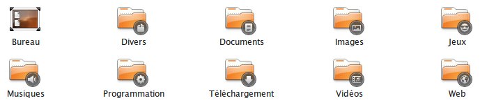
For my own use, I felt in love with the emblems from Erectus-Human icon set.
They consist in black circular background and grey foreground. They mix nicely with the human icon set and are a bit similar in design to the new notification icons. (included a screenshot)
While I really dislike the original orange emblem set, I do appreciate those.
They suffer from the same lack of accessibility (round icons as well). However, after a few days of getting used to, I find them very accessible. I hardly can explain what makes such a difference from the original Human emblems.