

© 2004
Canonical Ltd.
•
Terms of use
•
Data privacy
•
Contact Launchpad Support
•
Blog
•
Careers
•
System status
•
0e1f616
(Get the code!)
I also made one mockup more with text under the buttons. This is because it should follow the generic Gnome preference do you want to have text under the buttons or not. I think the default buttons with text are ok.
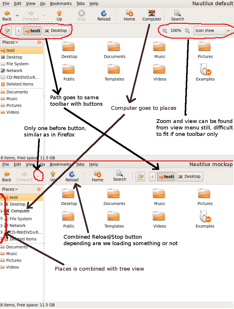
I moved the Computer button to places (also can be found from Go menu in case left panel is not used).
Combined the reload button with stop button. If loading something you need to stop before you can refresh.
Removed Zoom and view drop down list, they can be found from view menu. Removed one before button (those down arrow buttons), left one with same functionality as in Firefox so can go back and forth from there if needed.
Moved path next to buttons, nothing else on right side.
And Finally combined Places in the left with tree view.
I think these changes would not be too dramatic from end user point of view but would give more space for actual information what you are browsing, also it is easier to find files when you can use tree mode in left. Power users can still disable text under buttons but also novice users can understand for what purpose buttons are for.