Changing Status Not Well Reflected in Text Bubble Icon

Bug #439743 reported by jhfhlkjlj
6
This bug affects 1 person
Affects Status Importance Assigned to Milestone
humanity-icon-theme (Ubuntu)
Fix Released
Undecided
Unassigned

Bug Description

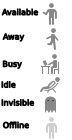
When I change status through this applet, the only graphical feedback I am given is a letter.

If I am offline, the text bubble is gray and looks like I'm offline.
If I am available, the text bubble is gray and looks like I'm offline.
If I am away, the text bubble is gray, has an "A" in it, and it looks like I'm offline (But with an "A" in my bubble now!)
If I am busy, the text bubble is gray, has an "A" in it, and it looks like I'm offline (having a hard time understanding THAT one)

Jaunty's behavior was pretty stellar. I feel that that behavior should be recycled with this updated icon.

description: updated
Ted Gould (ted)
affects: indicator-session → null
Revision history for this message
jhfhlkjlj (fdsuufijjejejejej-deactivatedaccount) wrote :

Would this be Human or Humanity? I'm currently using Humanity.

Revision history for this message
Vish (vish) wrote :

What do you mean by Jaunty behavior? could you post a screenshot of the jaunty behavior?

The lack of contrast has been fixed in the recent revs... If you see in the Humanity/status/24/ folder , there are different icons for different states , you may well be facing a bug where the states are not changing.

Things you need to consider:
- The bubbles are not allowed to use color
- I would like to hear alternate suggestions of how to represent the states

affects: human-theme (Ubuntu) → humanity-icon-theme (Ubuntu)
Changed in humanity-icon-theme (Ubuntu):
status: New → Incomplete
Revision history for this message
Vish (vish) wrote :

Attaching ,the alternate initial icons i had done. But the team wanted the bubbles to be consistent and not change shape. Hence the present shape. If you have suggestion of how to improve the bubbles , i'd like to hear them.

Also, Since the contrast has now been increased in recent revs, offline and online difference will be more easy to differentiate.

Changed in humanity-icon-theme (Ubuntu):
assignee: nobody → mac_v (drkvi-a)
Revision history for this message
jhfhlkjlj (fdsuufijjejejejej-deactivatedaccount) wrote :

Jaunty had a _clear_ indication of status changes. The current one is rather confusing. I can look at the top corner and immediately tell what my status is. It's very hard to do that with Karmic.

Of course, I'd rather just leave things the way they are. It wasn't broke, so don't fix it. But it seems that the Ayatana team want this bubble. :)

See the screens for a more unified feel. It's easier to differentiate, though it's a bit small and there isn't enough contrast between the symbol and bubble. But that's my mockup's problem :). I think this is better, but possibly not the best way to depict status. But with a text bubble so small and no color to go with, what else are we able to do?

Revision history for this message
jhfhlkjlj (fdsuufijjejejejej-deactivatedaccount) wrote :
Revision history for this message
jhfhlkjlj (fdsuufijjejejejej-deactivatedaccount) wrote :

Forgive me, the first attachment was a mistake. Can I delete it....?

Revision history for this message
Alessio Bolognino (themolok) wrote :

> I would like to hear alternate suggestions of how to represent the states

Available: a grey bubble with white tick (✔)
Away: a grey bubble with a white clock (⌚)
Busy: it's fine like it is now IMHO
Invisible: a white bubble with the grey dotted outline
Offline: a light grey bubble with a white X in it (✖)

You can use a grey bubble for Offline or Available, but not for both! The current Away bubble is also bad, I don't get how "A..." is supposed to make me think of "Away". First of all, "Available" also begins with an "A" and "Away", the ellipsis makes me think someone is still writing, just like when in a IM window I get the typing notification. Moreover, "Away" is an English word, a lot of GNOME users are not English speakers.

Revision history for this message
jhfhlkjlj (fdsuufijjejejejej-deactivatedaccount) wrote :

I like Alessio's suggestions, and he does have a good point about symbols based on English not being the most accessible tool for this indicator!

Simple symbols seems to be the best route. I do think that conforming to the shapes that Empathy and Pidgin use, but I'd be fine with anything that's easy to notice.

Revision history for this message
Vish (vish) wrote :

The offline state is not a wrong state ;) ... so that wont change.
I like the idea of a clock , but the clock would be more suitable for "idle" where at present a "z" is used.

So , maybe we can use just an arrow overlay for away. but I'm still waiting for better idea for away , to change the icons.

Revision history for this message
Vish (vish) wrote :

Fix committed in rev 408

Changed in humanity-icon-theme (Ubuntu):
status: Incomplete → Confirmed
assignee: mac_v (drkvi-a) → nobody
Revision history for this message
Launchpad Janitor (janitor) wrote :

This bug was fixed in the package humanity-icon-theme - 0.4.1ubuntu4

---------------
humanity-icon-theme (0.4.1ubuntu4) karmic; urgency=low

  [ Kenneth Wimer ]
  * Moving this to ubuntu-art-pkg team
  * Editing apport icon to red ; LP: #450825 .
  * Adding 24px Bluetooth icon and renaming previous greyscale icon to
    bluetooth-active. Removed app icons from Humanity-Dark which are no longer needed ; LP: #437162
  * Edits to user status icons to avoid using English characters in the bubbles ; LP: #439743
  * Adding gpm-* icons ; LP: #449334
  * Adding U1 icons ; LP: #438641
  * Correcting drive-* label ; LP: #436462
  * Different icons for volume mute and volume-0 , LP: #444548
  * updated to include various small changes to documents-*, synaptic actions
  * merged into release packaging and ready for upload

  [ Martin Pitt ]
  * debian/control: Add Vcs-Bzr: header.

 -- Kenneth Wimer <email address hidden> Wed, 14 Oct 2009 19:05:08 +0200

Changed in humanity-icon-theme (Ubuntu):
status: Confirmed → Fix Released
Revision history for this message
jhfhlkjlj (fdsuufijjejejejej-deactivatedaccount) wrote :

This is a good step in the right direction.

However, "Busy" and "Invisible" are the same icon.

Almost there!

Revision history for this message
Vish (vish) wrote :

Chauncellor , the two icons are definately not the same ;)

/usr/share/icons/Humanity/status/16/ you'll notice the user-busy and user-invisible are very different and if the wrong icon is used in your system , i would be a bug in the indicator-session applet

Revision history for this message
Vish (vish) wrote :

if the wrong icon is used in your system , *it would be a bug in the indicator-session applet

Revision history for this message
jhfhlkjlj (fdsuufijjejejejej-deactivatedaccount) wrote :

Strange, "Busy" and "Invisible" are using the same icon.

Mayhaps a reinstall will solve my problem.

Revision history for this message
jhfhlkjlj (fdsuufijjejejejej-deactivatedaccount) wrote :

I created bug 452659 for me new issue.

Revision history for this message
Michael Nagel (nailor) wrote :

closing task on NULL project

Changed in null:
status: New → Invalid
Curtis Hovey (sinzui)
no longer affects: null
To post a comment you must log in.
This report contains Public information  
Everyone can see this information.

Other bug subscribers

Remote bug watches

Bug watches keep track of this bug in other bug trackers.