UIFe: Dash - Shape and positioning of most of the elements in the Dash need adjustment
| Affects | Status | Importance | Assigned to | Milestone | |
|---|---|---|---|---|---|
| Ayatana Design |
Fix Released
|
Critical
|
John Lea | ||
| Unity |
Fix Released
|
Medium
|
Mirco Müller | ||
| unity (Ubuntu) |
Fix Released
|
Medium
|
Mirco Müller | ||
Bug Description
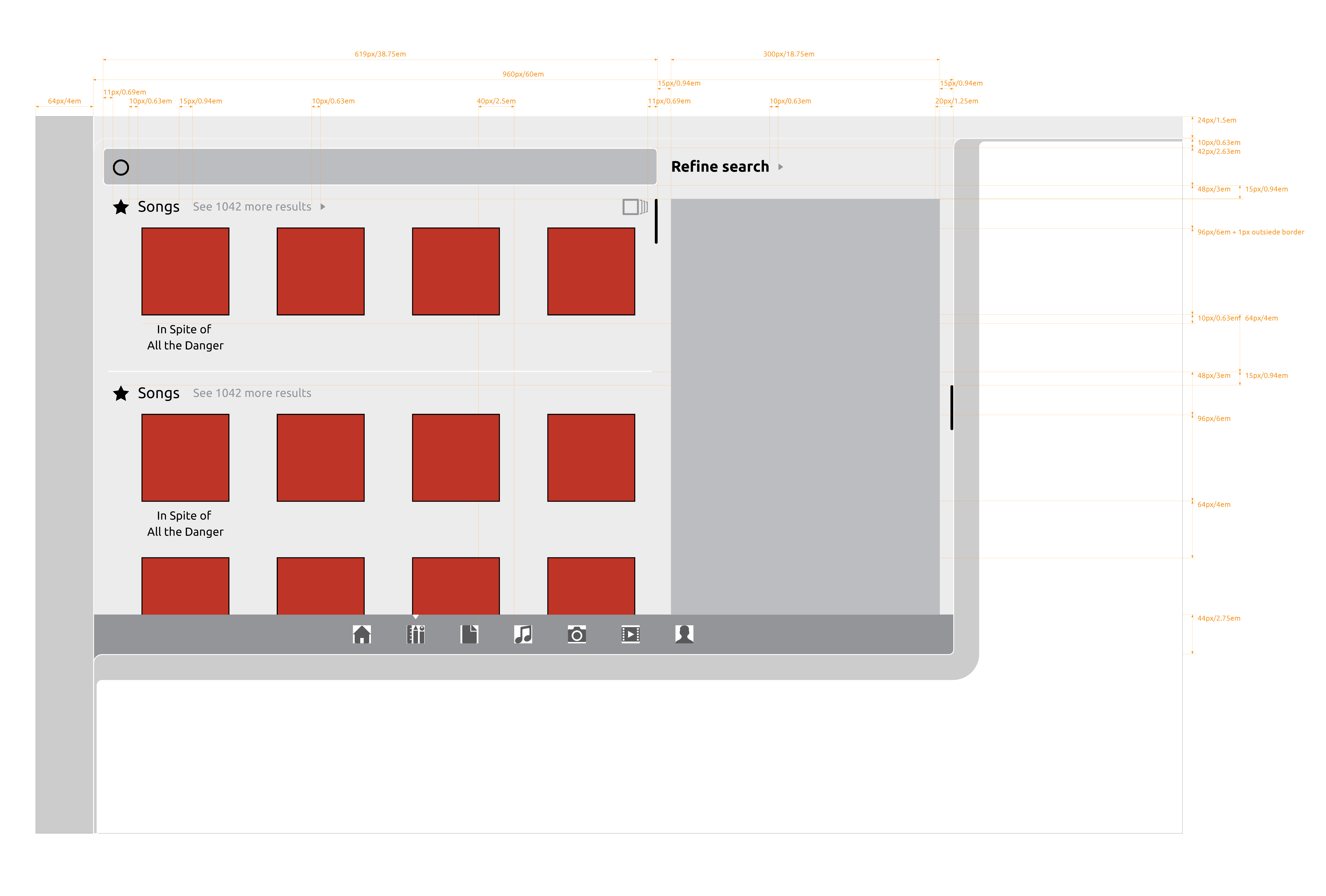
The shape and positioning of most of the elements in the Dash need adjustment. There are many many of these small issues, so rather then open 25+ separate bugs I will list them as bullet points.
Before reading the list, open the following image: https:/
In this image the current implementation is laid on top of the signed off design with 80% opacity. Look at where elements are placed relative to where they should be placed according to the design, and also look at the different shape of elements compared to the design.
When fixing these issues, keep taking screenshots of the implementation and matching them up to the design (as done with the Dash_layout.png) to check how the layout is progressing. When this process stops showing variations this bug is resolved ;-)
-------
List of positioning issues:
- The Category Headers are positioned wrong (too far left, too low)
- The search box is positioned wrong (centre should align with the center of the BFB, should start a few px to the left)
- The magnifying glass inside the search box is positioned wrong (should be further to the left)
- There is too much space between the individual icons in the search result
- There is too much space below each category header
- The desktop dash box is much too large (both height and width)
- "Filter results" header is positioned wrong (should be right and slightly up)
- The "All" button is aligned incorrectly relative to the other filter buttons (right sides should fall on the same vertical axis)
-------
List of shape issues:
- Category header icons are too large
- The font size of category header titles is too large
- The search result icons are too small
- "Filter results" is the wrong font size and weight
- The search filter toggle boxes are too high
- The search filter toggle boxes are too narrow
- The corner radius of the search filter toggle boxes is wrong
- The 'rating' stars are the wrong size
- the un-selected 'rating' star has the wrong border
- the search box is too short
- the 1px dividers in-between the categories should be narrower with 15px margin on each side
- the dividers in between the filter results categories are missing
- the 'All' button's shape is very wrong
- the filter results category headers are with wrong font size and weight
- the expand/collapse triangle is the wrong shape and size
- the expand/collapse triangle is missing from the filter results category headers
- The the font size of the text underneath each icon in the search results is too large
- The size and shape of the arrow that points to the currently selected Dash Lens is incorrect
Related branches
- Neil J. Patel (community): Approve
-
Diff: 329 lines (+75/-49)8 files modifiedplugins/unityshell/resources/dash-widgets.json (+2/-2)
plugins/unityshell/src/DashSearchBar.cpp (+2/-2)
plugins/unityshell/src/DashStyle.cpp (+33/-28)
plugins/unityshell/src/FilterExpanderLabel.cpp (+4/-2)
plugins/unityshell/src/FilterGenreWidget.cpp (+13/-8)
plugins/unityshell/src/FilterMultiRangeWidget.cpp (+10/-0)
plugins/unityshell/src/FilterRatingsButton.cpp (+7/-4)
plugins/unityshell/src/PlacesGroup.cpp (+4/-3)
| tags: | added: onew udo |
| Changed in ayatana-design: | |
| assignee: | nobody → John Lea (johnlea) |
| importance: | Undecided → Critical |
| status: | New → Fix Committed |

| Changed in unity: | |
| assignee: | nobody → Mirco Müller (macslow) |
| importance: | Undecided → High |
| status: | New → Triaged |
| milestone: | none → 4.14.0 |
| Changed in unity: | |
| importance: | High → Low |
| importance: | Low → Medium |
| affects: | ubuntu → unity (Ubuntu) |
| Changed in unity (Ubuntu): | |
| assignee: | nobody → Mirco Müller (macslow) |
| importance: | Undecided → Medium |
| status: | New → In Progress |
| Changed in unity (Ubuntu): | |
| status: | New → Confirmed |
| summary: |
- Dash - Shape and positioning of most of the elements in the Dash need - adjustment + UIFe: Dash - Shape and positioning of most of the elements in the Dash + need adjustment |
| Changed in unity: | |
| status: | Fix Committed → Fix Released |
Exact spacing and sizing specs (instead of just a mockup-screenshot) would be the right way to see this fixed in a timely fashion. If I keep measureing Design-mockups and compare them with screenshots of the implemenation, I'll be busy for weeks.
Rosie tried to export the grids from Illustrator but this didn't work out, so all we could do is best guessing for the moment.
I don't see this as "fix committed" from the Design-team.