
[Master] Window Control buttons: position/order/alignment
| Affects | Status | Importance | Assigned to | Milestone | |
|---|---|---|---|---|---|
| light-themes (Ubuntu) |
Won't Fix
|
Wishlist
|
Mark Shuttleworth | ||
| metacity (Ubuntu) |
Invalid
|
Undecided
|
Unassigned | ||
Bug Description
=== Master Bug ===
(As per the design team's request)
All bugs concerning the window controls are being duped to this master bug.
All the decisions regarding the position/
=== Desire ===
"Please centre the window title like in previous Human theme, and also re-order the window controls in classic order, positioned on the right side (menu - title - minimize, maximize close)."
==== Workaround ====
1. Only new themes, such as Ambiance and Radiance will have buttons on the left by default. You can continue using old themes, such as Human, in Lucid and those themes will continue to have buttons on the right side (according to http://
2. To revert to old layout, run in a terminal:
$ gconftool-2 --set /apps/metacity/
==== Return to defaults ====
If you would like to return to the system/theme default then run:
$ gconftool-2 --unset /apps/metacity/
==== Responses ====
Canonical Design Team Leader (Ivanka Majic) - 2010-03-10 and 2010-03-17
http://
http://
Ubuntu SABDFL (Mark Shuttleworth) replies on this bug report - 2010-03-15 onwards
http://
http://
http://
http://
http://
http://
http://
http://
http://
http://
http://
http://
http://
Canonical Ubuntu Community Leader (Jono Bacon) response - 2010-03-24
http://
=== Code of Conduct ===
To maintain a respectful atmosphere, while commenting please follow the code of conduct - http://
Related branches

| Marián Bača (majoobaca-deactivatedaccount) wrote : | #1 |
| Marián Bača (majoobaca-deactivatedaccount) wrote : | #2 |
| Chris Johnston (cjohnston) wrote : | #3 |
| Changed in light-themes (Ubuntu): | |
| status: | New → Confirmed |
| James P. Carter (jpcarter) wrote : | #4 |
Also do you think we could move the window buttons back to the upper right instead of the upper left over the File / Edit /Etc...
| James P. Carter (jpcarter) wrote : | #5 |
| Chris Johnston (cjohnston) wrote : | #6 |
James, that would need to be in a second bug...
Now with the change of the window control buttons, I'm guessing that the title is meant to be this way..
| Chris Johnston (cjohnston) wrote : | #7 |
After seeing this: https:/
I am going to mark this bug invalid.
| Changed in light-themes (Ubuntu): | |
| status: | Confirmed → Invalid |
| Marián Bača (majoobaca-deactivatedaccount) wrote : | #8 |
http://
| Chris Johnston (cjohnston) wrote : | #9 |
I'm not going to reopen a bug based upon a third party blog post when the wiki artwork created by Canonical is available which shows the new theme design. Bug is still invalid.
| Marián Bača (majoobaca-deactivatedaccount) wrote : | #10 |
It is strange. As you can see in bug attachments, window controls were on right side(just in strange order-see bug description). But after recent update they are on left side again. It is quite big regression, because I have(naturally a lot of people) a lot of applications, which have classic window controls(
| tgpraveen (tgpraveen89) wrote : | #11 |
@marian
+1
| Marián Bača (majoobaca-deactivatedaccount) wrote : | #12 |
- human-window-controls.png Edit (179.3 KiB, image/png)
I just changed theme to human, but window controls remain on left side. It looks horrible.
Thank you very much, Majo
| Marián Bača (majoobaca-deactivatedaccount) wrote : | #13 |
| tags: | added: metabug |
| Mitch Towner (kermiac) wrote : | #14 |
I have made this a "master bug report" or "metabug" as there are more reports coming in regarding this issue.
| Mitch Towner (kermiac) wrote : | #15 |
As stated on a duplicate bug report, if you are not happy with this design decision there is an easy workaround to revert this behaviour:
gconftool-2 --set /apps/metacity/
| Vish (vish) wrote : | #16 |
This bug is not invalid.
It would either be a "Wont Fix" or _might_ be re-considered for the final release.
This decision is something that needs to be made by the Upstream authors. The light themes hasnt yet been hosted publicly , once that is done , the concerned authors will decide.
| Changed in light-themes (Ubuntu): | |
| status: | Invalid → Confirmed |
| Vish (vish) wrote : | #17 |
Setting it to medium , since this is not just an aesthetic problem , but also forces users toloose muscle memory and change their usage patterns.
| Changed in light-themes (Ubuntu): | |
| importance: | Undecided → Medium |
| Loop (matt-theworldtree) wrote : | #18 |
I would add that the arrangement of window controls does not revert to the expected layout when switching from Light back to Human or other themes, nor is there any way for a user to choose how they want their windows laid out except for the above workaround. It's great that it's an aesthetic decision, but a) it should only impact the new themes, and b) should be more readily user-controlled in the event that it is unwelcome.
| BavarianPH (bavarianph) wrote : | #19 |
I want to thank Mitch Towner for sharing the command to reverse the "new ART":
gconftool-2 --set /apps/metacity/
It worked immediately, thank you very much!
(As a Ubuntu user I would like to know all the commands to properly fix or configure the OS
This is part of the Linux/Ubuntu way, namely: The freedom to control ones own OS, apps,
and thereby be in control of one's PC. This choice has been taken away from us by
Microsoft, and hopefully will be given back to the people through Linux and Ubuntu
The tendency to control and have power over others is a huge BUG
At least we can escape to Ubuntu for a little more freedom!)
BavarianPH,
Ubuntu forever!
| Matthias Klumpp (ximion) wrote : | #20 |
The menu is missing in this command! gconftool-2 --set /apps/metacity/
I think it would be better to switch the layout back because a lot of people strongly dislike the new layout. (It was not really welcomed by the Ubuntu users) The new button order also does not fit in well with a lot of other applications e.g. like Google Chrome or XMPP and no other major Linux Desktop uses it by default, which will confuse application developers. (The button order would have to be changed in KWin too to have a more consistent look)
Also, the icon of the application is not visible in titlebar anymore, which makes the order of windows even more confusing.
Would be good if a member of the Canonical design team could comment on this bug.
| Vish (vish) wrote : | #21 |
Setting to Low, as we have a workaround.
| description: | updated |
| Changed in light-themes (Ubuntu): | |
| importance: | Medium → Low |
| status: | Confirmed → Triaged |
| Travis Watkins (amaranth) wrote : | #22 |
As this is a request to change the default settings I've changed the importance to Wishlist.
| Changed in light-themes (Ubuntu): | |
| importance: | Low → Wishlist |
| Yann (lostec) wrote : | #23 |
A workaroud??? You're kidding I hope?
The woarkaround breaks visual appearance because of symetry problems.
You may really think twice for such a huge habits change: LTS versions targets enterprises and aims to be a Red Hat or Suse alternative... but I really don't immagine any sysadmin install a distribution configured like this: Users screaming, loss of productivity...
This is really a pity to make this kind of change to:
-Make a bad copy of Apple layout, that count for 5% PC market share... whose users are under Steve gourou influence and are not really subject to change for any Linux flavour!
-Sink the Ubuntu boat in 6 months...
So please make this appear on top again... and go reading ubuntu forums to hear the scream about this stupidity!
| Changed in light-themes (Ubuntu): | |
| status: | Triaged → Incomplete |
| dwan (dwanafite) wrote : | #24 |
We should have a way to revert to the old button layout in a GUI manner, not with a command-line workaround, as this affects the final user. Be able to put the button back to the right side (where they have always been) with a command line is just a usability joke.
| YannUbuntu (yannubuntu) wrote : | #25 |
Make a GUI to put the buttons on the left-side if you want, but please leave the buttons on the right side by default !
As the other Yann (!) says, this is a crazy change for a LTS !!!
| Mitch Towner (kermiac) wrote : | #26 |
Setting back to triaged as no more info is required for a developer to be able to work on this. Please don't change the status of this bug.
Please see top post for a workaround, sorry for missing the "menu" part of the string in my earlier post.
| Changed in light-themes (Ubuntu): | |
| status: | Incomplete → Triaged |
| alain57 (alain57) wrote : | #27 |
- one button uggly Edit (4.7 KiB, image/png)
left side or right side is not the main problem.
Even If i agreed that copying the mac OS style is not the best idea. Some apps have the icon on right, so putting the gtk theme to the left will only perturb people.
for me this new themes are cool (in design) but are uggly in some way
if you try to force the buttons in this order : minimise, maximise, close => you will have an UGLY theme
and on ALL window who only have 2 or 3 buttons, you'll have something ugly too?field.
for me this theme is cool (in design) but it's uggly in some way
if you try to force the buttons in this order : minimise, maximise, close => you will have an UGLY theme
and on ALL window who only have 2 or 3 buttons, you'll have something ugly too
ok having a new theme is cool, but changing the side an the order of the buttons is kind of disturbing
copy Mac design is a bad idea too.
there are about 5% Mac user,
and about 90% Windows user
Convincing 10% windows users to switch on ubuntu, will bring a LOT more people than bringing 100% of mac user
Ok there are people who want to change from windows to mac, but its not for the button position ^^ so stop copy useless stuff ^^
| alain57 (alain57) wrote : | #28 |
| Changed in light-themes (Ubuntu): | |
| status: | Triaged → Confirmed |
| Yann (lostec) wrote : | #29 |
OK, setting back to "confirmed"... maybe this is the more appropriate as "triaged" is clearly inappropriate: Buttons artwork is so more symetric, so changing gconf makes this look very bad.
So the solution may be to change buttons to make them symetric again for users being able to change default behaviour withous artifact... or making a second theme that is coherent, that could be chosen at install.
Maybe Canonical could uses this to make stats on users choice: Is users choose left (I doubt!), maybe this could become the default in future releases. But let users decide!
| Vish (vish) wrote : | #30 |
@Yann , Kindly stop changing the bug status!
This bug has enough information , is there any information missing from the bug?
Triaged means:
* A member of UbuntuBugControl believes that the report describes a genuine bug in enough detail that a developer could start working on a fix
* Use this when you are confident that it should be looked at by a developer and has enough information
For more information on bug status , see : https:/
| Changed in light-themes (Ubuntu): | |
| status: | Confirmed → Triaged |
| Vish (vish) wrote : | #31 |
The "developer" in tis case is the design team.
| scholli (scholli-tz) wrote : | #32 |
I like much the idea of the text on the left side than in the center. The place of the control-buttons has no importance for me.
| tags: | added: gloam |
| Dylan McCall (dylanmccall) wrote : | #33 |
This bug description mentions two completely separate issues: the window buttons and the window title. On the other hand, discussion seems to be completely about the buttons. I suggest editing the description to simplify things and maybe filing another bug if there is another regression caused by the position of the window title.
As well as being against the standard approach to how we manage bugs, putting both issues in one report is unfair to the other wishlist items being marked as duplicates of this one.
The window title position is a considerably less polarizing issue and one that _is_ controlled by individual themes (instead of gconf settings).
There's also the question of whether this is about the order of the buttons or just the side of the window they are on. The order of the buttons is what breaks other Metacity themes, while the side of the window is what really hurts muscle memory. I'm assuming you want them both back, but again, clarification in the bug description would go a long way.
| summary: |
- [light-theme] please centre window title and order window controls + [light-theme] please revert the order of the window controls back to + "menu:minimize,maximize,close" |
| Alex Eftimie (alexeftimie) wrote : Re: [light-theme] please revert the order of the window controls back to "menu:minimize,maximize,close" | #34 |
- window_controls_position_gui.png Edit (107.9 KiB, image/png)
Hi,
I know this doesn't solve the problem, but I have changed gnome-appearenc
Maybe this will be handy for the users wanting to change back the position of the controls.
I do like left better :)
| Marián Bača (majoobaca-deactivatedaccount) wrote : | #35 |
Wishlist? You must be joking! Did anybody see screenshots in attachment? (e.g. consistence_
| BavarianPH (bavarianph) wrote : Re: [Bug 532633] Re: [light-theme] please revert the order of the window controls back to "menu:minimize, maximize, close" | #36 |
I run Lucid-alpha3, and the "Customized Theme" tab / "Windows Border" tab
(or page)
does not have the option "Control: O right O left" ?
BavarianPH,
Ubuntu forever!
-------
On Tue, Mar 9, 2010 at 3:51 PM, Alex Eftimie <email address hidden> wrote:
> Hi,
>
> I know this doesn't solve the problem, but I have changed gnome-
> appearence-
> switch for the window controls position. See branch and screenshot
> attached.
>
> Maybe this will be handy for the users wanting to change back the
> position of the controls.
>
> I do like left better :)
>
> ** Attachment added: "window_
> http://
>
> --
> [light-theme] please revert the order of the window controls back to
> "menu:minimize,
> https:/
> You received this bug notification because you are a direct subscriber
> of a duplicate bug.
>
> Status in “light-themes” package in Ubuntu: Triaged
>
> Bug description:
> Binary package hint: light-themes
>
> Please centre window title like in human theme and also order window
> controls in classic order(minimize, maximize close).
> Thanks, Majo
>
> ------ WORKAROUND -----
> To revert to old layout, enter in terminal:
> $ gconftool-2 --set /apps/metacity/
> "menu:minimize,
>
> To unsubscribe from this bug, go to:
>
> https:/
>
| Yann (lostec) wrote : Re: [light-theme] please revert the order of the window controls back to "menu:minimize,maximize,close" | #37 |
Try to assign this to canonical desktop... Because current answers really look like bad jokes!
| Changed in light-themes (Ubuntu): | |
| assignee: | nobody → Canonical Desktop Team (canonical-desktop-team) |
| assignee: | Canonical Desktop Team (canonical-desktop-team) → Canonical Desktop Experience Team (canonical-dx-team) |
| Mark Shuttleworth (sabdfl) wrote : Re: [Bug 532633] Re: [light-theme] please revert the order of the window controls back to "menu:minimize, maximize, close" | #38 |
assignee None
Yann, please do not assign bugs to someone unless you are responsible
for their tasking. You can assign a bug to yourself, or someone who
works for you, or a team or person in a team that you lead in Ubuntu.
But assigning a bug to someone who is NOT in that list is a bit like me
sending you an invoice for the time it has taken to write this email ;-)
Mark
| Sebastien Bacher (seb128) wrote : Re: [light-theme] please revert the order of the window controls back to "menu:minimize,maximize,close" | #39 |
the choice there is a design decision, it's worth noting though that the order should apply only to light themes, it doesn't now but the issue will be fixed for lucid, the title not being centered is also a different issue than the order and has a different bug.
| Yann (lostec) wrote : | #40 |
That's nice to learn issue will be fixed before release and have been understood at highest Ubuntu level.
Regards
| Mark Shuttleworth (sabdfl) wrote : Re: [Bug 532633] Re: [light-theme] please revert the order of the window controls back to "menu:minimize, maximize, close" | #41 |
The issue is not a bug, it's a difference of opinion on what is the best
result. We may change it, or we may hold it.
Mark
| Matthias Klumpp (ximion) wrote : Re: [light-theme] please revert the order of the window controls back to "menu:minimize,maximize,close" | #42 |
How to we find out which is the best option? (My opinion is clear and the opinion of the community is, as far as I see, mostly negative. But if there is a good reason for choosing this button order (the dx-team will have made some tests before) and a possibility to fix this mess with XMPP and Google Chrome, I will not complain about the change.)
| Mark Shuttleworth (sabdfl) wrote : Re: [Bug 532633] Re: [light-theme] please revert the order of the window controls back to "menu:minimize, maximize, close" | #43 |
We'll consider it carefully, in the light of all of that information,
and take a decision.
Mark
| Matthias Klumpp (ximion) wrote : Re: [light-theme] please revert the order of the window controls back to "menu:minimize,maximize,close" | #44 |
Thanks!
Matthias
| Marián Bača (majoobaca-deactivatedaccount) wrote : | #45 |
XMPP and Google Chrome? There are tens of applications, that do not use metacity. This will be tragedy, I suppose...
| Matthias Klumpp (ximion) wrote : Re: [Bug 532633] Re: [light-theme] please revert the order of the window controls back to "menu:minimize, maximize, close" | #46 |
I just named a few, prominent applications.
Is it planned to change the button layout in KDE, Xfce, LXDE and all other
desktops too? Cause if not, there will be not only an inconsistency between
Ubuntu and all other distributions and desktops, but also between the
different Ubuntu derivatives. This would be very bad, I suppose cause there
will be much confusion for users and for application developers who draw
their own window decorations.
On Wed, 10 Mar 2010 15:20:12 -0000, Marián Bača <email address hidden>
wrote:
> XMPP and Google Chrome? There are tens of applications, that do not use
> metacity. This will be tragedy, I suppose...
>
> --
> [light-theme] please revert the order of the window controls back to
> "menu:minimize,
> https:/
> You received this bug notification because you are a direct subscriber
> of the bug.
>
> Status in “light-themes” package in Ubuntu: Triaged
>
> Bug description:
> Binary package hint: light-themes
>
> Please centre window title like in human theme and also order window
> controls in classic order(minimize, maximize close).
> Thanks, Majo
>
> ------ WORKAROUND -----
> To revert to old layout, enter in terminal:
> $ gconftool-2 --set /apps/metacity/
> "menu:minimize,
>
> To unsubscribe from this bug, go to:
>
https:/
| Vish (vish) wrote : Re: [light-theme] please revert the order of the window controls back to "menu:minimize,maximize,close" | #47 |
I'm not in favor of the new position. But right now, the community opinion/poll is a moot point.
Its like asking Americans or British who have switched locales : “do you like driving on the right or the left side of the road?” ;-)
Stating it as a huge negative for the change is unfair.[OTOH, apps broken is a negative]
Change is always good , *if* there is a good reason to change.
Without knowing what the problem was earlier and why this has been changed , one really cant judge the change.
Of course , the problem with the old position has not been mentioned.
Since comments[debate?] on this bug are increasing , I'v updated the description with the apps affected.
Would be easier for the folks working on the bug , to see if the problem can be solved in the apps , rather than digging for the broken apps in the comments.
| description: | updated |
| Alin Andrei (nilarimogard) wrote : | #48 |
I for one don't see any possible good reason for this change (unless someone who was in charge of this change cares to explain), but in my opinion this is just something done for branding: OSX has the buttons on the left, Windows on the right, Ubuntu on the left but with maximize and minimize inverted so all 3 are different.
But the brand should be defined by good, not bad things (like this change).
| Marián Bača (majoobaca-deactivatedaccount) wrote : | #49 |
Affected applications:
- Chrome/Chromium
- XMPP
What is this? These apps are not affected, they just use their own window decorators, identical with these in various desktop environments(GNOME, KDE. XFCE...), except Ubuntu. Why do they have to change their own window decorators, only because in Ubuntu(gnome only for now) are window controls on the left?
| description: | updated |
| Dave Stroud (bigdavesr) wrote : | #50 |
This has affected all applications on my ubuntu machine. No mater what theme I use. I used the work around and it put the buttons back to the right side but they are in wrong order. I am forever trying to maximize my window hitting the button I am used to hitting and the window disappears. I guess you can get used to the new way, but I would like to know why it was changed. Thanks
| Conscious User (conscioususer) wrote : | #51 |
It should be mentioned that the discussion would be much more productive if there was actually an official stance, a wiki documentation, a blog post, or *anything* explaining the reasons for the change.
This was made for NotifyOSD, for the MessagingMenu and for most of the non-trivial changes Ubuntu introduced.
The closest the users got to an explanation was the latest blog entry in Ivanka Majic's blog (http://
I'm not saying that the explanation should satisfy everyone. All I'm saying is that it should exist.
| Ryan Peters (sloshy42) wrote : | #52 |
@Matthias
I certainly hope they switch things back to normal. It would be way too much of a hassle to switch every other Ubuntu-based OS just because of what they "think" is a good design. I feel bad for the Lucid users using Chrome...
| Elias Amaral (dlight) wrote : | #53 |
This seems to be a real usability problem. And it's an LTS, OMG!
I was reading a blog post, http://
Please try to fundamentally change the UI only with non-LTS versions. Thank you.
| Changed in light-themes (Ubuntu): | |
| assignee: | Canonical Desktop Experience Team (canonical-dx-team) → nobody |
| Chris Cheney (ccheney) wrote : | #54 |
I'm not sure if this has been noted but it seems there is also a real bug here (not just difference of opinion) in that every time light-themes is updated it reverts the user's setting in gconf. So even if you do change the button order back as soon as light-themes updates it will change it back. I assume the change to make the button order only apply to light-themes will also fix that.
You can also use the following to reset the button order:
gconftool-2 -u /apps/metacity/
| Yann (lostec) wrote : | #55 |
As the final decision is not made, maybe this little pool could help ;o)
http://
At time of writing, 79% to keep current non Apple standard...
| James Schriver (dashua) wrote : | #56 |
i've grown quite find of the changes and from a usabilty standpoint it seems to be very efficient, absent the muscle memory. I am not nor was a Mac user so this change was absolutely foreign to me. After two days, instinctively I've noticed my mouse pointer idles cocnsistently just under the left side of the metacity buttons. This makes the screen real estate adjustment much shorter, distance wise for me. I know I'm probably in the minority, but this is definitely a step in the right direction.
| Alessandro Ranaldi (ciaolo) wrote : | #57 |
I agree with James Schriver, once one get used to the new position of the buttons, he/she can reach them in less time because top-left corner is almost always nearer the content of the window than the top-right corner.
This, though, doesn't explain the choise to set the new position of the buttons to all other themes. Each theme must have its own settings, so revert DEFAULT metacity options to older ones, and change the individual settings for the new two themes.
| nomnex (nomnex) wrote : | #58 |
I disagree. I am a right hander, the pointer usually stands-by on the right part of the screen, as such | under_bar | square | cross buttons on the right of the windows = best usability & common standard
This is obviously a "Mac complex", and speaking for myself Mac s...s at 100% with their pedantic concepts of "doing things differently"
| Yann (lostec) wrote : | #59 |
Be very careful with this kind of change: A few hours in a virtual machine doing almost nothing but testing may not be appropriate.
To illustrate this, I still sometimes close a window with intend to maximise or minimize it: The reason is these max/min controls were on the right in windows 3.x and close was on the right side... 15 years and I still sometimes make this error!
When I close an autosaved document, that's not so much troubles... but when that's the debugger after 2 hours trying to solve my embedded target problem, that's almost 2 hours lost: Some things cannot be saved and this is why in a corporate environment targeted by LTS, this will be a huge deal breaker for Canonical.
Coherency with many apps (especially the ones using tabs, tab close will stay right as usual... what a mess) is another problem.
Those who give Ubuntu a try at home having windows at work will not want to change their habits several times a day.
Ubuntu bug #1 will not be solved this way IMO...
| philinux (philcb) wrote : | #60 |
This poll and discussion also favours no change with buttons on the right.
Lucid testing forum.
| Jack Leigh (leighman) wrote : | #61 |
Good to hear that other themes won't be affected by this change for Lucid.
Still seems a totally defunct change which is not meeting support, however.
| Omer Akram (om26er) wrote : | #62 |
With these settings I had the problem for 4 hours and the next day when I started ubuntu I had no problem with the new controls position rather things look better as there nothing on the top right side. People complain without even testing the change for a few hours. (Even when a person wears new clothes it takes a bit time to adjust in them ;)
| Conscious User (conscioususer) wrote : | #63 |
Omer, I do not disagree with your statement and I have grown used to the new position/ordering myself. However, any change to habits must have a reasoning behind it.
When NotifyOSD was introduced, people had to change some habits, but all the usability arguments and future roadmaps were/are available in a nice wiki page for anyone to see. The same goes for the Messaging Menu, the Software Center and the Me Menu. Even the color choice in the new branding was explained in a long and detailed blog post by Mark Shuttleworth.
For the button positioning, however, there was absolutely no official stance from the design team on the reasoning behind it. In a recent Ars Technica article, Ryan Paul states that Ivanka Majic posted explanations in her blog. As I previously stated in this bug report, not only her blog post mentions only the questions and no answers, but clearly states that she does not agree with the design herself.
I doubt that revealing the reasoning would satisfy all users, but at least they would have a base to build arguments on. Right now, a lot of people are *assuming* the reasons and criticizing Canonical based on those assumptions. This is wrong, but there's little else possible when an official statement does not exist.
| Stuart Vickers (sv87411) wrote : | #64 |
I agree with Conscious User whole heartedly on the reasoning front.
So far many people have provided numerous valid arguments re usability in the blogs and forums and in this bug report against making this change - breaking themes, breaking with another applications look and feel that don't use Metacity, restricting usability - for visually impared users, muscle memory, change to icon order, close icons too close to Edit/View menu in many applications etc etc. However no one is yet to provide any valid and convincing arguments for this change.
People are making assumptions, but even if those assumptions turn out to be valid they are very weak reasons for making such a change. People will/may get used to it, but that's not the point. I personally wouldn't get used to it becuase I switch daily between Microsoft Windows use and Ubuntu use. So I will apply whatever workaround is necessary to facilitate my own needs. But for new users to Ubuntu there needs to be an air of familiarity and this already exists even with dual panels.
This change breaks usability and compatibilty in a default LTS installation of Ubuntu and there is no official word for the reasoning behind it. Until we can enter into the discussion and challenge and understand those reasons this is a bug because something has changed with no explanation.
| soundpartner (michael-soundpartner) wrote : | #65 |
if the new theme brougth something new i wouldnt complain.
the big problem for me is the new order. i can change side as i want to bit the order bothers me...
i was looking forward to something new and exiting. i was imagining something like the maximize icon on top of the minimize icon, and then the close icon on the side. this could bi devidet so the minimize and miximize was on one side and the close on the other.
or maybe combine the 2 bars so the icons was at the same line as file, preferences and so on, but this change of the order doesnt make sence and only results in the system not dooing what is expectet.
furthermore the grafic design of the butons are made so that they hang together. that is ugly if you change the order
| jgv (visserjg) wrote : Re: [Bug 532633] Re: [light-theme] please revert the order of the window controls back to "menu:minimize, maximize, close" | #66 |
A lot of people use these controls to identify the right edge of the
active window. This is significant when there is more then one window
overlapping each other on the display. The same issue is there with the
window title. When it is centered (as in human) one can know that the
window is stretching to the left side as far as to the right side from
the position of the title. Putting all info to the left gives no
information at all concerning the window dimensions. Do not ignore this
visual aspects. The current window design (until human) did not just
drop from the sky. Someone had good arguments for them, which I cannot
confirm for the light themes.
-----Oorspronke
Van: Omer Akram <email address hidden>
Reply-to: Bug 532633 <email address hidden>
Aan: <email address hidden>
Onderwerp: [Bug 532633] Re: [light-theme] please revert the order of the
window controls back to "menu:minimize, maximize, close"
Datum: Fri, 12 Mar 2010 09:30:18 -0000
With these settings I had the problem for 4 hours and the next day when
I started ubuntu I had no problem with the new controls position rather
things look better as there nothing on the top right side. People
complain without even testing the change for a few hours. (Even when a
person wears new clothes it takes a bit time to adjust in them ;)
| Yann (lostec) wrote : Re: [light-theme] please revert the order of the window controls back to "menu:minimize,maximize,close" | #67 |
It would be nice to have a clear decision, now, to revert or not on this design change... and the reason for the try, just for users's respect...
So the ones that do not agree could stop talking to walls here and start using their time to consider alternatives.
| jhfhlkjlj (fdsuufijjejejejej-deactivatedaccount) wrote : | #68 |
half of the dupe reports talk about the controls being on the left side instead of the usual right. This bug report says nothing of that in the title or description. Are the same principles applied to this one as well? If not, we need to separate them.
| description: | updated |
| Barry Kelly (bkelly-ie) wrote : | #69 |
"Change is always good , *if* there is a good reason to change." - this is emphatically false. Change is by default bad, even if there are good reasons for it. There must be *excellent* reasons for change, not merely good reasons.
| Stanislaw Pitucha (viraptor-gmail) wrote : | #70 |
Where is the discussion about pros/cons? Where can we learn what caused that change and why should we be happy about it? When will Ubuntu team stop dropping such bombs just before the freezes? (why does it remind me of the update notification fiasco?)
Maybe some person who is responsible for the change can list the reasons and address the long list of usability / compatibility issues listed in http://
| Matthias Klumpp (ximion) wrote : | #71 |
Quote of the blog Stanislaw Pitucha mentioned:
Why the new windows control order is wrong:
"• Because the window title isn’t centered, the window controls being placed directly in front of it put it in a weird indented position
• The “slightly off left” location is inconsistent with Nautilus, Firefox, Thunderbird, Pidgin, Empathy, and every other tabbed program we have, which have close buttons for their tabs on the right.
• The left position is inconsistent with Windows, previous versions of Ubuntu, and even OSX – users have to relearn decades of muscle memory.
• Users who interact with both Windows and Ubuntu machines (or migrate from Windows) will have a much harder time than they did before.
• The buttons are too close to the file and edit menus, making catastrophic misclicks much more likely. Closing something on accident should be as rare as possible.
• Even without misclicking, a user will have to take more time to use the window control and avoid a misclick. This is an example of Fitt’s Law.
• The close position is also inconsistent with the power button in upper right. Currently, “close it down” is something you can always do from the upper right anywhere in the system: within a tab, within a window, and even for the whole computer. The new window controls break that entirely.
• The new position leaves a lot of empty, wasted space in the upper right of most windows. While strictly speaking the amount of unused space is the same, it looks much worse when it’s all clustered together. When the controls are on the right, the extra space can function as a buffer for the potentially destructive window controls.
• Similarly, the upper left of most windows now becomes much more crowded, creating a rather unpleasing contrast to the relatively empty upper right.
• In previous Ubuntus you could close windows on the left if you really wanted, by expanding the small circle menu that’s now gone entirely. File->Quit is also an option, which is now very close to the close box.
• Gnome upstream has them on the right, causing consistency and developmental problems when we deviate. This is particularly jarring with the adoption of future projects like Gnome shell and Gnome 3, which will change again how we interact with window controls.
• The current implementation breaks themes not designed for the new button order (which is currently every theme we ship, so even changing the theme back doesn’t help)
• A day before User Interface freeze of a long term support release is the worst possible time to suddenly spring this on everyone without explanation.
• It is very difficult to change them back as we don’t have any UI tool for doing this (the current method is manually editing gconf keys)
• The new position doesn’t actually do anything beneficial."
| David D Lowe (flimm) wrote : | #72 |
A related (but separate) bug is the fact that gnome-appearanc
| drs305 (drs305) wrote : | #73 |
I'd like to add another problem with moving the default buttons to the upper left.
In gconf-editor, the setting /apps/metacity/
I tried adding a report with "ubuntu-bug gconf-editor" but it will not connect to the server. This seemed like a logical alternative.
| Robert Readman (robert-readman) wrote : | #74 |
More people want it on the right by default than at the left, change it back! doing this hours before the interface freeze is ridiculous! Anything but the buttons! Release Mangers please fix!
| yareckon (yareckon) wrote : | #75 |
I support moving the controls back to the position where users expect them rather than change by fiat.
Just think how much consensus cred canonical could get back by listening to the community on this one. It would be the perfect counterexample for years against accusations of undemocratic behavior.
| tags: | added: lucid |
| Omer Akram (om26er) wrote : | #76 |
If it was possible I would say that for Lucid buttons on right side with option to move them on Left side from appearance menu, for Lucid+1 buttons on left with option to move on left side and lucid+2 only left side.
| Stuart Vickers (sv87411) wrote : | #77 |
Why move them at all, whether it be in Lucid, Lucid+1 or Lucid+5? Where's the rationale?
| Alvaro Kuolas (kuolas) wrote : | #78 |
This was meant as a "design" idea... not a good one, but an "iadea" that passed as "it is" before even posting it BrainStrorm for consideration.
http://
It should be reverted by RC... if not this could end bad, very bad for Ubuntu.
| Alvaro Kuolas (kuolas) wrote : | #79 |
I think that bug #532633 it's related but not a duplicate. Bug #532633 wants to revert the order of the buttons when this bug is for the buttons place, not it's order. Anyway, they should fix both problems by RC, they are critical usability BUGs.
This bug is not in the light-theme nor Metacity... it's in the configuration made by Ubuntu developers.
| Luiz Felipe Talvik (talvik) wrote : | #80 |
Disadvantages:
-Aesthetically unpleasing: Windows button, application menu and panel menu all stacked.
-Increase the chance of closing the window accidentally.
-Breaking consistency of all Ubuntu releases, most Linux distros and window's managers.
-Most people don't like it
-Come on!!! IT'S A LTS RELEASE!!!
That was a really unprofessional decision. There always has to be really good reasons to break consistency.
Asking yourself why is it there, and then changing it IS NOT A GOOD DECISION
| Mitch Towner (kermiac) wrote : | #81 |
The command gconftool-2 --set /apps/metacity/
Further discussion should really take place on the brainstorm page mentioned earlier (http://
Please continue this discussion at http://
| nomnex (nomnex) wrote : | #82 |
As long as the settings of the buttons can be changed in an easy manner through the gconf-editor, this bug is closed for me.
The layout change is at the discretion of Canonical after all. We, end users, can revert it if we don't get by.
| John Baptist (jepst79) wrote : | #83 |
Why should the user have to go through gconf-editor to change this? Average user doesn't know about gconf-editor, and certainly doesn't know what key to modify.
I'm not opposed to this kind of change, but it should be changable from the Settings|Appearance panel, which is the natural place for this kind of thing. You should be able to set the orientation and ordering of the frame controls in the same place that you set the size of the mouse cursor, that is, it should be theme-dependant.
| Yann (lostec) wrote : | #84 |
Another discution takes directly place here, with design chief:
http://
But if this one is not considered a true bug (in a sense that's right: This is not a software error... but a design error that will cause users errors and loss of productivity: Same result in a way)... just don't forget that at the beginning of Ubuntu founding principles, there is bugs that are not really bugs also ;o)
| ViViD (vivnet) wrote : | #85 |
This bug affects me as well. The window controls should be on the right side and in the standard order of minimize, maximize, close for the final release of Lucid. At the very least, please make this configurable. If someone actually wants the controls on the left side, they can make this adjustment on their own.
| Bryan Hundven (bryanhundven) wrote : | #86 |
This is also annoying for x automation scripts, as well as being a design issue.
Was there any consideration for users with accessibility needs during this decision process?
| Pietro Battiston (toobaz) wrote : | #87 |
Assuming (and I think it's true) that the majority of Ubuntu users' native language is written from left to right, it is also important to notice that both human eyes and screen readers will want to first read the title of a window, and only after see buttons which yield no information at all (since they are the same in all windows).
But then, I feel quite ridicule in commenting about a secret, totalitaristic (and entirely legitimate, sure) decision on the configuration of a project, GNOME, which instead devotes so much attention to usability.
| Ralf Nieuwenhuijsen (ralf-nieuwenhuijsen) wrote : | #88 |
It's funny how whenever there is bad press (and the net is full of hate now, because of this decision), they say file bugs, participate in the community.
And there's the stonewalling.
I really feel like Canonical is just giving us the finger here.
The success of Ubuntu was always about the community. And often when there was an 'issue' that divided Canonical from Ubuntu, canonical could count on a very large silent majority (for example, look at the issue of codecs).
But that silent majority is upset. They don't like many of the changes.
I've shows the look 'n feel to a couple of users I maintain, and they are very explicitely 'i don't want that'.
Not just about the window icons. The icon spacing also.
And they already hated the gdm changes that happened in karmic.
Just a general question, does Canonical do any user testing at all?
Because I literally showed this to my non-technical friends I have running on Ubuntu, just to get an honest response.
I wasn't suggesting I didn't like the theme or anything. I was really curious if this was one of those 'silent majority' situations again, where only us nerds get upset.
But it's not.
Mark I want to warn you.
This is going to seriously Ubuntu's popularity.
Not just the window button issue. But the complete inconsistency of the design.
To summarize the issues:
- with lucid whether programs will have their buttons on left or right will be random in the eyes of most users
- the close button is not at a corner, which will increase RSI
- the GDM is still not usuable on 1024 width, (ever since Karmic). It simply doesn't fit.
- the horizontal margins on the notification area are different from the vertical margins and any other visual language throughout the UI
- red is only used on the window buttons
- the window buttons are the only one's that look like spheres.
- purple is only for both tooltips and window background, making them hard to read.
- the scrollbars have a very different inconsistent 3d effect with gourad shading on them that's not used anywhere else.
- the issue of the ugly position of notification bubbles is still there (because of the searchbox when we have firefox maximized? seriously?)
Maybe the designers you hired are very talented. Maybe they are not.
But the end result is a mutated monster with no vision, with no consistent visual language and it is upsetting everybody.
Stop stonewalling the community.
If the before mentioned issues are really design decisions (which I doubt), then we would love to hear the rationale.
So far, all we hear is stuff like 'opinions can differ' .. and 'its not final yet'.
Should design start with the rationale, and then be implemented.
Shouldn't it be easy to publish the rationale of stuff like the window button positions, icon spacing issues, gdm not fitting in 1024 width anymore, etc. ?
Or were the rationales not documented?
Or perhaps more likely, for many of these decisions, there was no rationale?
Look at how well established and consistent the branding work was.. and how easy it was to explain the rationale.
is it too much to ask to do the same for the style of _actual product_ ?
| Dmitry Tantsur (divius) wrote : | #89 |
This is a terrible change. I don't want to go from Ubuntu just because of border buttons! Please, make it an option!
And why is this bug about light themes? This change affects ALL themes!
| nomnex (nomnex) wrote : | #90 |
> I really feel like Canonical is just giving us the finger here.
> Mark I want to warn you
R u kidding? Hopefully, it's a minority voicing up their complains in an unfriendly and with a self-centred vision. Nevertheless, it is undermining. If I was Mark, I would give the finger, and go on a island with some of my Canonical friends, for a break.
I dislike the "Mac" feel of these icons, as their layout on the left, but let's be passionate about hardware compatibility, or mono eradication, and less about minor cosmetic details.
I am done with this bug report, may the buttons be on the upper left, right, or even on the middle of the window...
| Mark Appier (appier) wrote : | #91 |
In a school environment, there are a large number of users, both students and mainly older staff, who have just recently learned to consistently locate the power button and shut down the machine from within the operating system. My concern is in providing support for transitioning these users through a change that appears to be change for the sake of change, adding no functionality. My suggestion would be to continue with a default buttons on the right arrangement, making the new arrangement easily available through a GUI.
Regarding the comments that have been less than polite, please understand I am making no indictment against Mark Shuttleworth, Canonical, or the Ubuntu developers--quite the contrary. I really like Ubuntu and the packages that come with it; they are delightful, and Mr. Shuttleworth is appreciated. Even though the comments here and in other places may not always be complimentary, they show significance and impact--people care!
| Jo-Erlend Schinstad (joerlend.schinstad-deactivatedaccount) wrote : | #92 |
I've had those buttons at the same place for about twenty years, and I've used them a large amount of times almost every day during these years. It's incomprehensible to me that someone could consider this a mere cosmetic change.
| tsm124 (tsm1248) wrote : | #93 |
left or right?
POINT:
Who cares what your use to. Tradition isn't correct because people have been using it longer.
Left is great and is perfect for the desktop environment and is very easy to navigate since we read from left to right we would start from the left. The buttons start from the left also, therefore allowing the user to quickly move a couple of pixels and select a button.
I say give the option for both the "traditionalist
This is a positive thing people as in + not this -
| tsm124 (tsm1248) wrote : | #94 |
Let's not compare it to mac windows or any other os lets just look at what is faster for a user with no bias involved.
| tsm124 (tsm1248) wrote : | #95 |
Ralf Nieuwenhuijsen-I have to disagree with you i think its is going in a positive direction the icons and is improving bit by bit.
The "new brand" is amazing and your criticism sounds more like insults then actual criticism.
You started off with a few good points and then just started to insult rather then suggest.
| Omer Akram (om26er) wrote : Re: [Bug 532633] Re: [light-theme] please revert the order of the window controls back to "menu:minimize, maximize, close" | #98 |
@michael, During karmic release cycle I installed karmic beta on my friends
laptop, he was inspired by ubuntu that its free, how the company afford
something like an OS without getting any money from the user. When I ran the
live session he did not notice but when the installation completed and I
gave him the laptop and asked him to try it for a few minutes without asking
anything from me. after he tested he said. "Yaar ismain change kia hai?"
translated "whats different in it" I looked at him with straight eyes ( now
he uses windoze). In my believe we should (ubuntu) look and feel different
from our biggest enemy. This change makes the feel of the OS cooler IMHO.
For usability point of view, think that every application is using things on
the left sides == browser tabs, buttons in every app start from left, menu
buttons like file,edit start from left so why go to the right hand side for
window operations?
On Sun, Mar 14, 2010 at 12:20 AM, MichaelSwengel <email address hidden>wrote:
> @tsm124, the new brand is great - and that's not what we're talking
> about here. The problem is the button location and layout.
>
>
> (btw, you'd better not be using "tsm" as "TrueSongMedia"... ;) )
>
> --
> [light-theme] please revert the order of the window controls back to
> "menu:minimize,
> https:/
> You received this bug notification because you are a direct subscriber
> of the bug.
>
> Status in “light-themes” package in Ubuntu: Triaged
>
> Bug description:
> Binary package hint: light-themes
>
> Please centre window title like in human theme and also order window
> controls in classic order on the right side (menu, minimize, maximize
> close).
>
> Thanks, Majo
>
> ------ WORKAROUND -----
> To revert to old layout, enter in terminal:
> $ gconftool-2 --set /apps/metacity/
> "menu:minimize,
>
>
>
> To unsubscribe from this bug, go to:
>
> https:/
>
| Alvaro Kuolas (kuolas) wrote : | #101 |
I hate the new theme, I hate the new GDM, I hate half baked "solutions" for the distro. Canonical is being too edgy on releases, that's the other extreme to debian (lagging a lot on releases for "stability").
I'm migrating to another distribution. This "bug" for me is closed.
| Matthias Klumpp (ximion) wrote : | #102 |
I dont't think the new button order is a good choice, it's the worst think the dx team could do cause of the things named above.
But I would understand if Canonical wouldn't change the buttons back, as the company sponsoring Ubuntu Canonical has every right to do so.
But there is one thing I really hate: The community ASKED Canonical to change the layout back, but they did not even COMMENT on the change. No member of the teams responsible for this change have commented on the bug report.
This is really disappointing. This behavior looks like Canonical does not care about the community, they do not even want to explain the changes they did.
Would someone of the dx-team be so nice to explain why the change was made and if there is a chance to change it back for the LTS?
| Changed in metacity (Ubuntu): | |
| status: | New → Confirmed |
| Neil Broadley (scaine) wrote : | #103 |
It's taken two years and 116 comments here (https:/
General "usability" in Ubuntu is pretty low and I think it's down to a complete lack of usability studies. If they /are/ performed, they're being done so privately and the results are remaining private. Until we can see the results of such a study, all we have is one person's opinions against another. And it sounds a lot like Mark's made up his mind on this one - given his comments and participation in this thread and the suspicious timing of this change (on the day of the UI freeze).
| Bernhard (b.a.koenig) wrote : | #104 |
- Screenshot.png Edit (47.0 KiB, image/png)
If buttons remain on the left, we have to change a lot of community themes since their title bar is messed up now (title no longer centered) see screenshot. Is there a bug for this already or should I file a new one? It would definitely depend on this bug.
| Bernhard (b.a.koenig) wrote : | #105 |
If we're really going to run into a left/right schism, then this bug should be worth looking at: bug 533758.
| description: | updated |
| Yann (lostec) wrote : | #106 |
@Scaine: "it sounds a lot like Mark's made up his mind on this one - given his comments and participation in this thread and the suspicious timing of this change (on the day of the UI freeze)"
I agree with that:
If one's want to make sure... just send Mark S. an NMI playing with bug affectation!
As it seems a lot of people disagree with this change and the way it was done (when you want to fuck someone unwilling... take him by surprise...), up to quit Ubuntu... Taking the risk of being kicked from launchpad is no more a problem.
Maybe the "Steve Jobsite" should be considered a new illness, indeed!
| Mitch Towner (kermiac) wrote : | #107 |
@ Yann: To maintain a respectful atmosphere, please follow the code of conduct - http://
| Yann (lostec) wrote : | #108 |
Mitch: I'm sure individuals pushing this interface change, which imo does not respect users at all (aim and method/timing, see hereupper), have all signed this "code of conduct"...
Corollary: That's not a valid respect criteria... Maybe a bug report should be filled :o)
| Sam Townsend (stownsend42) wrote : | #109 |
I have totally fixed this problem in my PPA: https:/
Make sure you log out and then log back in after installing my version of light-themes.
After that, your interface should look like this: http://
| Mark Shuttleworth (sabdfl) wrote : Re: [Bug 532633] Re: [light-theme] please revert the order of the window controls back to "menu:minimize, maximize, close" | #110 |
Sam, thanks for making the PPA, and I encourage folks who prefer that
layout to use it, or to follow the instructions for setting the gconf
preference manually. It's great that you can do that.
The default position of the window controls will remain the left,
throughout beta1. We're interested in data which could influence the
ultimate decision. There are good reasons both for the change, and
against them, and ultimately the position will be decided based on what
we want to achieve over time.
Moving everything to the left opens up the space on the right nicely,
and I would like to experiment in 10.10 with some innovative options
there. It's much easier to do that if we make this change now. I
appreciate that it's an emotive subject, and apologise for the fact that
I haven't been responding in detail to every comment - I'm busy moving
house this week. But the design team is well aware of the controversy,
your (polite) comments and more importantly *data* are very welcome and
will help make the best decision.
When we have a celebrity bug report like this, it's a real exercise for
our values of communication, civility, and ubuntu. Thank you to those
who have pointed to the code of conduct when things get heated. And
thanks even more to those who FELT heated but didn't let it show :-)
Mark
| Matthias Klumpp (ximion) wrote : Re: [light-theme] please revert the order of the window controls back to "menu:minimize,maximize,close" | #111 |
Thanks Mark! This statement was exactly what I wanted to hear. (I'll definitely not change back from Ubuntu, no matter were the buttons are :-P)
| description: | updated |
| description: | updated |
| Mark Appier (appier) wrote : | #112 |
Thank you Mark! In a school environment, we tend to adopt the LTS release and keep it until a few months (read: summer break) after the next LTS is released. So, for now, any computers with the new LTS distribution here will feature buttons on the right for the sake of consistency.
However, that does not mean I am against buttons on the left if there is something constructively occupying space on the right--nor do I mind providing support for our "less computer savvy users" if this means additional functionality. Changing the buttons now to transition users before adding new functionality in 10.10 makes sense. For now, though, I plan to wait to transition my users at a more opportune time.
Again, thank you for all that you do. It is appreciated!
Mark Appier
| KSSG (kssg) wrote : | #113 |
@Mark
I think this is a very sensitive decision to take in a LTS release, considering how many users are unable/unwilling to learn how to change it. It will create that kind of frustration that is not critical but enough to create "hatred" to the brand. There are already several shortcomings/
Also, I would like to hear real explanations on the "good reasons" for the change. So far it seems just a mere "let's be different" decision. As for the usability behind it...well, you are just ignoring the usability studies that put the close buttons on the corners in the first place.
Let's be clear, this decision doesn't affect ME, I am a KDE user and I am able to modify a simple theme. And as me, most of the concerned users here. But the problem is, as always, the masses. Ubuntu often gets installed by "the geek friend" to the "average Joe"....think of the geek friends everywhere ;) We are worrying about the reaction of the masses because it will ultimately influence Ubuntu's view to the world. Whiners make much more noise than satisfied customers.
Also, gconf is as valid as workaround as the registry is in Windows. It's an unfriendly, crude app that just works, and mistakes on it require fixing beyond the abilities of an Average Joe. Consider that as well if you want to go forward. Maybe you should go "browser ballot screen" on the users to give them a choice before starting.
But the biggest problem here is the feeling of our calls for sanity seeming to fall in deaf ears. This is like a poker bluff. Be really sure you got good cards, or you might lose brand credibility and be labeled as just another evil megacorp. Once you get the stigma, you'll be forever evil even if you just make one mistake.
| Conscious User (conscioususer) wrote : | #114 |
Mark, as much as I appreciate the response, it would be interesting (and would allow more constructive discussions) if it was a little less vague. Do sketches (even very rough ones) of new ideas for the right side already exist? Or possibilities for the right side will be thought only *after* the results of this experiment are obtained?
I'm asking this because there wasn't any argument given in favor of the change (at least not officially) before your post, and now those "future possibilities" seem to be the first one. One has to wonder if they are the only one.
So please, if possible, can you list some concrete, non-vague arguments in favor of the left side? Not responses to the arguments against (easy to adapt, easy to revert, etc.), I mean pure arguments in favor (ex: "we did usability studies and the efficiency of having all clickable things on the same side outweighted the risk of accidental clicking").
At the very least, isn't it possible that you could give an official statement declaring once and for all that future possibilities for the right side are the main reason, if that's the case?
| Ben Romer (bromer) wrote : | #115 |
So in the *ahem* "light" of this declaration, should we file bugs for applications that do not consistently follow the "close goes on the left" style within closable UI elements like tabs - for instance, Nautilus (both in the sidebar and the file manager tabs) and Firefox? Shouldn't these apps be patched so to respect the window manager's preference?
There is poll data available: The Ubuntu Forums have a poll (http://
| Jim Rorie (jfrorie) wrote : | #116 |
> Moving everything to the left opens up the space on the right nicely, and
>I would like to experiment in 10.10 with some innovative options
> there.
Then the best solution would be to introduce the right/left change when you have implemented that technology. That way, the user can weigh the benefits of the new technology and the learning curve. As it stands, it appears capricious to many without the associated benefit.
| Asif Youssuff (yoasif) wrote : | #117 |
Unlike many here, I don't have a huge issue with moving the window controls to the left side -- like many, I was relieved that the change is planned only for the light themes, although all other themes are currently broken.
However, even given that, the control order is odd. Again, unlike many here, I don't have an issue with the "Mac style" -- but currently, it isn't even done in the Mac OS X style. If we do want to move the controls to the left, I think it would be best to match the control order in Mac OS X, not only for familiarity (which is a reason given to keep controls on the right), but also because we aren't really certain (without given usability studies) of whether the new layout, which is different from all mainstream environments (including GNOME and KDE) is actually better, and whether this "better" is worth re-learning to be different.
I propose that if we are going to move the controls to the left, that we ought to give careful consideration to simply using the already familiar control order from Mac OS X -- to do otherwise should be backed up by some rationale, at the very least.
Placing more controls on the right is interesting, but doesn't change the problem that having a strange order (to all users) of controls gives. If we must have them on the left, can we at least go for some familiarity?
| magneze (jeff-magneze) wrote : | #118 |
It's nice to get some comeback on this, but we still don't understand the reasoning behind the decision. If there is stuff coming in 10.10 that might necessitate moving the buttons, and you can't tell what they are - fair enough, but why not make the change in 10.10!
The usability _is_ impaired with this change. I've made this comment in a few places and I'll make it again. Compatibility - users ought to be able to use knowledge gained from other systems, the positioning and layout are like nothing else so this usability quality is violated. Coherence - Firefox, Nautilus and I daresay other applications all have close on the right.
I stuck with the new layout until tonight. I had to change back it just wasn't working for me.
How about this - use the massive interest in this issue to get some people interested in doing proper usability tests with a view to changing things in 10.10 if that's what the testing indicates would be best.
| description: | updated |
| Pablo Quirós (polmac1985) wrote : | #119 |
"Moving everything to the left opens up the space on the right nicely,
and I would like to experiment in 10.10 with some innovative options
there. It's much easier to do that if we make this change now."
It'd have been nice if this comment had been made some time ago, together with a deep reasoning on the concrete changes that are in mind.
We are supposed to be a community, we all use Ubuntu and contribute to it, and we deserve some respect regarding these kind of decisions. We all make Ubuntu together, or is it a big lie? If you want to tell us that we are all part of it, we want information, and we want our opinion to be decisive.
I'm talking about polls where only 10% of the people wants this change. And I'm talking about the secrecy on the reasons and the future UI plans for Ubuntu, which will deeply affect all of us. We want to take part of it, and we are excluded, as we were in the new branding design. I've seen lots of proposals for new brandings and themes over these years (been using ubuntu since Warty indeed), some of them really good, and most of them going nowhere. There is talent in the community. But someone decided then that it wasn't what we needed, that we needed no change. And now, someone has decided that it is the moment, now we need a change, but without our contribution, without our opinion. Without us.
If we are working together, if this is *really* a community, there are a few things wrong here.
| Jeff Schroeder (sejeff) wrote : | #120 |
Non-troll comment for sabdfl or the canonical design team. As a Lucid tester, how will you get "data" on me as a single user changing back to the more sane (imo) right side default? Seriously, is there a button that says, "Send button position gconf data to canonical"? I'll click it if there is one, but think there isn't.
If not, how are you supposed to know how many people are reverting this user interface experiment to the upstream default button position? What determines whether this change was a success or not? ie: Ok threshhold xxx has been met so we should revert this change for the next beta? I'm very interested to know.
Thanks and keep up the good work! Lucid is the best release yet.
| Andreas Blochberger (andreas-blochberger) wrote : | #121 |
The biggest issue with this left/right positioniong is consistency. Other applications have already be mentioned. But there is also Ubuntu Netbook Remix. When one maximizes a window, the close button is on the right hand side again. That's very confusing.
So, if the controls are to remain on the left, then the UNR titlebar in the panel has to be changed as well, to have its close button on the left side (and maybe the unmaximize and minimize buttons should be added, and the look should be adjusted to that of the theme).
| Yann (lostec) wrote : | #122 |
"Moving everything to the left opens up the space on the right nicely"
Well... but my mouse pointer default position, when "idle", is on the right... I think that's the same for almost every right handed people I observe!
Is this only valid for right handed side of the population? Not sure: Most of them also read left to right... and expect ending lines and closing facts to be there.
Maybe this setup should be users's choice in accessibility items like mouse buttons reversal and so on... and everyone depending on it's preferences, right or left handed, reading the occidental or arabic way... could make HIS decision.
And that would be the right (huh!) rmethod even if this kind of users respect is not in the bible-code. Let's let the "inconditionnal respect of the guru way" be Apple's code of conduct, not Ubuntu's one.
That's my last words on this subject: IMO no more data are needed, every biggest concerns have already been explained several times.
If this is maintained without user easy user choice (maybe a choice screen at install could be added, and choice statistics recorded and default changed in future versions only if I'm wrong), that will be a political decision and there is imo no more to do... But I can hear Steve Ballmer laughing from 9000km.
| John McGuckian (jaymac) wrote : | #123 |
Whatever Mark has got up his sleeve, I think it's a very bad decision to partially implement it in an LTS release. A lot of the user-base (read: non-geek users) will be using this release until the next LTS in 2012. Where is the logic in leaving them stuck with a partially implemented feature for this length of time?
From the LTS wiki:
> We are more conservative in our package merge with Debian, auto-synching with Debian testing, instead of Debian unstable.
> We start stabilizing the release early by significantly limiting the number of new features. We will choose which features we package into the LTS release, versus which ones we leave out and allow for users to optionally download and use from a separate archive.
> Avoid structural changes as far as possible, such as changing the default set of applications, lots of library transitions, or system layer changes (example: introducing KMS or hal → DeviceKit would not have been appropriate changes in a LTS).
Change it in 10.10 Alpha 1 if you want time to gather data and feedback.
| belovedmonster (jd-hartland) wrote : | #124 |
Regarding Shuttleworth's hints of new features using the right corner coming in 10.10...
I've generally supported all the choices to use incomplete features and software in the past, as I've seen the need for things to be given time to bed in before the next LTS (empathy and software centre being prime examples), but to move the window controls now just because in the LTS +1 you want to experiment with stuff in the right corner... I just don't buy that as an argument.
Your LTS is supposed to be your flagship product that people will want to run for multiple years. In a way your regular 6 month releases are all effectively beta releases for the LTS, since installing an LTS defaults to wanting to only upgrade to the next LTS. So why potentially spoil the LTS in order to facilitate an experiment in what is effectively a beta release. It just doesn't make sense.
If the LTS release actually does its job right, and gives people a great OS that they will want to use for multiple years, then that means people won't even see these new amazing right corner features for YEARS. Imagine explaining that to someone...
"In case you are wondering why the window controls are in the left, well its because 2 years from now you will be able to use new features in the right corner. Cool huh?"
No. No its not.
| Fabio Bossi (fabio-bossi-deactivatedaccount) wrote : | #125 |
I have nothing against buttons on the left side. What I find really odd is their order: the most frequently used ones should be in the more accessible positions, so I'm quite sure that the close button should be in the corner.
| Alessandro Ranaldi (ciaolo) wrote : | #126 |
Something will be implemented on the right side of the windows in the future.
Let's suppose that it will happen during 10.10 development.
I think that there are two possibilities.
1 - Both RC and final releases of Lucid will have the buttons on the right. This alpha3-beta1-beta2 phase is used to experiment the new position of the buttons. This position will be back early in 10.10 development, and we will see the new functions on the right side of the windows then.
2 - Lucid is released with the buttons on the left-side, and eventually it will have the new functions on the right side (10.04.2 maybe).
I don't know wich would be the best, because I don't know the new functions.
| meborc (meborc) wrote : | #127 |
Mark - how about you moving the exiting new stuff you are going to implement to the left side, and leaving buttons to the right? :) or is the menu going to be the obstacle then?
Why is the right upper corner so important? I guess it has something to do with the indication pop-ups. But LOWER right corner is also a nice place to put stuff, so you could leave the buttons on the right side and implement the new stuff in the lower right corner.
Sorry if this has suggested earlier, too many comments to dig through
| Kazade (kazade) wrote : | #128 |
Mark, I appreciate you commenting on this issue. Might I suggest that if you do want to relocate the controls to the left hand side consider at least leaving the close button on the right for this LTS release - for consistency (pretty much all tabs, multiple document interfaces etc. have the close on the right and it's quite late in the cycle to try patching everything from Ooo to Firefox to Nautilus etc.)
This is also what Ivanka suggested, and I came up with the same solution when I tried to work out where I'd put the buttons ( http://
Next release you could then move the close button across to the left if that is what is required, but it's worth noting that if the buttons are on the left they will be directly under the hoverable "Activities" button in gnome-shell. As we don't completely know what Gnome 3 is going to bring I think making this change in an LTS, which you may need to revert, might not be the best idea.
| Diff Handy (ubuntu-verbena) wrote : | #129 |
2c
I decided to stick with the buttons on the left after the change, to see how it worked out for me. I'm still getting used to it but having the maximise to far left, I find useful, it's the easiest to locate and the button I use most. I've noticed that I don't (or haven't so far) closed any windows by mistake - conversely it's harder to close windows when I want to. Again, I'm still in the mode of learning the new position and though I no longer go over to the right with my pointer, the button order is still something I have to look at.
From an aesthetic point of view, I find the menu and control clumping to the left to be slightly too busy and have found the space on the right being blank to emphasise this. There appears to be a plan for this though so maybe it'll even out the look. Overall the Ambience and Radiance themes are really very nice. Radiance seems particularly well done in comparison to a number of other dark themes I've used. The palette in Ambience seems to work well.
People don't like change, I guess. It'll be interesting to see the reaction to Gnome Shell.
| Louis Taylor (kragniz) wrote : Re: [Bug 532633] Re: [light-theme] please revert the order of the window controls back to "menu:minimize, maximize, close" | #130 |
This change does not really affect me, the only thing I find wrong with this
decision is that ubuntu users where not told about any of the changes which
would happen, and had to find it out themselves from the alpha release :(
On 16 March 2010 09:52, meborc <email address hidden> wrote:
> Mark - how about you moving the exiting new stuff you are going to
> implement to the left side, and leaving buttons to the right? :) or is
> the menu going to be the obstacle then?
>
> Why is the right upper corner so important? I guess it has something to
> do with the indication pop-ups. But LOWER right corner is also a nice
> place to put stuff, so you could leave the buttons on the right side and
> implement the new stuff in the lower right corner.
>
> Sorry if this has suggested earlier, too many comments to dig through
>
> --
> [light-theme] please revert the order of the window controls back to
> "menu:minimize,
> https:/
> You received this bug notification because you are a member of Ubuntu
> Artwork Team, which is a direct subscriber.
>
> Status in “light-themes” package in Ubuntu: Triaged
> Status in “metacity” package in Ubuntu: Confirmed
>
> Bug description:
> Please centre the window title like in previous Human theme, and also
> re-order the window controls in classic order, positioned on the right side
> (menu - title - minimize, maximize close).
>
> ==== Workaround ====
> To revert to old layout, enter in terminal:
> $ gconftool-2 --set /apps/metacity/
> "menu:minimize,
>
> --OR--
>
> Use this PPA: https:/
> This option will also fix the graphical appearance of the buttons.
>
> ==== Overview ====
> Canonical design team leader - "Those pesky buttons" - 2010-03-10
> http://
>
> Mark Shuttleworth's reply (on this bug report) - 2010-03-15
>
> https:/
>
>
>
>
--
--Louis Taylor--
http://
| vervelover (alessiopangos) wrote : Re: [light-theme] please revert the order of the window controls back to "menu:minimize,maximize,close" | #131 |
Mark your answer makes no sense at all. IF you decide to add something new on the right side in 10.10, then switch the buttons in 10.10, and people will get use to that much quicker, 'cause they will see WHY you did that. If the change is in 10.04, it will just look like a nonsense decision, but it actually IS nonsense.
Do you really think people can better get used to something that isn't there and makes their life harder, than actually seeing why the change is there? I don't need 6 months to get used to something useful, nobody does. If the change has a sense, you get used in a day. But it 10.04 it has no sense, at all.
| Alvaro Kuolas (kuolas) wrote : | #132 |
I was thinking the same as Diff Handy: What will be of Gnome Shell? All this works would be on vain because Gnome 3.0 it's at the corner. For my part I really love the standard Gnome 2.28, and I've used Windows, KDE2, KDE3 and Gnome 1. I must say the Gnome "classical" interface is the best there is (resembling the old MacOS Classic). I don't like this layout, and I don't like the Gnome Shell.
That's why in the GNU/Linux world we have choice... and so many desktops systems.
| fewt (andrew-wyatt) wrote : | #133 |
"The default position of the window controls will remain the left,
throughout beta1. We're interested in data which could influence the
ultimate decision. There are good reasons both for the change, and
against them, and ultimately the position will be decided based on what
we want to achieve over time."
What are these reasons you are aluding to? Don't you think that impacting your entire community requires an actual explanation? You owe it to your community to not leave them in the dark about force feeding gigantic user impacting changes such as this.
"Moving everything to the left opens up the space on the right nicely,
and I would like to experiment in 10.10 with some innovative options
there. It's much easier to do that if we make this change now. I
appreciate that it's an emotive subject, and apologise for the fact that
I haven't been responding in detail to every comment - I'm busy moving
house this week. But the design team is well aware of the controversy,
your (polite) comments and more importantly *data* are very welcome and
will help make the best decision."
This is a very silly argument, and I really struggle to believe that you wrote this. Leaving everything on the right opens the space to the left just as well, so this explanation for this change makes absolutely no logical sense. Why can't Canonical / Ubuntu team experiment with the space on the left? I don't really see any actual value in the decision or your statement here in support of it.
"When we have a celebrity bug report like this, it's a real exercise for
our values of communication, civility, and ubuntu. Thank you to those
who have pointed to the code of conduct when things get heated. And
thanks even more to those who FELT heated but didn't let it show :-)"
You shouldn't need "celebrity bug reports" because you should be working with the community and making sure they are aware of and approve of changes like this. Have you forgotten that Ubuntu is supposed to be a community distribution, because at face value it seems you have.
I suppose you and canonical will do whatever it is you want to do with this, but just remember that the community asked you to leave it alone and you and your company chose to ignore them.
Thanks for reading.
-Fewt
| John Vivirito (gnomefreak) wrote : | #134 |
I'm getting the feeling that most on this bug report did not read Marks full comments.
He states in comment 110
" The default position of the window controls will remain the left,
throughout beta1."
He and other Ubuntu devs had said this is the way its going to be and no changes are considered at this time.
I am against moving them to the left side. There are a lot more right handed people than left handed. I don't recall the percentage facts but i think left ==12% but don't recall.
I also suggest that being civil is the best way to suggest change or not. I have seen a few or more posts that are "heated" and this is not the best way to get something changed/not changed.
| Edward Karavakis (edward-karavakis) wrote : | #135 |
Hm, I am left-handed but I cannot use the window controls on the left side - it is just weird and extremely awkward even for a left-handed guy..
Cheers, Eddie
| JasonBurns (47-m450n-47) wrote : | #136 |
The buttons definitely need to stay on the right, or at least have an option to switch between instead of just changing your theme. I have to use Windows at work and have to use it for a lot of games and such. Switching between where my window controls are in each OS will suck. PLEASE keep the controls on the right!
| Emmanuel Touzery (emmanuel-touzery) wrote : | #137 |
two things:
1. i'm left handed and driving the mouse with the right hand, i think lots of left-handed people do that
2. this will make wine applications look even more out of place, also chrome has the problem. for wine i think it's more or less unfixable. but i understand that wine is not really a high priority for canonical.
| Emmanuel Touzery (emmanuel-touzery) wrote : | #138 |
(ok it seems wine can use standard window titlebar nowadays so i take that back...)
| Tomas Šaduikis (tomas-saduikis) wrote : | #139 |
theres no need to change the buttons to the left until 10.10. For God's sake - it's an LTS release, not an experimental joke.
| Bálint Magyar (balintm) wrote : | #140 |
"Moving everything to the left opens up the space on the right nicely,
and I would like to experiment in 10.10 with some innovative options
there."
— Mark Shuttleworth
Is the plan to move windows' menus and then most menubars away from right under the close button? Even then, in my opinion this experiment's results are worthless without some real statistical data regarding participants' mouse pointer movements before AND after the titlebar change.
| Bálint Magyar (balintm) wrote : | #141 |
I agree that this is a great communicational challenge though. :)
| maxstirner (philipp-d) wrote : | #142 |
As far as I understand this was all under wraps right up to the freeze - zero user consultation.
What happened to consistency? Perhaps one should focus on getting the desktop experience nice and solid instead of changing the desktop search engine, messaging client, window buttons, photo manager, music manager, and background image every single time.
Thanks for your attention
| magneze (jeff-magneze) wrote : | #143 |
Mark mentions data collection - is there somewhere central where this is happening? There is data already spread all over various forums, blogs etc
| scholli (scholli-tz) wrote : | #144 |
I am agree with that decision what Canonical took. I noticed I am faster with the left-option (mouseway) and it's really nice looking. Why I didn't noticed it before? But true, it's really better. Now we know too that it was made for a special reason... so I am ignoring all words against and hope the first plan can continuing straight.
justmy2cents
| Tralalalala (tralalalala) wrote : | #145 |
This "bug" desn't affect me at all. Actually, this "bug" makes me very happy.
I use Mac OS X a lot, so I'm used to having these buttons on the left side. I also use Ubuntu and I always change the layout so the buttons are on the left side in my Ubuntu-installs. I only use Mac OS X and Ubuntu (with Ubuntu having these buttons on the left), but I don't use Windows at all, so I'm completely used to having these buttons on the left.
Why are there so many people who don't want to have these buttons on the left? Just use it for a few weeks and you're completely used to having the buttons on the left.
Why should these buttons have to be on the right? Why should Ubuntu be like Windows? Why should it be wrong to place the buttons on the left side like on Mac OS X. I'm really happy the appearance of Ubuntu is more and more changing to the appearance of Mac OS X, instead of the appearance of Windows.
Moving the buttons from the right side to the left side was a great decission and I really hope it won't be changed back, because of the negative comments. Those who are complaining just have to try it a few weeks and they'll be completely used to having the controls on the left side. Please Canonical, just release Ubuntu 10.04 and the future releases with the buttons on the left.
| Tralalalala (tralalalala) wrote : | #146 |
Emmanuel Touzery wrote 7 hours ago:
"1. i'm left handed and driving the mouse with the right hand, i think lots of left-handed people do that
2. this will make wine applications look even more out of place, also chrome has the problem. for wine i think it's more or less unfixable. but i understand that wine is not really a high priority for canonical."
1. Completely offtopic: I'm right handed, but half of the time I'm driving the mouse with the left hand. I can use a mouse with my right hand and with my left hand, so to prevent me from getting RSI, I drive the mouse with my right hand for a few hours and then drive the mouse with my left hand.
2. Google Chrome is no problem. You can configure Google Chrome to use the title bar of the window manager, instead of it's own title bar. It's in the preferences, under the tab called Personal (or something like that).
WINE shouldn't be of any priority. Yes, I'm completely against the use of WINE, but that's completely offtopic.
| James Schriver (dashua) wrote : | #147 |
Now this revelation I've found to be intriguing. I spoke of muscle memory before in my previous comment having using operating systems with the controls always on the right Min > Max > Close.
I have been using Lucid with the metacity changes for almost two weeks. Now, while at work using Windows based machines, I have found myself consistently moving the mouse to the upper left instead of the right. The arguments of trained behaviour are quickly over turned, at least in my case. I have also not received any complaints from my wife, 16, 10, and 8 year old daughters. Old habits can be broken relatively fast. Thanks again and it's a much welcomed change.
| Jon Ogilvie (svtdragon) wrote : | #148 |
I wanted to throw my voice out there as one saying "not in an LTS".
This was an unexpected change which I promptly reverted.
To reply to #146, the issue is not being like Mac or Windows (though if I had to pick, I'd pick Windows because it makes evangelism easier--much larger base of Windows users to convert) so much as it is being like Ubuntu. And previous versions of Ubuntu have not been like this. In the past few releases, I've seen unjustified, abrupt, and awkward changes in common workflows like shutting down the system (removing the shutdown option from the System menu), restarting X (the removal of Ctrl+Alt+Backspace functionality), and now window manipulation. Because of the former I've now installed Mint's menu because I couldn't find a way to change it back. And, again, I promptly reverted the latter.
All of these changes have yielded no discernible usability gain, and as a commenter above said, to make a change in the most common of users' workflows requires not just a good reason but a great one. There has to be some tangible benefit.
If this change makes another later one easier, do them both at the same time so we can see what the grand scheme is. Otherwise it's just an unwanted interruption and another thing to learn for those of us stuck in a Windows [corporate] world by day. I suspect this change alone might lead people to check out Mint if implemented in the final release of Lucid.
| aysiu (ubuntubugzilla-psychocats) wrote : | #149 |
"Why should it be wrong to place the buttons on the left side like on Mac OS X."
It isn't on the left side like Mac OS X. It's on the left side unlike Mac OS X.
Here are some key differences:
* On Mac OS X, the close button is still the outside button, even though the controls are on the left.
* Mac OS X has always had controls on the left. They didn't suddenly move there in Snow Leopard.
* Mac OS X has a universal toolbar, so the window controls aren't bunched up with the menu items.
It's not just about right v. left. It's about an arbitrary change midstream that has no benefit. It's about OS X having other design decisions (not implemented in Lucid) that make a left-side control work.
| heian (heian12) wrote : | #150 |
Hi,
I strongly disagree with this change in ubuntu 10.04.
Most of the time i use windows at work.
It will be very confusing to see the three controls on the left, and the
next day on the right and so on.
The more ubuntu looks like windows, the more (new) people will give it
a try.
In my opinion, this is a very, very bad move.....
heian
| Loop (matt-theworldtree) wrote : | #151 |
I don't think anyone's purposes are served by approaching this as an "or" question and dwelling on personal and pseudo-logical reasons for supporting one form or another. Some people like the previous Windows-style setup; others are fond of the left, OSX-like orientation.
As we've seen from the workaround, this issue can be addressed and changed very simply with the modification of a single key. Why not simply make this an option, just a radio button in the course of the setup or even upgrade procedures? The customizability is, itself, a selling point, a point of differentiation for Ubuntu as compared to other OSes.
This shouldn't be "LEFT BAD, RIGHT GOOD" or vice versa- just give the end user the *option* of how they want their UI to work, and don't change that default without consulting the user. As Google so recently learned (Buzz...), it's far better to allow users the option to Opt-In to new or changed functionality than to make assumptions.
| aysiu (ubuntubugzilla-psychocats) wrote : | #152 |
"I don't think anyone's purposes are served by approaching this as an 'or' question and dwelling on personal and pseudo-logical reasons for supporting one form or another. Some people like the previous Windows-style setup; others are fond of the left, OSX-like orientation."
Well, as I explained before, the left orientation is not OS X-like. It's not just a simple matter of left and right, not to mention the button order is all messed up.
"As we've seen from the workaround, this issue can be addressed and changed very simply with the modification of a single key. Why not simply make this an option, just a radio button in the course of the setup or even upgrade procedures? The customizability is, itself, a selling point, a point of differentiation for Ubuntu as compared to other OSes."
Ubuntu is supposed to have one application per task and, more importantly, sane defaults. Yes, customizability is part of the appeal of a Linux distro, but the sane defaults should also be a selling point. So, yeah, put the controls back on the right as they were and then have a simple radio button for people who want it on the left to put it on the left.
| Allan Caeg (allancaeg) wrote : Re: [Bug 532633] Re: [light-theme] please revert the order of the window controls back to "menu:minimize, maximize, close" | #153 |
>
> Ubuntu is supposed to have one application per task and, more
> importantly, sane defaults. Yes, customizability is part of the appeal
> of a Linux distro, but the sane defaults should also be a selling point.
> So, yeah, put the controls back on the right as they were and then have
> a simple radio button for people who want it on the left to put it on
> the left.
I agree (well, I always agree with the aysiu :D).
I like the rationale behind the new position of buttons. In fact, I prefer
it over the conventional one. However, many people won't. Many can say that
it's not so hard to learn, but people still freak out. When a new user
debates with himself whether or not he's going to keep using Ubuntu, he may
even consider the window button order as a factor for deciding.
UX wise, the new window button order may be best for people who aren't used
to any window button order. However, the small UX benefits of this new
window button order may not justify the bad press Ubuntu is going to get
because of this.
| scholli (scholli-tz) wrote : Re: [light-theme] please revert the order of the window controls back to "menu:minimize,maximize,close" | #154 |
#150:
Ubuntu is Ubuntu. It isn't a Mac-OS and it isn't a Windows-OS. It hasn't to be similiar with any Operating Systems like Android, Win, Mac, BeOs, ... The most Peoples comes from Windows and if it isn't the same they will return to Windows is a bad and old argument. If I install another OS I know that have to be different... if I start my Computer and it's only Ubuntu installed or I choose it with Grub, so I know that I am starting a own-kind-working Operating System. We talk only about the buttons, but Gnome is different in behavior, like Mac, Windows, KDE etc. haves different functionalities in their usabilities-
| jgv (visserjg) wrote : Re: [Bug 532633] Re: [light-theme] please revert the order of the window controls back to "menu:minimize, maximize, close" | #155 |
Well the situation is obvious. The community has in these bugreports
responded with a lot of valid arguments with pros and cons on an
unannounced and appearently irreversible issue. Canonical until now
stated vary vague that it has to do with some experiments due for Ubuntu
10.10. So on this day March 17th 2010 we all might know where we stand.
Besides that, the community that has responded is not a representative
cross-cut of all Ubuntu users. So I fear the chain reaction after April
forthcoming. How many common Ubuntu users are there working with Windows
as well? How many Ubuntu users do not have a steep learning curve?
Ubuntu was promoted with "Ubuntu for everyone" and it was!
What I sadly see in this moment is this. Lucid testers already
frustrated about the stability of the current Alpha3 ("the worst Ubuntu
Alpha3 in years") now aware that 10.04 will be an experimental LTS will
end their efforts with testing and bug reporting. So the "going down"
has begun.
| costales (costales) wrote : Re: [light-theme] please revert the order of the window controls back to "menu:minimize,maximize,close" | #156 |
Hello.
With the buttons to the left I see 2 main problems:
1 .- You can close / minimize / maximize when you really wanted click into the menu.
2 .- The window has too much "weight" of objects in his left, and nothing on your right. I do not see the window compensated.
As Mark says, if you foresee an innovative use this area to the right, then I prefer the buttons on the left, in other case, not.
A greeting.
| Conscious User (conscioususer) wrote : | #157 |
I think this bug report outlived its usefulness. It seems (sadly) that no more information will be given from the developer side and the state can be considered "won't fix" (for better or for worse).
Furthermore, new people arriving here will (understandably) have no patience to read the entire thread and just repeat arguments that were previously said before.
I think it would be better to move further discussions and request for info to mailing lists and reopen this bug only when the situation has changed at least a little bit (ex: further changes in the position or some new, concrete info about the mysterious possibilities for the right side).
I think the only thing that is keeping this report alive is the hope that Mark might appear once again.
| scholli (scholli-tz) wrote : | #158 |
What really sad is, is the fact that peoples won't changes. For example in my country (Germany) there are many peoples they don't like changes in customs... they don't like new versions of programs or new versions of an OS. For that reason still are many peoples who still uses Windows XP and Internet Explorer 6. But think about that it's a absolutely nonsense.
If the buttons are on the right or on the left, the most persons still stay with XP or old versions of Ubuntu etc. Newcomers don't watch there the buttons are, they look more if their hardware runs out the box or they can be satisfied with offered applications ... all escorted with a good stability. ... we put so much importance in something what is quite irrelevant in the end.
# 155:
I am running Alpha 3 and it's very good for be an Alpha. I really don't know what that "going down" means? It's the best Ubuntu I have seen right now. ;)
| vladimir prieto (vladimirprieto) wrote : | #159 |
"I would like to experiment in 10.10 with some innovative options there"
it's been 1 day using the left design buttons order, and it have been terrible (and i'm not a newbie). it would be easier to get use to it if the pain of making this change would give me something in exchange.
i mean, if i got new functionalities or make my life easier, or at least know when and how would i be benefit from it, then the change would be reasonable.
change it just for "experiment" make no sense to me.
| scholli (scholli-tz) wrote : | #160 |
# 158: I thought only loud; but my opinion is without analytic base and yes, for many peoples it's relevant, probably, and I have to respect it. Sorry for speaking loud my emotions and thinkings at that moment.
| James P. Carter (jpcarter) wrote : | #161 |
Having the buttons on the left is not just aesthetic it is a functional flaw... I attempt to click on File or Edit and accidentally close a window I am working in. Ubuntu is for humans not geeks... correct? Why would a functional change such as this be kicked down? Why would it be automatic. Will the gconf fix work going forward or will another subsequent update revert the style back? I do believe reading through the comments that the users do not like the change. This is X not Mac.
Aside from that if the attempt was to make it Mac-ish the order on a Mac is close:minimize:
(looking at my mac)
I've been working with linux since 1996... I love linux distros because they are different. I love them because you can customize. I love Ubuntu because over the years working with other distros I have learned much but do not want to 'have' to customize for a functional system. Please do not break the UI.
I know to some it may seem a 'very' small issue but some of us have grown very frustrated with the location of the window buttons. I did just now (I was waiting for the official fix) use the gconf fix posted earlier, thank you for that. Again, I am using Ubuntu so I do not have to customize for a well configured and functional system.
It works out of the box. Which is perhaps a major factor for enterprise acceptance. In the enterprise this item will most likely get reverted... so... I leave it in your capable hands.
| Alvaro Kuolas (kuolas) wrote : | #162 |
I believe that more is less and less is more.
If we clutter the Right and Left with unnecessary buttons... we are doomed. Most of Ubuntu changes doesn't comply with the Gnome HIG. If Canonical want's to in roads with the UI and "human" interfaces it going to be vital to adhere to the Gnome HIG or, in the worst case, write it's own.
I only see chaos in the latest lucid UI, the touchpad middle click problem, the light-theme lack of contrast, OSD notify behavior, the new GDM with lack of customization and now this... the windows control disorder. All of this are good on paper (I really liked it on the blueprints) but half baked on the current release.
| nick (swcodfather) wrote : | #163 |
I can't believe people are getting so uptight about this. I switched my 9.10 box to use the latest themes that will go into Lucid and then switched the buttons to the left. Must have taken me all of about ten minutes to get used to them, and I have been using Gnome for nearly a decade. I really like them on the left, they work well, and I agree they do leave a lot more room on the right to do something with.
If you are really that bothered about it , it takes about two seconds to switch them the right.
Keep them on the left, I like the change.
Nick
| Dmitry Tantsur (divius) wrote : | #164 |
Well, now I've switched to AwesomeWM and I no longer have any buttons. Are you really intending to make Ubuntu an OS for geeks like me?;)
| Neil Broadley (scaine) wrote : | #165 |
Nick, if you like them on the, you should change them to the left. But /by default/ these buttons should be on the right for the many, many reasons already discussed on Brainstorm, Planet Ubuntu, Ubuntuforums and this very bug report.
Ubuntu. Linux for human beings. I hope that remains the case, despite reports like this one. Funnily enough, I notice that this particular slogan is no longer present on the Ubuntu.com website.
| Coz (cosimo321) wrote : | #166 |
Hey guys,
Well this is just another , friendly . complaint about the buttons on the left of the window title bar!!
I would like to preface this with the statement made by mark shuttleworth:
"Moving everything to the left opens up the space on the right nicely"
Mr. Shuttleworth...with all due respect..that statement is a bit "wobbly-eyed" :)
moving the buttons left or right will open the opposite side of the title bar equally,, I see no advantage to opening the right side of the title bar over keeping the left side opened!
Further more...I think it would be more appropriate to have a tick box...to change positions of the buttons...for left and right handed people... to have the buttons on the left for "suspicious æsthetic" reasons is no more than a lack of creativilty..
I say that because it has always been easy to switch locations of the buttons in gconf...at least as far as I can remember.
So the reasons for this are , at best, un-creative and kind of a smack in the face for those of us who have used gnome ... pronounced.
I suggest ..again... a tick box or several options for buttons on the left...buttons on the right...and buttons in the center...
in fact a small grouping of options..easily accessible by the user to change locations of not only the buttons but also the title on the title bar itself.
coz
| Mark Shuttleworth (sabdfl) wrote : Re: [Bug 532633] Re: [light-theme] please revert the order of the window controls back to "menu:minimize, maximize, close" | #167 |
On 15/03/10 23:42, Pablo Quirós wrote:
> It'd have been nice if this comment had been made some time ago,
> together with a deep reasoning on the concrete changes that are in mind.
>
> We are supposed to be a community, we all use Ubuntu and contribute to
> it, and we deserve some respect regarding these kind of decisions. We
> all make Ubuntu together, or is it a big lie?
We all make Ubuntu, but we do not all make all of it. In other words, we
delegate well. We have a kernel team, and they make kernel decisions.
You don't get to make kernel decisions unless you're in that kernel
team. You can file bugs and comment, and engage, but you don't get to
second-guess their decisions. We have a security team. They get to make
decisions about security. You don't get to see a lot of what they see
unless you're on that team. We have processes to help make sure we're
doing a good job of delegation, but being an open community is not the
same as saying everybody has a say in everything.
This is a difference between Ubuntu and several other community
distributions. It may feel less democratic, but it's more meritocratic,
and most importantly it means (a) we should have the best people making
any given decision, and (b) it's worth investing your time to become the
best person to make certain decisions, because you should have that
competence recognised and rewarded with the freedom to make hard
decisions and not get second-guessed all the time.
It's fair comment that this was a big change, and landed without
warning. There aren't any good reasons for that, but it's also true that
no amount of warning would produce consensus about a decision like this.
> If you want to tell us
> that we are all part of it, we want information, and we want our opinion
> to be decisive.
>
No. This is not a democracy. Good feedback, good data, are welcome. But
we are not voting on design decisions.
Mark
| fewt (andrew-wyatt) wrote : Re: [light-theme] please revert the order of the window controls back to "menu:minimize,maximize,close" | #168 |
"you don't get to second-guess their decisions"
"You don't get to see a lot of what they see unless you're on that team."
"being an open community is not the same as saying everybody has a say in everything."
"There aren't any good reasons for that"
"we are not voting on design decisions."
So, its your ball, it isn't a community ball and if we don't like it we shouldn't use your distribution because it belongs to you, your team, and no one else.
I get it now.
Thanks for the clarification, and all of these great one-liners.
| Paolo Sammicheli (xdatap1) wrote : | #169 |
I would like to add a feedback about the buttons on the left.
Everytime I look for close button on right and I have to force myself to find it in left position I feel an anti-instinctive feeling that make me sad. Really! When I revert it on right if feel better.
Just like that times I tryied to drive in London (I'm Italian). It's a disorienting feeling that you need a lot of training to get used to.
Probably with months of training I would get used to it, just like if I move in London after months I would get used to driving to the left.
But If I move in London I may find some benefit in driving so maybe the motivation could help in getting used to. I can hardly imagine at moment a motivation to force myself on using window button on left.
Regards
| Neil Broadley (scaine) wrote : Re: [Bug 532633] Re: [light-theme] please revert the order of the window controls back to "menu:minimize, maximize, close" | #170 |
I don't think many people thought this was a vote. We're not voting, we're
complaining, in the only manner open to us as members of the community - in
a bug report. The problem is that no-one appears to be listening, despite
the excellent arguments against this decision.
And no-one has yet tried to counter those arguments. That's not good.
On 17 Mar 2010 22:34, "fewt" <email address hidden> wrote:
"you don't get to second-guess their decisions"
"You don't get to see a lot of what they see unless you're on that team."
"being an open community is not the same as saying everybody has a say in
everything."
"There aren't any good reasons for that"
"we are not voting on design decisions."
So, its your ball, it isn't a community ball and if we don't like it we
shouldn't use your distribution because it belongs to you, your team,
and no one else.
I get it now.
Thanks for the clarification, and all of these great one-liners.
--
[light-theme] please revert the order of the window controls back to
"menu:minimize,
| scholli (scholli-tz) wrote : Re: [light-theme] please revert the order of the window controls back to "menu:minimize,maximize,close" | #171 |
@fewt you're doing really play the surprised? McDonalds... you can let suggestions, feedbacks, reclamations. You go there to enjoy your hamburger, but you can't enter in the kitchen and fry your own hamburgers. You are not a kitchen-employee of that company. The same Canonical's product Ubuntu. The Ubuntu-community do a lot off stuff around that product... normally for the community than for Canonical. ,)
| Scott M (me22-ca+ubuntu) wrote : | #172 |
Does this even really help?
If I'm on the left side of the screen and really don't want to go all the way to the right, I can just click top-left, which gives me all of the options -- minimize, maximize, and close are there, as are a few not available on the right.
But why wouldn't I just go all the way to the right?
Slamming my mouse to the top-right is, after clicking where I already am, is the easiest possible actions for me to perform. (Fitts's Law, see http://
| Scott M (me22-ca+ubuntu) wrote : | #173 |
To quote Mark: "it means (a) we should have the best people making any given decision" ... "the best person [...] should have that competence recognised and rewarded with the freedom to make hard decisions and not get second-guessed all the time."
You say yourself that you "should", not that you necessarily do. Perhaps the fact that your other teams do make their changes without getting such prominent push-back means that, just maybe, for this issue, you don't.
You're right; One project isn't a democracy. Popularity, though, by definition is. Is this issue more important than Bug #1?
| Lasse Kärkkäinen (tronic+mb48) wrote : | #174 |
I highly prefer keeping the old layout but if you insist on putting those buttons on the left side, at least use the same order as OSX does (close, minimize, maximize). Creating inconsistency is bad, mmkay?
It would also be nice if the graphics would not break no matter which order is used, but I guess the theme engine just doesn't allow this...
| aysiu (ubuntubugzilla-psychocats) wrote : | #175 |
People wouldn't have to second-guess your decisions if you would simply explain the reasons for your decisions. A benevolent dictatorship goes so much better when you're transparent about the process and give rational explanations for decisions instead of just making arbitrary decisions that appear to have no usability benefits, letting the community scratch their heads and try to figure out what you were thinking, and then making vague references to wanting to experiment with the right side that gets freed up.
For more details on how you can not be a slave to the peanut gallery while also not experiencing this kind of unprecedented backlash with regard to your decisions, see this Ubuntu Forums thread post:
http://
| BavarianPH (bavarianph) wrote : Re: [Bug 532633] Re: [light-theme] please revert the order of the window controls back to "menu:minimize, maximize, close" | #176 |
I have been reading 100s of e-mails and shaking my head.
This "left, right buttons" issue is turning into a war over trifles.
The Ubuntu Developers have a right to develop Ubuntu anyway they like
(within reason).
YOU (plural) develop new themes and offer them to the users.
The users can make choices with their open-licensed *individual copy* of the
OS:
They can accept or reject any theme, any option, any choice on their own
private PCs.
There is no need to argue over individual tastes. - I like blue, you like
red, so, I make mine
blue, and you make yours red. - Ubuntu gives individuals the greatest amount
of choice of
most OSs. - I can compile my own kernel, I can create and alter themes,
boot-up,
wallpaper, screen-savers, etc., I can choose any of tens of thousands of
programs.
There are more options than most users know what to do with. -
Thank YOU for YOUR innovations and imaginations and YOUR Linux expertise!
Keep up the good work, and continue to offer us your best and newest art and
innovation.
It is YOUR right, after all, it is YOUR baby (as long as it does not turn
evil and hurts people -
leave that to Microsoft).
BavarianPH,
Ubuntu forever!
> ==== Workaround ====
> To revert to old layout, enter in terminal:
> $ gconftool-2 --set /apps/metacity/
> "menu:minimize,
>
> Use this PPA: https:/
> This option will also fix the graphical appearance of the buttons.
>
>
>
| Andrew Heil (heilandrew) wrote : Re: [light-theme] please revert the order of the window controls back to "menu:minimize,maximize,close" | #177 |
Dear Mr. Shuttleworth & Ubuntu design team:
Now that you've reminded us, the end users, of our proper place in the pecking order, I would respectfully request that you consider adding an easy way of changing the min/max/close buttons from the left back to the right. Perhaps by providing a simple radio button choice in the Appearance Preferences.
It may seem silly to argue this much over where those buttons are, but, I must say I've been dinking with computers for over 20 years, and have been pushing my mouse up to the right-hand corner of application windows to get to the min/max/close buttons for approximately the same amount of time. The cliche "I know it like the back of my hand" applies here. I'm simply not going to spend time adapting to a new way of doing things just because the design team of one "flavor" of one Linux distro thinks it looks good.
Nor do I want to futz around with gconf-editor or add a repository every time I install Ubuntu, just to get those buttons back to where I'm accustomed.
Why should you care? Only because I doubt I'm the only one who feels this way.
| BadChoice (guitarboy000) wrote : | #178 |
XDD I'm really impressed how this decision has made so many noise, they're are just buttons!! and can be changed!! so, where's the problem? that everybody is used to the buttons to the right?, well, everybody is used to other OS too
1. I agree in putting buttons to left, they're better when you're used to them (So you need to use them for a while)
2. Everybody can do what he wants, even change its position, so why bothering?
| Mark Shuttleworth (sabdfl) wrote : Re: [Bug 532633] Re: [light-theme] please revert the order of the window controls back to "menu:minimize, maximize, close" | #179 |
@aysiu
The problem with your Forums post is that it says "this is what really
happened" and is, in fact, quite incorrect.
Some members of the design team asked that the window controls be
grouped on the left, and presented the visualisation. So it wasn't that
I "prefer it that way". I didn't like it initially, anticipating that it
would generate a great deal of resistance. However, it does line things
up nicely for work I would like us to do in future. And the major
argument against it appears solely to be "we're used to it here", which
is important, but not overriding.
Mark
| Mark Shuttleworth (sabdfl) wrote : | #180 |
On 17/03/10 22:34, fewt wrote:
> "you don't get to second-guess their decisions"
> "You don't get to see a lot of what they see unless you're on that team."
> "being an open community is not the same as saying everybody has a say in everything."
> "There aren't any good reasons for that"
> "we are not voting on design decisions."
>
> So, its your ball, it isn't a community ball and if we don't like it we
> shouldn't use your distribution because it belongs to you, your team,
> and no one else.
>
> I get it now.
>
> Thanks for the clarification, and all of these great one-liners.
>
@fewt
There's a job waiting for you at a tabloid, if that's how you treat
commentary. Isolating snippets and using them out of context is just rude.
You can throw your toys out of the cot, but other than expressing a
personal preference, you haven't informed the discussion at all. Most
importantly, you do NOT have a say in *everything*. Anybody is welcome
to participate, and it's worth building a reputation for yourself as
being competent at something. If the community process *works*, that
competence will be rewarded with the ability to make tough decisions.
At the moment, your approach is not highlighting any particular
competence on your part, other than for aggressive and unhelpful
argument backed by a willingness to twist people's words - not something
we have a department for in Ubuntu.
Mark
| Paolo Filardi (paolofilardi) wrote : Re: [light-theme] please revert the order of the window controls back to "menu:minimize,maximize,close" | #181 |
I suggest one simple thing.
Move to another distribution if you don't like Mark/Canonnical's philosophy
GNU/Linux world is big enough to find the distribution that fit your needs.
Personally i don't find polite the way someone treated Mark (and at the same time Mark treated the community) but i don't use Ubuntu because Mark is a nice person.
I use Ubuntu because it rocks.
I will open gconf-editor, it's not a problem.
| Paolo Filardi (paolofilardi) wrote : | #182 |
I'd like to add just a simple thing:
it's not easy to make every user happy...
... yes but it seems that nobody's happy.. :-D
| fewt (andrew-wyatt) wrote : | #183 |
Hi Mark. I didn't take anything out of context, those were your words, I just put quotes around them to emphasize how ridiculous they were. If that's a problem maybe you shouldn't have said them.
As for personally attacking me, well I guess when you cannot win an argument on merit, go for the jugular, right?
As for not informing the discussion I believe someone who I don't know quoted me in comment #170, so there is something to chew on. Also I seem to remember making post 133 also.
As for my competence, I just thought it was worth mentioning here that your users are backlashing against your decision, but what the hell do I know I just work on the core team of a distribution that listens and adapts to direct input from its users. I am also not the one trying to make the case for moving window controls to the left of the screen just because I like it better that way.
Aggressive? FU. Wait, that's what you are telling your community.
Nice.
/unsubscribed and no longer wasting my time with this thread OR Ubuntu.
Your welcome.
| Alvaro Kuolas (kuolas) wrote : Re: [Bug 532633] Re: [light-theme] please revert the order of the window controls back to "menu:minimize, maximize, close" | #184 |
Mark, I want to ask you: What is you vision about GnomeShell? It fit's
with what you are planing? Can we see blueprints of you plans?
At first I disliked the change, now I don't care. But I must say that I
hate half baked solutions... like the new GDM (you must admit it, the
default theme is horrid). I've seen lately (since Hardy) that Canonical
is pushing half made software in it's "sane default", in the hope that
more eyeballs would lead to acceptance and better software.
Alpha and Beta testers doesn't make better software, programers do.
The success of most of the greatest software protects is because of
programing skills and good taste. That's the example of the Linux kernel
witch is based on Linus taste.
On Thu, 2010-03-18 at 08:28 +0000, Mark Shuttleworth wrote:
> @aysiu
>
> The problem with your Forums post is that it says "this is what really
> happened" and is, in fact, quite incorrect.
>
> Some members of the design team asked that the window controls be
> grouped on the left, and presented the visualisation. So it wasn't that
> I "prefer it that way". I didn't like it initially, anticipating that it
> would generate a great deal of resistance. However, it does line things
> up nicely for work I would like us to do in future. And the major
> argument against it appears solely to be "we're used to it here", which
> is important, but not overriding.
>
> Mark
>
| Milan Bouchet-Valat (nalimilan) wrote : Re: [light-theme] please revert the order of the window controls back to "menu:minimize,maximize,close" | #185 |
Yes, Mark: flamewars aside, please ensure buttons on the left are not turning into a nightmare when GNOME Shell is used. I can confirm that reaching e.g. the icon button in the left corner of a maximized window is very likely to lead you to hit the hot corner, especially on touchpads - and even for experienced people.
It's a common practice to move the cursor to the top right corner of the screen, and then move it down to the close button of a window, instead of fighting to reach it directly. This won't work when Ubuntu switches to GNOME Shell, and reverting this after Lucid would be too bad.
| hills (hills) wrote : | #186 |
Mark Shuttleworth:
> However, it does line things up nicely for work I would like us to do in future. And the major argument against it appears solely to be "we're used to it here", which is important, but not overriding.
There are many places in applications, like tabs and panels, where close buttons are on the right. Please consider Nautilus, Firefox, OpenOffice.org, all KDE applications. Consider also GNOME panel and GNOME Shell: left side for starting and opening, right side for closing session. The last sentence voices the mental model for all user interface.
This bug breaks user's habits, but also makes lack of cohesion in all user interface, so new habits will not revive.
| dayo (3-contactdayo-gmail-com) wrote : | #187 |
Maybe Shuttleworth should let his Communitizer handle this, if he can't keep his cool among the very community he claims this purple OS is about? Very unbecoming to lose your temper like that. Even for a dictator.
| Shane Fagan (shanepatrickfagan) wrote : | #188 |
This is a very simple matter of people who feel strongly against a change always seem to shout the loudest. I have the feeling that 99.9% of users dont feel strongly about this issue either way. That the .1% of people are just against change. Ive been using the buttons on the left side since the update of lucid a while back and it feels ok it takes about 15 minutes to get used to.
It makes sense to me that the top left hand side of the screen is to open and close apps and the top right of the screen is for my attention. So notifications are in that corner and so are the app indicators so I glance up there to check whats going on without having distractions like window management. So my immediate attention is drawn to that corner. So I like the controls on the left.
I remember more or less the same argument when Notify-OSD was put in the top right. They wanted it anywhere but there because it got in the way of the window controls and the searchbox in Firefox. Moving the window controls to the left and moving Notify-OSD slightly down fixed that complaint.
I think there will always be many chefs and not enough cooks.
Oh and just a note, quoting polls is completely useless because unless its taken from a controlled group the results are always biased. So if a random set of 100 people who use Ubuntu was polled it would be a lot more reliable than a quick question at the end of a blog post because the people who care about the issue most will always vote and most other who people who dont care wont.
| dariocaruso (ing.gonzo) wrote : | #189 |
@ Mark Shuttleworth
I'm happy to see how launchpad and canonical is open to personal
contribute, but it i don't understand what we can promote and what no.
We have for example ubuntu brainstorm, forum, and other ways to comment
your work, but please, you have to say at all community exactly what we can
say about the project and what we can do for canonical EXACTLY.
So if we only can release feedbacks and bugs report for canonical team without influence them, why we have to spend time to promote our ideas?
I'm happy that you Mark stay here to speak with us, but you have to clarify in every one canonical service where is the limit. And i'm talking about ubuntu brainstorming first of all.n say about the project and what we can do for canonical for
| dariocaruso (ing.gonzo) wrote : | #190 |
forget to say that Launchpad is a good way to integrate our support in development of application
| dayo (3-contactdayo-gmail-com) wrote : | #191 |
"I have the feeling that 99.9% of users dont feel strongly about this issue either way."
"Oh and just a note, quoting polls is completely useless because unless its taken from a controlled group the results are always biased."
Are the poll results as biased as your "feelings", man? Comic stuff, that there. At least the community ran a poll. How about canonical?
Tell you what's going to happen over the next month or two. You'll have a huge portion, people like fewt and I, who will no longer be using Ubuntu, and will no longer endorse or recommend it. You'll have a huge portion of people who'll simply fork ubuntu and bring that thing back to the community, because they take the "humanity to others" thing quite seriously, and are not just in it for the buck, like Shuttleworth, who basically bastardized the true Ubuntu spirit for corporate gain (http://
And then you'll be left with a dwindling group of less and less convinced fanboys. It's happened to other projects, and Canonical's put Ubuntu in a cloudified sports car in the fast lane to that very same destination.
| Shane Fagan (shanepatrickfagan) wrote : | #192 |
@dariocaruso
You can contribute anywhere you can so if you can write a good bug report join the testing team.
If you can develop start contributing code and apply to be a contributing developer.
You can become a MOTU.
Just go to the irc channel of the team you want to join and ask where to start.
There are lots on non canonical employees contributing to make ubuntu better. All you have to do is apply whatever skills you have. Contributing ideas and opinions is helpful but as I said above "I think there will always be many chefs and not enough cooks."
| Shane Fagan (shanepatrickfagan) wrote : | #193 |
"Are the poll results as biased as your "feelings", man? Comic stuff, that there. At least the community ran a poll. How about canonical?"
I didnt say it wasnt based on feelings I said it was useless because not everyone feels strongly enough to choose right or left because they simply dont care.
I dont think there would be a fork of ubuntu with just the window buttons moved to the other side. It takes a lot of effort to distribute software so it seems a little excessive to fork.
I believe everyone has the right to comment on the issues at hand but if you cant think up a reason against it other than
A. "Im not used to it"
B. "Its not like how windows does it"
C. Misquoting fitts law
then you shouldnt comment at all. Trolling and repeating the same reasons isnt at all helpful.
| Ben Romer (bromer) wrote : | #194 |
Can we please focus this bug on the actual problems? There are at least two that have been reported:
- The theme preview in the GNOME appearance panel shows the buttons on the right for these themes.
- Switching to the theme moves the buttons to the left, but switching away from the theme does not restore them to the right.
Perhaps the first problem could be fixed, and the second dealt with by having a "light-
| Pablo Quirós (polmac1985) wrote : | #195 |
"We all make Ubuntu, but we do not all make all of it. In other words, we
delegate well. We have a kernel team, and they make kernel decisions.
You don't get to make kernel decisions unless you're in that kernel
team. You can file bugs and comment, and engage, but you don't get to
second-guess their decisions. We have a security team. They get to make
decisions about security. You don't get to see a lot of what they see
unless you're on that team. We have processes to help make sure we're
doing a good job of delegation, but being an open community is not the
same as saying everybody has a say in everything."
First of all, thank you to take the time to answer personally. I'm sure lots of people, including me, appreciates that.
Don't take me wrong, I think a meritocracy is a good way of doing things, but, as you say, there have to be processes to make sure the delegated job is properly done -- and there's where the community has a part. In the end, it is us, users, who judge wether something is good or bad. This is the same in any bussiness: consumers, in the end, decide. And if there is a majority of users, or consumers, who thinks something is wrong, then the delegation you where talking about is not working properly.
The new design team has made really good changes to the system, and the new branding is really good. That said, I think they've shown some inexperience. A good design team would have done 1) a good reasoning on the need for this change. A basic rule of usability is to be easy and predictable; when you are going to change something like this, you have to be sure that it is *really* for the better. 2) Usability tests. As I said, it's a big change with a great impact, and you shouldn't just "try" something, you have to experiment with real users and good tests, to gets sure the decision is the best. 3) Get the opinions of the final user. In the end, the change is something to make his life better. If he doesn't like it, it has no sense at all.
If you accept an advise, I think what you are lacking in the design team is an usability expert... or maybe there is? the point is that the design team should take usability more into account.
I've read someone who, regarding this matter, said that he is tired of designers telling him how he should use his computer. And he is right. I think you are wrong in one thing: you say this is not a democracy, but, in the end, it is. Design is a democracy. If users don't like a design, if they are unhappy with it, or it makes their life worse, it has no sense at all. Design is for users, and if they don't like it, it's failing.
And I'd like to comment on other issue as well: openness. You said that only the teams responsible for something have all the information on that matter; I don't see the reason, and it goes strongly about my sense of a community. Openness is good for everyone; it's one of the strengths of free software, and one of the pilars of a community. If reasoning of the decisions taken is closed, and plans for the future are hidden, the community is weakened and it will be much more difficult for us to feel part of the project. Lots of communities, and most of the information in thi...
| dayo (3-contactdayo-gmail-com) wrote : | #196 |
I believe everyone has the right to comment on the issues at hand but if you cant think up a reason against it other than
A. "Im not used to it"
B. "Its not like how windows does it"
C. Misquoting fitts law
then you shouldnt comment at all. Trolling and repeating the same reasons isnt at all helpful.
A. where in this thread did I say that?
B. where in this thread did I say that?
C. where in this thread did I do that?
Let me tell you something, my friend. If lies and backtracking are the only way for you to defend this fiasco,
then probably it is you who is the troll.
You ask for reasons against moving the window buttons? How about reasons FOR it? other than Shuttleworth's vague hand-waving at experiments for 10.10?
| dayo (3-contactdayo-gmail-com) wrote : | #197 |
The fact that requests for valid reasons for this drastic change is perpetually met with such childish defensiveness, just goes to show that there wasn't any "design team" who came up with this. Order from above. In true dictator fashion.
| dayo (3-contactdayo-gmail-com) wrote : | #198 |
@Pablo Quiros, I wish YOU were the Community Manager. Excellent post.
| Shane Fagan (shanepatrickfagan) wrote : | #199 |
@dayo read the second paragraph https:/
All the 3 reasons I quoted were mentioned multiple times everywhere.
| sentvid (sentvid) wrote : | #200 |
Initially I didn't like the design change either. But looking at other design improvements, I decided to forget (forgive may be a strong word) about the decision. previously I used Sidux and that came only with KDE. Since I like gnome I had to install gnome.
I guess its just 3 clicks to change the button placement / change to a different theme. I can see a lot of other people already released "Radiance-right" themes.
Its just matter of time...
| scholli (scholli-tz) wrote : | #201 |
This thread would be shorter, better and more serious for the design team if we 'switch of' "emotions" finally.
# 194 is a back to topic and has interesting points. The design team needs good points and facts for take good decisions. Stay by topic is the most helpful thing that we can do.
One solution is maybe a left(default)
| Mark Shuttleworth (sabdfl) wrote : Re: [Bug 532633] Re: [light-theme] please revert the order of the window controls back to "menu:minimize, maximize, close" | #202 |
On 18/03/10 14:01, dariocaruso wrote:
> We have for example ubuntu brainstorm, forum, and other ways to comment
> your work, but please, you have to say at all community exactly what we can
> say about the project and what we can do for canonical EXACTLY.
>
Brainstorm is great, and lots of good comes out of it. There are many
cases where knowing what lots of people think, or creating a forum for
*anybody* to publish their ideas, is useful.
My point to fewt is simply that there are also many areas where we
explicitly don't run things by vote or consensus.
Ubuntu is plenty big enough that there is an area where anybody can make
themselves an expert, take on responsibility, and lead. But it's also
big enough that if we try to make everybody feel like they can weigh in
on *every* decision, we'll grind to a halt.
This is a flashpoint, but most decisions are not as contentious as this
one. I'm backing this decision because I think it's the right one in the
long term. It may be right, it may be wrong, but I have a mandate to
take the decision. The same is true of our kernel lead, and our
community governance leads. They are fallible (I certainly am) but they
are nevertheless empowered to take decisions.
Mark
| Mark Shuttleworth (sabdfl) wrote : | #203 |
On 18/03/10 14:07, dayo wrote:
> ... are not just in it for the buck, like Shuttleworth, who
> basically bastardized the true Ubuntu spirit for corporate gain
> (http://
>
Time will tell. I feel quite good about the contribution I'm making, but
you're entitled to disagree. I'm sure you have a complete perspective on
the many things that I do, and therefor are in a good position to make
that judgment.
Mark
| Mark Shuttleworth (sabdfl) wrote : | #204 |
On 18/03/10 14:31, Pablo Quirós wrote:
> I've read someone who, regarding this matter, said that he is tired of
> designers telling him how he should use his computer. And he is right. I
> think you are wrong in one thing: you say this is not a democracy, but,
> in the end, it is. Design is a democracy. If users don't like a design,
> if they are unhappy with it, or it makes their life worse, it has no
> sense at all. Design is for users, and if they don't like it, it's
> failing.
>
Yes, design is a democracy in the sense that users vote with their feet
- they choose the products that work well for them. If we fail badly
with this, or any other piece, they will go somewhere else, and we lose.
Look, I understand this is risky. In my judgment, it's worth the risk.
Being able to tackle risky things is one of the things that gives us the
chance to catch up to the big guys, and beat them. That doesn't mean we
should be cavalier, but I'm not going to shy away from an opportunity to
do something much better now just because Microsoft did something a
particular way 20 years ago.
Mark
| andybleaden (andy-bleaden) wrote : Re: [light-theme] please revert the order of the window controls back to "menu:minimize,maximize,close" | #205 |
I personally have found the change from left to right strange but easier for me to use...but that may be the way my brain works
| description: | updated |
| scholli (scholli-tz) wrote : | #206 |
Off-Topic... who cares now!
@ Mark:
Lucid Lynx is frightening good and nice-looking. Microsoft will spend you another travel to the space for free; better said to the moon, because they wish you out of the planet earth after the release surely! Hold the course ... Bug [1]. :D
| Changed in light-themes (Ubuntu): | |
| assignee: | nobody → Mark Shuttleworth (sabdfl) |
| assignee: | Mark Shuttleworth (sabdfl) → nobody |
| bigbrovar (bigbrovar) wrote : | #207 |
@Mark You honestly feel that this change of windows button to the left is best for Ubuntu? And the best time to make such change is in an LTS? Personally I am less concerned about the windows way or the apple way but rather that whatever usability decision the design team make should have usability impact on the users. Left for me There are many things that needs fixing on the Ubuntu desktop usability wise and windows button are just not one of them. But that is just me. The way I see this not one person had complained or felt that they was a problem with the window button being on the right. Even the people who claim to prefer it on the left or adjust to it that way many of them never had a problem with it being on the right. All I can say is that it would be nice if things like usability and design should be open more to the community. Canonical always have their veto but at least the community would have a sense of participation.
One thing I would love to hear is how the design team hopes to get round issues of breaking consistency with the rest of the Linux desktop. That is a issue that would need to be addressed. Many people on Ubuntu would be using emerald compiz window decorator will that be patched too to respect this new window button replacement?. others would be using openbox. some of us also have kde installed on our system. How is the design team going to get round the issue of consistency which if not sorted would lead to bigger usability issues than was created by the window buttons being on the right.
Also would this window button redesign be implemented in other ubuntu variants like kubuntu, Xubuntu, lubuntu? Because if design team is telling us that this change is in fact the best thing then surely there wouldn't wont to exclude ubuntu variant from the best usability experience.
Maybe there should be a check button that asks the user way he would like his windows button placed. (but that too would add more level of complexity to the install process and make it less human friendly)
Personally as a sysadmin in charge of a university where Ubuntu is used solely by all our staffs, students, and faculties. This change should never have come in an LTS release (if it most be made at all) and in my humble opinion is just a solution looking for a problem. It doesn't in anyway increase my workflow or that of my users and having to resort to gconf command or installing extra ppa everytime I install ubuntu for my users (and I do that alot) is not something am looking forward to. But then maybe am not as long sighted as Mark.
| hills (hills) wrote : | #208 |
Mark Shuttleworth :
> That doesn't mean we should be cavalier, but I'm not going to shy away from an opportunity to do something much better now just because Microsoft did something a particular way 20 years ago.
It is something more than Microsoft whim. In the West culture we are reading from left to right, from top to bottom. These are natural starting and ending points. So, the most convenient place for close button is a bottom right corner of window. That's why big buttons (Close, Apply, OK etc.) in bottom right corner of windows works so well.
Top right is the worst place for close button. Think of moving close button to the top right or even bottom right.
| hills (hills) wrote : | #209 |
Edit: Top *left* is the worst place for close button.
| Brewster Malevich (brews) wrote : | #210 |
I was sceptical of this change at first. But having only used lucid since the alpha 3 release, I've grown quite fond of the current button position, on the left hand side of the screen.
I would encourage users to be patient and to give lucid (now beta 1) some solid, rigorous use (not 5 minutes as virtualized install) before making a decision and voicing an opinion.
While I understand that many people have put forth this effort and continue to disagree with this design choice, I have been surprised with the large number of knee-jerk reactions to this change.
| dayo (3-contactdayo-gmail-com) wrote : | #211 |
Time will tell. I feel quite good about the contribution I'm making, but
you're entitled to disagree. I'm sure you have a complete perspective on
the many things that I do, and therefor are in a good position to make
that judgment.
Mark
-----
Sarcasm isn't going to help your issue here. There are a lot of very excellent
points and perspectives all up and down this thread, against putting the buttons on the left.
If you value Canonical's credibility at all, then your line about "We're interested in data which
could influence the ultimate decision." won't be just transparent placating. Hopefully, for your sake
and the community's sake, you'll follow through on this.
It's saddening that you apparently do not have any problem whatsoever using an LTS release for UI/UX experimentation.
Why not have a testing branch like Debian does? But of course, you're too busy trying to beat companies
on who's radars Canonical doesn't even appear. It's quite bizarre.
It baffles me to no end, that you would get so pouty about the community's reactions to
such a monumental change in UI/UX. We're not all fanboys and praise singers, you know? Deal with it.
| bigbrovar (bigbrovar) wrote : | #212 |
@ Mark Shuttleworth I think what @Pablo Quirós meant was that the aim of design and usability is to make the life of the user easier, to improve their workflow hence their productivity. If the design fails to achieve this (and only the user can tell) then that design has failed and reason be restored.
>Yes, design is a democracy in the sense that users vote with their feet
>they choose the products that work well for them. If we fail badly
>with this, or any other piece, they will go somewhere else, and we lose
Are you saying that those who think that the new design of windows button placement does not suit them, should take a walk and find another distro? You might ask how can we know if users are happy with this design choice without first trying it and see from their feedbacks if it helped make their lives easier? True but you really don't want to perform such a test on an LTS which is the version of Ubuntu that is adopted by enterprise users. Even though I feel this change is a solution looking for a problem. Still I am not against giving it a try in one of the in between LTS releases and using the feedback generated as input on whether such a move would benefit the user or not.
>Look, I understand this is risky. In my judgment, it's worth the risk.
Serious Mark you really think making this risky decisions for an LTS release is worth it? seriously?
>Being able to tackle risky things is one of the things that gives us the
>chance to catch up to the big guys, and beat them.
One way to catch the big boys is ask what their secret is. and one of it is consistency. Windows as pretty much maintained the same look since windows 95, they just added more polish and more superlatives but its essentially the same start-menu, windows management buttons, the same task-manager hence a user knows what to expect from a newer version of windows. This is one of the reason why windows is very popular many people know what to expect and how to find their way around. Even with all its flaws Microsoft or Apple wont wake up one morning and decide their were going to change the location of their window button placement its just not something you want to do for a serious OS. You dont experiment too much with a serious OS. look at redhat or Sled the big players in the linux desktop They don't experiment with their users. They try to keep things consistent I am not saying Ubuntu should be that conservative or enterprise focussed, we can always maintain a balance.. keep the desktop consistent and the underthehood stuffs should do the magic design thats and design and usability decisions should really improve the usability and workflow of users. and not force them to have to relearn how to use their desktop. Consistency is the biggest problem of free desktop we always move the post to many times.
Whatever decision the usability team makes the deciding factor is how the user reacts to its, whether its makes their usage of ubuntu easier or adds to their problem. You raised the issue of the Kernel team (among other teams) If they make a radical change to the Ubuntu kernel which impacts negatively on the user. You would get the same backlash you are getting now...
| aysiu (ubuntubugzilla-psychocats) wrote : | #213 |
"The problem with your Forums post is that it says "this is what really
happened" and is, in fact, quite incorrect.
Some members of the design team asked that the window controls be
grouped on the left, and presented the visualisation. So it wasn't that
I "prefer it that way". I didn't like it initially, anticipating that it
would generate a great deal of resistance. However, it does line things
up nicely for work I would like us to do in future."
No, Mark, the real problem is that is what the public perception of what happened is. And that matters as much as, if not more than, what really happened. The first indication we had of any part of the decision-making process was you saying in an IRC chat that you do prefer it that way. You didn't say you were initially opposed to it.
Perhaps instead of focusing on minor factual clarifications, you can focus on the bit about how things could have gone? I fully respect that you're self-appointed benevolent dictator for life. I fully support your prerogative in making decisions without opening it up to a vote. It does behoove you, as a leader of an open source project that touts itself as a community-based distro, to have a certain kind of transparency in your process.
You can even be secretive about it while also being transparent. A simple Wiki entry or Blueprint (or even just a quick email on a mailing list) that goes along these lines "Lucid alpha users will see a small change in the button order with this latest update. I know this will take a little getting used to, but rest assured we on the design team have a good reason for changing it up, and you'll be excited to see what we put on the freed-up right side. We aren't opening this up to a voting process, but if you have legitimate concerns about the move, please let us know, and we will take them into consideration." Would that have been so difficult to do?
"And the major
argument against it appears solely to be "we're used to it here", which
is important, but not overriding.
Mark"
Mark, you're a busy guy, so I know you don't read all forum posts and brainstorms, but maybe you can take a second look at the comments in this very bug report. Comment #71 has quite an extensive list of arguments against the change, and they aren't just "we're used to it here":
https:/
I'm hoping you just skimmed over and missed that and that you aren't being deliberately obtuse. I have a lot of respect for what you've done these past five years with Ubuntu. I want to give you the benefit of the doubt here.
| Adam Williamson (awilliamson) wrote : | #214 |
Mark, if you'd let someone entirely unrelated plunk an oar in for a minute, I think "However, it does line things
up nicely for work I would like us to do in future." is at the nub of this. You've said a couple of times that the idea is to free up the right hand corner for Other Stuff You Will Put There Later, which is a valid idea. What I don't get, though, is why you think it makes sense to do the freeing-up before you've got around to inventing the Other Stuff. It gives people all the drawbacks of the re-arranging with none of the benefits of the Cool New Stuff, so it's not that surprising that they wind up belly-aching.
You said somewhere that you think it's better to 'get ready' for the change now, but...why? I don't see how it would be innately more difficult for people to adjust to the new layout once you've got the Cool New Stuff ready, and then they'd have the Cool New Stuff to make up for having to adjust to the new layout. Sure, it probably wouldn't be any _easier_ either, but that's not really a sufficient argument for doing it now. If you did it when the other changes are ready too, it'd probably make a lot more sense to people. If you've covered this somewhere, sorry, but if I haven't seen it, probably a lot of others haven't either =)
| Miguel Branco (arlanthir) wrote : | #215 |
I agree with Adam Williamson and I think a lot of the heat this is generating comes from the fact that we don't know what is the "Cool New Stuff" that is being envisioned for the now free space.
I think most people can't really see improvements with this change and maybe it would open our minds a bit if we knew what sort of plans Mark/the Design Team have in store for us.
| Aleksander Morgado (aleksander-m) wrote : | #216 |
More than one person is missing the point here, I believe.
Ubuntu is free to use, distribute, and even more important in this case, free to modify. If you dislike the buttons on the left, just use the already mentioned gconf or extra PPA methods. That's it. Of course, you can like Ubuntu'
Personally, I don't like Ubuntu One. And I am not blaming Ubuntu for including it in the default installation; I just uninstall it.
| jerkface (jerk-deactivatedaccount) wrote : | #217 |
LOL, this shit storm is hilarious. I'm not going to waste my time with ubuntu anymore. It was a noob distro anyway.
| Mark Shuttleworth (sabdfl) wrote : Re: [Bug 532633] Re: [light-theme] please revert the order of the window controls back to "menu:minimize, maximize, close" | #218 |
On 18/03/10 17:36, bigbrovar wrote:
> Are you saying that those who think that the new design of windows
> button placement does not suit them, should take a walk and find
> another distro?
No. I'd rather they joined this thread and the ayatana list and
discussed options and ideas there. I wasn't saying "if you don't like
it, take a hike", I was acknowledging Pablo's point that ultimately
users *do* vote, by choosing products that work best for them.
> You might ask how can we know if users are happy with this design
> choice without first trying it and see from their feedbacks if it
> helped make their lives easier?
That's very hard to guage from the initial reaction. There have been a
lot of people who said, in effect, "EEEK CHANGE". There have been others
who said "I got used to it and haven't seen any major problems that I
was worried about, like accidentally closing apps". It would be useful
to get data. A mailing list or bug thread isn't data, though it's still
useful.
> True but you really don't want to perform such a test on an LTS which
> is the version of Ubuntu that is adopted by enterprise users. Even
> though I feel this change is a solution looking for a problem. Still I
> am not against giving it a try in one of the in between LTS releases
> and using the feedback generated as input on whether such a move would
> benefit the user or not.
The fact that this is an LTS cuts both ways. If I'm confident that
10.10, 11.04 and future releases will have the controls on the left, it
makes even more sense to do it now (because the LTS will then not look
dated compared to newer releases). As a precedent, we shipped Firefox
3.0*beta* for 8.04 LTS, which caused an uproar but was the right
decision given that 2.0 was nearing its end of life at the time.
>> Look, I understand this is risky. In my judgment, it's worth the risk.
>>
> Serious Mark you really think making this risky decisions for an LTS release is worth it? seriously?
>
Yes, very much.
> Consistency is the biggest problem of free desktop we always move the
> post to many times.
Much as it undermines my position, I have to agree.
Mark
| Fox (fox-nowdqk) wrote : Re: [light-theme] please revert the order of the window controls back to "menu:minimize,maximize,close" | #219 |
I wish Linux proponents would decide whether you want people to switch to Linux from Windows or OS X, or not. I'm just trying Ubuntu again (Karmic) after last trying it (I think Dapper Drake was the last version I'd tried previously). It has improved tremendously since then but now I read this condescending attitude by the developer and I'm wondering what is is that makes Linux developers so arrogant at times. You guys all have Asperger's Syndrome or something? If I want to be treated badly by a company that thinks that I should have no say at all in their design decisions, I can just keep using a Mac (in case you are wondering, I am NOT a Mac fanboy — in fact I sincerely doubt I'll ever buy another, it has disappointed me in many ways).
Anyway, having used a Mac, I would say that it would not be a big upset to me if the buttons were on the left provided that the order emulated that which Mac users are accustomed. But it's troublesome to me that you want everyone that has learned how to get around in Windows, and/or on a Mac, to learn yet a third button pattern. This is not an insignificant thing - I, like many other computer users, have developed a "muscle memory". Maybe you don't experience this and don't understand it, but some of us don't cope with arbitrary design changes as well as others. If there were some valid reason for this — if it were necessary because of some new feature or something, or even because of some legal issue, then I could understand it, but no one is saying that.
So the way it comes across to me, and probably to many others who've noticed this change, is that you're doing it simply because you can, just to prove you wield some kind of power over others. It's like you're saying, "Look, Dad, I can force people all over the world to change the way they do things! I can make them unlearn YEARS of habit and use the computer the way *I* want them to use it!" Many of your users are telling you that this MATTERS to them, and your response is essentially "Let them eat cake!"
Sure, those who are knowledgeable enough can change the button order, but then you run into another issue, non-standard operation between machines. Let me give you an example. When I got my Mac Mini, I was coming from a Windows machine and wanted to use my Windows keyboard and have it operate as it always had, so I went out and got a third-party program (keyremap4mackbook) that let me switch keys to make them more Windows-like. I'm happy, and certainly not frustrated by the keyboard anymore at all (though I was very frustrated the first month, before I found that program). Trouble is, my son also has a Mac, and he does not remap his keys. So guess what happens when he tries to use mine? He gets really frustrated because he's used to a keyboard that operates the way Apple intended, which is non-standard from Windows.
Now you are going to have users that are used to the Mac OS X, and to Windows, that will change the button order first thing. Then you will have other users that either don't have the "muscle memory" issue, or are too uninformed to switch the button order. So what happens when a Linux admin who is used to the new order has t...
| Ryan (ryan-farmer-personal-deactivatedaccount) wrote : | #220 |
@Fox
I agree entirely. If Ubuntu fails, this is why. Look no further. Look at how many people hate this, and yet we have the developers saying that the majority opinion of the people that use the thing daily is stupid and that the non-standard behavior won't change.
It's not a meritocracy when bad things float to the top and you have a small self-interest enforcing the bad ideas over the opinions of the masses. This is exactly the kind of behavior that makes people want to get up and leave Microsoft or Apple to begin with.
Ever since Canonical went and bought Mac Asay, it's been "to hell with free software" and trying to mindlessly mimic the Mac. :P
| Mr. X (obvio-capitao) wrote : | #221 |
Mark Shuttleworth wrote:
> No. This is not a democracy. Good feedback, good data, are welcome. But
> we are not voting on design decisions.
Mark,
I completely understand and agree with your position -- you are the benevolent dictator for life, and Ubuntu is not a democracy.
HOWEVER, I also understand and agree with most of the critics who say that this particular change in the user interface is bad.
People gave different reasons for why the change is bad. I'll give you another reason: touchscreens.
In the next couple of years we're going to see more and more touchscreen devices. As you may know, our fingers are not as precise as mouse pointers. If you put the close/minimize/
If you agree that we are going to see more and more touchscreen devices, I hope you'll also agree that the close/minimize/
You don't have to listen to our opinions, but please consider what is best for the project in terms of usability.
| Adrian2MiL9 (adrian2mil8) wrote : | #222 |
Hi Mark , let me make a little contribution a this controversy , a o.s. , this one o anyone should be easy to use to the novice , they should do it so that it turns out to be as easy as possible to which are not geeks , the geek o experienced linux user can tune the desk by himself , but a novice what come from winxx it can turn out to be afraid in the first moment and to retire before beginning for things tam simple as the position of the buttons, it is me who believes , allow me to suggest humbly a idea and this is an option would be nice , at the first login after install with a dialog box that shows if the buttons of a side are wished or of other and that he is this user who decides as he has left more comfortable .
a cordial greeting Mark . :-)
| Neil Broadley (scaine) wrote : | #223 |
Still no comments from the design team at all? Compiz, Firefox,, gnome-appearance, gnome-shell, etc that will need to be remodelled?
What about the users who don't like the buttons on the left and swap it to the right - will they therefore forgo the pleasures of Cool New Stuff when 10.10 comes out? Will doing so break themes? Worse still, will everything be patched to have close-on-left and therefore look stupid when users change to buttons-on-right?
What about Kubuntu and the other distros which don't appear to have picked up this change?
What about a simple method of feedback to guage how many users oppose this?
All questions asked over and over again in this thread, met with total and utter silence.
| KSSG (kssg) wrote : | #224 |
@Mark
Mr.Shuttleworth, you clearly are a more successful person than I am, and I respect your opinions to a certain degree.
I only want this change to be reverted since I work with regular end-users without computer knowledge and I am sure they will react to this change in a negative way.
You seem to be either stubborn or very confident. I won't discuss this change further since, after all, it doesn't affect ME personally. I can change it, most of the persons posting here can, if they like it or not.. Just think of those who got Ubuntu installed by a friend or relative, the type of people vulnerable to phising scams and spyware infections. They need to be babysitted, to put it bluntly.
Your adamant replies suggest me you do have something interesting in your mind, and I am certainly not the only one wanting to know what it is. You also imply you thought of the negative consequences, so you clearly thought of the non-tech users (which are after all, the largest numbers to handle).
From my humble position I suggest a little insight on the things to come. Play your cards right and you might turn hatred into hype.
Being an Ubuntu user, I am naturally inclined to see my distro of choice success. It's the same reason we want our team to win.
| Mr. X (obvio-capitao) wrote : | #225 |
Adam Williamson wrote:
> You've said a couple of times that the idea is to free up the right hand corner
> for Other Stuff You Will Put There Later, which is a valid idea. What I don't get,
> though, is why you think it makes sense to do the freeing-up before you've got
> around to inventing the Other Stuff. It gives people all the drawbacks of the
> re-arranging with none of the benefits of the Cool New Stuff, so it's not that
> surprising that they wind up belly-aching.
That's a very good point.
If there are any reasons for the change, this should be tested separately -- like Gnome Shell, which I love.
The worst thing to do, in my opinion, is to do a disrupting change in a LTS.
| Jef Spaleta (jspaleta) wrote : | #226 |
Scaine:
The problem here is that people are talking past each other. What's primarily missing is a definition and explanation of the data and data collection methodology that Shuttleworth and the rest of the design team are interested in seeing collected and will respect as being good enough to form the basis of addressing design deficiencies. Without the precise details of what the form of the data is that the design team is interested in reviewing, the external group of people who are interested in seeing this reverted are casting about making a best effort to provide the input they feel qualifies as "data."
So far Shuttleworth has disregarded everything people have pointed to as not meeting his definition of "data." This can go on forever, further causing frustration and leading people to assume others in the conversation are acting in bad faith, until Shuttleworth puts his neck out and makes an emphatic statement as to what actually constitutes data. The ball is in Shuttleworth's court. If he wants to play ball with the community over the design process...he'll define what the community needs to do to impact it. If he doesn't want to play ball...he should just leave it at "trust me" and not talk about wanting "data" and getting everyone's hopes up. The more good faith effort people put into trying to convince him otherwise and being rebuffed as inadequate, the more emotional its going to get.
The problem is... the design team hasn't set forth a workable process by which deficiencies in their decision-making can be addressed by externals. If Shuttleworth is sincere about desiring data that will influence decision-making, then he needs to communicate what that means to the layuser sitting outside the design team and who is sincerely endeavoring to provide the necessary feedback to impact design decisions. Not just this one decision...but a standing process that applies to quantifiable deficiencies in all the closed door design decisions.
It also doesn't help that Shuttleworth and the design team are keeping future plans for the titlebar so private instead of sharing mock-ups as to what the open space on the right of the title could actually be used for in 10.10 and beyond. Withholding that sort of information makes it harder for others to correctly contextualize the short-term pain for long-term gain of this change.
| Vish (vish) wrote : | #227 |
> gnome-shell, Compiz, Firefox,, gnome-appearance, etc that will need to be remodelled?
To add to the list , "webpages" .[chat tabs, mail tabs , info bars , in-page popups, modal popups ] All the major sites have close buttons for these on the top right. [I'm not even sure if there is a site which places the "close" in a different location ]
When we are trying to blur the the distinction between desktop and the web, moving the close button to the left further widens the gap. User will now have to get used to two different positions for the same action.
Even if we fix all the apps within Ubuntu , not sure if we can convince the rest of the world to switch too. ;-)
IMO , if the "new exciting" stuff needs the space in the right, Ivanka's suggestion of "max and min on the left and close on the right." seems more reasonable.
| zcat (zcat) wrote : | #228 |
http://
I've read through most of the comments and justification but I still think this change is MAJOR FAIL. Please revert.
I've been working very, very hard to fix Bug #1 and this sort of change is probably the most destructive thing you could possibly have done. Nobody I've spoken to likes this change, no matter how you may justify it. You may as well have changed the default keyboard layout to dvorak!
| scholli (scholli-tz) wrote : | #229 |
@ Atel Apsfej:
+1
But publish ideas and inventions soon in form of mock-up's can be copied by the concurrence and the "Joker"-Card is played before it could dig hurtful. Better believe to Shuttleworth and let him play the poker-game without rush him show his cards. I believe in his abilities, you not?
| robbert (robbertvandendoorn) wrote : | #230 |
Can people please stop complaining about the window controls being on the left side? Windows has them on the right side, but it’s completely illogical to have them on the right side. The GUI of Windows is completely illogical and causes it’s users to get RSI, because of all the mouse movement when working in Windows.
To start an application, you’ve got to go to the lower left corner of the screen to click on the Start button. Then you want to do some tasks in this application, so you’ve got to go to the upper left corner to get to the File menu, the Edit menu or the icons on the toolbar. Then you want to close the application and you’ve got to go to the upper right corner to click on the X. Then you want to start another application and you’ve got to go all the way back to the lower left corner.
This is completely illogical and causes RSI, because of all the mouse movement. Apple already figured out it’s better to have the window controls on the left, because everything else is on the left (menu bar starts from the left, icons on the tool bar start on the left and tabs on a tab bar start from the left). Gnome already figured out it’s better to have the Applications menu on the top of the screen, because everything else is on the top of the screen (menu bar, tool bar and tab bar are all on the top of the screen, so applications are more quickly accessable when they’re on the top too).
Moving the window controls to the left is the best decision Canonical ever made. The applications are on the upper left corner, the menu bars, the tool bars and the tab bars are all on the top of the screen and most of the time only the left part of these bars are filed with menu items, icons and tabs (especially since resolutions of computer screens are getting higher and higher). Most of the clicks are being done in the upper left area of the screen, so it’s completely obvious to have the window controls in this area too.
Even before the first screens of this new button layout appeared I already made the change myself. I’m running Ubuntu with the window controls on the left for more than a year now and mouse movement has been reduced. Now everything is just in one place (the upper left area of the screen). Before I moved the window controls to the left side, I was constantly moving my mouse from the left side to the right side of the screen when opening and closing applications. Completely illogical. The left side is definately the right place for window controls.
| Bruno Girin (brunogirin) wrote : | #231 |
<sarcasm>
<disclaimer>this tag may include content you can't see the funny side of</disclaimer>
<workaround>please read the whole post and go have a walk before replying in anger</workaround>
Oh dear! A pre-release version of the next Ubuntu includes a massive change to an essential element of user interface: the close button is now on the left! The world is going to end!
OK, so what? If I look at all the window managers I've used in the past apart from Gnome, I count: Amiga OS (1.3), Motif, CDE, Ye Olde Mac Classic, Mac OS-X, whatever the WM was on SunOS 4.x and the old HP-PA, Windows 3.1 to Vista. The only thing I can say is that the positions of the Close, Minimise and Maximise buttons has been quite varied. In fact, the only OS in here that ever had the Close button in the top right corner was... Windows 95/NT4 and above. Every other one had it in the top left corner.
The current argument reminds me of the time when we upgraded customers from Windows NT 3.51 to NT 4. Microsoft did something terrible with NT 4: they replaced the application launcher window with this weird bar at the bottom that had a "Start" button and they moved the Close button from top left to top right! How dare they? My customers were up in arms. Granted, considering said customers were FX and equity traders, some of them had an IQ inversely proportional to their earnings and found it difficult to adapt to the change, but still. Every time I visited them, I was told: "We'll call your boss, you'll lose your job over this! We'll go to the competition! Microsoft will crash down in flames for doing this!" Did I lose my job? No. Did they go to the competition? No. Did Microsoft crash down in flames? Hell no, otherwise we wouldn't have bug #1!
</sarcasm>
Having said this, is this a major change? Yes. Should it be pulled back? No, not now and here's why:
1. Despite the fact that this thread seems to indicate that the whole Ubuntu community is up in arms, this is not the case because the sample of users in this thread is a self-selecting one. The users who see no problem with the change will never find this thread because they won't go looking for it. On the other hand, every single user who disagrees with the change will go to Launchpad, find the thread and add his own negative comment. So whatever data this thread contributes to the problem is by definition biased and should therefore not be used in the decision. On the other hand, that same data provides an interesting set of test cases as it shows a varied range of opinions and experience, which is useful for my second point.
2. Such a usability change can only be validated or invalidated by widespread user testing. No amount of polls, reviews or limited usability studies will tell you whether the change is a good one or not. And, guess what? A beta release is exactly the right way to do such testing: it's stable enough that you can give it to non-technical users but you still have the option to correct bugs before the final release. I suspect this is exactly why Mark Shuttleworth said that the current button layout would stay *for the duration of beta 1 at least*. And I believe that, if beta testing were to show t...
| personman (personman-145) wrote : | #232 |
OK. Fair warning, this is long as hell, but there were some ideological differences that I felt needed to be addressed. This is a reply to Mark which is probably too way long to justify his reading it, but I'm posting it anyway.
>We all make Ubuntu, but we do not all make all of it. In other words, we delegate well. We have a kernel team, and they make kernel decisions.
Seems reasonable enough, assuming they are reasonably open-minded individuals, who take the ideas of others in to consideration, particularly their users.
>You don't get to make kernel decisions unless you're in that kernel team.
If by "that kernel team," you mean, everyone who has ever filed a bug report or mentioned an oops, or tested SOMETHING or any of the various other cooperative activities between users and developers that have given us the kernel we have today over the last 18 years or so, I might even agree with you here...
>You can file bugs and comment, and engage, but you don't get to second-guess their decisions.
Now that is where, IMO, you are completely wrong. NO ONE is above being second-guessed. Not a president, not a king, not Linus Almighty, nor God himself. (Who, incidentally, I don't believe exists, and if he did, should be overthrown.)
I'm not going to call you a dictator because that is extreme, and a word obviously widely-viewed as being a personal attack. I will say, it seems to me your thought process is indicative of an authoritarian mentality.
Why should it not be? You're a CEO... That is the job. I personally don't believe in the authority principal... This does not mean I reject all authority. The Anarchist Mikhail Bakunin put it well. It is long, but hopefully, enlightening. I've offered a brief summary in my own words that follows this, feel free to skip ahead...
"Does it follow that I reject all authority? Far from me such a thought. In the matter of boots, I refer to the authority of the bootmaker; concerning houses, canals, or railroads, I consult that of the architect or engineer. For such or such special knowledge I apply to such or such a savant. But I allow neither the bootmaker nor the architect nor the savant to impose his authority upon me. I listen to them freely and with all the respect merited by their intelligence, their character, their knowledge, reserving always my incontestable right of criticism and censure. I do not content myself with consulting authority in any special branch; I consult several; I compare their opinions, and choose that which seems to me the soundest. But I recognize no infallible authority, even in special questions; consequently, whatever respect I may have for the honesty and the sincerity of such or such an individual, I have no absolute faith in any person. Such a faith would be fatal to my reason, to my liberty, and even to the success of my undertakings; it would immediately transform me into a stupid slave, an instrument of the will and interests of others."
To summarize: I will defer to the authority of experts, but voluntarily, and not by force.
I admit, that sometimes the authority of expertise is a legitimate authority. This is why Linus writes my kernels rather than Bob down the str...
| Jef Spaleta (jspaleta) wrote : | #233 |
Scholli:
Do I believe Shuttleworth is infallible? No. I believe the previous mistakes made with nautilus spatial are proof enough of that. When he mistake a mistake in judgement...who's he accountable to for that if not the entire Ubuntu community? Who certified him an expert designer? He may be passionate about design but it doesn't automatically make him good at it. I'm passionate about basketball and I'm terrible at it. Whose in a position to tell him his designs are bad if not the external Ubuntu community? You can't really expect Canonical employees to go toe-to-toe with him when he's made up his mind. That's the problem with organizational structures that are built on cults-of-
Does that mean that all the decisions should be second-guessed? No. I'm not even really sure this one decision is even worth arguing over. But others do.
The underlying problem here is Shuttleworth has rushed an incomplete set of changes onto users without laying down a roadmap to put those changes into context. If this needs to be top secret for business reasons...they could have just waited and wow'd everyone when it was time to implement the beneficial changes that require this not so beneficial change. He hasn't articulated why this change really needs to be in an LTS release when the benefits of the change are going to be experimented with in a 10.10 time frame. Isn't this sort of experimental stuff exactly why PPAs exist? Couldn't the Canonical design team work on this in a PPA and invite people to consume the PPA as early adopters?
On top of that he's really giving people mixed signals about how to constructively impact design decisions. People are trying to show him "data".. its just not the "data" he thinks is valuable. Okay...great..so what exactly is valuable "data?" He's not saying. His responses strain the credibility of the idea that he wants community feedback.
Ubuntu is utterly and completely Shuttleworth's baby. If he wants to collaborate with the community that has been drawn into the project's promise of transparency..then he should make good on that promise and be transparent and communicate about plans. If he wants to be Steve Jobs 2.0 and wow potential consumers with innovative product offerings born from behind closed doors with no community input then he can be that instead. He just needs to decide be consistent about how he wants to interact with the Ubuntu community. Consumer or collaborators...his choice.
| Daniel Planas Armangue (daniplanas.a) wrote : Re: [Bug 532633] Re: [light-theme] please revert the order of the window controls back to "menu:minimize, maximize, close" | #234 |
El vie, 19-03-2010 a las 00:18 +0000, personman escribió:
> OK. Fair warning, this is long as hell, but there were some ideological
> differences that I felt needed to be addressed. This is a reply to Mark
> which is probably too way long to justify his reading it, but I'm
> posting it anyway.
>
> >We all make Ubuntu, but we do not all make all of it. In other words,
> we delegate well. We have a kernel team, and they make kernel decisions.
>
> Seems reasonable enough, assuming they are reasonably open-minded
> individuals, who take the ideas of others in to consideration,
> particularly their users.
>
> >You don't get to make kernel decisions unless you're in that kernel
> team.
>
> If by "that kernel team," you mean, everyone who has ever filed a bug
> report or mentioned an oops, or tested SOMETHING or any of the various
> other cooperative activities between users and developers that have
> given us the kernel we have today over the last 18 years or so, I might
> even agree with you here...
>
> >You can file bugs and comment, and engage, but you don't get to second-
> guess their decisions.
>
> Now that is where, IMO, you are completely wrong. NO ONE is above being
> second-guessed. Not a president, not a king, not Linus Almighty, nor God
> himself. (Who, incidentally, I don't believe exists, and if he did,
> should be overthrown.)
>
> I'm not going to call you a dictator because that is extreme, and a word
> obviously widely-viewed as being a personal attack. I will say, it seems
> to me your thought process is indicative of an authoritarian mentality.
>
> Why should it not be? You're a CEO... That is the job. I personally
> don't believe in the authority principal... This does not mean I reject
> all authority. The Anarchist Mikhail Bakunin put it well. It is long,
> but hopefully, enlightening. I've offered a brief summary in my own
> words that follows this, feel free to skip ahead...
>
> "Does it follow that I reject all authority? Far from me such a thought.
> In the matter of boots, I refer to the authority of the bootmaker;
> concerning houses, canals, or railroads, I consult that of the architect
> or engineer. For such or such special knowledge I apply to such or such
> a savant. But I allow neither the bootmaker nor the architect nor the
> savant to impose his authority upon me. I listen to them freely and with
> all the respect merited by their intelligence, their character, their
> knowledge, reserving always my incontestable right of criticism and
> censure. I do not content myself with consulting authority in any
> special branch; I consult several; I compare their opinions, and choose
> that which seems to me the soundest. But I recognize no infallible
> authority, even in special questions; consequently, whatever respect I
> may have for the honesty and the sincerity of such or such an
> individual, I have no absolute faith in any person. Such a faith would
> be fatal to my reason, to my liberty, and even to the success of my
> undertakings; it would immediately transform me into a stupid slave, an
> instrument of the will and interests of others."
>
> To summarize: I will defer to the authority of experts, but ...
| Dave Stroud (bigdavesr) wrote : Re: [Bug 532633] Re: [light-theme] please revert the order of the window controls back to "menu:minimize, maximize, close" | #235 |
Bruno Girin wrote:
> <sarcasm>
> <disclaimer>this tag may include content you can't see the funny side of</disclaimer>
> <workaround>please read the whole post and go have a walk before replying in anger</workaround>
>
> Oh dear! A pre-release version of the next Ubuntu includes a massive
> change to an essential element of user interface: the close button is
> now on the left! The world is going to end!
>
> OK, so what? If I look at all the window managers I've used in the past
> apart from Gnome, I count: Amiga OS (1.3), Motif, CDE, Ye Olde Mac
> Classic, Mac OS-X, whatever the WM was on SunOS 4.x and the old HP-PA,
> Windows 3.1 to Vista. The only thing I can say is that the positions of
> the Close, Minimise and Maximise buttons has been quite varied. In fact,
> the only OS in here that ever had the Close button in the top right
> corner was... Windows 95/NT4 and above. Every other one had it in the
> top left corner.
>
> The current argument reminds me of the time when we upgraded customers
> from Windows NT 3.51 to NT 4. Microsoft did something terrible with NT
> 4: they replaced the application launcher window with this weird bar at
> the bottom that had a "Start" button and they moved the Close button
> from top left to top right! How dare they? My customers were up in arms.
> Granted, considering said customers were FX and equity traders, some of
> them had an IQ inversely proportional to their earnings and found it
> difficult to adapt to the change, but still. Every time I visited them,
> I was told: "We'll call your boss, you'll lose your job over this! We'll
> go to the competition! Microsoft will crash down in flames for doing
> this!" Did I lose my job? No. Did they go to the competition? No. Did
> Microsoft crash down in flames? Hell no, otherwise we wouldn't have bug
> #1!
>
> </sarcasm>
>
> Having said this, is this a major change? Yes. Should it be pulled back?
> No, not now and here's why:
>
> 1. Despite the fact that this thread seems to indicate that the whole
> Ubuntu community is up in arms, this is not the case because the sample
> of users in this thread is a self-selecting one. The users who see no
> problem with the change will never find this thread because they won't
> go looking for it. On the other hand, every single user who disagrees
> with the change will go to Launchpad, find the thread and add his own
> negative comment. So whatever data this thread contributes to the
> problem is by definition biased and should therefore not be used in the
> decision. On the other hand, that same data provides an interesting set
> of test cases as it shows a varied range of opinions and experience,
> which is useful for my second point.
>
> 2. Such a usability change can only be validated or invalidated by
> widespread user testing. No amount of polls, reviews or limited
> usability studies will tell you whether the change is a good one or not.
> And, guess what? A beta release is exactly the right way to do such
> testing: it's stable enough that you can give it to non-technical users
> but you still have the option to correct bugs before the final release.
> I suspect this is exactly why Mark Shuttleworth said that the ...
| AtomFusion (adamsfusion) wrote : Re: [light-theme] please revert the order of the window controls back to "menu:minimize,maximize,close" | #236 |
@Mark Shuttleworth
> There's a job waiting for you at a tabloid, if that's how you treat
> commentary. Isolating snippets and using them out of context is just rude.
So, instead of answering him, you criticize him of "taking quotes out of context" when I looked and saw that, amazingly, he didn't. Instead of shutting out suggestions, maybe actually read them. Now, if you like it, that's fine, it's your very own look and feel for your distribution, but take some consideration into the feelings, comments, and suggestions of people who actually use it. I most relate this to a quote: "I've never lived in a building without my name on it." - Ivanka Trump. And it seems like you won't use a distribution without your name all over it. Well, at least I hope you eat your own dog food.
| Bruno Girin (brunogirin) wrote : Re: [Bug 532633] Re: [light-theme] please revert the order of the window controls back to "menu:minimize, maximize, close" | #237 |
On Fri, 2010-03-19 at 00:41 +0000, Dave Stroud wrote:
> Bruno Girin wrote:
> > <sarcasm>
> > <disclaimer>this tag may include content you can't see the funny side of</disclaimer>
> > <workaround>please read the whole post and go have a walk before replying in anger</workaround>
> >
> > Oh dear! A pre-release version of the next Ubuntu includes a massive
> > change to an essential element of user interface: the close button is
> > now on the left! The world is going to end!
> >
> > OK, so what? If I look at all the window managers I've used in the past
> > apart from Gnome, I count: Amiga OS (1.3), Motif, CDE, Ye Olde Mac
> > Classic, Mac OS-X, whatever the WM was on SunOS 4.x and the old HP-PA,
> > Windows 3.1 to Vista. The only thing I can say is that the positions of
> > the Close, Minimise and Maximise buttons has been quite varied. In fact,
> > the only OS in here that ever had the Close button in the top right
> > corner was... Windows 95/NT4 and above. Every other one had it in the
> > top left corner.
> >
> > The current argument reminds me of the time when we upgraded customers
> > from Windows NT 3.51 to NT 4. Microsoft did something terrible with NT
> > 4: they replaced the application launcher window with this weird bar at
> > the bottom that had a "Start" button and they moved the Close button
> > from top left to top right! How dare they? My customers were up in arms.
> > Granted, considering said customers were FX and equity traders, some of
> > them had an IQ inversely proportional to their earnings and found it
> > difficult to adapt to the change, but still. Every time I visited them,
> > I was told: "We'll call your boss, you'll lose your job over this! We'll
> > go to the competition! Microsoft will crash down in flames for doing
> > this!" Did I lose my job? No. Did they go to the competition? No. Did
> > Microsoft crash down in flames? Hell no, otherwise we wouldn't have bug
> > #1!
> >
> > </sarcasm>
> >
> > Having said this, is this a major change? Yes. Should it be pulled back?
> > No, not now and here's why:
> >
> > 1. Despite the fact that this thread seems to indicate that the whole
> > Ubuntu community is up in arms, this is not the case because the sample
> > of users in this thread is a self-selecting one. The users who see no
> > problem with the change will never find this thread because they won't
> > go looking for it. On the other hand, every single user who disagrees
> > with the change will go to Launchpad, find the thread and add his own
> > negative comment. So whatever data this thread contributes to the
> > problem is by definition biased and should therefore not be used in the
> > decision. On the other hand, that same data provides an interesting set
> > of test cases as it shows a varied range of opinions and experience,
> > which is useful for my second point.
> >
> > 2. Such a usability change can only be validated or invalidated by
> > widespread user testing. No amount of polls, reviews or limited
> > usability studies will tell you whether the change is a good one or not.
> > And, guess what? A beta release is exactly the right way to do such
> > testing: it's stable enough that you can give it...
| scholli (scholli-tz) wrote : Re: [light-theme] please revert the order of the window controls back to "menu:minimize,maximize,close" | #238 |
@ Atel Apsfej:
Wow. I am baffled about your ability to write and think. Here are writing many genius, but not all here have your ability to say it clear, with good arguments (points) and the cruel reality without being offensive, arrogant or simply unrespectful. I saw you are member here since February here and I don't know how much time you're familiar with Ubuntu and how much is your knowledge about Canonical's politic. I am with you with the most things you said, but nevertheless we are talking only about some simple control-buttons moved from the right to the left. I am really shocked about, how polemic that gewgaw is handled by the community. To be honest, and now I come to that what you wrote, is your wish about the transparency between Canonical and the community:
I think there are some important cases where a work-together and transparency would be really nice. But do you really think that this - buttons - are a essential and important element which has to be supervised by the community? We have to spend all our spare time and energy for this thematic? This peanut can be managed easily by the design team. We should give really only "datas", no emotions and without creating a religion from it. The desing team collects "datas" meanwhile we spend our energy in truth important stuffs. For that I am agree with #234 (Bruno) Point 2.
| Pat (jthm-98-deactivatedaccount) wrote : | #239 |
im going to fedora if the buttons stay
| Mark Appier (appier) wrote : | #240 |
Pat, the buttons don't have to stay--you may put them wherever you would like. Customization is one of the really great things I like about Ubuntu and other linux distributions. My desktop barely resembles the default. Because I have a mix of Ubuntu releases and Debian as well as Windows that my users navigate throughout the day, I intend to keep default positions for the buttons for my users on the right for the remainder of this school year.
I have students in my classes who use Mac at home that have consistently moved their buttons on their desktops to the left side on Hardy, Intrepid, and Jaunty. The neat thing is that for a desktop user to move his or her buttons doesn't bother anyone else--their buttons are still where they left them. (I haven't actually implemented Lucid on any machines in the lab because it is still in development. We tend to do the LTS thing on most machines. Of course, teaching Chemistry, Physics, and being Coordinator of an Eschool Program probably makes me a defining example of "geek".)
Personally, I think Mark Shuttleworth's idea for "the default position of the window controls will remain the left, throughout beta1" is a good idea. This should give the team a good opportunity to collect solid, objective data. At this point almost everything, excluding aysiu's poll and including my examples, is completely anecdotal. Just the activity on this bug and in the forums indicates that this issue justifies some study using the scientific method. If the button order and left placement truly tests out better and is easy to accommodate, this stands a chance of really setting Ubuntu apart from the pack and competing with the big guys. Add a new functionality on the right hand side, and we have icing on the cake.
In the meanwhile, if you like the buttons on the right, as is my personal preference for the time being, then, put them on the right. Unlike the GUIs found on some other proprietary operating systems, you have the freedom to implement it however you would like.
Thanks again for a wonderful operating system!
Mark Appier
| mangwills (mangwills) wrote : | #241 |
My mouse cursor usually hovers around the right side of windows because the vertical scroll bars are on the right. Also, since I read left-to-right, it seems easier to interact with windows at the right side.
I usually close, minimize, or maximize windows and work with menus using the keyboard, so I think I can get used to a "left-handed" window controls.
| personman (personman-145) wrote : | #242 |
But on a more serious note, people have looked to the top-right corner for window controls since Windows 3.1 atleast. Unless he is reserving the top right corner for some magical blow-job button, I think he is going in the wrong direction.
| server_3249 (server-3249) wrote : | #243 |
I think it's amazing how Ubuntu manages to screw up every major version with some serious deal-breaker. 9.10 broke my wireless and graphics drivers (that worked perfectly in 9.04), and asked me for a password every minute. I never got to using it. And now 10.04 comes along with ridiculous purple colors and window buttons with changed position by default. I mean seriously don't you have enough problems with Ubuntu? There are more pressing UI failures in Ubuntu than window buttons. Why do you need a stupid double taskbar and the user to type a password (that can't even be set to a short one) every minute- Not all users are dealing with government secrets you know? - is something I have never understood.
You should start thinking of messing with such things once you have as much UI poish / taste as Firefox. Also Mark Shuttleworth's attitude to this whole matter has been egregious, rude, haughty and alarming. You just lost another user.
| Yann (lostec) wrote : | #244 |
Looking back at this thread, the issue seems completely misunderstood by Ubuntu representatives.
Maybe to understand the debate, it should be made clear that this is the straw that broke the camel's back!
Someone hereupper complain about regressions every 6 months... the most annoying and not quirkable maybe the wifi: In a world where more laptops are now shipped than desktops, do you think this is a minor issue? As well as constant changes in acpi/power management that break suspend since... Dapper! No, it's not.
For wifi, since ipw replacement by iwl, Intel boards (so widely shipped in centrino based laptops) are subject to regressions since 2 years (and latest LTS, still not reliable): Yesterday I tried the lucid dailly build ISO (probably what will be the b1): My 3945 was at 60% strenght, limited to the worst modulation sheme (that limit wifi g BW to 1Mb/s!), 3 meters from AP... That's worse than hardy...
More surprising, I'm now trying alternatives: One of them caught my attention, PCLinuxOS. Same iwl driver, but full strenght and BW, a beta that works like a charm from live USB with nvidia proprietary drivers loaded: Never seen that before.
I don't know if I'll keep hardy till next year support end... and switch to Debian 6.0 that should be there meantime... or try something that is still more on the edge, but with users in mind (because sticky to the basis, as ubuntu at the beginning: Good HW support, acceptable reliability, clean interface without social networking stupidity/Apple bad copy. Hassle free rolling release: Another user centric feature delayed by ubuntu by 6 months... every 6 months!)... but upgrading to lucid is no more in my plans even if a full reinstall bothers me.
The confusion between what democraty should trigger (general long term distribution orientation, usability priorities...) and what meritocraty should apply to in ubuntu process (kernel/driver expertise, applicative sw test and integration)... is really worth reading!
| Tom Arnold (g0tt) wrote : | #245 |
OK, just a short comment:
I like change and I think Ubuntu should be able to change things to be better than their competition.
But I also use Chrome, Kubuntu and Windows and this is really hard to get used to (I tried for weeks now).
IMO it is better to change these things with upstream in Gnome 3.0 and not in a LTS.
Thanks to all that care about Ubuntu
| mystiko (tvodv1) wrote : | #246 |
I am somewhat disappointed that none of the community contributors as so far is aware of the real intentions of this issue. Moving the buttons to the left is not a change for the sake of change as someone earlier supposed.
No, they are keen enough at Canonical's and have weighted this carefully. As is admitted in the mean time the movement has to do with freeing space on the right side of the desktop. But they cannot say why, for it is somewhat controversial. And neither Microsoft as Apple has done this so far.
It's all about introducing commercials to the desktop!
Yes people, as off Ubuntu 10.10 we can enjoy banners, pop-up windows and so on.
Such as: “You have been busy for an hour now, take a Coca Cola for new Energy”
or if you typed the word “boat”:
“Happy Hollydays offers you a 3-day mini-cruise to the Bahamas for the awsome price of $...”.
Oh, you don't like advertisements on your desktop? Well Cannonical can supply you with a commercial free version of Ubuntu at the reasonable price of $49.99.
Is this weird? Time will learn. It works this way on the internet. For this moment take a deep breath (or two).
| Mr. X (obvio-capitao) wrote : | #247 |
> My mouse cursor usually hovers around the right side
> of windows because the vertical scroll bars are on the
> right. Also, since I read left-to-right, it seems easier to
> interact with windows at the right side.
That's a very good point.
There's no sense moving the min/max/close buttons to the left, if the scroll bars are still in the right.
Perhaps the UI designers were trying to open space for the notifications? A better solution would be to display the notifications in the bottom right.
| Mark Shuttleworth (sabdfl) wrote : Re: [Bug 532633] Re: [light-theme] please revert the order of the window controls back to "menu:minimize, maximize, close" | #248 |
On 19/03/10 10:53, Mr. X wrote:
>> My mouse cursor usually hovers around the right side
>> of windows because the vertical scroll bars are on the
>> right. Also, since I read left-to-right, it seems easier to
>> interact with windows at the right side.
>>
> That's a very good point.
>
> There's no sense moving the min/max/close buttons to the left, if the
> scroll bars are still in the right.
>
Our design roadmap calls for us to reduce the visibility of scrollbars,
and emphasise:
- touch scrolling
- scrollwheels
Most people don't scroll with the scrollbar any more. The use the
scrollbar to gauge "how much fo the document am I seeing".
> Perhaps the UI designers were trying to open space for the
> notifications? A better solution would be to display the notifications
> in the bottom right.
>
No, notifications were not the primary driver. Moving the window
controls to the left does ease the interaction with the notifications,
though.
Mark
| Bernhard (b.a.koenig) wrote : Re: [Bug 532633] Re: [light-theme] please revert the order of the window controls back to "menu:minimize, maximize, close" | #249 |
> No, notifications were not the primary driver.
Why not simply say that you cannot tell us the reason? :)
| description: | updated |
| Philippe Escarbassière (phil-esc) wrote : Re: [light-theme] please revert the order of the window controls back to "menu:minimize,maximize,close" | #250 |
@Mark
Scrollbars are still very useful even with a mousewheel, when navigating in a large document for example by either scrolling the bar or middle clicking, please don't kill them at least *before* something as useful is implemented :)
Furthermore, a lot of users (at least around me) don't even know how to use touch scrolling (or hate it because it's 'hard' to use).
Philippe
| Mr. X (obvio-capitao) wrote : | #251 |
Mark Shuttleworth wrote:
> Our design roadmap calls for us to reduce the visibility of
> scrollbars, and emphasise:
>
> - touch scrolling
> - scrollwheels
If you are actually considering touch scrolling, than you should also consider that touch screens are much less precise than mouse pointers: the mouse contact area is exactly 1 pixel, while fingerprints spread across a significant area. That is a good reason to keep the close button out of the way.
I really love Ubuntu, and want it to succeed.
| Neil Broadley (scaine) wrote : | #252 |
Shouldn't this bug, by now, be assigned to someone on the desktop experience team? And can anyone confirm when a decision will be made regarding this?
And still no comments from anyone who was responsible for this? Other, obviously, Mark himself. Or any rebuttal to comments made in post 71?
| Martin Meyer (elreydetodo) wrote : | #253 |
Forgive me if I'm confusing this bug with the one about moving buttons back to the right side of the window, but I actually like this order:
gconftool-2 --set /apps/metacity/
It seems to me that there is some argument is around having the close button so close to non-destructive menus. So why not move it back on the right and leave the other two on the left? I'm finding that I kind of like having minimize and maximize over on the left, just not close so much.
FWIW, I do prefer minimize on the left of the maximize button. I can't really explain why.. it just seems right. It could just be an i've-always-
Would it be possible to put a new tab in the Appearance capplet to control position of the window manager buttons? Maybe if we make this easily configurable (via GUI) it will enough for people? It'd be nice to have a little preview of what the top border would look like and allow the buttons to be dragged to different positions.
| splashis (splashote) wrote : | #254 |
I totally agree with all the people that don't want such a big change in an LTS.
As Mark said: He wants to free space for something "NEW", but people want to work with an LTS for several years and don't want to be bothered by a design based on an "in between" conception.
If you're sure you want to do it, ok, keep discussing with the community and implement it in 10.10 but NOT IN A LTS-Version!
| Yann (lostec) wrote : | #255 |
"
Our design roadmap calls for us to reduce the visibility of scrollbars,
and emphasise:
- touch scrolling
- scrollwheels
Most people don't scroll with the scrollbar any more. The use the
scrollbar to gauge "how much fo the document am I seeing".
"
Hum... I think the very long list of concerns in current bug is a very good test to see how much this is wrong (as navigating in any long single paged document, like source code...).
Experiment using a touchpad or a scroll whell on this report and hear your fingers complain! Scrollwhell is useful for line to line precise navigation. Elevators are more appropriate to move quickly on large areas.
So both are usefull and current global ergonomy, after about 25 years of fine darwinian tunning process, again really make sense.
This would be another error, for mainstream computer use IMO.
Maybe for a MID or a tablet interface, something else could make sense: But I don't see touchscreens going in generalist computer area, there is too much people upset by fingermarks on a computer screen for this concept having any future oustide very specific use cases.
| hills (hills) wrote : | #256 |
According to comment #208, if we are going to change button position and order, this is the best:
(left:) maximize, (right:) restore, minimize, close.
| scholli (scholli-tz) wrote : | #257 |
I hear alway touchscreens as argument. But it's a funny argument in my eyes. The pick-up'ed Icons on the panel, switch off - button on the panel, control-buttons (right or left), hide windows-applet, ... all is too small for that feature. Honestly it needs a different Desktop-Interface like the Ubuntu-Remix for Netbooks is, but THAT as an argument is ridiculous.
# 253: I think it's a bad idea separate the control-buttons. Firstly it's looks hideous and second ... mhh I don't know. Don't like it. Before that, better put it all together to the right side. The best is left. Menu, toolbar-buttons etc. all in a ratio near together. I am faster now and have shorter mouseways since the new change. ,)
| John Talbot (jwtalbot) wrote : | #258 |
My opinion...
Love em on the left!!
| John Lewis (jlewis-johnlewis-deactivatedaccount) wrote : | #259 |
My 2 cents worth:-
1. From a purely productive point of view, having the minimize, maximize and close buttons near the menus saves having to move the mouse pointer to the opposite side of the screen under certain circumstances. Personally I would rather waste untold seconds of my life enjoying a good book or a nice wine than moving my mouse pointer unnecessarily.
2. I totally agree with the view that this isn't and shouldn't be a democracy. Coming from a Gentoo background, when Daniel Robbins left (along with autocracy), and the "council" came into existence (the beginning of democracy/
Basically when everything has to be decided by committee/consensus view it a) slows the decision making process down a lot and b) some pretty silly decisions get made in the interests of trying to keep everyone happy.
Personally I would rather have things move forward and improve quickly at the expense of a minority of decisions I don't agree with. The crux may come when a lot of decisions aren't agreed with by a lot of people and then the distribution becomes crap. We aren't there yet and as long as Mark Shuttleworth and others in the upper echelons remain conscientious it probably won't happen.
| Andreas Scherf (scherfa) wrote : | #260 |
I think most people are right handed and now their way (with the mouse) is greater than before.
Please let the icons on the right side of the bar. Users who come from another OS are confused and so they
search for an alternative OS. Stop this wired things.!!
| Matt Wagenknecht (mattwag) wrote : | #261 |
ok. guys.. I didn't read all the posts because the bickering started to make my head hurt. I am as passionate about Ubuntu as most of the people that posted here. I'd show you the tattoo but it's in a private place. :) Seriously, the passion of this argument is good but not directed in the right place.
Stop and think for a second.. Dismiss all the personal attacks and clear your mind. What is one of the primary reasons that people have embraced Ubuntu so passionately? Most of your personal answers can be boiled down to one point: openness. The ability to make it your own. While I understand the reasoning to dress up the new OS to a more appealing look, it changes the usability of the interface. I don't agree with it, but I understand it.
It has been assumed many times that the purpose of improving Ubuntu is to increase market share. Considering where the majority of the market share lies, Ubuntu defaults should focus on making those users (who are primarily very, VERY non-technical) comfortable with switching over. It's a sad fact, but if you make non-technical users have to think about basic usage actions, they will be less likely to switch. Most of them don't even know what a DOS prompt is in their old OS, much less a terminal in this new OS. Look at it from the perspective of the target audience, not the perspective of us that have been using it for years.
If one of the goals of the new release is to pull users from the OSX religion, you are on the right track. However, I can tell you that you won't be nearly as successful as you would be targeting another market. You're are not investing your resources well at all.
Rhetorical question: How hard would it be to add a toggle button under Customize Theme in the Appearance dialog? If it restricts the ability to build custom themes or opens a can worms, fine.. toss a shell script somewhere safe for those of us that could actually find it, instead of requiring non-technical users to find threads like this to feel comfortable.
| BavarianPH (bavarianph) wrote : Re: [Bug 532633] Re: [light-theme] please revert the order of the window controls back to "menu:minimize, maximize, close" | #262 |
- Window-Buttons-Editor Edit (14.7 KiB, application/octet-stream; name=Window-Buttons-Editor)
"Window-
original script
was called, (c) 2010 Pablo Seminario <email address hidden>.
Is a simple GUI script to place the buttons on the Titlebar in any order,
and right or left.
Create a link, put it in the menu, desktop, menubar, etc.-
The only thing missing is an option to center, or right and left the *Title
text* in the Title bar.
I am sure that a script could be created and added to enable Title centering
into the
"Window-
adding a
"Window-manager icon" (/usr/share/
link,
or what ever icon you wish to choose.
The *"attached*" file is the script for Window-
BavarianPH,
Ubuntu forever!
| Nandox7 (nandox7) wrote : Re: [light-theme] please revert the order of the window controls back to "menu:minimize,maximize,close" | #263 |
Amazing, what a fuss just because it was decided to move some buttons to a different side
This is a setting and not a hard coded feature... it can be changed by the user.
Let me guess all here complaining still have the default wallpaper, theme, login splash, ... you never changed nothing
from the default settings.
What is actually the problem when this setting can be easily changed?
| Jef Spaleta (jspaleta) wrote : | #264 |
scholli:
I make no claim that this particular issue is as important as the emotion displayed in the discourse would suggest.
It's like when I have a big argument with my wife over something small. Once the emotions are spent and we rationally talk through why the out-of-proportion argument happened..It's never just that one small thing. It's a series of small things..and that one just happened to be the one that triggered the release of built up frustrations. More often than not the underlying problem is that one of us is not communicating well enough about requirements,
Maybe the out-of-proportion response here is indicative of a systemic lack of communication from the design team about their plans and vision.
Contrast how the Canonical design team works with how the recent Gnome hackfest participants communicated what was going on at the event. http://
Out of all the listed participants on that page with blogs... how many of the non-Canonical employees made an effort to communicate back about the event to the Gnome community via the Gnome planet. I can count multiple posts from participants employed by several other companies making a concerted effort to communicate to the rest of us in the Gnome community where the design discussion was going from their expert pov. How many Canonical employees made a proactive effort to communicate what was going on? I don't remember seeing a single Canonical employee who participated in those design discussions blogging about it in the Gnome planet feed.
I mention that little caveat because I think it speaks to the underlying problem..a problem that will persist and color all future interactions with the community over differences of opinion in design decisions. That problem is a a lack of proactive communication on the part of the Canonical design leaders about what's going on. This should be a big concern for the community watchdogs inside Canonical. How the design team, and its growing influence over the Ubuntu experience could be the genesis of a systemic, insular corporate culture inside Canonical that is more concerned about dealing in a reactionary manner to community feedback as a drain on their productivity instead of proactively communicating a roadmap and soliciting the community for feedback early on in the design process.
It's really easy to brush the egregious emotion over this one design issue aside and chalk it up to a small number of malcontents. But even Shuttleworth got dragged into making uncharacteristic personal attacks in this report. That should send up a red flag. There's something else going on here that is causing an out of proportion response. And if I'm right about the underlying problem, then the communication break down between designers and the community is just going to get worse unless its dealt with.
| linex83 (linex83) wrote : | #265 |
It is my opinion as well that the button should be in the right edge, because this is where ALL users are going to look for it.
| owen.c (owen-c93) wrote : | #266 |
I would just like to add that this is very hard to trackpad users. Pushing the mouse to the right takes longer and is harder to do. Pulling your finger is much easier.
If I had to test a location for the buttons I would use the center.
Hopefully you consider laptop users in the decision.
| enb (elitenoobboy) wrote : | #267 |
Fine, move the button thingies to the left. Whatever. But the least you could do is give the users the ability to move it back using the gui, by putting something in the preferences> appearance config menu, so they don't have to mess with gconfig to get the buttons to where they are consistent. Is that too much to ask for, Marky?
| bwat47 (bwat47) wrote : | #268 |
I agree with Luiz Felipe Talvik.
Changing it is not only completely pointless but it is just annoying the users and it is completely inconsistent with every previous version of ubuntu and every other distro (for no reason)
| CyrusCT (cyrusct) wrote : | #269 |
I think the real problem here isn't whether the controls are on the left or on the right. If users don't like something, they will find a way to change it, and share those changes with other like minded users. The real issue seems to be about whether or not the novice user will be able to make such changes and how the applications and user interface respect those changes if specified.
In xubuntu, there is already a solution to this issue. When selecting the theme, there are options on the right side of the "Window Manager" window where the user can select which elements are represented in the title bare and where they are placed. These options to modify become unavailable when they are not supported by the theme. Since both Gnome and Xfce are based on Gtk, it shouldn't be too hard to add these configuration options to ubuntu. I would recommend including them so that they can be accessed by opening Appearance Preferences, going to the Theme tab, clicking on the Customize... button, and having them be somewhere on the Window Border tab of the Customize Theme window.
As long as the process for changing the setting can be found intuitively by a novice, I don't care where the default position is.
As for my own preference, that would be on the right, in order to be consistent with the KDE apps I use, when I rdesktop in to one of the computers at work (which much to my dismay run Win98 and WinXP).
I can see the merit of clearing the space for things to come, and not wanting the LTS release to look outdated, but if it will be 2 year before the things to come actually arrive, e.g., not implemented in 10.04.1, 10.04.2, etc., then I fail to see the benefit of doing this in an LTS. I would greatly appreciate it if Mark S. would indicate some of the intended uses, or indicate that he is not at liberty to disclose that information, and why (such as a statement indicating that Canonical can't afford the risk of their business competitors getting a hold of the prospective uses for the area). The secrecy without reason will only aid Microsoft's FUD-mongering.
| Benjamin Geese (ben-8409) wrote : | #270 |
I did not read all the comments here, but some of them are really annoying and stupid. i got used to the new position and now i like it. The only thing which confuses me is the shutdown button still being on the right.
All these people here complaining about the issue with google chrome having the button on the right side: it costs you only 20 seconds to change that: open the chrome options menu, click on options, change to the "personal stuff" tab und choose "use system title bar and borders". not really a hard.
In my opinion, new themes look great. with kms and plymouth, its the most beautiful booting, login and desktop experience i've ever seen on any desktop os and by far superior the the older ubuntu releases.
| XFACT (avinandan) wrote : | #271 |
It's very disappointing to know that people don't like to try anything new, they always like to be happy whit whatever going on and usual, Lucid tried somthing new this time and all of you are disagreeing with it :(
Very bad! i like th new feature and it's good! I strongly contrary to this bug!
| Mark Shuttleworth (sabdfl) wrote : Re: [Bug 532633] Re: [light-theme] please revert the order of the window controls back to "menu:minimize, maximize, close" | #272 |
On 19/03/10 18:52, Atel Apsfej wrote:
> Contrast how the Canonical design team works with how the recent Gnome
> hackfest participants communicated what was going on at the event.
> http://
>
> Out of all the listed participants on that page with blogs... how many
> of the non-Canonical employees made an effort to communicate back about
> the event to the Gnome community via the Gnome planet. I can count
> multiple posts from participants employed by several other companies
> making a concerted effort to communicate to the rest of us in the Gnome
> community where the design discussion was going from their expert pov.
> How many Canonical employees made a proactive effort to communicate what
> was going on? I don't remember seeing a single Canonical employee who
> participated in those design discussions blogging about it in the Gnome
> planet feed.
>
As it happens, Canonical was a sponsor and host of that summit. We had
folks attending. We agreed not to have our entire design team there so
as not to swamp the event and make it "too Canonical", which was a
concern expressed by some of the people involved in planning the event.
Without us, it would not have happened. We are very serious about
improving the way design is done in GNOME, and invested a lot to help
all the participants improve their user experience analysis skills and
processes.
Now, you are welcome to draw your own conclusions, but please accept
that your assumptions about other people's intent and motivations may
just be mistaken.
Mark
| Jordan Erickson (lns) wrote : Re: [light-theme] please revert the order of the window controls back to "menu:minimize,maximize,close" | #273 |
From a support standpoint this is a nightmare.
I can see that if this was a smaller project, it wouldn't create many waves. But come on, Ubuntu is #1. I'm moving to Lucid from Hardy because of LTS. I run LTSP servers for thousands of students and teachers. They are ALL going to complain to me. As easy as it is to fix w/gconf, this is going to make Ubuntu look very inconsistent to them. That is not good for the image of Ubuntu to its users.
| Jef Spaleta (jspaleta) wrote : | #274 |
Mark:
I did not make any assumptions about intent or motivations on the behalf of anyone at Canonical.
What I am saying is that maybe...just maybe the Canonical design team isn't communicating enough about intent and motivation so that the external community can see individual changes in context of the long term vision. I've sketched what the consequences of a lack of communication can look like...but I've not spoken to what I think Canonical's motivations are in failing to layout a bright roadmap for externals to use to put changes into the correct context. But man, I'm so hoping its revenue generating Google Adwords in window titlebars...but I haven't actually said that yet.
What I am suggesting is that there is a lack of communication from the Canonical design team outward into the larger community. Did I at any point question the fact that Canonical cares about usability and design? I know very well Canonical sponsored the Gnome event. But sponsoring a small team event, is not the same as communicating the vision created in that event. I saw a lot of people making an effort to really communicate a larger vision of what is going on in an effort to prepare the wider community for the UI changes that are going to result of that peer-expert meeting. And because of that effort to communicate, its going to be much easier for externals to understand how each individual change fits into a broader context. Did any of the Canonical participants at that Gnome hackfest blog or any other way communicate their experience of the Gnome hackfest? Sure Canonical sponsored it...but did any of the Canonical attendees "communicate" to the wider Gnome community outside that room? Its effort to communicate expert opinion to non-experts that aids in the acceptance of the larger vision...not the simple fact that the experts are in fact experts.
What I am suggesting is that you and your team need to be mindful of a pattern of behavior that disregards the power of external proactive communication to set the context of a discussion over individual changes. I'm not speaking to what is motivating that pattern of behavior, what's motivating the lack of discussion about the benefits opening up the right side of the titlebar. I'm just pointing out its a deficiency in your communication strategy in that you haven't laid down a roadmap where this change makes sense in context. If individual design decisions continue on like this, communication is going to become more shrill which each such change.
| dfoerster (dfoerster-deactivatedaccount) wrote : | #275 |
Already now a large number of people are upset by the changed placement of the window controls. There's still time to fix it before the release though. Just admit people don't like the change and revert it! Put up a poll if you don't believe it. Releasing this change would have a major negative impact on usability and alienate a lot of supporters and advocates.
| Jordan Erickson (lns) wrote : | #276 |
@Mark Shuttleworth: You said in #248,
> Most people don't scroll with the scrollbar any more. The use the
> scrollbar to gauge "how much fo the document am I seeing".
Can you site any references to this? Scrolling through this bug report, for instance, would take a LONG time with a mouse wheel.
| Jef Spaleta (jspaleta) wrote : | #277 |
Jordan:
I don't think you can hold up webpages this long as typical or even moderately common usage.
Having to scroll all the way to the bottom to see newest comments and to get to the "Add comment" box in Launchpad is more indicative of a design failure of the launchpad web interface itself than it is an example of the necessity of keeping an emphasis on scrollbars. Note the word "emphasis"
I think we can agree that if you have to flick your finger 100+ times on your scroll wheel or your trackpad or on your multi-touch display..to get to an input box...the webpage is broken by design.
| Jordan Erickson (lns) wrote : | #278 |
@Atel, Yes, the web is broken. Ubuntu is changing it's design, and the web is not compatible with it. The web must change.
Seriously?
| Pablo Quirós (polmac1985) wrote : | #279 |
@Atel I ALWAYS use the scrollbar to scroll, and I know more people who does.
I just hope this possible change isn't made the same way that the buttons', and some usability testing is done before doing changes that may seriously affect lots of people like me.
Not to talk about having to redesign lots of websites on the internet... and scrolling large documents in OpenOffice... are we kidding??
| John Baer (j.baer) wrote : | #280 |
It appears there are two items causing concern with this team.
The first – the window control buttons are now located in the upper left hand quadrant of the window frame.
The second - the order of the buttons has changed.
There is plenty of data to support locating the buttons in the upper left corner or upper right corner of the window frame. Which is better? I do not know but my assumption is folks do not choose an OS based on the placement of the window frame controls. If that were true Mac OS or MS Windows would be different.
My belief is this decision was not made by the flip of a coin, the toss of a dart, or the personal preference of any single individual. I believe the concept was discussed, debated, and evaluated as to adding value to Ubuntu as it exists today and what it will become tomorrow.
As to the order of the buttons, the same arguments apply.
My suggestion is let’s not be too quick to judge and give it a try. I see a "work-a-around" is already in place for those who feel strongly the placement is incorrect.
In my opinion the community should be willing to take reasonable risks to advance the user computing experience and stand ready to accept the challenges when the bar is raised.
The number of comments offered on this subject stands as evidence to the strength of the community as everyone who participates takes pride in what the final solution becomes.
Maybe the communication wasn't as good as it could have been but folks are busy and things will be missed. In some circumstances there is no right or wrong - just different.
Lucid will be a success and that success is something we can all be proud of as I believe it will set the standard for all future releases.
Respectfully,
John
Artwork Team
| solca (osolares) wrote : | #281 |
Respectfully I want to say that moving the buttons to the left and changing buttons position is a very bad idea, if you want to do that create a new theme and don't make it the default for the minority that wants that.
Sure, I'll vote with my feet too if you ship like that because you are not validating your users, maybe it's time to return to Debian, and I really liked Ubuntu... :(
| Rafael Gattringer (rafael.gattringer) wrote : | #282 |
Luckily I know understand that I can configure the buttons with gconftool. My anger is finally gone. After many times scanning the gconftool shell command I actually didn't understand the meaning of ":". The good outcome of this bug is that I have my minimize and close button back on the right. Furthermore, I "killed" my maximize button. I don't need it as I double click on the title bar.
As long as I have the power and especially knowledge (!) on how to configure my interface I don't care what the default solution is.
After every ubuntu installation I rearrange many interface settings anyway, like reducing the workspace to a single one or moving the taskbar to the top.
For the distro upgrades I would recommend keeping the buttons at the same location. Sensible users who don't understand how to rearrange the buttons would surely get confused.
Regarding the decision making process I think it is good that Mark backs the decision of the design group. That gives the groups security that their decisions are respected. However more transparency might be helpful and for the community to help adding research (like usability studies) and discussion. The teams then can still decide on their own.
Or perhaps we just don't know enough about how these special groups operate and it is a lack of communication / informaton.
At last an off topic wish. As a micro Karma contributer it is still very unclear to me where to post what in the Ubuntu landscape. We have brainstorm, launchpad, mailinglists with similar topics, all where wishes can be placed. With a wish of mine I went through launchpad, gnome bugzilla, a gnome mailinglist, an ubuntu mailing list and finally got no reaction, not even where it would be best to place my wish. https:/
So please give us better instructions where to contribute - perhaps with a very easy to find single (!) page as a signpost (e.g. "ubuntu lighthouse") with explanations and short use cases. Goto x when y ...
Thank you. Rafael
| RegPerrin (rto27) wrote : | #283 |
As far as I know, there have been no papers or research published on window button placement, or the advantages/
What we do know already is that it appears that MS arbitrarily chose the top-right position, and Apple chose the left because they didn't want to follow MS. As with many decisions taken in the infancy of UI design, it was probably a "well that seems alright" or a "can't think of anything better right now" type of decision. These decisions have stuck with us for many years now, so there is much to be said for keeping it that way. It may just happen to be that the initial top-right position is in fact the best or close to the best position possible, and that the initial designers just got it right first time.
There is a natural ease of movement of the arm and wrist of right-handed mouse users in an arc roughly centred on the elbow/wrist area. A natural pivot-point.
This means that the top-right position for most-used buttons is an easily reached one. Top-left buttons would appear to be reached via a non-natural wrist movement, or a movement requiring small movement of the whole arm which entails more effort from the user. There are of course a series of mouse-movement enhancers (like acceleration) in the software which are designed to mitigate these problems.
There is a natural tendency to "throw" the mouse pointer towards the known position of a button, and anything which makes this easier or harder will be embraced or rejected by users.
There is also the principle of positional constancy to be considered.
If there is no conclusive evidence to show that repositioning buttons will be advantageous, then it is better to keep the status quo. There is a saying "if it ain't broke, don't fix it". People often quote this for good reason: they don't like change.
Even if something is "broken", there is often such widespread acceptance of the "broken" item, that changing it causes more alienation and or user rejection than the efficiencies a correction or fix would create.
A good example is the 'qwerty' keyboard.
The layout was set when manual typewriters could not keep up with the speed of key strikes by operators. The 'qwerty' layout is designed to slow down the user. This obviously does not now apply in the digital age, yet changing the vast majority of the populace away from a known bad design, to a proven better layout (e.g: dvorak) would be extremely difficult if not impossible.
Any hardware manufacturer insisting on this would most likely see a large drop in sales.
Keeping it all in perspective, as window buttons are probably not on the same level of user-interaction importance as the main interface device (keyboard), I would be all for change if there was good evidence showing improved window management with button repositioning, with only relatively small retraining or disruption involved. However, as I mentioned before, there does not appear to be any research to support such a change.
I would suggest there is a whole PhD in such a research topic!
If a window button layout, which is different from the accepted status-quo, is imposed upon users, then it is my consid...
| reida010 (david-reichling) wrote : | #284 |
- gnome-shell.png Edit (109.2 KiB, image/png)
Hello,
i hope this was not already mentioned (i can't read 283 comments now) but when you use gnome-shell the buttons are very near to the activity button.
sometimes i open the overlay mode when i want to use the buttons.
This can suck ;-)
on the other side when i don't use gnome-shell i prefer the buttons on the left side.
David Reichling
ps: Lucid will rock no matter if they are left ore right :-)
| scholli (scholli-tz) wrote : | #285 |
# 281:
Really the minority? I had understand in a post before that 99.9% are happy with it and 0.1% unhappy... they come here in search of shout loud somewhere! and let a comment. :-) ... Well, maybe I am only saturated a little bit with the 280 comments: yes, not, anger, off-topic, chantage, ideas, datas, ...
Seriously. If there a good idea for 10.10 out and the buttons have to be on the left for that reason, why don't let them do! I was skeptic at first, too, but I noticed, with time, that it isn't so bad everybody is shouting out. Surely it will exist something for change the side quickly for everybody who want have it really on the right side or because the third-game-theme looks better with the buttons on the right side.... Maybe a ratio-button in the preferences or a simple and little Metacity-Tool!? I think we should be curios and begin to thing different and not be a old, conservative and all new hating person. I saw that someones aren't really against this, but the reason that this is a LTS, they are in panic. But if 10.04 have it finally on the right and 10.10, 11.4, ... on the left; for the mentioned new feature, the LTS will be 2 years long a strange creature! But this had said Mr. Shuttleworth yet.
Good night. :-)
| Requiem Masamune (requiem) wrote : Re: [Bug 532633] Re: [light-theme] please revert the order of the window controls back to "menu:minimize, maximize, close" | #286 |
On Sat, 20 Mar 2010 00:55 +0000, "j_baer" <email address hidden> wrote:
> My belief is this decision was not made by the flip of a coin, the toss
> of a dart, or the personal preference of any single individual. I
> believe the concept was discussed, debated, and evaluated as to adding
> value to Ubuntu as it exists today and what it will become tomorrow.
>
> As to the order of the buttons, the same arguments apply.
>
> My suggestion is let’s not be too quick to judge and give it a try. I
> see a "work-a-around" is already in place for those who feel strongly
> the placement is incorrect.
I have to politely take issue with this "give it a try" attitude.
Firstly I feel underestimated, do you really think I don't know what I
want? that *we, linux users* don't know what I want? Simply choosing
linux already implies having strong opinions about computers.
Secondly, I have business to do, and a life, enough free software is of
alpha and beta quality for me to be enrolled into a usability study to
justify someone's pet windows configuration I never asked for.
Thirdly, this is a LTS, do you want to make an experimental release out
of a LTS? Making it opt-in is the best option.
Fourthly, if the polls reflect the preferences of the users (when in
reality polls are visited by early adopter types) I predict most users
will simply google for "ubuntu fix window buttons" where they will find
this one liner in the forums
$ gconftool --type string --set /apps/metacity/
menu:minimize,
And go about their business as usual.
Certainly this change won't break ubuntu (except for a few hundred kids
who will as a result of this hate ubuntu as soon as their school forces
them to use it) it will only make it slightly more annoying, this will
simply be added to the list of stuff we have to do every time we upgrade
like installing codecs and such.
The tragedy is, the ubuntu packers will go around thinking they made
everybody happy *while* proving everybody wrong! haha! But no, listen to
the polls, the polls are the answer.
Some else said that this is not an issue people over which choose their
distro. It's true,probably, ubuntu won't loose much users from this
change, certainly, it won't gain any. And the people who don't and won't
care will still not care. so what do the people that do care think? Is
their opinion that unimportant?
--
http://
| Denis.K (dkorkut) wrote : Re: [light-theme] please revert the order of the window controls back to "menu:minimize,maximize,close" | #287 |
I would of expected a user survey to go out, or something along those lines to get an accurate, and full understanding of what USERS would feel best with. After all, ubuntu is an OS that is built around open and free ideals. Not letting everyone, or at least OPENLY DISCUSS CHANGE, is a breach of its own beliefs and mission
Seeing as that changing the side of the window buttons is a pretty big UI change, many users feel that they aren't getting a say in the changes that they dislike, and is why there are a lot of negative thoughts, with negative attitudes. But, however, if it is put into perspective, it is reasonable to be acting in such a way.
For years, ubuntu has had its window buttons on the same side, in the same order. With the new changes the buttons are now on the left, but not only that, they are in a different order. I strongly believe that this completely ruins the consistency factor of ubuntu. And on the other side, seeing as this is it's 10th release, and a LTS, it is also reasonable that there is going to be some change.
However, the main problem is that every, every, every popular OS has the close button in a corner, and never towards the center...this is probably the greatest concern of all the people who are against the change, and NOT the side of the buttons.
Whats done is done, unless the UI Freeze is lenient. But for NEXT TIME, Canonical should put extreme care in making sure users are satisfied.
(Surveys, surveys, surveys, heck, even Google is doing it!)
| Tyler Brown (condoulo) wrote : | #288 |
This has probably been mentioned many times before, however. The way I look at it, I don't mind them on the left side. What I have a problem with, is that they just threw the buttons on the left side, and left it in the same order as they were on the right, meaning the close button is on the inside, and the minimize button is on the corner, which makes things really really awkward. I've used them on the left many times before, however, when I always put them on the left I always put the close button in the corner, and the minimize button in the inside.
So, my problem isn't the fact that they did it. My problem is the fact they just swapped the three buttons and the Menu button/icon, and didn't try to re-arrange it in a way that would put the close button on a corner.
| double (doppelbauer) wrote : | #289 |
Moving the buttons left is a *big* step ahead. User look from the top-left to
bottom-right. Currently I am a KDE-user (Kubuntu) but will switch to GNOME
with lucid. Aligning the title left is also a very good idea. I never liked
centered titles.
| RagTimE (cragtime) wrote : | #290 |
very bad decision
like to have the window controls on the right
| Martin Kaba (kanute) wrote : | #291 |
For me it makes no big difference, left or right, if the developers want it this way, let it be. I left Windows almost 10 years ago, and I've changed my habits several times, this is certainly not going to be the last or the biggest.
| steveacab (antonio.chiurazzi) wrote : | #292 |
I would have a more constructive idea that respects the ideas of canonical and the ideas of some users of the community.
should also be easy to implement.
2 click and we are all happy.
| Jason (beatme101) wrote : | #293 |
I too am strongly opposed to this change. I just hope it does not catch on in Kubuntu, or Linux Mint.
| CyrusCT (cyrusct) wrote : | #294 |
Does anyone know if this bug might be related to maximus failing to hide the window decorations? I am currently running ubuntu (not the netbook remix) with maximus and window-picker to maximize on desktop real estate.
| Mr. X (obvio-capitao) wrote : | #295 |
John Lewis wrote on 2010-03-19:
> Basically when everything has to be decided
> by committee/consensus view it a) slows the
> decision making process down a lot and
> b) some pretty silly decisions get made in the
> interests of trying to keep everyone happy.
Rafael Gattringer wrote on 2010-03-20:
> Regarding the decision making process I think
> it is good that Mark backs the decision of the
> design group. That gives the groups security
> that their decisions are respected.
I agree with the posters above. Even under pressure, Mark shows that is a true leader.
However, I still hope he will discuss the issue with the design team and revert the change.
| aodhagan (aodhagan) wrote : | #296 |
Honestly people. Really? This whole thread has devolved into watching a flock of birds peck at one another. Trying to belabor this process to death by having a running popularity contest of who likes what where won't convince anybody of anything. I would be willing to go out on a limb and suggest that everyone who has posted to this tread thinks the same thing now as before they posted.
I in fact have been employed within the field of human computer interaction. This type of change just really isn't that significant. It is annoying to relearn, but so is everything else ever so subtly different between any two systems. Haven't you ever sat down at a friends computer and felt the psychological discomfort that comes from having different programs installed, short-cuts in different locations, and configuration settings slightly different?
My hat's off to the whole Ubuntu community for building a hell of a system. My hat is off, and will remain so, to Mark S. for his generosity in funding Canonical and the Ubuntu community with his personal resources, including his time and his wealth. Show some gratitude and stop acting like my six year old.
Mark and the design team are making a tough call. That's what they do. That's why they are in the positions they inhabit. Even wolves and lions recognize that any group needs leaders. In the end, a committee creates excellent dialogue, but the chairperson has to make the decisions and live with the results.
My two cents suggest that the current position of the close button on the right side of the three windowing buttons 'feels' wrong. The buttons were kept in the same order as on the right, but simply moved to the left. Understanding the danger of using the same layout as Mac OS X, and the comments of copying and emulation that will undoubtably ensue, the close button seems to belong in the corner. However, its not my call. I love enough about Ubuntu not to get in a huff over one issue. If a persons commitment to something can't even weather one issue failing to meet expectations, then their commitment was zero anyway.
Thank you again to everybody who has worked so hard to make Lucid such a well developed system, especially those whose contributions have spanned not only this release, but all those that came before - those long hours of incremental improvement have made this a highly anticipated release in my Free Software experience.
| whiskeyfrances (whiskeyfrances) wrote : | #297 |
To whom it might concern:
- The proposed changes should not happen suddenly on a LTS.
- Things should happen for a reason: Do you have a way to show us where this is leading to? Do you have factual data that supports that this is the best solution?.
- Our changes and customization should not be written over. It's understandable that a new installation will come with new features and different options than before. It's not unreasonable to ask that, when upgrading the distro, changes are not overwritten, so our options get respected.
- A way to opt out some of the proposed features would be also great to have.
While this community is not a democracy, one would expect real respect and consideration from whomever has the steering wheel.
So, basically, what many us, the community, are doing here is affirming their right to disagree with you, the company. Yes, we can disagree with your decisions, that's what ultimately Linux is all about; we customize our desktops to suit our needs. What we need from you is respect, so that your decisions don't affect ours and our productivity overall.
| Optimus55 (andre-richards) wrote : | #298 |
I honestly can't believe what I read here.
Mark's response to fewt were clear and very truthful. If everyone out there got to make design decisions for ubuntu, it would ship by default with hundreds of xp, vista + osx clone themes and thousands of tasteless bikini wallpapers with "ubuntu" tagged on.
This thread almost makes me want to stop using ubuntu not because of the window borders, but I don't want to be associated in any way with the kind of people I see here, crying and complaining. Completely disgusting.
| Mark Appier (appier) wrote : | #299 |
Optimus 55, if you don't like the ability to customize your desktop or implement alternative themes, there are a number of proprietary operating systems that already accommodate you. As for Ubuntu, one of the really neat things is that it does have a number of themes that ship with it as well as several hundred if not thousand variations and alternatives that are desktop ready on art.gnome.org. To me, this is a plus, not a minus.
Regarding the community, the reason there are so many comments is because there are a lot of people that care about Ubuntu. If a similar change were made on one of the less popular distributions, hardly anyone would notice. People are here that want to see it succeed!
| Michael Noyce (miken) wrote : | #300 |
Personally, at the time of writing this, I do not like this change as it seems to be more a change for changes sake in an effort to simply be different. There seems to have been an element of groupthink in the design and decision process. This is a pity because for the most part, despite a few edge cases here and there, I actually quite like the look of the new Lucid themes.
The top-left of the window is now overloaded and looks cluttered with the window buttons, window title, application menus, and icon bars. Even more so when the window is maximised and you have the Gnome Panel and Gnome Menu Bar in the top-left as well. The old Window layout was more balanced with the actual application icon, window title, and window buttons spaced across the top of the window. (I have not tried this with Gnome Shell yet, but I can foresee problems unintentionally entering the Activities Overview. And just to add to the confusion when using the Activities Overview a close button appears on the top-right of the window under the mouse.)
Even after several days usage I am struggling to over come my muscle memory. I still instinctively move the mouse to the upper-right to maximise, minimise, and close my windows. When I then look at the top-right of the window to actually select the window button I want I have found myself momentarily confused ("Hey, where are the window buttons?") before correcting myself ("Hey, they are on the left now, remember."). I still get caught out using the maximise and minimise buttons.
Perhaps this is being made more difficult because I am also using other computers running Windows and Karmic so the existing muscle memory is being re-enforced using these. Whatever the reason, I am finding it frustrating and it makes the time to perform the intended action longer.
I am sure there are usability and GUI experts out there that would have a field day explaining why this is the case. Thankfully, unlike some other desktop environments, with Ubuntu I can change the theme and window button positions if I decide this change is not for me in the long-term. I guess time will tell.
| JD Evora (jdevora-saadian) wrote : Re: [Bug 532633] Re: [light-theme] please revert the order of the window controls back to "menu:minimize, maximize, close" | #301 |
I'm against making that change, at least now, without having them a few
months in "beta testing" for find out all the "regression bugs" that it
generates and how the people feel about it.
Maybe since the first 10.10 alpha?
>
> The fact that this is an LTS cuts both ways. If I'm confident that
> 10.10, 11.04 and future releases will have the controls on the left, it
> makes even more sense to do it now (because the LTS will then not look
> dated compared to newer releases). As a precedent, we shipped Firefox
> 3.0*beta* for 8.04 LTS, which caused an uproar but was the right
> decision given that 2.0 was nearing its end of life at the time.
>
I don't think that the FF 3 situation is the same, you knew that a few
months later everything was going to be OK.
Now you will have a half backed solution that will still around for 2 years.
I think that you can always give the 10.4 users the option to move the
buttons to the left in 6 months in an update if all those experiments
work out.
> Our design roadmap calls for us to reduce the visibility of scrollbars,
> and emphasise:
>
> - touch scrolling
> - scrollwheels
>
> Most people don't scroll with the scrollbar any more. The use the
> scrollbar to gauge "how much fo the document am I seeing".
Please don't get rid of it, I don't think that the mouse is going away
any time soon, specially in the enterprise and the scroll bar is the
best way to go directly to a specific point in a large document.
| jerrylamos (jerrylamos) wrote : Re: [light-theme] please revert the order of the window controls back to "menu:minimize,maximize,close" | #302 |
Moved them back to the "right" side from the left ("wrong" side for me) by doing this thanks to iRock:
gconftool-2 --set /apps/metacity/
Among other things, with them on the Beta default left, I frequently lose a line on the 1024x768 laptop display. I need every line I can get.
Jerry
| Optimus55 (andre-richards) wrote : | #303 |
@Mark Appier,
I couldn't agree with you more. The reason there are so many comments is because people do feel passionate about Ubuntu, which implies they are doing something very right. I love customizing my desktop and understand that if i want to change something, I can.
It doesn't matter if I like the button placement by default or not. I have the option to change it.
My problem is with people who are seriously offended because ubuntu has made a design change which they (ubuntu) believe will help them advance linux desktop usability and differentiate the product from dozens of other run of the mill distros.
You need to understand. Ubuntu has done leaps and bounds for the usability image of linux based OSes. They got to where they are by doing what they were doing all along. Why now should the process change? People shouldn't feel a god-given sense of entitlement to control the development decisions. The code is open, you can make your own changes to the interface, you can even contribute ideas and suggestions.
It's fine if people disagree, but disagree respectfully. Offer a ppa or workaround option. Show something quantifiable.
I feel glad knowing that there are so many passionate open source users. Just do it logically and with taste is my advice.
| Pako (elektrobank01) wrote : | #304 |
Putting the buttons on the left side is very functional. Make a test and you'll notice that whenever you open the window, the pointer is always closer to the left than the right side of the window, meaning less pointer movements over the desktop.
| owen.c (owen-c93) wrote : | #305 |
Fine add it as an option to put it on the left, but leave it on the right for default as the little gain (which is very debatable) does not to weigh the outrage from users. Look at what yo have from alpha testers which are people who expect change and want to try something different.
Imagine what will happen when the other (less tolerable) 99% realise, and then find out how you completely ignore the testers input (in this case).
And if you are stuck on the idea then add it as an option on the live cd so the user can choose upon installation.
| Denis.K (dkorkut) wrote : | #306 |
@Mark Shuttleworth (if you still check this)
Given the amount of disappointment, I (as well as the design team) would listen to what people are saying, but of course, you said it wasn't reasonable to do so for the future (for new features). Then at least give our thoughts *some* consideration.
Since the decision is to put the buttons on the left now, the only logical, and understandable action to take would be to completely mirror the original layout onto the left. Therefore making the order, Close - maximize - minimize. Note that this still isn't the same as OSX. (OSX-Close, Minimize, Maximize)
Now, I can see you give the counterpoint that it's in the same order on the left as it is on the right. Sure it's a valid point, but the brain still tends to want to click the [left] corner to close, because it used to be in a corner originally.
I still don't understand what is holding us back from keeping the button layout on the left, but in a different order. If you could explain, it would be great, so people, like me, will stop worrying and trying to give counterpoints in an attempt to persuade somebody, that might, or might not be listening. (It's like firing a gun a night)
There should not be any reason to not make a huge change, slightly less easier to adapt to.
Thanks, and I hope you and the design team will still consider some sort of change to the order.. of course, if you had the time to read this.
| summary: |
- [light-theme] please revert the order of the window controls back to - "menu:minimize,maximize,close" + [Master] Window Control buttons: position/order/alignment |
| description: | updated |
| Oded Arbel (oded-geek) wrote : | #307 |
I think the main problem with the new button order, and the reason why the close button is where it is in MS-Windows and MacOS-X, is that the close button is the most used buttons of the three window controls and it needs to be somewhere that is static and easy to get to.
Because some windows have all three window controls, some have only two (like status dialogs which cannot be maximized) and some even have only the close buttons (like a modal dialogs) - then in Lucid, sometimes the close button is the farthest left, sometimes its a bit in from the left and sometimes its the third button on the left - often with no rhyme or reason.
Someone above mentioned RSI, which is a good argument but its worse then that, Jim - its simply hard to know where to hit when you go against the grain because muscle memory and Fitt's law want to target the far corners. The user has to make the conscious effort of clicking somewhere else.
I personally don't mind if the buttons are on the left or on the right, as long as the close button is in a consistent location. I think the suggestion made by several people to have the maximize and minimize buttons on the left and the close button on the right is a good compromise.
| Pako (elektrobank01) wrote : | #308 |
Well, here is the second reason why LEFT buttons are better, ESPECIALLY FOR RIGHT HANDERS. If you lay your hands on the keyboard you''ll notice that the right hand is always pointed to the left corner of the monitor, it's a natural placement of hands and wrist, that's why moving cursor to the left side of the monitor is always easier, especially for right handers who prefer to use touch-pad instead of mouse. It's a law, it's a pure physics. Do you remember the Ergonomic Keyboards? Did you ask yourself why the buttons are curved?
| Aigars Mahinovs (aigarius) wrote : | #309 |
Pako, that's exactly the reason why window manipulation actions should be on the right - the left is crouded with easy to access and easy to target application menus and toolbars, it is also close the the Applications menu, but if you *really* want to close a program, this action should significantly differ from the routine movement to the top-left, that is why the close button MUST be on the top right, so that there is zero chance of confusing this very destructive and rare action with all the other actions that we do all the time in the menu and on the toolbars.
| scholli (scholli-tz) wrote : | #310 |
Aigars that is the wonderful thing that all is left. The start-menu on the panel. The windows with their control-buttons, the menu, the toolbar-icons, most important bookmarks, tabs, ... Wow, it's really faster work with it. I never clicked bad, because I look quickly and target well... like always. The scrollbar is on the right - it's a one-moment action to come to the point in a long list I wont to be. From there I use the wheel of the mouse for slight moves on the page. If I have open windows (inactive and above) they are situated generally on the right side of the screen. So I can click on them to activate without running in danger to click some of the control-buttons. Maybe the close-button on outside side would improve the stuff a little bit more, but I can work with the current positions well, too. I noticed, too that many peoples at first was shouting against, but than they gave a try and they changed their opinion... like me.
I know Ubuntu since the beginning as something different, better and this is why I like Ubuntu so much against the rest.
| Aigars Mahinovs (aigarius) wrote : | #311 |
Too many control elements in the same place actually increase distance between all of them due to Fitts law - if there are many elements in one area, you need to slow down the mouse movement to accurately hit the one specific target you are aiming for. Moving such dangerous button as 'Close' into the mix increases it even more as you will want to be REALLY careful not to close your window by accident.
In short - moving these buttons left actually decreases the speed that you can work with menus, toolbars and Applications menu - in has a hard negative impact on the usability of all elements around it. While a rare 'Close' action might be sped up a bit, all the freqent actions of accessing the menu, using toolbar buttons and using Applications menu are significantly slowed down by the presence of the explosive 'Close' button in that area of the screen.
While you might the merfect mouse sharpshooter, keeping in mind the needs of people with less precise mouse movements is also important - the precision needed to hit these buttons on the left among all the other control elements there is much higher than before - people with special needs and movement problems will have a much harder time navigating this environment.
This is why I would recommend the layout of 'minimize,maximize, title ,close'. Accidental clicks on minimize or maximize are easy to undo and maximize can be also accessed by double-clicking the title, so minimize should be in the corner as it is harder to access otherwise.
| Spang (hetkot) wrote : | #312 |
Look I'm not opposed to progress, if I was, why on earth would I mind installing a beta OS. But the concept behind progress is that there is actual improvement. Changing things for no good reason is simply unproductive.
Why could you oppose change in this case. Because it forces us to change habits, more specifically in this case automatisms. Automatisms allow us to live life without having to think about trivial tasks. They aren't there when you're born, but are built with experience, which takes time. By forcing people to change automatism (for no good reason) your actually forcing people to waste "thinking time" on trivial actions. It's like changing the order of the throttle and the break in a car, just because the designer liked it better that way?
If the potential fancy new toy in the right corner was actually there, people wouldn't be feeling that the changing effort is for nothing.
And by the way, for those who state it's all about options. Yes, options are great, but they are no excuse for poor decisions. By which I'm not stating this one is a poor decision. I do strongly disagree with it though and form me it's back to menu:min,max,close for now.
| phede92 (phede92) wrote : | #313 |
For Mark
Ubuntu = Mac OSX
| scholli (scholli-tz) wrote : | #314 |
@ Aigars
"Moving such dangerous button as 'Close' into the mix increases it even more as you will want to be REALLY careful not to close your window by accident."
This should be the reason why the ’Close’-button is in the third place... for ’no’ clicking by accident.
"... there are many elements in one area"
That is the great stuff. It's a good usability-point... I don't see it negative - the opposite happens. ;-)
> While you might the merfect mouse sharpshooter, keeping in mind the needs of people with less precise mouse movements is also important - the precision needed to hit these buttons on the left among all the other control elements there is much higher than before - people with special needs and movement problems will have a much harder time navigating this environment.
Maybe. But even this I don't think it's so grave. The applications with important datas who's get a change will ask you before closing always if you're sure that you want close without ’save’ it. The second is, that the ’Close’-button is in a place there this kind of accidents are nearly impossible.
"This is why I would recommend the layout of 'minimize,maximize, title ,close'."
Safer, but more ugly. (my point of view)
| Aigars Mahinovs (aigarius) wrote : | #315 |
@ scholli
> > Moving such dangerous button as 'Close' into the mix increases it even more
> > as you will want to be REALLY careful not to close your window by accident."
> This should be the reason why the ’Close’-button is in the third place... for ’no’ clicking by accident.
No, the new location of the Close button is not in any safe place - it is right next to the 'Edit' and 'View' menus in most applications and right next to the middle of the 'Applications' menu for maximized windows (or any windows put into the top-left corner of the screen. It is surrounded by useful functionality, which is not harder to reach realiably because of this mine.
Also, if 'ugly' is a valid argument, I think it looks ugly when everything is piled up in one side of the window and the other side is bare and unused.
| Moraes Junior (moraesjunior) wrote : | #316 |
IMHO, if it'll be on the right side, please keep the same old order: minimize, maximize, close. But If it goes to left corner, please, keep the OSX order: close, minimize,maximize.
It is already "hard" to change from windows and osx style, now imagine to have to pay attention in the new Ubuntu buttons order proposal either! So please, no metter what corner, but keep it natural for the users.
Cheers!
| Jordan Erickson (lns) wrote : | #317 |
Obviously this UI change is 'hot' enough to warrant an easily accessible choice by the user. At the *very least*, please include an option in "System -> Preferences -> Appearance" to put the buttons on right/left/
| Tom Jaeger (thjaeger) wrote : Re: [Bug 532633] Re: [Master] Window Control buttons: position/order/alignment | #318 |
On 03/22/2010 09:21 AM, Aigars Mahinovs wrote:
> While you might the merfect mouse sharpshooter, keeping in mind the
> needs of people with less precise mouse movements is also important -
> the precision needed to hit these buttons on the left among all the
> other control elements there is much higher than before - people with
> special needs and movement problems will have a much harder time
> navigating this environment.
Of course, if you're not very precise with your pointing device (or
visually impaired, or simply using a high-resolution screen) you're
pretty much screwed with the new theme anyway since it is apparently a
design decision (!) not to allow the buttons to scale (bug #532641,
status "Won't fix") and, to add insult to injury, to not give any visual
feedback as to which button has been pressed (bug #532551).
Sadly, the design team doesn't feel the need to comment on those bugs
(especially the first one) either.
| frotz (frotz) wrote : | #319 |
Ubuntu should probably consider following the <a href="http://
| Jiri Lebl (jiri-lebl) wrote : | #320 |
I think that most of the posters have Ubuntu's well being in mind. While not a democracy, I hope that the fact that so many people arguing against the new layout is taken as data by the design team of Ubuntu. It's not that the design team must do whatever the posters want. But the design team should notice that the change is highly unpopular among these early testers. If it causes these users enough of an annoyance, extrapolate to the generic user.
If the argument is "where you like the buttons best" then I would agree that it doesn't matter. But as far as I can see, there are lots of people "annoyed" by the new layout, rather than simply not liking it. There is a difference. This should be taken as an indication of the wider userbase. A thought experiment should be a person trying Ubuntu for the first time. Is that person going to be annoyed by this? If so, it is very counter productive. The people arguing for the new layout don't seem to be "annoyed" by either layout, they simply like the new one better.
| Pako (elektrobank01) wrote : | #321 |
If the left buttons would be a standard for all operating systems (although standard in MAC) shift from left to right will also bother you, I think it's more about habits than functionality. I think 99% of you already know how to set your desktop by your measure, It is your opportunity to do that in Linux, which is not the case with other operating systems, so keep respect for the developers.
| Greg Merchan (gregory-merchan) wrote : | #322 |
I've made comments on blogs about this and I hope it will be helpful to add them here.
The layout I've seen in screenshots has already shown flaws, because whatever draws the window frames hasn't been made to adjust rounded outlines when buttons are missing. That's an "easy" fix, barely worth noting. Same goes for other complaints about broken themes.
But also apparent in those screen shots is that with the new button arrangement the buttons will either be in different places on different windows, or there will be gaps, or we will need frame controls that for some windows are always disabled. This was already a problem because of the order of Minimize and Maximize; no maximizable window is not minimizable, but some minimizable windows are not maximizable.
It was always advisable to put Close in the top-right corner because we have left-aligned menu bars in the windows. In fact, in the early days of GNOME it was decided that the Help menu item must not be right-aligned because that would place it too close to the Close button (among other reasons).
There has always been a good reason to keep Close away from Minimize and Maximize - it's too easy to miss your intended target.
Put these together and an order like Min-Max-
But the danger of accidentally clicking Close can be mitigated by other changes. The Close button can be disabled when there are unsaved changes in a document. You still have to reopen your document, but at least nothing should be lost. In lieu of that, the application can prompt the user to save changes. Annoying, but alas.
If these things are done, then Close can be safely put next to Minimize and Maximize and it can be put on either side.
If missing-button gaps are to be avoided, disabled window frame controls will not be used, and the buttons will be grouped together, then there is one button order which is suitable for the frames; from outside to inside that is: Close, Minimize, Maximize. Change those conditions, and anything goes. (Well, almost.)
I favor getting rid of all three buttons and replacing them with . . . well, that another topic, eh?
| Nobody McMannnnn (nobodymcmannnnn) wrote : | #323 |
I like the buttons on the left. I would like it even better if the menu bar was put to sleep. The File Edit ... bar is a throwback from pull down menus in 80's text console applications.
| Martin Jackson (mhjacks) wrote : Re: [Bug 532633] Re: [light-theme] please revert the order of the window controls back to "menu:minimize, maximize, close" | #324 |
I would like to point out some things for those who are willing
to listen:
1) Mark has not stated that the window controls decision has been
finalized. He said that he supported the interface team's decision to
do it this way for the beta. I think we do Ubuntu and the Canonical
team great disservice if we believe they won't consider community input.
I work in a corporate environment, and one of the most precious things
in that setting is the ability to make decisions. What happens to the
interface team if Mark turns around and says, "ZOMG! The community is
ON FIRE! Revert the window controls change NOW!" Not only does that
undermine the interface team, it undermines every other team in Ubuntu,
because it sets a precedent that says that Mark will override anyone,
at any time.
While I'm skeptical about this particular change, I give Mark a lot of
credit for backing the people he has hired to make these decisions. I
have trust that they will ultimately do the right thing.
2) It's fairly straightforward to work around, should the final
decision be to leave controls on the left for the release of 10.04. I
agree with those who are asking for a radio button or other easy config
dialog to choose which side to use.
| Michael Gilbert (michael-s-gilbert) wrote : | #325 |
Mark Shuttleworth wrote:
> This is a difference between Ubuntu and several other community
> distributions. It may feel less democratic, but it's more meritocratic,
> and most importantly it means (a) we should have the best people making
> any given decision, and (b) it's worth investing your time to become the
> best person to make certain decisions, because you should have that
> competence recognised and rewarded with the freedom to make hard
> decisions and not get second-guessed all the time.
I must respectfully say that this logic is a bit flawed. Isn't the best person to make any decision actually the original (upstream) developer? And if that's the case then sticking with their defaults should always be optimal. If you want to change their code, then you need be very proactive and persistent to sway their opinions.
However, even bringing the change up with upstream will probably seem quite rude. They have already chosen to paint their bikeshed blue, and you want it purple; but its their bikeshed. What gives you the authority to impose your views on their property? If you really want to paint their bikeshed, you should really demonstrate to a very good reason to do so (as yet unseen yet for the button change). On the contrary, you have asked the community for data to support upstream non-divergence, but the correct approach is for you to justify the divergence to upstream and the community.
On the other hand, if you try, they may happily adopt your viewpoint; they'll push the change, and it will eventually roll into an Ubuntu release.
As it stands now, this is the wrong way of going about this change.
Best wishes,
Mike
| Craig Hansen (craig-hansen) wrote : | #326 |
If the design team is on the ball, they should recognize that the position of the buttons is not arbitrary, to be changed on a mere whim, or the observation that not all window system do it the same way give one license to place them wherever they please. Moving the buttons to the left because there may be other interesting things to do with the space appears equally arbitrary unless the proponent can suggest something concrete to do on the right with all that empty space.
There are logical reasons for placement of the controls. For example, the controls can suggest a hierarchy of controls where controls on the left (and top) have more dramatic effects (such as closing the window) than controls on the right (or bottom) (Menu items). Posters in this thread have observed that left-to-right readers see controls on the left before the right. Internationaliz
Consistency of use interface is extremely important, and a late chance of this type is going to lead to an enormous number of applications that don't follow such a late-breaking trend - it would have been, and still could be, much more orderly to make the button positions set in a gconf-string as in a theme, also have a similar effect on applications - thus the applications can be altered first to make them consistent with a dynamic theme setting - then changing the theme makes all the applications stay consistent.
There are more subtle choices to be made in the user interface that should be made in conjunction with such a change. GUI's have struggled with scroll-bar placement over the years (left-scroll-bar vs right-scroll bar). I make the personal observation that my mouse position tends to gravitate toward the right because of the right-scroll-bar, and making the scroll-bar position match up with the window-manager controls would further reduce eye and mouse motion. Minimizing large motion is important because Fitt's Law (which has been frequently misused in the discussion above) suggests that it take extra time to make a precise positional move when the initial motion is large.
Personally, I'd be fine with having the window buttons on the left, but I'd rate the importance of having the close button in the corner very high, and I think it's also extremely important that these choices should be made consistent with the applications. If the applications can't be altered to be fully consistent with the UI change in time for the release, the best solution is not to change at this time. As to Mark S's comment that there's something interesting to do with the space, I fail to understand how that motivates the placement of the but...
| Jasey (jason-rivers) wrote : | #327 |
Just to add my input here to Mark, The design team, and everyone else involved. This is a MAJOR change, and is a huge risk. I like people taking risks, however, I really do not think that an LTS version of the Operating system is the place to do this sort of thing. Especially when there are so many other applications (which have been mentioned more than enough times in this post) all have the close button on the right.
My vote here goes to reverting back to buttons on the right, and then at the very start of the work on the next release to play with which order buttons should go in, (close on the right, minimise/maximise on the left as another example). I might be interested in this change, however not at the beginning of an LTS, when other applications do not (and probably will not) follow suit. from a usability point of view this is going to annoy far more people than it pleases.
I honestly do like the idea of changing it, I just don't think this is the right time to do so.
Jason.
| Brosseau (brosseaub) wrote : | #328 |
as someone how help teachers get tech in the class this is desastrous our users are VERY low tech and it just create frustrations. i know i can move them back using a script but what will it break in the futur ? i just cant see the benefit being so great
| Mark Lister (mark-lister) wrote : | #329 |
Since there's no use for the extra screen real estate at the moment what about duplicating the controls left & right? Possibly collect stats on which side gets used (and stuff like how users scroll for that matter). Netbeans had something similar a year or two ago.
| Magnetizer (magnetizer) wrote : | #330 |
Hi Mark,
as far as I can see, you (and (y)our people) are doing a great job. Just do not try to convince everybody or defend yourself in an endless discussion in which every single post will be nullified anyway (of course this one will not be different).
Your time is better spent thinking about the next steps for Ubuntu (and of course other projects) that will make sure it becomes or stays (fill in whatever you want) the greatest Linux distribution out there which actually could resolve bug #1....
As I see it: buttons on the right, buttons on the left...I'm a human being (hey, that's what Ubuntu is for, isn't it?) and that means I have the ability to learn and to adapt. So, for me it's not a problem at all (otherwise I just change it the way I like it) and besides, I suspect ALT+F4 still closes the current window...;-)
So Mark, don't waste too much time on it...Keep up the good work!
Kind regards, André
| Alan (mrintegrity) wrote : | #331 |
After reading the various (99% negative) news stories about this subject, I was totally ready to come here with my flaming pen and write some nasty comments :). However, after having read through most of the report, it has become clear that many of the issues are pure knee jerk reactions (including my own initial reaction). TBH, I doubt most people have even tried it yet!
The left handed options are easier to work with once you get used to them and it doesn't take that much time. This doesn't change the fact that the option to switch back to the previous layout should be totally easy and done by meerly switching theme, not by running a command manually.
As for the comments from Mark, it's great to see such interaction from the head of a project of this size, quite unusual and a big plus for Ubuntu (regardless of your viewpoint on the button placement).
Keep up the good work :)
/Alan
| Dave-B (david-balch) wrote : | #332 |
In the interests of structured information, I've created a wiki page to list the pros and cons of the window control location, skipping the anecdotes and highlighting areas where more information would be helpful: https:/
Please add/edit to include more pros/cons, but keep it clear from ranting :-)
| Paul Belanger (pabelanger) wrote : | #333 |
DR;TL
Just fork ubuntu if you don't like it.
FWIW: I don't like the layout of the buttons. I like them on the right. If I wanted them on the left, I would get a mac.
| Arturas K (arturas-k) wrote : | #334 |
than hardcore win user meets linux / gnome - at some point comes the question “why on earth someone switched buttons ok and cancel on dialog screens”. my response always is “to make you brainless monkeys read what you are clicking on”. than comes some laugh...
the question about changed border buttons location, while other distributions have it in default location, will be in the same unanswerable never-ending league like “I can not find firefox / thunderbird in debian”, no mater how many times you say “iceweasel / icedove”... even worse - changed button location is not changed branding - its fiddling with a habits, and habits don't go away easily!
by the way, most people I know, to increase productivity and working area - kills top panel on site. this way an argument of preparing some space for future improvements (my guess: deeper messaging integration, or something cloud related) is more of feature bloating or buzzword chasing instead of polishing useful bits already in there...
please reconsider, because the scale of average user irritation this change might bring is mind blowing...
| Ronnie McMaster (ronnie-mcmaster) wrote : | #335 |
I have been testing this for a few days on my Netbook with touchpad only and I think it does take more mental effort to go after the buttons with them being on the left.
I don't have Lucid on my desktop machine yet, but I have changed the buttons to match the new Lucid setup and. IMHO, it isn't a hard change when it only requires one little flick of the wrist to move the pointer to the left hand side.
I realize that Mark or at least the design team may have some plans for what is going to happen on the right side and I am all for having something that is unique to Ubuntu. I think there is a lot of knee jerking happening and some people just can't handle change. If it is decided that the buttons will stay on the left, there really needs to be an easy GUI option for changing it from side to side.
In the Appearance applet, if one were to click Customize, there could be a selection for left or right side button in the free space to the left of the Delete button. Just a thought that I am sure someone may have already voiced on the design team, but maybe others will agree that this could help during the next six months, until the "new function" can be added to the right side of the control panel.
| krutoileshii (krutoileshii) wrote : | #336 |
I guess i will add my 2 cents. window control placement really makes no difference to me, except i find it useful when close button is opposite of the minimize and maximize buttons as my aim is not that great with the mouse.
i would be nice to have an option at install to pick the placement though, for extra irritated people.
| Evgeny Kolesnikov (evgenyz) wrote : | #337 |
We have scrollbar on the right and Poweroff/Status buttons on the right. Every Gnome HIG compliant dialog have Close/Cancel/OK buttons on the right. And mouse pointer most of the time is on the RIGHT side of the screen (just make video
of your desktop while you working and see it)!!!
But hey! We need slick widow title bar! This is very important! Slick!
Ar-r-r-rgh...
| Richard (rd1) wrote : | #338 |
Clearly there are many people (including me) who don't like the new title bar layout, and the loss of the application's icon from the title bar - so as a minimum there should be a GUI way to easily revert to the older layout, and this should be the default when choosing a different theme. Existing themes such as Human and many others were designed around the old layout, so why is the new layout imposed on them?
Also, this will really not help at all with maximising the ease of transition for Windows users (bug 1) - they can adapt to the system menus being on the top of the screen, but this will just be another roadblock in adopting Ubuntu.
Another problem with the Light theme is the highlighted area just below middle of the top panel - this draws the eye to that part of the screen for no purpose. Normally such highlights are used in web and UI design to draw the eye to the most important part of the screen, but here it's just used for no reason I can see.
Instead of imposing this annoying change, how about fixing a real issue that is causing accessibility and usability problems to users today - the fact that on large screens (or any screen for someone with visual/motor disabilities) it's very hard to resize a window using most Ubuntu themes: https:/
| AJenbo (ajenbo) wrote : | #339 |
@BobPendleton make sure you are not running gconf-edit with sudo or you Will be changing the setting for the root user and not your self.
| Sorpigal (sorpigal) wrote : | #340 |
If you're going to clone MacOS button layouts you should be cloning the right version, namely <= OS9. The MacOS X button layout never made any sense and is a clear usability regression. Color blind users have a harder time distinguishing between the buttons. Initially the buttons had no iconography apart from the color until mouseover, when a small icon appeared. These points are sufficient to illustrate the fact that MacOS does not hold some special usability knowledge and is not automatically worth copying.
That said, cloning any Mac button layout is not ideal.
The "dangerous" close button should be isolated from other buttons, or visually very distinct. MacOS 9 and below did this by putting it on the left, by itself. Windows, recently, has done it by changing the size and shape of the button.
Having any buttons on the left-hand side is a problem as long as the menus for the application are also on the left. In classic MacOS this was less of an issue because maximized windows were not the norm and the menu bar was disconnected from the application. If the menus are on the left and the menu bar is in the application window and the close button is on the left then there is a probability that close will be clicked by mistake. Having "less-dangerous" buttons on the left is also problematic in this scenario, but not as catastrophic. Since Ubuntu uses in-window menus it is not advisable to have buttons on the left at all.
Intuition is a hard thing to pin down. It is my perspective that computer UIs are never intuitive and must always be learned; thus, there is an advantage to not requiring unlearning and relearning but no advantage to making the initial learning "intuitive." Once something is learned the most intuitive type of UI will be similar to the learned UI, regardless of what the learned UI looks like. Given that appealing to Windows users is a stated goal of Ubuntu keeping the window control buttons in the learned location makes sense.
Whatever goal might exist with regards to moving the default button location it should be remembered that this is not a design decision but a user preference. Users can, and will, change it back. When they do it is important that the experience remain pleasant; the theme must adapt to the button location and not appear 'ugly' as a result. Further, whatever is eventually meant to occupy the right hand side of the title bar must be equally able to occupy another place on the title bar, or even be absent, depending on where the user has chosen to place his buttons.
If a change were to be made then the ideal placement for window control widgets would be the bottom left of the window, not the top at all. When dragging and resizing a window the titlebar and right-hand side are the most common places people place their pointers. By putting the buttons, especially close, at the far opposite end of the window it becomes a very deliberate operation to access them. In addition, typically nothing else is "nearby" the lower left corner of a window on an Ubuntu desktop (on Windows this would still be an issue since the Start menu is there for maximized windows.) This is the least dangerous position for close and a ...
| Pako (elektrobank01) wrote : | #341 |
I'm sure it took you at least 15 minutes to write this comment, to change the button layout will take you less than 15 seconds.
| Jonas Jørgensen (jonasj) wrote : | #342 |
Mark,
I prefer the left-side layout, but what is your answer to how it will work with gnome-shell? Assuming Ubuntu in the future will use gnome-shell instead of metacity+
| jgv (visserjg) wrote : Re: [Bug 532633] Re: [Master] Window Control buttons: position/order/alignment | #343 |
I guess 90% of the normal Ubuntu users ( not the testers aware of this
bug report) won be able to do so in 15 minutes (never heard of
gconf-editor and so on. And for them we take this action.
P.S. This comment took 15 seconds.
-----Oorspronke
Van: Pako <email address hidden>
Reply-to: Bug 532633 <email address hidden>
Aan: <email address hidden>
Onderwerp: [Bug 532633] Re: [Master] Window Control buttons:
position/
Datum: Tue, 23 Mar 2010 12:11:01 -0000
I'm sure it took you at least 15 minutes to write this comment, to
change the button layout will take you less than 15 seconds.
| Pako (elektrobank01) wrote : | #344 |
How can be so sure that new users will doesn't like the new layout?
| Christoffer Lervåg (chris-parelius) wrote : | #345 |
I guess Ubuntu feels a desire to stand out. I can't really think of any other (sane) reason behind this change of window control button order. I actually don't care that much whether these control buttons are on the left or the right side. To be honest, I think its more consistent that they are placed on the right hand side, as we have the scroll bar at that side. However, IF these buttons are to be placed at the left side, FOR THE LOVE OF GOD, put the close window button in the corner! When I want to close a window, I aim my mouse at the corner of the window (doesnt really matter if its left or right), but its absolutely critical to have the button in the actual corner! It is a complete mystery that the Ubuntu designers don't understand this! Please, aim for consistency and swallow your pride: This has to be changed back for the final release of lucid, or you are making a huge mistake.
| Pako (elektrobank01) wrote : | #346 |
jgv:
There are thousands of Mac users switched from Windows. Are they complain about different layout? None of them.
| Kasimir Gabert (kasimir-g) wrote : | #347 |
Mark: Stating that these design decisions are good because ``the people who made them are good'' is some pretty poor logic---an appeal to authority if I'm not mistaken. I think the hundreds of upset people would be better convinced if you presented some sort of an explanation as to why this design decision was made, or delegated this decision out to whichever good person made the decision. If there's no way of convincing people it is good, then there is something seriously wrong.
| Nobody McMannnnn (nobodymcmannnnn) wrote : | #348 |
"If there's no way of convincing people it is good, then there is something seriously wrong."
This is a weasel word fallacy.
And yet Galileo never relinquished his belief of a heliocentric solar system because there was something wrong with ...
| Pako (elektrobank01) wrote : | #349 |
Hm, according to gnome-look.org if you go to most downloaded section you'll find a MacOS-X theme at first place with 1622321 downloads, so there are 1622321 potential users that will like the new Ubuntu Left layout.
| Yann (lostec) wrote : | #350 |
For those who say "I don't see any problems, Mac users does not complain about left buttons", that's really unfair:
1) Because it's their decision to buy this SW/HW bundle.
2) Other points of the interface make a difference: Menus are not on the application window (they are on the upper bar), so for Mac users there is no risk to close the application when you want to open a menu for instance.
Almost everyone complain because this change user habits and lack the coherence of the inspiring Mac OS interface: It's a badly engineered hybrid that will annoy users, being source of many errors.
But maybe Canonical, in it's short history, lack knowledge of annoying users cost? Maybe they could ask Microsoft about Vista debacle...
On top of these concerns (among others), underlying Ubuntu evolution that may appear in these interface changes have imo been summarized very well by Crunchbang (originaly Ubuntu based) founder speaking about the reasons for recent Debian rebase:
"Unlike the Ubuntu project, Debian does not have a commercial sponsor with any commercial interests. This was never an issue for myself, until recently when Canonical seems to have become less of a sponsor and more of a governing party; I know this is debatable, but I believe that some of their recent decisions might not necessarily have been made with the best interest of their users/community at heart."
| TenLeftFingers (tenleftfingers) wrote : | #351 |
I hope this data is useful; At first, the change was very alien to me and I kept going to the top right to access the window controls. I went through a period of cheating by just using F keys before deciding to give them a fair commitment - this is development after all - and not a place to complain and influence the outcome to suit me personally.
After three days of usage (two hours per day), I found that the mistaken click behavior stopped - besides the very rare relapse. Now I get it right all the time and I attribute that to the fact that it 'makes sense' to me. It feels like that's where they belong, and I have less to think about. "Whatever it is you want, it's on the left." I also love the visual look of having the right space opened up.
I find I have to scan less often as all controls, toolbars, buttons etc. seem to naturally blossom from the top-left now. It's organic and it works - for me.
I have notions of supporting Ubuntu for local charities and maybe schools and I did consider the support consequences. However, I don't think that a new button position will warrant a phone call from the users. They may complain as they get used to it .. but I can't imagine being called with a question like "can you remind me where those buttons are again?" And if you *are* providing support, you should be competent enough to change them back if you feel it absolutely necessary.
I think in the end, this experiment will boil down to: "How resistant can people be to change."
| Ronnie McMaster (ronnie-mcmaster) wrote : | #352 |
Mr. Pako, I am glad we seem to have the same point of view with this. I have faith that Mark and others have an innovative plan for our new button layout, but I think there will be quite a few people that just can't handle change.
Way up the list there was a post about system admins wouldn't implement this release because of the button issue using productivity as an excuse. I would hope that if a system administrator thought this would have a negative impact on his/her coworkers, then he/she would have the sense to look up the fix. entering "ubuntu buttons" into a Google or Yahoo search will quickly bring up links to the many threads and blogs on this issue. He/she could even put a message on every desktop on how to get him to change it after giving it a try.
| Yann (lostec) wrote : | #353 |
"Way up the list there was a post about system admins wouldn't implement this release because of the button issue using productivity as an excuse. I would hope that if a system administrator thought this would have a negative impact on his/her coworkers, then he/she would have the sense to look up the fix"
The problem is this kind if change will trigger more and more patches from Debian base to keep global interface/
So in a near future this problem will not be solved by a few lines of configuration added to gconf (or gconf-editor will start to look like regedit!), for each users (no global setting possible): That's an unpredictable hassle for people who make long term predictable choice, imo a deal breaker.
Ubuntu servers took market shares... desktop not really.
2 reasons:
-It's long term choice and next Ubuntu will only be third LTS (compare to Red-Hat history...): Maybe we were at the end of the observation period.
-Maybe having 1 year to switch after only 2 years (3 years support and 2 years between LTS desktop releases) is too often: Compare to Red-Hat (about 7 years support) or windows (XP: 2001-2014): Maybe having the same support time for desktop and server LTS (5 years) could help.
Now, we add a third reason... Ubuntu desktop will not go corporate this way :-(
| scholli (scholli-tz) wrote : | #354 |
Inconsistence: I don't think here is a inconsistence, because the close-button is still on the right.
Customs: If somebody works with a Mac and use at home Ubuntu or via Dualboot... I never heard complaints about it. I think it's better to have a own face than have the same face like the majority of the Operating Systems. Many peoples don't like change customs, but it's life and that isn't really grave. Buy a new car and you have to learn again.. never mind.
Accidentally clicking: The close-button is glowing red! and totally outstanding. Please don't invents nightmare-
Chantage: It's rude and nobody get afraid of it.
Newcomers: The don't know how easy is the change from left to right with gconf-editor, even they don't know that this exist. It's true. So they will work with the default-setting and the will custom on it. Hope that a setting in the preferences or a ratio-button will included somewhere.
etc. etc.
I am totally agree with the post #321. The functionally don't suffer any misery. It's only a habit-point that peoples don't want. But how to get a new face if you can't change it without forcing learn new habits. At first nearly everybody shout loud, but with time the noise disappear and they accept the new face of Ubuntu. Maybe they see and recognize that left have positive points, too. For my part I am moving less the mouse and I like it.
Hope that the design-team don't get afraid to do what they think to do and give Ubuntu a new, nice and recognize face.
respectfully Scholli
| Yann (lostec) wrote : | #355 |
"Accidentally clicking: The close-button is glowing red! and totally outstanding. Please don't invents nightmare-
Well... never user a touchpad? Or a >5 years old mouse? Ask your elderly about their gesture precision too...
Application menus not located on the application window in Mac OS (but on top bar) make a difference:
http://
That's obvious: You are free to aggree with current settings (that you could have made on your own before!), but don't destroy real usability arguments because the functionnality is there: This is differents concepts you are mixing intentionaly... with a "let's be honest" toned message!
Well, be honest yourself!
| Pako (elektrobank01) wrote : | #356 |
Well... never user a touchpad? Or a >5 years old mouse? Ask your elderly about their gesture precision too...
Gesture precision has nothing to do with the left or right side
| Greg Merchan (gregory-merchan) wrote : | #357 |
I've noticed only one mention of the disappearance of the system menu, also called the window menu or the application menu. It's the one that shows when you click the application icon in the frame, right-click the frame, or press Alt+Space. To maximize a window, I usually use Alt+Space-X. That may be a habit formed to avoid missing Maximize and clicking Close.
I mentioned this bug to a Mac user I know and she knew the buttons were in the frame but didn't recall, without looking, which did what. She confessed she almost never uses the frame controls. A thousand anecdotes don't make a data point, but there you go.
| jgv (visserjg) wrote : | #358 |
Well... never user a touchpad? Or a >5 years old mouse? Ask your elderly
about their gesture precision too...
Gesture precision has nothing to do with the left or right side
But it does! Cann't you see that?
"Having any buttons on the left-hand side is a problem as long as the
menus for the application are also on the left. Since Ubuntu uses
in-window
menus it is not advisable to have buttons on the left at all."
Please, make allowance for other people, who don't have your skills.
-----Oorspronke
Van: Pako <email address hidden>
Reply-to: Bug 532633 <email address hidden>
Aan: <email address hidden>
Onderwerp: [Bug 532633] Re: [Master] Window Control buttons:
position/
Datum: Tue, 23 Mar 2010 16:17:13 -0000
Well... never user a touchpad? Or a >5 years old mouse? Ask your elderly
about their gesture precision too...
Gesture precision has nothing to do with the left or right side
| scholli (scholli-tz) wrote : | #359 |
"Well... never user a touchpad? Or a >5 years old mouse? Ask your elderly
about their gesture precision too...
Gesture precision has nothing to do with the left or right side
But it does! Cann't you see that?"
I have to admit that this is probably a negative point from this change. The rest of the contra-arguments don't have really sense...
But in other hand there are good points of this change. Mostly shorter mouseways, all near in one range and a own face, for example.
Yann I am always honest with what I say. I always say what I feel and see. Here I see a good change and it feels good. ,)
| chris109 (chris109) wrote : | #360 |
> Pako wrote 5 hours ago: #341
> I'm sure it took you at least 15 minutes to write this comment, to change the button layout will take you less than 15 seconds.
- And you have to change it every time it every time you set up a computer.
- And you have to explain how to change it to every user who's is switching from Windows to Ubuntu.
- And you will spend a lot more time to answer to new Ubuntu users, asking in a forum how to change it.
There is no reason for this new default button arrangement. Doing things different just to be different is stupid. (Sorry, for that.) Most people look for the buttons on the top right corner of a window and it's always a sign of good user interface design to match peoples expectations as often as possible.
Personally I support every change, which has a reasonable background. This change doesn't.
| Ronnie McMaster (ronnie-mcmaster) wrote : | #361 |
"- And you have to explain how to change it to every user who's is switching from Windows to Ubuntu."
That is assuming that people coming from Windows are not open minded to change, which I find to be hard to believe, being the person has actually opened up the to the opportunity for such a major change. When I came to Linux, I was prepared and wanting something totally different from Windows. I saw people posting bashing everything about Windows on the forum. Now it is most of those same people who are now complaining they want Ubuntu to look like Windows.
I gladly help others on the forums and I am actually planning to start working on getting into the BT, so I can help people the best way possible. I will gladly respond to the help threads and help people put the buttons where ever they may want them.
I think Mark is going out on a limb here to bring a change that will possibly make Ubuntu stand above many of the other distros that are trying to get into people's desktops.
| hitaisin (hitaisin) wrote : | #362 |
I like new button position!
please hide somehow file menus from apps (like in chrome or new opera 10.5)
| Jeff Burns (admiraljkb) wrote : | #363 |
GUI changes AFTER a product has released are always controversial. You'll get less complaints by building a whole new Window Manager than by changing a small usability item. Whatever gets released is pretty much what you're stuck with, unless you can keep making minor usability changes/tweak over a span of years so as not to rock the boat too much. (I've had experience with other UI projects at work, and a couple of buttons getting moved around sometimes result in nothing short of death threats.... People get REAL cranky about the interface of things after they've started using it.)
Most of us are used to the current window layout, and much of us have used it since the 80's. That's been a really big selling point of Ubuntu and OpenOffice is the lack of retraining for end users. Folks who were used to WindowsXP and Office 2003 could come over to Ubuntu and be productive nearly immediately. I tell folks that all the time, and they generally find it to be true, particularly the ones who were avoiding Vista and didn't want a Mac. The buttons on the right make sense. I know there is supposed to be something to take advantage of that space, but why can't it use all that "dead" space on the left instead?
I think to my wife and daughter, and both sets of our parents.... They all go NUTS when there is any UI changes at all and get lost very quickly when someone "moves their cheese" as it were. I admit the button placement disoriented me for a while, but like a trooper I went on for a week and until I could make a informed choice. One issue for me is that I go back and forth between MANY systems of varying OS's. They all have the buttons on the right, with the oddball exceptions of Lucid and Mac. As a result that does hit the productivity a bit, and I found I actually prefer the buttons where they are. Sometimes on a change like that I would find that it was more convenient.... But not this time. Change for change sake isn't good, ask MS about Vista...
However, this mini-debacle has raised a good point about the UI config, and I DO think it would be cool if users had an EASY way to make decisions for themselves on this. I mean that's one of the brilliant parts of Linux and OpenSource projects is the diversity of ideas. Let the Mac guys (and others who like it) have change to buttons on the left, while the rest of us keep our buttons on the right by default.
| Pako (elektrobank01) wrote : | #364 |
Well, I think the position of the buttons should be defined by Mr. Mark, after all he is responsible for the development and progress of Ubuntu and he invests in it. Democracy? It is like hiring a Yokel cave man in Mr. Pininfarina team to advice him about a new look for the next model of Ferrari. There are things that can't be done a democratic way!
| Jordan Erickson (lns) wrote : | #365 |
Not that this adds, in any way shape or form, any kind of useful information...but there was a story posted regarding Ubuntu's Lucid entering beta:
http://
And the first comment (and subsequent replies) are about the window button placement. ;)
| Rocko (rockorequin) wrote : | #366 |
The button re-arranger in Ubuntu-tweak (http://
| Yann (lostec) wrote : | #367 |
@Pako:"Gesture precision has nothing to do with the left or right side"
Please, read again...
I was saying that with current desktop+window layout (having applications menu in application window, unlike Mac OS where menus of the selected windows appear on desktop top bar), being imprecise when buttons are right is not a big problem: Worst case make you select the background.
When left, everything looks too close and the risk is to hit close/min/max buttons when you want to open an application menu (typicelly the "File" menu, always at the left).
With right buttons, separation was clear... as the separation is also clear in Mac OS whatever the buttons position is because the logic of the interface differs: Menus are not in application window.
So it's not a problem of precision being better right or left sided... but the consequences of the same error are now worse: Up to killing the application you're working with.
This is the problem of copying some elements of an interface missing others: Coherence is lost.
Watch this to see the fundamental difference... but carefully this time:
http://
| Pako (elektrobank01) wrote : | #368 |
Yann, maybe you are right, but not absolutely. If you read my previous comments #304 and #308 (which I truly believe it has a point) You can find the advantages in left side buttons, but claiming that left side buttons are absolutely wrong placed, is non sense.
| scholli (scholli-tz) wrote : | #369 |
Peoples are thinking what that new feature can be in 10.10!? And I found this idea in a forum (mock-up made by tawk):
http://
So the motto is "Change" we have to tolerate new stuffs and the decisions behind that (if you can't accept) ... We should be glad that new ideas and stuffs are coming and not crying like little girls, because things and habits are changing. Ubuntu is already Mark S. Baby and the design-team is surely very specialized for that job.
| Johnathon Weare (jrweare) wrote : | #370 |
Consistency in the interface is all that matters. Moving to the left is inconsistent with a Firefox tabs as others have mentioned above. I personally like right placement so it is above the scrollbar. Changing is OK, but there should be an overall goal of consistency in mind, not whim.
| Imtiaz Rahi (imtiaz.rahi) wrote : | #371 |
I have already switched the buttons to the right with gconf-editor according to posted instructions.
So, its no issue on my Desktop PC and in my user account. But still I hope Ubuntu will switch to the old layout.
Lots of people showed fantastic arguments why it should be. So, I am not going to add more.
My concern is when other people to whom I advocate to (in BD) use Linux (specially Ubuntu), they are going to ask explanation from me (they don't know Canonical/SABDFL) why the buttons are on right. And I don't want to answer that question and explain this as I don't accept and not convinced by the arguments provided by Ubuntu design team.
Not to add I will have instruct or change this thing for all of these general/non-tech users.
| scholli (scholli-tz) wrote : | #372 |
@ Weare:
But the close-button on the Firefox-tabs and Google-Chrome (Chromium) -tabs are on the right. Like the close-button in the control-buttons-bar on the Metacity; it's on the right, too. Where is the inconsistency, please? It's on the left, but it isn't a Mac-Clone, because the order is different. The close-button is in the end (right) and is nearly impossible to click on it accidentally - the signal-color is red and even for color-blind peoples see the different [contrast] between Max, MIn and Close. I say nearly impossible, because users with touchpads, old mouses and elder peoples without gesture precision can click bad accidentally. But this can happen to you maybe if you have them on the right side, too. Important "datas" you want lost in any case, because the applications will pop-up a security-ask-window before leaving it totally. Unfortunately this are only points I am thinking. Would be nice to hear something from the chefs. :)
| Changed in metacity (Ubuntu): | |
| status: | Confirmed → In Progress |
| Pako (elektrobank01) wrote : | #373 |
scholli, there is no sense to be argued with hot heads, we will only lose our energy. Full respect for you and Mr. running_rabbit07. I'm out of here, for now ;)
| scholli (scholli-tz) wrote : | #374 |
I am out of here, too. I see the bug is in progress now - so the developers has collected enough datas. Let's see how the final decision will be. :-)
| Pako (elektrobank01) wrote : | #375 |
gaurush shauman, who's this guy? What's is in progress?
| Omer Akram (om26er) wrote : | #376 |
Please dont change the status of the bug if you dont know what you are doing
| Changed in metacity (Ubuntu): | |
| status: | In Progress → New |
| Requiem Masamune (requiem) wrote : Re: [Bug 532633] Re: [Master] Window Control buttons: position/order/alignment | #377 |
No one is arguing it isn't easy to change.
The point is that this will only make things harder for new users
(mainly from windows but also mac).
The point is also that this makes no one happy (or about %5 of users
IIRC the poll has disappeared or become hard to find)
All the arguments in favor are very weak or irrelevant.
"You can get used to it!" yes, but why?
"You can change it back!" yes, but why? Also newbies can't.
"I like it better this way!" most people --including current users--
don't.
"New features...!" can go on the left instead.
"Mark's baby...!" is our baby too, as in we love ubuntu too.
"But he pays for it" which is why we are arguing with him, not forcing
him.
I won't even make the argument that the new position is inherently bad,
the menu button has been on the left since forever and I hardly ever
click it inadvertently.
That's all, that's the end of it I'm unsubscribing to this bug. I don't
think there is much left to say.
--
http://
| Pako (elektrobank01) wrote : | #378 |
Oh, you made me cry
| Tom Jaeger (thjaeger) wrote : Re: [Bug 532633] Re: [Master] Window Control buttons: position/order/alignment | #379 |
On 03/24/2010 01:13 PM, Pako wrote:
> Oh, you made me cry
http://
If you don't have anything nice (or meaningful) to say, don't say it.
This bug is already long enough.
| Pako (elektrobank01) wrote : | #380 |
I was polite in most of my comments, I'm very sorry if I insult anyone here.
| kallisti5 (kallisti5) wrote : | #381 |
Please don't move the button locations Canonical.
Having the close buttons on the left side is the farthest away possible location from the scroll bars on the right (where users spend a great amount of time with their mice)
don't change the location simply based on the want to change (or look like OS X). As a very,very minimum.. keep the buttons where they are and make your new-fangled left button approach an option in the appearance applet.
| kallisti5 (kallisti5) wrote : | #382 |
| Alvin (alvevind) wrote : | #383 |
::Switching daily between Windows and Ubuntu::
I have tested the left aligned buttons for a week now.
A point to note: I use Ubuntu at home. I must use a Windows computer at work (and in Windows the buttons are still on the right side).
I have not been clicking the wrong thing lately (but did it earlier on).
The main reason for this that is that every time I minimize/
Instead of a 0.3 second automatic reflex gesture the operation has become a recurring 2.5 second IQ-test. I pass the test every time now but still my brain must channel off focus at a task that before was automatic.
What is worse is that this also impacts me when using the Windows work computer. The buttons there remain on the right side as always, but I now experience the same pause-and-think effect as I do with the left-side buttons on Ubuntu. I estimate the semi-conscious pause before clicking the correct button is "only" about 1.5 seconds in Windows.
Even though a few seconds here and there is not a big deal there is still a noticeable effect.
If I was using *only Ubuntu* both at *home* and at *work* I suspect I would have no problem adapting to this in a few weeks, and get back to the 0.3 second automatic gesture.
But making the company I work for switch their computer park to Ubuntu is not an option that is on the table.
I doubt I am the only Ubuntu user that is stuck with using a Windows computer at work.
My assessment is:
1) Full time Ubuntu users (that are not regularly using another OS) will fully adapt to the new layout in a matter of weeks.
2) The new layout will be a recurring bump-in-the-road for people who are unable to become full time Ubuntu users (due to work or other factors).
PS:
Apart from the window button placement, the other design changes in Lucid are all pointing in the right direction (no pun intended)
| Pyramid Technologies (pyramidtechnologies) wrote : | #384 |
I have been silently watching the debate/debacle, and I would like to suggest the name for Lucid Lynx be changed to Livid Lynx, because the vast majority of people are livid about it. ;)
As a computer user for over 32 years, changing the button order and location for unspecified reasons is an unwise move in my opinion. Mark and Canonical are certainly entitled to do as they wish, but so am I. I will not use the gconf hack because I believe that while this may temporarily solve one issue; and it may indeed only contribute to the further breaking of the overal UI experience because of the burron order/position being implemented by those responsible for the changes of the UI. I'm already using a more popular operating system at work where I must constantly "band-aid" and "fix" shoddy programming. I won't do that at home or for my clients.
If the order/position does not change back in Ubuntu before the final release, I will simply move on to straight Debian, leaving Ubuntu behind. I agree with the sentiments of those who have posted on the various message boards, blogs, emails, and in this very bug post here; on the negative things that this will cause for Ubuntu, Canonical and users. This will not make people who were loyal stay, and it certainly won't entice Windows users to switch. Most of the public is very, very, very non-technical. Lucid Lynx will soon become the same albatross to Canonical that Vista was to Microsoft.
Clearly, there is a division and a schism that transcends far beyond merely button order/positions; and while such changes are major (though all too-often I've seen them called "trival", trust me, they are not...); what is even more major than this change is the fact that these changes were snuck in ala Microsoft-style right before the freeze. This tells me that people KNEW this would go over like a lead balloon.
Ubuntu the OS is technically based on Debian.
Ubuntu the community is based on the Ubuntu philosophy of "humanity to others". Making major changes, and especially sneaking them in, is counter-productive to all involved. It is also inhumane to do because of the imposed learning curve and the very real potential for breakage of related UI systems because of this fundamental change to the UI.
Try changing "File Edit View" to "googlimaxmus Fredricktar and Jimjombjam". It's only a "trival" change. No one will get upset, and if they do, well, they are just being unreasonable.
Right?
| Colin Law (colin-law) wrote : | #385 |
Just adding myself to the list of those who think moving the buttons is a bad idea. I am particularly concerned about friends and family that I have persuaded over to Ubuntu. It is easy enough for those who have commented here to switch the buttons back but less technical users will be confused when they upgrade and suddenly all is different. I will have to sort them all out I suppose. :(
| kallisti5 (kallisti5) wrote : | #386 |
if ubuntu makes the default in the top left, then flops it back in the next release users who got acustom to it in the left will once again be disbanded. Pleas Ubuntu, don't make this change and make yourselves look like a less professional / polished operating system.
| James P. Carter (jpcarter) wrote : | #387 |
@ Shane Comment #188
"This is a very simple matter of people who feel strongly against a change always seem to shout the loudest. I have the feeling that 99.9% of users dont feel strongly about this issue either way."
This bug report does not represent a good subset of 'users'. Most 'users' have no idea this bug report nor even launchpad exists. The 'users' are unaware of this issue and the backlash from this change is nowhere near the level it will likely reach. Some of those 'users' are technical and savvy but do not play with the 'testing' version of any distribution or OS. When the 'users' update... and receive the change it will be interesting to say the least.
@ No one in particular...
While rolling out linux desktops to corporate users... the ui will be changed for their comfort... not against. This is not to produce leisure, gaming, or laziness... it is for production. Most people (users) have grown accustomed to Wintel system UIs... NOT Mac, NOT UNIX, NOT Linux.
I can roll linux and give it to corporate users if I make it simple and familiar (GDM theming, fluxbox hacking etc...) I've done it many times now with full acceptance and praise (slackware and debian). I can not say the same for the 2 times I have attempted similar roll outs with MacOSX... too different and it scares the "users".
The more comments I read on this the more disappointed I become in the design decision. Not my place as I have learned from the comments... unfortunate...
My third and final comment on this bug... I apologize for being a pest and focusing on the trivial. I'll move back over to dealing with my swap issues. Thanks for all the fish!
| Mark Shuttleworth (sabdfl) wrote : Re: [Bug 532633] Re: [Master] Window Control buttons: position/order/alignment | #388 |
On 23/03/10 13:36, Kasimir Gabert wrote:
> Mark: Stating that these design decisions are good because ``the people
> who made them are good'' is some pretty poor logic---an appeal to
> authority if I'm not mistaken.
I didn't say the decision is good because the people are good. I am
fairly quick to admit my own fallibility, and under pressure might even
admit the fallibility of my colleagues too. It's not yet clear whether
this decision will stand the test of time, or not.
However, I did say that:
- I and others appreciate the feedback and the passion
- we have a mandate to make decisions of this nature
- we have reason to pursue this change, and are running it through the
beta to evaluate it
- we know it's controversial. more controversy doesn't help, data might
- if we think this will stick for two years or more, doing it now makes
more sense than less
We've made other decisions in the past that were controversial. The
current layout of the standard GNOME desktop, for example, was quite
controversial at the time. Till GNOME and then other distros adopted it.
Some of those decisions missed the mark, some stuck.
Mark
| Jordan Erickson (lns) wrote : | #389 |
Hey, regardless of the nature of this controversy, cheers at least for the head honcho actually keeping involved with the process AND community input. You can't say that for most. *holds up pint*
| James Lewis (james-fsck) wrote : | #390 |
I found the change to be un-desirable, not because I don't like it... but for 2 reasons.
1. When it happened, it broke the menu button and I only had maximise, minimise and close.
I hope this will not happen in the final release.
2. When it happened, because it didn't work correctly I was looking for how change the setting, and there was no way to do it...
I think that if this was a configurable change it would be far less of a problem.
Once I knew how to change it (and fix the menu button) I decided that I quite liked the change and decided to leave it.... but I would still have been aggrieved if I was unable to choose....
| krutoileshii (krutoileshii) wrote : | #391 |
I would actually like to track the mouse positions over the course of a couple days(Might actually be interesting to see what the most common resting place is at least for myself) just to see. Anyone know a way to actually do that? I will gladly share the data if anyone will want it.
| Ronnie McMaster (ronnie-mcmaster) wrote : | #392 |
I am still amazed that people insist that a new person coming from Windows would have a problem with the button change.
An person without an open mind would not leave Windows for Linux.
I have been to Best Buy and I have seen people playing with Macs for the first time and I have never seen any of them say that they were not about to buy an expensive system with the buttons on the left. Yes, it is clear why they put them on the left.
I am looking forward to this new innovation that might just surpass Mac's interface.
Good luck to you all and please don't blow a fuse over something so simple as a button change.
| Mark Appier (appier) wrote : | #393 |
"An person without an open mind would not leave Windows for Linux." --voluntarily...
However, I am in a school environment where I assign students to computers. I try to accommodate student preferences to a certain extent, but a number are just assigned to a computer that meets the requirements to complete their assignments. For asian language support, that is Ubuntu. Also, a number of corporate users are on Ubuntu because the administration of their place of employment has chosen Ubuntu as their operating system. These are not voluntary users.
I would like to see more corporate users choose Ubuntu, so the less negative feedback those decision-makers receive from their employees, the more of them will stay with Ubuntu or adopt Ubuntu in the future.
| Changed in metacity (Ubuntu): | |
| status: | New → Confirmed |
| cornbread (corn13read) wrote : | #394 |
I have over 20 clients on ubuntu. When I do the upgrade on their systems they have all made the choice, they will all continue to have buttons on the right.
If you can't "experiment" with new functionality with the buttons on the right (by adding another button that replaces them when toggled) then the experiment has already failed.
If you plan to move the buttons to the left make more space in between them and the menu bar OR move the menu bar to the right to prevent accidental pressing of users.
This is not meant to open up sores or create controversy, simply to explain how 20+ users feel about it.
| nomnex (nomnex) wrote : | #395 |
Comment #390> I think that if this was a configurable change it would be far less of a problem.
I wonder if there is a point, knowing most users will probably use the option to move them on the right.
Obviously mostly nobody (Canonical & Mark aside) likes the layout (and the "Mac" design) of these buttons. These buttons suffer a plain rejection from start. No matter the type of users, they all agree about the fact: "the button look like Mac buttons and that's bad. The buttons on the left--again a lot like on a Mac--is wrong".
We already had a similar situation in 9.10: System>Appearance Preferences>Menus and Toolbars: "Show the icon menus" as they were in 9.04. The only noticeable feedback I could read on the net about this change was: Ubuntu 9.10 is getting neater. I have never used the option--and probably nobody has--because removing these icons made sense. Good change are always welcome from the majority.
If these buttons create such a polemic and provoke a global rejection, the common sense would be to review the design and location before the official release. A "configurable change" in this case would be only the tacit reconnaissance of a misjudgement.
| Ronnie McMaster (ronnie-mcmaster) wrote : | #396 |
nomnex- I am guessing you haven't been watching the thread aisyu made with the poll in it on UF. There are quite a few people coming out of the woodwork saying have have given it a try and aren't having much of a problem at all.
| scholli (scholli-tz) wrote : | #397 |
In my opinion the most are more nightmares than value arguments. I am tester and since Alpha 3 I am using Lucid with all default from home. Than the new Brand come and I had the buttons left. I was surprised, but I gave it a change. Till today I haven't noticed any contra-
But everybody haves different opinions of that. Nobody knows really how much peoples are pro and how much are in contra. The easiest would be to put it to the right and forget all about. This would be a great pity, because we lose directly the change of give Ubuntu a new face and identity in this little detail. (KDE/Gnome works different than Windows - why the buttons must be same like in Windows).
So my hopes are that Canonical is doing a scientific test separately and get the award they need for the final decision. This threat owns more opinions than value datas. That's fact.
| nomnex (nomnex) wrote : Re: [Bug 532633] Re: [Master] Window Control buttons: position/order/alignment | #398 |
On Thu, 2010-03-25 at 03:54 +0000, running_rabbit07 wrote:
> nomnex- I am guessing you haven't been watching the thread aisyu made
> with the poll in it on UF. There are quite a few people coming out of
> the woodwork saying have have given it a try and aren't having much of a
> problem at all.
This is not about a problem, this is about identity. Some people might
express their content on a poll, these buttons are still a topic of
polemic for most I guess.
ps: do you mind pasting the link for my information? Thanks
| Ronnie McMaster (ronnie-mcmaster) wrote : | #399 |
There are a few others on this subject as well in the same sub-forum. You will see there are a lot of knee jerk responses, but there are quite a few good arguments for both sides of the issue. http://
| scholli (scholli-tz) wrote : | #400 |
Clicking on the menu?! (I saw it in the linked forum). But what bad precision, really. wow. The distance is far enough. If the control-buttons haves finally hover- and pushing-
If the decision will be left, so we have to understand that the free space on right will be reserved for a new feature which will come in 10.10.
| magneze (jeff-magneze) wrote : | #401 |
I return to this bug and it's still going round in circles. Maybe the design team could address the usability issues that have been posted time after time. People being rude are getting responses where they don't deserve them whereas some people make usability points that aren't addressed.
| Pako (elektrobank01) wrote : | #402 |
The same this people or most of them proved that they doesn't respect the look of Ubuntu no matter which version is, they 1622321 times downloaded the Mac theme from gnome-look and thousands of other themes, I'm pretty sure they will completely change the look of their desktop at the moment 10.04 will come, even complained in the previous version that they can't change the theme of GDM, (the dialog manager that last only 5 second on your desktop), proving again that they does not respect the Ubuntu design. Did they care about new users? I don't think so!
| Alvin (alvevind) wrote : | #403 |
Quote from Mark Shuttleworth:
"It would be useful to get data. A mailing list or bug thread isn't data"
I am very interested in what specific type of "data" that qualifies as relevant.
Does this poll produce relevant data?
http://
Or has a piece of tracking software been added in Lucid beta 1 that automatically records statistical data about the user's use of window buttons and sends it back to Canonical?
Please give us some specific examples of how we can gather the relevant data that you are actually interested in.
| nomnex (nomnex) wrote : | #404 |
<quote>Or has a piece of tracking software been added in Lucid beta 1 that automatically records statistical data about the user's use of window buttons and sends it back to Canonical?</quote>
r u kidding? Ubuntu bundled with spyware software, like Adobe or M$? That's funny.
| Pyramid Technologies (pyramidtechnologies) wrote : | #405 |
Now the sheer irony... post #404 and talking about spy software not found in Ubuntu.
404....indeed.
| aysiu (ubuntubugzilla-psychocats) wrote : | #406 |
Yes, Mark, if you can clarify a bit about what kind of data you will actually consider as a factor in your decision, perhaps people here can actually help you by providing that data so we can avoid arguments that just go around in circles.
What are you looking for? Polls? Anecdotes?
If polls, what would you like the poll options to be? If anecdotes, what specific things do you want people to test for?
Believe me, most of the people here who are opposed to the change would love to be able to work with you to get you what you need to make a well-informed decision. We just need guidance on what will actually help you.
So far, you haven't seemed to really take into consideration the valid criticisms that have been brought up (and, no, they haven't just been "we're used to something else"). You keep mentioning "data," so it'd be great to know either what data you are currently collection and what userbase that consists of or what data you would like us to collect for you and how you would like that approached so that you do take it seriously.
| aysiu (ubuntubugzilla-psychocats) wrote : | #407 |
That should say "currently collecting"
| Jef Spaleta (jspaleta) wrote : | #408 |
aysiu:
Yes this is one of the fundamental communication breakdowns between the closed door design team and the external community. Shuttleworth and the design team want data.. but they haven't communicated what that means. Why hasn't that happened? Is the team concerned that the passionate minority with game the system and heavily bias the data that is being collected? There hasn't been a general data collecting methodology articulated for any of the experimental design decisions. This, more than any individual design decision, is the fundamental breakdown in communication which risks hardening passionate contributors in the Ubuntu community against Canonical in leading this work.
| Pako (elektrobank01) wrote : | #409 |
passionate contributing with 0.0000001%?? with such a poor percentage most of people in this list doesn't even deserve a launchpad account, nor to make decisions in the name of approximately 30.000000 Ubuntu users, especially because they get the OS for FREE.
Whether the new users will like the new layout? I do not know and nobody knows it.
| Mark Shuttleworth (sabdfl) wrote : Data that would be interesting | #410 |
On 25/03/10 17:12, Atel Apsfej wrote:
> Yes this is one of the fundamental communication breakdowns between the
> closed door design team and the external community. Shuttleworth and
> the design team want data.. but they haven't communicated what that
> means. Why hasn't that happened? Is the team concerned that the
> passionate minority with game the system and heavily bias the data that
> is being collected? There hasn't been a general data collecting
> methodology articulated for any of the experimental design decisions.
> This, more than any individual design decision, is the fundamental
> breakdown in communication which risks hardening passionate contributors
> in the Ubuntu community against Canonical in leading this work.
>
Atel, there is no conspiracy involved, nobody is afraid that data would
be biased, because it's clear that all data is somehow biased and will
need to be evaluated in that light. Nevertheless, data would be interesting.
I haven't said what data in particular, because I thought it better to
let people invent for themselves what might be a relevant study. If I
said "I want data on X Y and Z" we'd get into a long argument about
whether that's the relevant thing. I'd rather folks here had responded
by saying "cool, here's some data I gathered".
Since that hasn't happened, some things I'd be interested in:
- where does the average mouse rest? i.e., when it's not being used,
where is the mouse, usually? Think of a looooong term heat map of mouse
locations, over a few hundred desktops and a few weeks. That would be
interesting. Lots of people have said "My mouse is generally near the
left because there's so much else there". others have said "The
scrollbars on the right mean my mouse is hanging out there". Data would
be useful.
- are there accidental clicks on the close button in the new location?
We know that the new location has lots going on around it. Are people
accidentally clicking the wrong thing?
- does it take longer to click it in the new location, once one is
moving with intent in the right direction? We know that the fact that
there's a lot around the target means finer motor control is required,
and we know that generally means slower, more careful, more irritating
movements. But is that actually measurably observed?
Those are three items I'd like data on.
But I'm sure there are folks following this conversation who could come
up with smarter and more insightful formulations.
Mark
| Alan Pope 🍺🐧🐱 🦄 (popey) wrote : | #411 |
- IOGraphica - 8.1 minutes (from 22-04 to 22-12).png Edit (524.1 KiB, image/png)
In terms of mouse heat map maybe we could get people to use the rather funky java based app "IOGraph" which tracks mouse movement and depicts it graphically.
I just downloaded it and ran it from the command line:-
alan@wopr:
java version "1.6.0_18"
OpenJDK Runtime Environment (IcedTea6 1.8pre) (6b18~pre3-
OpenJDK 64-Bit Server VM (build 16.0-b13, mixed mode)
alan@wopr:
A window pops up in which there is a 'record' button. Press that, minimise the window (if you can hit the minimise button without the world ending) and you're set. Leave it running for an extended period and try to forget it's there. No cheating now!
As an example attached is a woefully short image of my use over the last 8 minutes since I discovered the application. I was using google chrome to read news mail and do a bit of tweeting. I have attached one image with my desktop behind it and one without. The one with doesn't do well because I have a big fat black terminal which makes it hard to see the lines. Hence attaching both.
Perhaps (if Mark is in agreement) we could have a bunch of Ubuntu community members run this for a day (or whatever their typical computer usage pattern is) and submit their own images ?
| Alan Pope 🍺🐧🐱 🦄 (popey) wrote : | #412 |
- IOGraphica - 8.1 minutes (from 22-04 to 22-12)n.png Edit (224.1 KiB, image/png)
This is the image without my desktop behind it.
| Gabriel Samfira (gabriel-samfira) wrote : | #413 |
@Mark
I don't know if this is the right place to give you data on those 3 items, but at the moment there doesn't seem to be a more suitable medium, so here we go:
1. I prefer to have "Select windows when the mouse moves over them" (or focus-on-hover), so my mouse is all over the place. I rarely close a window, but i do maximize and minimize allot.
2. well..not *allot* of accidental closes, but enough to get me to pay more attention to what I am clicking. I do however (even now):
- maximize when i want to actually minimize
- minimize when trying to maximize
This happens mostly because i use Lucid at home and Hardy at work. We will continue to use Hardy until it is no longer supported. We try to avoid changing things in the workplace that don't *really* need changing (saves time and money).
3. For the first 10-30 minutes, every time i want to use the window controls, i go to the right first, and then remember that...they moved :). After that i consciously make the decision to move to the left (knowing that the buttons moved), and take great care on what i click. So it is not effortless. I have to think about what I'm doing, or i might close the window, lose some work and go out and buy a pound of ice-cream to ease my frustration. It does impact productivity on some scale.
At least at this point in time, taking into account the time i have spent in lucid (2-3 hours a day starting with Beta1), i feel uncomfortable with the change. This happens mainly because i have to get accustomed to the new order every time i get home from work. Its even more annoying when i try to find the controls on the left side in Hardy, because i have gotten used to them in Lucid. It is frustrating when a simple task like maximizing,
Hope this helps a bit!
Best regards,
Gabriel
| habtool (clive-wagenaar) wrote : | #414 |
Hi Mark
Maybe it would be an idea to setup something like:
https:/
Alpha/Beta/ Lon-term loyal users could then install a test-pilot package and opt-in to certain test that Canonical need done for feedback.
You could then run say the heat map test for 5 days with buttons on the left and then 5 days with buttons
on the right.
I did some of the tests with the testpilot for Mozilla and it was not very intrusive and most importantly
it was OPT-IN. That is key for this sort of direct data feedback.
Dont just change take search feedback like was done in Karmic cycle with the Firefox addon ;)
Many of us Ubuntu users are relatively loyal, but too many 'odd' tests/changes in the development cycle could
scare us off. Make the controversial changes opt-in like test-pilot and then directly track the usage you need ;)
I moved to Crunchbang #! Statler for some quite time during button-gate.
(XFCE based on Debian Squeeze for Alpha) and will then track Debian stable.
Any way, just an idea of how you can get the real data ( but must be opt-in if it reports data back to base)
The only feedback you get without something like test pilot is us screaming here in bug reports when we think you
taking a wrong turn. Most of us want Canonical to succeed but as we run the Alphas/Dev versions we also get spooked
when we see potential for something embarrassing happening.
Best of Luck
| Jef Spaleta (jspaleta) wrote : | #415 |
Mark:
Good, finally some guidance. You shouldn't wait for people to think up data products on their own, that risks people spinning their wheels creating "data" that gets discarded because it doesn't meet your definition and leads to people feeling they are being ignored.
You and the design team are the only group in a position define what is acceptable data in your decision-making process. Putting forward some questions you want answered like you did above is helpful. But you could go further, and articulate a framework by which questions can be proposed by externals, accepted by the design team as important to the design process, and then answered with an acceptable data collection methodology.
If you do not articulate a data feedback framework that is acceptable to the design team then how is anyone suppose to know what you think is and is not acceptable? If you don't have a process by which people can propose questions worth answering with data, how do people know what to collect data on?
Generally speaking..when doing an experiment in a professional research setting you have to have a firm grasp on the questions you want answered and how you plan to collect data _before_ you do the experiment. You seldom just throw stuff together and "see what happens." Neither of the questions nor the data collection methodology were communicated before this "experiment" with the button positions. Something to think about before you embark on the next round of design experiments.
| Jon Ogilvie (svtdragon) wrote : | #416 |
@Alan
I think what matters isn't so much the *absolute* positioning so much as where your mouse is hanging out relative to the window that's selected (assuming that's good proxy for the window you're looking at). Another small concern is whether or not it's possible to use this program on a very long-term basis; i.e., on my home--Lucid-
Perhaps the program you linked could be modified, or another like it created, which might be able to report back to a central server (when asked to) your history of mouse pointer relative to window-in-focus, in order to generate composite statistics/images.
I'm sure there are plenty of people around here who'd be up for a small project like that.
| Pyramid Technologies (pyramidtechnologies) wrote : | #417 |
@Mark,
I like the idea in post #414. You need real world data, not just from us geeks, but Joe Sixpack End-User.
That being said....
" - where does the average mouse rest?"
Upper-righthand corner
"i.e., when it's not being used, where is the mouse, usually?"
Same place as above...in the upper right-hand corner.
"are there accidental clicks on the close button in the new location?"
Yes. A little story that applies here... Back when I worked as a Guitar Tech, my motto was "Never let the musician think" because if they have to think, they can't play. They lose their flow. Crazy as it sounds, but if that effects pedal is not in the exact same place on that stage every night, it WILL throw them off. I guarantee it. It becomes habit to "feel" and "know" where "X" (whatever X is" be it an X button or an X pedal on a stage. EVERYONE is a creature of habit, and while we can adapt, some things are better left *as is* unless there is a VERY good reason otherwise. I have not seen any concrete reasoning other than some vague references to possibilities in 10.10; and as someone else said here awhile ago....why not have those unnamed/unverified features a spot on the left vs the right side? As for those features, I think people would at least like a rough idea of your concepts for that spot.
To quote use a famous movie quote..."throw me a bone here, people."
"We know that the new location has lots going on around it."
Yes. Too much in fact.
"Are people accidentally clicking the wrong thing?"
I'm not...because I refuse to use it that way. I tried liver once too and know I don't like it, so why eat it? Ya know?
"does it take longer to click it in the new location, once one is moving with intent in the right direction?"
Yes. See my comments on moving and thinking, crteatures of habit, etc.
"We know that the fact that there's a lot around the target means finer motor control is required, and we know that generally means slower, more careful, more irritating movements."
In where many older people are using Ubuntu and America's boomers are getting older, this is not such a good idea.
"But is that actually measurably observed?"
Tangibly? No, not in hard data format, but only tangible in the sense that it affects those who attempt to use it that way.
| Alvin (alvevind) wrote : | #418 |
Big thanks to Mark for clarifying what he meant by "data".
Data gathering on the scale suggested (hundreds of desktops over several weeks) can be a pretty big undertaking if taken seriously.
My comments to Mark's questions:
Question 1: "Where does the average mouse rest? I.e., when it's not being used."
Data gathering methods:
1A: Ask people where the mouse usually rests within a 3X3 screen grid.
1B: Observe users doing everyday tasks, and make note of the mouse location.
1C: Create and install a piece of software that collects statistical data over a period of days or weeks.
Caveats:
What does "not being used" mean? Does it mean the mouse is in the hand but not actively doing anything productive, or does it also include situations where the user has let go of the mouse? My opinion is that 5 seconds with the mouse motionless but in hand is much more relevant than 5 minutes where the user has let go of the mouse while reading an article.
Are we only interested in the habits of existing Ubuntu users? Or are we also interested in Windows users? And Mac users? Should we collect data separately for each group to see if there are statistically relevant differences?
Question 2. "Are there accidental clicks on the close button in the new location?"
Data gathering methods:
2A: Ask people how often they have clicked on the close button when they did not mean to.
2B: Observe users doing everyday tasks, and make note of the mistakes they make.
Caveats:
The fact that a users click the wrong button (e.g. close instead of maximize) might not automatically be attributable to the placement. Maybe they would have made the mistake even with the right side button placement? What we really are interested in is are there more or less accidents now than before. So gathering the same type of data from a control group (with the regular button placement) might be useful to create a baseline to measure against.
Question 3. "Does it take longer to click it in the new location, once one is moving with intent in the right direction?"
Data gathering methods:
2A: Ask people if they feel the use of window buttons takes longer or shorter now than before.
2B: Ask people if the use of window buttons feels more natural and intuitive now than before.
2C: Observe users doing everyday tasks before the switch, measuring the time of critical operations. Then do the switch. Then make them do the same type of tasks, and measure the time of the same operations. Then compare to see if certain operations have become slower or quicker.
2D: Create and install a piece of software to measure mouse activity and gather statistical data from the seconds immediately preceding a button operation. (Did the mouse change course or did it go straight? How fast did it move? How far from the target button did the speed start to decelerate? How quickly after deceleration did the click occur?)
Caveats:
Data gathering should start before doing the switch, in order to collect control data. What we are interested in is the difference before/after, for each individual test subject.
If we want to gain scientific information about these things we need to be specific about what specifically we are me...
| Savvas Radevic (medigeek) wrote : | #419 |
I hope this decision doesn't have to do with the fact that (statistically) most of the designers/artists are left-handed... :P
Anyway, my opinion is that this is just a marketing trick, similar to the one that happened with the ugly background.
Even if it is true, I'm not afraid of changes and I like trying out new things. I can always customize it. :)
| Colin D Bennett (colinb) wrote : | #420 |
Dear Ubuntu:
If you're going to force a left-hand-side window button layout on poor users, at least make the following two concessions (and I have converted many relatively non-technical Windows users to Ubuntu users, including my wife, my dad, and my father-in-law).
(1) My mouse spends nearly all of its time on the left side of the screen since it has the scroll bar AND the window control buttons. If the window buttons are moved to the left, the scroll bar must also be moved to the left hand side.
(2) At least put the Close button in the corner, instead of three buttons in.
The close button is the most important of the three window bar buttons (minimize, maximize, and close).
When the buttons are one the left, I very strongly feel that the Close button should be on the left, closest to the corner. It should not be the third button from the edge, since it is the most important button and being in the corner makes it easier and quicker to click on.
If you disagree that it's the most important button, consider this: You can always resize the window by grabbing the edges to make it big enough or even fill the screen instead of maximizing it, or you can move it out of the way to access other windows instead of minimizing it. Also, you may not minimize or maximize every window you open, but you will eventually have to close each window; although some windows may be closed in other ways, often it is very inconvenient to choose File | Close such as you would have to do for a Nautilus folder window.
Thanks.
| nomnex (nomnex) wrote : | #421 |
I guess we can all do that, if there is someone to record the data:
=Q1. Where does the average mouse rest:
On the right, near the scrolling bar (I scroll; when I am done I close using the upper left X button on 9.10)
=Q2. Do you use the notebook trackpad:
I never will (imprecise, slow). I use a small USB mouse and keyboard to navigate
=Q3. Are there accidental clicks on the close button
No
=Q4. Does it take longer to click it in the new location
Yes, see *A* below
==Added
A. The mouse pointer on 10.04 is now either resting on the scrolling bar (extreme right) either on the buttons area (extreme left): It takes me longer to go interact with the windows buttons from the scrolling bar.
B. the title windows on the left is distracting. I have to focus on the left. A title on the middle is recorded photographically without visual effort.
C. the scrolling bars+mouse+keyboard are and will forever be the core component of my navigation on screen. Tactile screen on my personal computer? I don't need and I don't want it.
| nomnex (nomnex) wrote : | #422 |
For those not following the thread in a linear fashion, #421 comment was answering Mark's questions, see: #410 comment
| scholli (scholli-tz) wrote : | #423 |
Data form User Scholli:
(male, 35 years, right-hand)
1. Mouse-position:
Before the change I had the buttons always on the right. The mouse was generally on the right side. But actions like save, open etc. let me moving the mouse from right to left and back again - automaticly.
Now after ~ 2 weeks work with the buttons on left: With time I get changed my habits (beginning the second or third day). I leave the mouse after scrolling with the scrollbar on the right half of the screen. If I am using tabs, actions on the toolbar or using the menu, control-buttons I let the mouse in the left part; almost near the last action. If I have to change something like tabs or save quickly.. even close the window, the mouse is near and I have to move only slightly. If I am working with Karmic on my Netbook (sorry, no Remix) and I feel stupid now about the long ways I have to do with the Touch-pad from right to left and back. I noticed that left makes my life faster and easier. For that I am a big Fan of this change.
2. Accidentally clicks:
It's a short history. No. Okay the menu don't have a hover when the mouse is over them. But the toolbar-icons have and the control-buttons will have. The last update from the light-themes made Max and Min hover well. Close can be improved more for getting a better visual signal. This signals are avoiding clicks on the wrong button and it's a visual quick mark of that what you want click. It happens quickly and without thinking. All as usual.
Opinion:
It's a little stuff, but it improved, for me, a lot of the usability. I never knew about it. In the first days I was against and asked me what is the sense of this? But I changed my opinion about it quickly. Apart of that I noticed that Ubuntu get a own face. Okay it's left like Appels MacOS X haves, but it's different. I am agree with the idea to start with it now (LTS) and I give this change a +1 (Pro).
PD: My dates are honest and true. I hope the rest will do the same. I hope too that I can leave this threat from now for ever, finally ... :-)
I was participating here a lot of, because Ubuntu imports me much.
Cheers
| BobPendleton (bob-pendleton) wrote : Re: [Bug 532633] Data that would be interesting | #424 |
On Thu, Mar 25, 2010 at 4:12 PM, Mark Shuttleworth <email address hidden> wrote:
> On 25/03/10 17:12, Atel Apsfej wrote:
>> Yes this is one of the fundamental communication breakdowns between the
>> closed door design team and the external community. Shuttleworth and
>> the design team want data.. but they haven't communicated what that
>> means. Why hasn't that happened? Is the team concerned that the
>> passionate minority with game the system and heavily bias the data that
>> is being collected? There hasn't been a general data collecting
>> methodology articulated for any of the experimental design decisions.
>> This, more than any individual design decision, is the fundamental
>> breakdown in communication which risks hardening passionate contributors
>> in the Ubuntu community against Canonical in leading this work.
>>
>
> Atel, there is no conspiracy involved, nobody is afraid that data would
> be biased, because it's clear that all data is somehow biased and will
> need to be evaluated in that light. Nevertheless, data would be interesting.
>
> I haven't said what data in particular, because I thought it better to
> let people invent for themselves what might be a relevant study. If I
> said "I want data on X Y and Z" we'd get into a long argument about
> whether that's the relevant thing. I'd rather folks here had responded
> by saying "cool, here's some data I gathered".
>
> Since that hasn't happened, some things I'd be interested in:
>
> - where does the average mouse rest? i.e., when it's not being used,
> where is the mouse, usually? Think of a looooong term heat map of mouse
> locations, over a few hundred desktops and a few weeks. That would be
> interesting. Lots of people have said "My mouse is generally near the
> left because there's so much else there". others have said "The
> scrollbars on the right mean my mouse is hanging out there". Data would
> be useful.
>
> - are there accidental clicks on the close button in the new location?
> We know that the new location has lots going on around it. Are people
> accidentally clicking the wrong thing?
>
> - does it take longer to click it in the new location, once one is
> moving with intent in the right direction? We know that the fact that
> there's a lot around the target means finer motor control is required,
> and we know that generally means slower, more careful, more irritating
> movements. But is that actually measurably observed?
>
> Those are three items I'd like data on.
>
> But I'm sure there are folks following this conversation who could come
> up with smarter and more insightful formulations.
The question is being framed incorrectly. This is not a question of
minimizing hand motion. It is a question of cost benefit for the
individual users. Think about the constant bickering about the
advantages of Dvorak keyboard versus the Qwerty keyboard. No amount of
technical data will convince people to relearn how to type. The
possible advantage of the retraining is not sufficiently greater than
the effort you must expend to get that advantage. Not to mention that
in a world of Qwerty keyboards you must be prepared to type on a
Qwerty keyboard at any time any where. Fr...
| BobPendleton (bob-pendleton) wrote : Re: [Bug 532633] Re: [Master] Window Control buttons: position/order/alignment | #425 |
On Tue, Mar 23, 2010 at 5:02 AM, Richard <email address hidden> wrote:
> Clearly there are many people (including me) who don't like the new
> title bar layout, and the loss of the application's icon from the title
> bar - so as a minimum there should be a GUI way to easily revert to the
> older layout, and this should be the default when choosing a different
> theme. Existing themes such as Human and many others were designed
> around the old layout, so why is the new layout imposed on them?
>
> Also, this will really not help at all with maximising the ease of
> transition for Windows users (bug 1) - they can adapt to the system
> menus being on the top of the screen, but this will just be another
> roadblock in adopting Ubuntu.
Let me point out the unstated assumption here. That is that you can
transition Windows users to Linux. The sad truth is that it is hard to
transition Linux users to Linux. My work requires me to use Windows at
work. That requirement forces me to maintain a Windows box on the
shelf above my main Ubuntu desktop. I am not unlike the vast majority
of computer users in the US. I must use Windows at work or starve.
You can get people to use Linux as their second interface on new types
of devices because they expect a new interface. You can sometimes get
people using a Linux live CD as their secure/banking system (as some
banks are starting to push.) But, you can not expect to move most
people from Windows to Linux because of their need to eat. If you make
the interfaces to different the switch over costs becomes to high and
people will just junk the one that they see as different. For most
people that will be the Linux system.
By the way, Gnome lets you put control bars an any edge of the screen
and Windows lets you move the task bar to any edge of the screen. It
isn't hard to make Gnome look and feel a lot like Windows. You can
make it look so much the same it can be confusing. In fact so
confusing that I just went looking for the preference menu and
realized I was logged on to my Windows box.
Bob Pendleton
>
> Another problem with the Light theme is the highlighted area just below
> middle of the top panel - this draws the eye to that part of the screen
> for no purpose. Normally such highlights are used in web and UI design
> to draw the eye to the most important part of the screen, but here it's
> just used for no reason I can see.
>
> Instead of imposing this annoying change, how about fixing a real issue
> that is causing accessibility and usability problems to users today -
> the fact that on large screens (or any screen for someone with
> visual/motor disabilities) it's very hard to resize a window using most
> Ubuntu themes:
> https:/
>
> --
> [Master] Window Control buttons: position/
> https:/
> You received this bug notification because you are a direct subscriber
> of a duplicate bug.
>
> Status in “light-themes” package in Ubuntu: Triaged
> Status in “metacity” package in Ubuntu: Confirmed
>
> Bug description:
> *** As per the design team's request***
> All bugs concerning the window controls are being duped...
| Mark Shuttleworth (sabdfl) wrote : Re: [Bug 532633] Re: [Master] Window Control buttons: position/order/alignment | #426 |
On 25/03/10 22:18, gabriel_samfira wrote:
> 1. I prefer to have "Select windows when the mouse moves over them" (or
> focus-on-hover), so my mouse is all over the place. I rarely close a
> window, but i do maximize and minimize allot.
>
I understand that this is a relatively common preference, but it's only
common amongst highly technical and sophisticated users. I'm glad to
retain it as something an expert can enable (yay FLOSS :-)) but it won't
be the Ubuntu default for the foreseeable future, and therefor can't
easily inform our planning.
> 2. well..not *allot* of accidental closes, but enough to get me to pay
> more attention to what I am clicking. I do however (even now):
>
> - maximize when i want to actually minimize
> - minimize when trying to maximize
>
Yes, I think this is a very valid concern. The use of the same styling /
colour for both max and min buttons means one has to pay closer
attention than usual. The pared back nature of the iconography compounds
the problem.
> This happens mostly because i use Lucid at home and Hardy at work. We
> will continue to use Hardy until it is no longer supported. We try to
> avoid changing things in the workplace that don't *really* need changing
> (saves time and money).
>
If we stick with a theme approach in Lucid that is foundational for
future work, then a backport to current maintained releases would be
appropriate, making it easier for people to keep a consistent portfolio
of machines.
> Hope this helps a bit!
>
Yes, thank you.
Mark
| Mark Shuttleworth (sabdfl) wrote : | #427 |
On 25/03/10 22:25, Atel Apsfej wrote:
> Good, finally some guidance. You shouldn't wait for people to think up
> data products on their own, that risks people spinning their wheels
> creating "data" that gets discarded because it doesn't meet your
> definition and leads to people feeling they are being ignored.
>
We should learn from any data that's presented. If someone comes up with
interesting data, we should gather what insight we can from it. And I
would be cautious to define in advance the set of "things that might
influence us". In my experience, inspiration and caution can come from
unpredictable sources, and quite usefully so.
> You and the design team are the only group in a position define what is
> acceptable data in your decision-making process. Putting forward some
> questions you want answered like you did above is helpful.
OK, fair enough. In future, I'll be quicker to outline things that
*might* be interesting, and encurage the team to do the same, but will
still encourage folks to be inventive with their research and analysis.
Otherwise we're not really crowdsourcing insight.
> But you could
> go further, and articulate a framework by which questions can be
> proposed by externals, accepted by the design team as important to the
> design process, and then answered with an acceptable data collection
> methodology.
>
There are certainly some questions that could definitively be answered
with a single data set. We could keep an eye out for those. But they are
relatively special. In this case, I can't think of a single data set
that would be definitive. But that's why I'd prefer to leave the floor
open to folks to suggest ones that might.
> If you do not articulate a data feedback framework that is acceptable to
> the design team then how is anyone suppose to know what you think is and
> is not acceptable? If you don't have a process by which people can
> propose questions worth answering with data, how do people know what to
> collect data on?
>
Collect data on what's interesting to you. Most of us do this because
it's interesting, and we like both the company (that's you ;-)) and the
domain. I can't guarantee that any contribution will make it into
Ubuntu, whether it be a patch or a translation or a package or an idea.
But they all make it richer, one way or another. And work that doesn't
get picked up here is still part of the commons and may have an impact
elsewhere.
Mark
| Warlon (sampsa-p) wrote : | #428 |
Here's my little grain of data:
My mouse pointer usually hovers above the right part of the screen simply because text on the screen is aligned left and on the right side it's out of the way.
| jgv (visserjg) wrote : Re: [Bug 532633] Data that would be interesting | #429 |
If there is no conspiracy, it seems like a desperate act of the
designers to let the community swim in the unknown and then drop some
variables just a few weeks before the final release of a LTS instead of
a well planned, designed and methodical justified inquiry.
-----Oorspronke
Van: Mark Shuttleworth <email address hidden>
Reply-to: Bug 532633 <email address hidden>
Aan: <email address hidden>
Onderwerp: [Bug 532633] Data that would be interesting
Datum: Thu, 25 Mar 2010 21:12:25 -0000
On 25/03/10 17:12, Atel Apsfej wrote:
> Yes this is one of the fundamental communication breakdowns between the
> closed door design team and the external community. Shuttleworth and
> the design team want data.. but they haven't communicated what that
> means. Why hasn't that happened? Is the team concerned that the
> passionate minority with game the system and heavily bias the data that
> is being collected? There hasn't been a general data collecting
> methodology articulated for any of the experimental design decisions.
> This, more than any individual design decision, is the fundamental
> breakdown in communication which risks hardening passionate contributors
> in the Ubuntu community against Canonical in leading this work.
>
Atel, there is no conspiracy involved, nobody is afraid that data would
be biased, because it's clear that all data is somehow biased and will
need to be evaluated in that light. Nevertheless, data would be interesting.
I haven't said what data in particular, because I thought it better to
let people invent for themselves what might be a relevant study. If I
said "I want data on X Y and Z" we'd get into a long argument about
whether that's the relevant thing. I'd rather folks here had responded
by saying "cool, here's some data I gathered".
Since that hasn't happened, some things I'd be interested in:
- where does the average mouse rest? i.e., when it's not being used,
where is the mouse, usually? Think of a looooong term heat map of mouse
locations, over a few hundred desktops and a few weeks. That would be
interesting. Lots of people have said "My mouse is generally near the
left because there's so much else there". others have said "The
scrollbars on the right mean my mouse is hanging out there". Data would
be useful.
- are there accidental clicks on the close button in the new location?
We know that the new location has lots going on around it. Are people
accidentally clicking the wrong thing?
- does it take longer to click it in the new location, once one is
moving with intent in the right direction? We know that the fact that
there's a lot around the target means finer motor control is required,
and we know that generally means slower, more careful, more irritating
movements. But is that actually measurably observed?
Those are three items I'd like data on.
But I'm sure there are folks following this conversation who could come
up with smarter and more insightful formulations.
Mark
--
[Master] Window Control buttons: position/
https:/
You received this bug notification because you are a direct subscriber
of a duplicate bug.
Status in “light-t...
| Pietro Battiston (toobaz) wrote : | #430 |
Many right things have been said (and scarcely considerated, but that's another story), just one added observation: all comments of the form "they're just buttons", "you can change it", and partially also "you can change distribution" are simply irresponsible.
_I_ can change it, and probably will. But I installed >20 Ubuntus, and certainly distributed it and suggested it to much many people in my LUG activity. I don't control their systems, and I _know_ many of them will have troubles when they upgrade. I also know they don't read this bug. For instance, I know my grandmother will call me saying something's wrong, and I will fix the issue on _her_ computer, and say "sorry" on behalf on Ubuntu.
But next time, I'll probably install Debian. So yes, "you can change distribution" is a partially correct answer... though after putting so much trust and work in this one I suffer in admitting that I was simply very irresponsible in trusting in something that "is not a democracy" (in my ingenuity, I would have sweared that "englightened dictatorship" was just the perfect form of leadership for such a project).
Notice _I_ will probably keep using Ubuntu: it's simpler, more up-to-date. It's just not something I can afford to publicize, install and distribute, now I know the decision making process behind it.
| Pako (elektrobank01) wrote : | #431 |
Colin D Bennett wrote
>If the window buttons are moved to the left, the scroll bar must also be moved to the left hand side.
In my case and I hope in many of yours, I never use the right scrollbar since I'm able to use my touchpad scrollbar on my laptop, it is much faster and more efficient and I use only my right hand instead of both at once. For those who prefer to use the mouse they can find an option in Firefox that allows to use the third button as scroll (unfortunately, this option is not enabled by default in Firefox). With such adjusted environment I do not use right scrollbar at all and I work much faster and more efficient.
| Imre Gergely (cemc) wrote : | #432 |
@Pietro Battiston: I don't think you can be 100% sure that Debian (or any other distro) won't do something in the future you will dislike...
Tech people think that non-techies (your grandmother) will ZOMG what happened to the buttons. Just try to explain that she has to click on the left now to close the windows and not on the right, and she'll get it in notime and forget about it. I have non-tech parents, too, with Ubuntu installed at home, and grandparents who learned how to use a mobile (at their age).
It's just us who are "too aware" about these things (us, who read these bugreports and comment way too much on them). Your grandma will probably think, "ummm there's no button here... but there! on the other side, that looks the same, let's click it and see what happens. Tadda!" She won't care, they've changed it, ok, she'll get used to it. If she can use a computer, she will figure it out.
It's still easier than Ctrl+W, Ctrl+Q, Alt+F4 or File/Quit ;)
| Pako (elektrobank01) wrote : | #433 |
Imre Gergely You are absolutely right! The example of a normal, average, everyday user is my sister. She has a Macbook, not because she knows something about computers or OSes, but she is an trend setter, she doesn't even know where the shutdown button is! So what really is important to her is hers programs, These are: Facebook and Skype. So, until these two programs work well for her, she did not care for the buttons, the colour of the desktop, sounds and even the colour of her computer.
| Pietro Battiston (toobaz) wrote : Re: [Bug 532633] Re: [Master] Window Control buttons: position/order/alignment | #434 |
Il giorno ven, 26/03/2010 alle 10.41 +0000, Imre Gergely ha scritto:
> @Pietro Battiston: I don't think you can be 100% sure that Debian (or
> any other distro) won't do something in the future you will dislike...
I'm 100% sure it won't do something that the majority dislikes,
justifying it with secret plans, because it has that obsolete but nice
form of government called "democracy". But we're OT.
> Just try to explain that she has to click on
> the left now to close the windows and not on the right, and she'll get
> it in notime and forget about it.
I don't think she'll get used, after 10 years of Windows/Ubuntu. But
even if she did, why should I make her exert useless effort?! I love my
grandma. But we're OT.
By the way, my grandma doesn't use skype and facebook, we're again OT.
I'm sorry _I_ triggered the OT: my contribute for this bug was and is
just "if you extend _your_ experience to general rules without good
reasons, you're only contributing to confusion", and that's all.
| Pako (elektrobank01) wrote : | #435 |
I agree, but my grandmother would not know how to change the layouts and not even she bother, I think you're making things confusing even though I am 100% sure you already know how to adjust your desktop by you measure.
| Pako (elektrobank01) wrote : | #436 |
I just ended my call with my grandma on Skype. Asking her what side of buttons she prefer, she said Left, because she is a Karmic user, please point me how to explain her to change the layout (She wants to be an modern grandma). She desperately trying to do that and I can't help her.
| Imre Gergely (cemc) wrote : | #437 |
So maybe the first category of data should be: what percentage of the Ubuntu user base cares/notices/is pissed about this change. From ALL the users who use Ubuntu desktop. Because it aims to be for everyone not just for tech-savvy people, right?
Go upgrade to beta at your parents/
<OT>I would rather b*tch about why there's 500-600MB of RAM used up after booting in Gnome, without any programs open, than button placing.</OT>
| Pako (elektrobank01) wrote : | #438 |
Imre, why there's 500-600MB of RAM used up after booting in Gnome? Because there are more wishes than bug reports in launchpad, those wishes require а lot of RAM and processor power.
| Colin D Bennett (colinb) wrote : | #439 |
On Fri, 26 Mar 2010 08:18:42 -0000
Warlon <email address hidden> wrote:
> Here's my little grain of data:
>
> My mouse pointer usually hovers above the right part of the screen
> simply because text on the screen is aligned left and on the right
> side it's out of the way.
I had this same thought. The mouse pointer does interfere with reading
the text when it hovers over it.
Sometimes it's even worse: the mouse hovering in an area may even cause
tooltips to pop up and obscure the content of the window! This just
happened to me as I was reading the Boost.Thread docs on www.boost.org
- wherever the mouse rests, even in plain paragraph text, the section
title pops up as a tooltip!
| Colin D Bennett (colinb) wrote : | #440 |
On Fri, 26 Mar 2010 10:08:40 -0000
Pako <email address hidden> wrote:
> Colin D Bennett wrote
> >If the window buttons are moved to the left, the scroll bar must
> >also be moved to the left hand side.
>
> In my case and I hope in many of yours, I never use the right
> scrollbar since I'm able to use my touchpad scrollbar on my laptop,
> it is much faster and more efficient and I use only my right hand
> instead of both at once.
I use my touchpad scrolling and mouse scroll wheel *all* the time.
It's great for scrolling as you read a page.
However, when I'm reading a very long web page, ODT document, PDF, or
source code file (i.e. 50+ screenfulls) and want to get from the top to
the middle of the page, it is a complete waste of time to go "roll,
roll, roll, roll, roll, ..." with the wheel or touch pad; instead I
simply make a quick drag of the scroll bar thumb to the exact place I
want to go.
| Pyramid Technologies (pyramidtechnologies) wrote : | #441 |
@pako #438
So then run Enlightenment or XFCE.
Ideally, everything (*nix, Gnome, KDE, XFCE, Konversation, etc) should have a developmental branch and a production branch; with nothing in the Dev version being put into the Prod version until fully tested.
| Pako (elektrobank01) wrote : | #442 |
By some reason Debian GNOME works with only 90 MB. of RAM
| Pyramid Technologies (pyramidtechnologies) wrote : | #443 |
Yeah, Gnome uses a lot less than KDE, but XFCE uses even less than GNome, but of course true geeks ask "GUI? What's that? We're in CLUI since the 70's man. No mouse needed. What's the fuss?"
| Jef Spaleta (jspaleta) wrote : | #444 |
Mark:
Even when you crowdsource information you still need a framework. Frameworks like Ideastorm or Brainstorm are crowdsourcing frameworks.
And no, if you had communicated a need for questions to be asked, there would be no need for you to state your questions that interest you. Hell man, if you had actually used the crowdsourcing tools that you already have available to you, your questions could be slipped to be considered fairly with anyone elses. You could have seeded the crowdsource framework with your questions..under a pseudonym.
Lets roll back the clock and lets say that on the day you introduced this particular "experiment" the design team opened up a ticket in Brainstorm that requested people to add and vote on questions that should be answered with data about the design change being introduced. And then every single member of the design team communicates that mechanism via blogs or twitter or bat signal or whatever. The Design takes X amount of days to let questions come in. They then choose Y number of questions (not the top Y) they deem are important design considerations and communicate those questions of interest widely again and state they seeking people to come up with how to generate data then you move on to crowdsourcing a data methodology for answering each of those Y questions. That is a coherent process for crowdsourcing data driven design. Anyone who really believes that crowdsourcing data methodology is a good idea would be following something similar as a process.
And such a process does not exclude considering a totally left-field idea not driven through the process. Such a process does not take a way decision making at any step from the design team. But what that process does is proactively engage with externals in a time appropriate fashion and lets them know what feedback is desirable.
Coming back 400 comments deep into a heated bug ticket and finally stating that you want the questions to be crowdsourced is, well, its something I don't have polite words for, but it certainly is not going to lead to data driven design nor is it a sincere effort to crowdsource anything. The crowd isn't in this bug ticket. The crowd is on brainstorm.
And no Mark, this isn't about me. You stated flatly, belatedly, that _you_ wanted externals to provide data. I'm just the only one with enough experience pulling your teeth to get you to clarify that statement into something people can actually do something constructive with. You need to do better communicating in a timely manner how you want externals to provide feedback. If you continue to run design experiments this way your just going to burn up goodwill and you aren't going to get quality data.
| Pyramid Technologies (pyramidtechnologies) wrote : | #445 |
@Jefspa Leta: AMEN!!!
Not defining what you want will not get you what you want; and that is what Mar kis doing. It's like going to a party and asking people "Hey... you remember that one time that one guy did that one thing you know where with you know who?"
uhhhh yeah..suuuuuuure.
| Pako (elektrobank01) wrote : | #446 |
just to correct my typo error in previous comment. "works with only 90MB of RAM" > uses only 90MB of RAM.
| aysiu (ubuntubugzilla-psychocats) wrote : | #447 |
While Jefspa Leta brings up all good points, I don't see a need to keep saying could'a would'a should'a or "I told you so" to Mark at this point.
I do hope Mark takes this to heart for future design changes. Most critics of the change fully understand that Mark is in charge and that this isn't a democracy. But even a dictator can be open-minded to constructive feedback and provide guidelines in advance for how that should be given.
At this point, let's just get together what data we can that we think will help.
| Alvin (alvevind) wrote : | #448 |
To gain more data I posted a poll on the Ubuntuforums Community Cafe board.
http://
The reason for posting it there and not on the Lucid Lynx Testing board is to better to get a broader user base to answer (not only the beta testers).
The poll seeks two pieces of information:
1. Where does the mouse pointer rest?
M) Pointer tends to rest near the menu of the active window.
L) Pointer tends to rest on the left side of the screen.
C) Pointer tends to rest in the center of the screen.
R) Pointer tends to rest on the right side of the screen.
X) None of these.
2. Is there a marked difference based on the type of pointing device that is being used?
M) Normal mouse
T) Laptop touchpad (or other device)
The 10 poll options reflect the corresponding cross correlation matrix.
Hopefully this will produce some insight.
Either by showing a patterns or by showing that no discernible patterns exist.
| Jef Spaleta (jspaleta) wrote : | #449 |
aysui:
Would you like to suggest a better engagement strategy to get Mark talking? He's been pretty reluctant to communicate about specifics in the role he sees externals playing in design decisions until I started poking him in the eye..over and over and over again. I'd like nothing better than to not have to do it this way, because it really doesn't make me look that good. But its effective, and I care more about seeing a workable process that provides a satifactory way to drive feedback into the design process than I do about how you or Mark think about me personally.
I'm persistent in my messaging about better communication, yes. But I'm not berating him and I'm definitely not suggesting that he should have know better. He's human, he'll make mistakes. We all make mistakes. Mark however has a track record of being difficult accepting and acknowledging when he's made an error in judgement, in a timely manner. And in this matter I'm not going to push it so far as to get him to publicly acknowledge he's made an error in his communication strategy, there's no need for that. This is not a personal vendetta. But he does need to accept that fact, and understand how the lack of communication from him and the design team has impacted the quality of feedback he's getting now. I'm being persistent now, so that he'll commit to a better process for next time soon enough to impact design experiments in the 10.10 time frame.
400 comments deep into a bug ticket, several rounds with me, and its the first time he's mentioned "crowdsourcing". That's a problem. That's a big fundamental problem. I think he needs to sit down with an hour of quality Jono Bacon time and have Jono sketch out a crowdsourcing process that the design team can commit to using that includes a coherent communication strategy. I expect Jono could greatly improve on my strawman process.
| Pyramid Technologies (pyramidtechnologies) wrote : | #450 |
@Everyone.....
April 29th, the release date is the scheduled release date of the 3rd LTS release...at this point, rather than copy Microsoft and release Canonical's version of Vista because of this "Button-Gate"; maybe it's also time to:
1) Resolve it the way the majority of people want it or...
2) Provide real-world data and reasoning for the button order and position change to the left or.....
3) If 1 or 2 cannot be done (or done in time...) then to postpone the final release.
A missed LTS release date is better than a messed up released LTS.
Let MS release the MEs and Vistas to the world, NOT Canonical.
| scholli (scholli-tz) wrote : | #451 |
@ Pyramid Technologies
What a nonsense. In what relations you can put together the Vista-fail with the buttons?
1. you are sure the majority want it? You want it. Peoples who didn't tried it for a long period will say firstly "no". But this statement is generally not fair.
2. this is a fair point.
3. :O Joke?
Why you did this provocations? Why did you say this rubbish? For throw nonsense-wood in the fire? You think this will resolve your wish and the fear about that nonsense you said will put the buttons to the right place immediately?
Be fair and mature, please.
The statement form Mark S. was clearly. He is looking for value datas. finsih.
| Greg Merchan (gregory-merchan) wrote : | #452 |
@Pako
Until 2005, I ran Debian GNOME or jhbuild GNOME (on Debian) with only 96MB RAM. That was a Toshiba Portege 3010, you can look up the rest of the specs.
| Pako (elektrobank01) wrote : | #453 |
Maybe we could ask Steve Jobs and Bill Gates what they think and why they have chosen left and right layouts? Why not ;)
| Pyramid Technologies (pyramidtechnologies) wrote : | #454 |
@scholli
"What a nonsense"
Such is your opinion. I have stated mine and you disagree. cool. So be it.
"In what relations you can put together the Vista-fail with the buttons?"
Vista was going to be this be-all-
Beware all. beware.
1". you are sure the majority want it?"
Judging from here at 450+ posts, judging from the Planet Ubuntu blogs, other websites/blogs, I would venture to say "YES", the majority DO want it to stay the way it is now in 9.x and earlier, the way it is in Windows.
"You want it"
Glad you got that.
"Peoples who didn't tried it for a long period will say firstly "no". But this statement is generally not fair."
People are creatures of habits and resist change without VERY good reason, which as you agreed to in my #2, has yet to be disclosed by Mark or anyone else responsible. I, we are waiting Mark.
"2. this is a fair point."
Indeed. See the above.
3. :O Joke?
"Why you did this provocations?"
I stated my opinion, which unlike this button order/move, has not prompted "Buttongate" and thousands of posts on websites, blogs, emails, etc. IF there is ANY controversy, it is not because of my opinion, but rather because of the move and order of the buttons propgated by the powers-that-be.
THEY provoked. I, WE, responded.
"Why did you say this rubbish?"
Please refrain from stating your opinion as fact. This is not church.
"For throw nonsense-wood in the fire?"
See the above. Now moving on if we can.......
"You think this will resolve your wish and the fear about that nonsense you said will put the buttons to the right place immediately?"
No. I will wait and see and if it is not to my liking, which I know about the gconf hack, but I know that doing that will break the UI on the DE and applications, I will simply move to Debian. Problem solved for me. I DO prefer to stick with Ubuntu, but so far that loyalty has been pretty one-sided.
"Be fair and mature, please."
I TOTALLY agree. Mark? Are you listening? How about that explanation about the reasons for the button order change, button location move, and exactly what things are planned for the space on the right which in no way could possibly go on the left hand side instead?
I, we are waiting. Yes, please. DO be fair. DO be mature. Mark, the cat is clawing the bag. Let it out already.
"The statement form Mark S. was clearly. He is looking for value data."
Define "data". Too vague. Too ambiguous. This one time this one guy did this one thing -- you know.
| Pako (elektrobank01) wrote : | #455 |
450+ are not majority, 30.000000+ are.
>"How about that explanation about the reasons for the button order change"
Well, the time is running and there is still no particular reason and argument, why should be the right buttons retained.
| Pietro Battiston (toobaz) wrote : | #456 |
Il giorno ven, 26/03/2010 alle 20.41 +0000, Pako ha scritto:
> Well, the time is running and there is still no particular reason and argument, why should be the right buttons retained.
Please, at this point we are all taking as _obvious_ that right buttons
are to be retained _in absence_ of a particular reason and argument to
move them on the left, and that such a particular reason allegedly
exists but is secret and planned for a later release.
Assuming that collecting (some sort of) data is indeed useful, it is the
only thing that makes sense for the moment.
| Spang (hetkot) wrote : | #457 |
As the debate is still alive and kicking, let met drop in example of an argument that has surely passed the board. (What about novice users, and their willingness to migrate)
About a month ago I migrated my 62 year old mothers PC (pretty much used for PC-banking only), from XP tot Karmic. Something I would never have considered before Ubuntu times.
Anyhow a long story short, the transition form XP to Karmic went quite smoothly, no complaints so far. I am afraid however, if I'd migrate that home PC from Karmic to Lucid, without putting back these buttons where they were, the first question would be to go back to Windows.
I think thats a fear easily generalized. Moving those buttons will reduce the likelihood that people actually migrate from the most used desktop OS so far. I'm not even sure I would have gone Ubuntu all the way a few years ago, with those buttons over there. I may not be a kernel hacker, but as a computer science engineering graduate I wouldn't qualify myself a novice ;)
| Pyramid Technologies (pyramidtechnologies) wrote : | #458 |
Sprang, I agree.
Every year there is a list that comes out of the most popular distros, and for quite a few, Ubuntu held that, but I really do believe that if this move goes through, Ubuntu will become as current and relevant in today's world as NeXtstep, BeOS, Amiga and OS/2 are.
It's bad enough that we IT geeks have to do major workarounds to keep windows going for people, but now Ubuntu too? Is Canonical trying to compete with Microsoft for the most PITA OS to use? Maybe windowing shouldn't be square.. How about we make all windowing shapes circles instead? No one will care.
Right?
Let's go for the ugliest and most difficult OS to use... then we will be great, like Microsoft.
| Jeff Burns (admiraljkb) wrote : | #459 |
>Pako wrote:
>450+ are not majority, 30.000000+ are.
>"How about that explanation about the reasons for the button order change"
>Well, the time is running and there is still no particular reason and argument, why should be the right buttons retained.
I have yet to hear a compelling reason why to move the buttons to the left, other than "Mac does it", and "There is some cool (currently) vapourware coming out for 10.10". I'm dealing with a cranky 55 year old wife, 30 year old daughter, 80 year old father-in-law, and 80 year old father as it is for support. All of them go into "who moved my cheese" mode when flipping UI items around. Small UI changes that I don't even notice, and they go into some sort of fit on it. Then if it's for no discernible reason like this is, then I can't really explain it, other than there it is and I get grumbles back from them. If there is a cool feature that requires moving buttons around, then by all means bring it out, and maybe it'll be worth retraining for. At least then I've got a legitimate and visible example to explain this change in defaults. A carrot of enticement as it were. Although with both my father-in-law and father, I CAN'T allow their buttons to move regardless... They're easily confused and baffled by these "electronic typewriters" as they call them. Me personally, I CAN use it, but I find it just as counterproductive as the Mac interface so I switched it back. If I liked Mac, I'd have a Mac and I'd be the worlds biggest snob about it and frown on "free OS Mac wannabes", and not likely to move to Ubuntu even with an interface change. Ubuntu's big selling point is getting people off Windows almost without them noticing too much thanks to the current Gnome UI, Firefox, and OpenOffice's familiar interface coming from Office 2003.
With that said I think what is being (almost mistakenly) applied to both sides of the argument though is logic. For UI issues like this, much of the time logic has no place. I've dealt with these before at work with around a million users affected. Move around something on the screen, and let the anger begin. If something is to be moved around, it has to be clearly understood beforehand, evaluated by a larger focus group and not done on what seems to be a whim, and "that looks cool". if people understand it, and the need to move things around, they go with it and accept it without getting so cranky as they are getting here. Personally I see plenty of room on the left side of the titlebar for features. Just right justify the text and VOILA! OK, I'm trying to apply logic to it as well... The emotional element of peoples attachments to UI appearances has to be taken into account, in spite of it largely being an intangible for datapoints.
Mark - I'll address this bit directly to you, and understand I applaud everything thing you are doing here. You're on my most admired list. Understand I'm not against changing the UI. Some major UI changes are called for as this isn't the 1980's anymore and we're still not that far away from Xerox's original interface. Big UI changes are called for. Paradigm shifts even. Small changes where b...
| Pyramid Technologies (pyramidtechnologies) wrote : | #460 |
Thank you Jeff. You've said a lot of what is on my mind, as well as the mind of others, and you also included the issues that IT/Support people are going to face with this button order/move issue.
I think at this point, I could list many things, but so many people have listed them so many times, in so many different ways, we are just going round and round... so let's move on from the b*tchfest and go with the next action step.
Mark, UI Team,
What's next?
Where are we at now?
Where are we going next?
How will we get there?
| description: | updated |
| Pako (elektrobank01) wrote : | #461 |
So you said that you are not prepared for small changes, well what about the huge change in (GNOME aka 3.0) It's a desktop design that is 360 degrease different from all desktops today.
What would be your complain about? Revert my GNOME 2.0 back because I'm used to work in such a environment years and years back?
| motters (fuzzgun) wrote : | #462 |
I agree with the comments Jeff Burns makes. For me personally the position of the buttons is not a massive issue, but I am probably not anything like the average user - I'm more in the "power user" bracket.
The main issues with having the buttons on the left are:
i) It may pose issues for some non-technical users, as Jeff points out.
ii) It's hard to justify the change to people if no reasonable explanation has been officially given. When supporting other users I'll just have to say "I've no idea why they moved them to the left hand side", which doesn't look good either for me or Ubuntu generally.
iii) It appears from the number of comments here, and a vote on OMG, that this is a UI change which the community doesn't support. Distros go against the majority views of their users at their peril.
iv) It's just one more piece of ammunition for those who continue to (wrongly) claim that "Linux isn't ready for the desktop".
v) The amount of fuss kicked up by a UI change like this saps productive energy from the community as a whole. There are better things which effort could be focused upon.
| Spang (hetkot) wrote : | #463 |
@Pako
Watched the screencasts so I could make somewhat of fair judgment. As far as I can tell window management buttons are still on the right :P. I'm kidding, though again I think even here I can generalize. I'd say Gnome 3.0 shell allows you to keep your old basic habbits, window management on the right, taskbar, some sort of menu, but allows you to extend them. I even deem it possible my mother wouldn't be confronted with any of the new features. Fact of the matter is, I was actually planning to upgrade that PC to Lucid and then stick with the LTS while it was supported. ;)
Look, I'm not saying that an OS should be designed with 62 year old ladies in mind. But changes that impact very basic computer interaction patterns for some reason feel like they outweigh others by far. Things change in Gnome 3.0, but as far as I can tell they seem to be respecting the basics. And, changes that are there seem to have reason.
Don't change things for the sake of change, or to differentiate. Make changes because they make improvements.
(as I said before, no one would just changes the order of throttle and brake in a car, without a very good reason)
| Spang (hetkot) wrote : | #464 |
Btw,I should clarify. I don't think it's an outrage that Canonical threw the buttons over to the left in this beta. On the contrary, I think it was a great experiment. So an alpha/beta is the place to do it.
It has spawned a lively debate and in this debate I'm simply expressing my opinion. I disagree with the idea as it stands and I believe it isn't wise to include it in to a final LTS Ubuntu.
| Pako (elektrobank01) wrote : | #465 |
When support for LTS will expire in 2015, I assume there will be GNOME 5.0 which might be shipped without buttons at all, that's why it is better for you to start (sooner the better) to learn things used to do step by step.
| Tom Harris (tom-harris) wrote : | #466 |
@Mark Shuttleworth
Would data collected in Windows be considered useful? Since we're using this to make a UI design change the current UI shouldn't affect it right? What matters, presumably is how we interact with documents that will look mostly the same on any operating system. I will try to collect data in Windows 7, since that is what I use day-to-day.
I expect to see my mouse mostly resting on the right since English language text is usually left-aligned, so leaving the mouse on the left would obscure it. I don't have a TV though so there will be occasions where my mouse rests at a random position on the screen because I'm watching a video. My point is that everyone uses their computer for different tasks, so without defining a framework (i.e. asking where does the mouse rest while writing an email, what about when chatting, now when writing a letter...) the amount of variables involved in what individual people use their computer for will seriously wreck any chance of receiving meaningful data.
| scholli (scholli-tz) wrote : | #467 |
"Don't change things for the sake of change, or to differentiate. Make changes because they make improvements.
(as I said before, no one would just changes the order of throttle and brake in a car, without a very good reason)"
I think differentiate is important. Every OS should have his own identity and not be a habits-clone of Windows.
This change is a improvement or you didn't noticed that? You don't miss brakes in functionality and you have to move the mouse less. About your car-example: Better cars (Sprot-Cars, expensive Cars) moved the gearshifts to the steering wheel. ;-)
More arguments for left:
Gnome 3 is a radical change, the buttons not a bit. Grandma will return to windows or she have to learn a little bit. Changes is usual stuff in life! Gnome 3 have all "important" stuffs on the left side! touch.
Apple slogan is: "Think different ..." and obviously it means "be unique!" Hey and they have real success with it.
It's the simple truth that we have here a very conservative part of a community who is boycott and brake every change and avoid simple the progress.
But okay put the buttons on the right and we are moving senseless to left-right-
| Bernhard (b.a.koenig) wrote : | #468 |
Hey guys, stop bitching and download today's metacity update in lucid. It lets you switch the button position through the theme, so human buttons are back on the right, ambiance on the left.
| Mark Shuttleworth (sabdfl) wrote : Re: [Bug 532633] Re: [Master] Window Control buttons: position/order/alignment | #469 |
On 27/03/10 13:19, Tom Harris wrote:
> Would data collected in Windows be considered useful?
>
Yes, certainly. There'd be arguments about interpretations, but a good
data gathering exercise would identify that.
Mark
| Pako (elektrobank01) wrote : | #470 |
fair enough
| scholli (scholli-tz) wrote : | #471 |
Besides... I saw in the Ubuntu-Forum in Germany that the Threat about the new button-placing is poor in visits and comments. The Offtopic-
| Spang (hetkot) wrote : | #472 |
Let me mark the marketing in that statement:
-differentiate is important
-Better cars (Sprot-Cars, expensive Cars) moved the gearshifts to the steering wheel
-Apple slogan is: "Think different ..." and
First and last are pretty much the same. A comment on that better cars though. Euhm, a lot of these cars have the gear paddles to give 55 year old midlife crisising men that can afford them, an F1 feeling. Afaik, rally cars have the gear in the middle. F1 cars have it on the wheel because there's no other place to put it. That said, I chose brake and throttle with that in mind and because they are more essential.
Concerning Ubuntu's marketing, last time I checked, it was something like, "linux for human beings" (that would include 62 year olds) and not "Think different..." (which till tis day is actually implied when using linux, so no need to shout about it :P) .
So much for marketing, what about good science. Is it true improvement? My cursor doesn't spend most of its time in the top left, it's pretty much all over. Which seems logical when you're an intensive interleaved keyboard mouse user. But maybe we should postpone the shouting about science and senselessness until Ubuntu has a Mozilla FF Testpilot alike feature and we have real metrics. (as has been mentioned all through this discussion)
| scholli (scholli-tz) wrote : | #473 |
@ Bernhard:
Wow, true. This was a really good idea what they did with the Metacity-update. If Grandma likes it on the right, so she can switching in a simple the theme... "Dust" for example. ;) I thing it's a good compromise - like it. This could calm the most of the present inscribers here in this list, no? Maybe a Ambiance-left (default) and a Ambiance-right is a idea from me. What about that?
| Pako (elektrobank01) wrote : | #474 |
Bernhard wrote
-Hey guys, stop bitching and download today's metacity update in lucid. It lets you switch the button position through the theme, so human buttons are back on the right, ambiance on the left.
Pako wrote
fair enough
| Bernhard (b.a.koenig) wrote : Re: [Bug 532633] Re: [Master] Window Control buttons: position/order/alignment | #475 |
> here in this list, no? Maybe a Ambiance-left (default) and a Ambiance-
> right is a idea from me. What about that?
I'm sure those will be downloadable from gnome-look.org pretty soon!
| Pako (elektrobank01) wrote : | #476 |
@ Spang >(that would include 62 year olds)
If we ask our grandmas what we should do with future technology, will not get far.
| Pako (elektrobank01) wrote : | #477 |
* We will not get far
| Jeff Burns (admiraljkb) wrote : | #478 |
Pako, Pako, Pako...
My friend, you misinterpret me. But trust me, I understand what you are saying. 10 years ago I'd be with you on this debate/argument because I didn't have experiences that I do now supporting UI related stuff. Change is good right? Well maybe not sometimes... So when I say this is too small a change, it's because the change is incomplete, and just isn't worth expending Mark's precious political capital over at least until the feature is COMPLETE. There's a time to fight, and a time to strategically withdraw. This is the latter. Later it can be unveiled again when we've got a carrot, but until then I NEED that carrot to explain this change to my users that I support. Incomplete UI changes just don't work, you either have to go whole hog so something has demonstrably happened (again the carrot), or do nothing at all. I'm not against the UI changing. Gnome 3 so far looks really cool, and I've been an early adopter/tester of KDE4 in Kubuntu (and everyone who did knows how painful that was), and filing several defects along the way doing my part to help get it to something reasonably stable today, and I like KDE 4 better than Gnome as a personal preference. I'll probably start testing Gnome3 when I get a chance. I like most of the advanced interface in the new KDE, and probably will like Gnome3 as well. I don't like this small "button change", but I don't hate it either. It's a "meh" for me *personally*. But don't get my professional and personal preferences confused. Because they are different by necessity, as are a lot of IT guys out there who have to support one thing for the common good, and prefer something else on their own desktops. The reason why my professional and personal opinion differs is below.
I used to be IT, and now I'm in a Dev/Sustaining role for the last 10 years roughly. I've supported UI's now for close to 10 years and will give you a quick simplified example from my past that was on something quite similar. I've been on the front lines when a usability change was made on a product for one customer (with a proper defect for the change) that made reasonable sense and was logical, and we massively honked off 10 other major customers (or more). Their admin/secretaries use this tech stuff every day heavily (and have the ears of executives) and get quite cranky when things move since they run on auto-pilot on nearly everything from computers to phones. I mean absolutely enraged because two silly buttons moved and it interrupted their work processes. Many of my counterparts (including me) laughed at this controversy, because the buttons that moved were CLEARLY marked. I mean moving silly buttons around generated that much rage? Jeeesh. But after a second trip around and near death threats because people's "cheese got moved" I've learned to respect that average user, and secretaries in particular, regardless of my own sentiments. Much of the time you can swap out the ENTIRE OS, or their desktop phone and they'll get over it because it is something totally new and it's expected to relearn, (provided what goes in makes sense to them for how to navigate the product, and you stil...
| Pako (elektrobank01) wrote : | #479 |
@Jeff Burns, Please write shorter posts because English is not my native language, so is very difficult for me to understand you.
I have to compile my sentence before posting here and that's a time waste. ;)
| Neil Broadley (scaine) wrote : | #480 |
Jeff makes a good point about his wife exclaiming "Can't they leave anything alone??". We had similar immense pain when we upgraded to Office 2007 at my work. The office "ribbon" wasn't just viewed as a waste of developer time by our staff, but also caused actual affront. As if Microsoft had scrapped toolbars and introduced the ribbon very specifically to annoy our staff.
A short article corroborating this experience :
http://
(Yes, we upgraded anyway, but by god, yes, we needed a /lot/ of training and nearly two years later, few have anything good to say about the ribbon)
As for the latest updates making the buttons theme-dependent, this is kind of good news, but I also worry that even simply offering a theme with buttons on the left will introduce very real support issues. For example, when supporting PC-illiterate staff remotely and without access to VNC/screen control - you may have to ask these people to "move your mouse up to the top right of the window and click on the little "x" button". Well, that's not going to work if they've chosen a radiance theme, is it? A minor point perhaps, but we've been asked for data, so here it is.
The way this change was introduced, the blind-siding and subsequent utter silence on the matter and the recent comment spam from Pako and to a less extent, Scholli, have made it extremely difficult for me to see the matter objectively. And I can't believe that there /still/ hasn't been any real counter arguments to comment #71. That comment, incidentally, was a touch over two weeks ago. I know. It feels longer.
| Spang (hetkot) wrote : | #481 |
@Pako
If what I said leads you to that conclusion, you're cutting a bit to much corners...
@Bernhard & scholli
The theme dependent position is indeed somewhat of a compromise. I don't think it changes anything at the core of the debate though.
Anyhow, I think I've done enough community participation (or whining) on this certain subject on launchpad. I've expressed hopes and thoughts. In the end the call is made by Mark and the design team.
| scholli (scholli-tz) wrote : | #482 |
@ Scaine
What you think it's spam from me are only my intents for opening the mind, see the stuff from another angle (point) and show that most of the arguments don't haves the gravity they looks like at first moment. This threat is a meeting form "I am against it"-folk and I am in mission to give it a little bit paroli (to give sb. as good as one gets). I think it's a good marketing-gag, it contains usability-
| Pietro Battiston (toobaz) wrote : Re: [Bug 532633] Re: [Master] Window Control buttons: position/order/alignment | #483 |
The theme-dependent buttons are _bad news_, for two reasons:
1) they make clear that the "experiment" is much more than an experiment
2) the reason for the switch was to put something new (and certainly
great - though unfortunately secret, at the moment) on the right side:
it means that whatever direction Ubuntu is going, custom theme users
will be left out.
Not to offend, but the only good news I expect may only arrive in 5
days.
| scholli (scholli-tz) wrote : | #484 |
No Pietro. The custom-themes haves now the possibility to do their themes with the control-buttons on the left or the right (look down). The rest of the themes have it on the right, because they was made for it and they looks better this way.
-------
index.theme
[Desktop Entry]
Type=X-
Name=Ambiance
Comment=Ubuntu Ambiance theme
Encoding=UTF-8
[X-GNOME-Metatheme]
GtkTheme=Ambiance
MetacityTheme=
IconTheme=
CursorTheme=
ButtonLayout=
| Mike Rushton (leftyfb) wrote : | #485 |
@Bernhard
First off, please read the Code of Conduct you signed. No need for the offensive language.
Second, the updates thus far do not allow one to switch from the icons being on the left back to the right. The only thing I have noticed is the theme manager telling you that if you've got the buttons moved back to the right where they belong, that the theme you just picked was made for the buttons to be on the left. It will then move the buttons back to the left with the option to move them back where you had put them on the right. I see this as being more of a problem as it is now changing the options you manually made in gconf with no way to put them back other than gconf if you do not understand the wording and just click ok and the buttons are moved back to the left.
They put in this much effort to keep the buttons on the left, yet don't put in the same amount of effort to just put in an option to pick which side you want the buttons on regardless of where they are set at any given moment.
| Albert H (albert-s-huang) wrote : | #486 |
I'm surprised no one has used this fun little tool:
http://
Download it, and in a terminal run this:
cd FOLDER (depends on where you saved it)
java -jar IOGraph.jar
If you wish, you can add a screenshot of your desktop for reference.
Just click the options button (tiny little tool icon, in the middle of the button set, which is located on the bottom right), then click Use Desktop as Background. It will freeze a bit to do a screenshot, but then will finish. Click the options button again to return.
Then click the big circle to start the mouse tracking.
Minimize it now. It will begin tracking mouse movement.
Keep it running for a while (3-8 hours).
Then open that window back up, and move your mouse to the center of that image, and click the pause button. Then., click the save button at the top of that button set (which is located at the bottom right corner). Save the image, and upload it.
The bigger a circle, the longer the pointer has stayed in that position.
Now THAT's the "data" Mark might be interested in. :)
Just upload the resulting image here and specify where your mouse was most of the time.
My only hope is that the changes will be reversed. This simple change
could affect the future of Ubuntu, and whether people will adopt it or not.
Take Office 2007. People HATE it. Even after all that learning, they still
want 2003 (and a menu for 2010 and higher). Some people don't even
bother upgrading.
| jgv (visserjg) wrote : | #487 |
More or less roughly scanning through this whole debate, one can observe a vast majority of contributors against this change of the UI with at least plausible arguments and illustrations. They frequently state to represent other (less experienced) users. On the other side are a few very explicit contributors with basicly three arguments pro: distinction from other OS's, marketing aspects and usability improvements. They make it themselves very hard by just discussing the opponents arguments as inferior instead of making their own arguments more plausible for benefitting the mass. At a side-line there is the Ubuntu leader, watching and waiting and sometimes throwing minor bones into the crowd.
| Bernhard (b.a.koenig) wrote : | #488 |
Switching themes enables me to move the buttons to the right, e.g. switch to human theme or dust. If you still think it's not working as intended, please file a bug against metacity or comment here: bug 533758.
If you want to comment, please describe exactly what you did, by "switch icons" do you mean the window control buttons?
| scholli (scholli-tz) wrote : | #489 |
- IOGraphica (Scholli) - 28 minutes (from 19-25 to 19-53).png Edit (524.5 KiB, image/png)
28 minutes of shorter mouseways with the control-buttons left. I do my usual work with the new adopt habits.
| Pako (elektrobank01) wrote : | #490 |
@Albert H
Take Office 2007. People HATE it. Even after all that learning, they still
want 2003 (and a menu for 2010 and higher). Some people don't even
bother upgrading.
So why upgrading to GNOME 3.0 anyway? Let's stick with GNOME 1.0
| Tom Harris (tom-harris) wrote : | #491 |
- 1.5 hour mousetrack Edit (1.2 MiB, image/png)
@Mark Shuttleworth
As promised, here's an 1.5 hour mousetrack from earlier today. I figure any longer amount of time and the data is pointless because of the sheer number of different styles of task being performed. The lines obviously show mouse movement, the circles are the mouse not moving, bigger is longer time.
It is mostly me checking email, reading blogs and reading the paper.
| Devin Walters (devinw) wrote : | #492 |
Mark Said:
> Collect data on what's interesting to you. Most of us do this because
> it's interesting, and we like both the company (that's you ;-)) and the
> domain. I can't guarantee that any contribution will make it into
> Ubuntu, whether it be a patch or a translation or a package or an idea.
> But they all make it richer, one way or another. And work that doesn't
> get picked up here is still part of the commons and may have an impact
> elsewhere.
Interesting. Earlier on in the thread you were talking about how it's not a democracy and we shouldn't expect to be able to affect any decision. Now you've slowly changed your tune to say that:
"We'd like you to do a lot of extra work *for us*, which we *should have done ourselves before making this decision*. However, don't count on any of it mattering (because we've already made our decision, remember?)"
You're treating your developers as a commodity and I don't like it one bit. You also earlier on in the thread made mention to providing "meaningful" comments in this thread, and yet at EVERY SINGLE stage of the game you have avoided providing ANY substance. Even if it's not true, you shouldn't be navigating this thread anymore; I think it would honestly be better if you just quit replying. You have done nothing but make me more and more angry the more of your dodgy drivel I am forced to endure.
I didn't even know who you were before this thread, but I now feel pretty dirty knowing the truth about Ubuntu and its "leadership". Mark, you want the best for Ubuntu, but you haven't even thought about reconsidering the entire time, and it's sad you've taken such a close-minded approach to what I heretofore referred to as a community.
What are you thinking, man? Just ignore this thread and make your change like you planned on doing in the first place-- trust me, it's obvious. Quit trying to play politics while giving everyone the subtle middle finger.
I think it's time we parted ways.
I have been thinking about switching distros to something else, and this thread has nothing to do with me caring about button placement (I couldn't have cared less), and everything to do with me doubting the leadership of a project that allows someone in your position to continue to dig a hole this deep. Please quit blowing hot air and go back to your board room.
| martincasc (martincasco) wrote : | #493 |
@ Davin Walters:
Mark said that the design decision in not under voting, but good thata (against or not left position) is welcome for the final decision...
That's what he said... And I don't see any problem with that, it's something logical
(Read post comment #110 and #167 for more info)
Regards!
| Devin Walters (devinw) wrote : | #494 |
martincasc: I've re-read both posts carefully; It does not change my response. I don't feel like he ever really said anything in any of his posts. He would give an inch, take an inch. We haven't moved in 300 threads. Is this not obvious to anyone else?
| martincasc (martincasco) wrote : | #495 |
@David Walters:
Comment #110 "(...) The default position of the window controls will remain the left,
throughout beta1. We're interested in data which could influence the
ultimate decision.(...)"
comment #167 ·(...)> If you want to tell us
> that we are all part of it, we want information, and we want our opinion
> to be decisive.
>
No. This is not a democracy. Good feedback, good data, are welcome. But
we are not voting on design decisions.(...)"
I'm not quoting the rest of the comment, isn't neccesary... With this it's pretty enough
| Devin Walters (devinw) wrote : | #496 |
@MartinCasc
Yes, and I fundamentally disagree with pretty much every single one of Mark's responses to the criticism that follows in the previous *300* posts. There are so many instances in this thread where, as I just said, Mark writes two paragraphs which consist of absolutely *nothing*. Meanwhile, user after user pours their heart out giving him sound factual information on UI design. His response is to respond *as if* he is considering their post, but it is clear that he never has had any intention of being up front and honest with the community as to what all of this means when the whole thing he is planning comes together. That is 'tricky', at best, and quite possibly a flat-out refusal to share any information about future design plans.
What that tells me is that there is no interest whatsoever in doing anything but slowly placating the community with a lot of non-information. It is offensive to those of us with brains.
| Yann (lostec) wrote : | #497 |
For me, the issue is almost solved: Theme now update buttons position, so one's can choose "Dust" for instance... I currently give it a try in a VM (I don't like "Ambiance" background color that remain in terminal windows even if background image is changed).
Button layout reversal for new themes is also there, but the proposition seems to be there only at first time which imo, let's be open minded, does not let users try easily (with several reversals) and make their decision: Reversal should be proposed unconditionally for new themes.
Installing "Human", indeed, does not show application icon in application menu button? As several other themes...
Maybe this is another remaining issue for those who want to remain brown?
So, to summarize, IMO:
-Always propose reversal for new themes.
-Fix the application icon for menu button.
Regards.
| Pako (elektrobank01) wrote : | #498 |
Yann, I'm also think that this is an excellent compromise. I think that other people in this channel will like it too, if not, we gonna reach the comment #1000 soon :)
| Pako (elektrobank01) wrote : | #499 |
@Devin Walters "Yes, and I fundamentally disagree with pretty much every single one of Mark's responses to the criticism..... etc etc.
So what? He's response to all users is his billions of dollars invest in something that is given to you for prize ZERO!
You know what a real democracy is? When you go to the Microsoft site and complain about your unstable system, than in a very democratic way you'll gonna be kicked off in a less than second, telling you that you are responsible for your unstable system. Now that's the real democracy!
| Aigars Mahinovs (aigarius) wrote : | #500 |
I think the compromise is a good one - I have just updated to the newest packages in 10.04 and changed between the two themes: Human and Radiance. Human had buttons on the right and Radiance had buttons on the left. In the end I will stay with Human theme for the button layout, but change all its elements to Radiance - so I have Radiance with buttons on the right and it looks good. IMHO it can stay this way for 10.04, I bet there will be a bunch of themes for the both sides and we'll be able to gather some data from that as well - how many right-button themes and how many left-button themes there are in 6 months.
| Aaron Paul Madriñan (snoocete) wrote : | #501 |
@Yann
The application icon for the window menu button was removed following this bug report -
https:/
It only affects the human gtk themes (Human and Human-Clearlooks), other gtk themes besides high-contrast still has application icons in their window menus.
As a Human theme user I actually like this particular change, it cleans up the window title bar. The application icon can already be seen in the window list in the panels and the alt-tab dialog.
| Pako (elektrobank01) wrote : | #502 |
---------- Forwarded message ----------
From: J.G. Visser
Date: Sat, Mar 27, 2010 at 3:44 PM
Subject: [Bug 532633] Re: [Master] Window Control buttons: position/
To: Pako
Pako,
I suppose you want a place in history as the top contributor of this bug report. You have reached your goal, but I do not see any really constructive elements in your last posts. You keep repeating yourself.
You might consider if this is usefull anymore. The louder you shout, the more arguments you get from your opponents.
Mr J.G. Visser
Please stop replying to my private gmail account, so that the others 300+ users get misinterpret in this conversation, it is fair for those people to follow our conversation so they can easier make decisions and contribute to this bug.
"The louder you shout, the more arguments you get from your opponents."
- The more of yours stupid comments here, the more I get inspired.
| Mark Shuttleworth (sabdfl) wrote : Re: [Bug 532633] Re: [Master] Window Control buttons: position/order/alignment | #503 |
Folks, this bug is looking more like a mailing list every day. Can I
suggest that we stop just poking at one another here. There are
differing points of view, and insulting one another doesn't add to our
ability to settle this matter. So, I'd suggest that we only add comments
to this bug if they are adding data that could guide a decision. Neither
"Me too" nor "you nutcase" posts get us any further, and will just lead
to key people unsubscribing from the report.
Mark
| Pako (elektrobank01) wrote : | #504 |
I think I went too far with my comments and I really sorry, Mr. Visser, specifically apologize to you because I think you're older than me, so respect to you is even greater. At the end I think we got great respect by Ubuntu as always and I think that finally the passions around this bug is calmed down. From this point of view I'm sorry once again for most of my comments. I think we contributed much for the progress of Ubuntu and Ubuntu will deliver back to as such a wonderful OS as always did. I wish you best to all.
| description: | updated |
| Bob Dole (bobdole) wrote : | #505 |
Unless i can get a distro with the buttons in the correct position i will move to Fedora. I know i have no say in this decision but I'm not going to make this change on every PC I install this on.
| Pyramid Technologies (pyramidtechnologies) wrote : | #506 |
@Bob, fyi, and not to derail this bug, but you'll find that Fedora is a lot more bleeding edge than say Ubuntu or one of its' derivatives (like Linux Mint) are.
| Bob Dole (bobdole) wrote : | #507 |
thanks, yeah i think i might just skip this release and wait for Fedora's next release and go with that.
| Pyramid Technologies (pyramidtechnologies) wrote : | #508 |
I just downloaded and tried the latest Lucid:
1) I don't like the menu button order. Too confusing.
2) I don't like the button location on the left. Too confusing.
In both cases, my mouse hangs to the right by default.
3) I like how clear the default theme is, but the purple background, button order and moves make it look way too much like a Mac. If I wanted a Mac, I'd buy one. If I wanted to run Mac OS X, I'd run it. Same goes for Windows. I actually LIKE the Human theme from Ubuntu 8.04LTS.
4) Why can't I add my own custom GDM login screens anymore? Why have this and other GDM theme/features also disappeared?
I'll hang on to 8.04 LTS as long as I can, then move over to Debian if things don't change.
| scholli (scholli-tz) wrote : | #509 |
I have the good impression that Lucid will be a big success. It's the beautifulest and full with great features (Ubuntu's Indicator-Applets, Music-Store, Software-Center, ...) Distro far and wide in the Linux-World. Since Karmic I love the good progress Ubuntu is going. Even Windows 7 looks now worst than the new Lucid which will come out soon. I saw the good critics in the press and everybody is excited. Other good effect is that a part of the horrible conservative part of the community will leave us, because they can't accept changes and progress. A part will go... many new users will come. Now it's time for changes and improving the situation from the Bug #1. Happy.
from "Pyramid Technologies":
"I just downloaded and tried the latest Lucid"
Wow. I point it out.. simply. ;-)
| scholli (scholli-tz) wrote : | #510 |
After Mark S. clear statement we got here only comments of peoples they can't stop crying. It's so, because they know that Mark S. is here and is reading the comments. I hope that this exploitation will stop now and we will get here ***only*** clear datas from the key-peoples. Thanks.
| Jef Spaleta (jspaleta) wrote : | #511 |
Pyramid Technologies 508:
Have you been running Karmic? My understanding that the GDM customization issue you refer to was introduced when moving to GDM 2.26 from 2.20 because of the refactoring of upstream GDM the original gdmconfig no longer works. Ubuntu skipped several upstream releases of GDM to avoid regressions due to the refactoring...but you can't wait forever and GDM was finally updated again in the run up to Karmic's released introducing the configuration regression. Subsequently a replacement stand alone gdmconfig was created I believe by Canonical's Desktop Team and submitted to Gnome as a patch via bugzilla.
Reference with regard to the existing re-written config tool:
https:/
This has a good discussion as to why the original gdmconfig need to be let go:
https:/
And the issues preventing a good complete secure rewrite are not completely solved:
https:/
| ViViD (vivnet) wrote : | #512 |
My apologies if this is redundant data.
Most certainly due to the popularity of this bug, the buttons are nearly completely configurable in either left or right side situations. However, if additional .png associations could be made for the "close" and "menu" buttons, specifically when they are isolated from the other buttons, it would be completely (as far as I can tell) configurable. As of light-themes_
Again, sorry if this post is redundant.
| Josh Vermaas (yoshi121212) wrote : | #513 |
I generally don't keep up with all the new releases, and when I upgraded from 8.04 I was generally very impressed by all the improvements that have happened over the past 2 years. And then I noticed that the buttons were on the wrong side. For me on my own personal computer it isn't a big deal (look up way to change it back on google, 5 minutes later, done). However when I help a friend install Linux and their only experience is with Windows, this issue is sufficiently annoying to make me reconsider if I'll recommend Ubuntu over other distributions that will be faster to setup (if only slightly). There is enough stuff to do on a clean install of any desktop Linux distribution (go get the multimedia codecs, a better pdf reader, install Mathematica and/or Matlab, Java, flash, etc.) that adding an extra step really doesn't make any sense to reasonably busy students who need their computer setup quickly.
| Oliver Joos (oliver-joos) wrote : | #514 |
I also feel a strong temptation to add another "why I don't like those buttons", but let me try differently:
To me the problem seems to be, that ALL themes are affected by a decision meant for the new themes only. So I propose to fix this by changing the GLOBAL setting for button positions into a PER-THEME setting. And as the design team makes use of this setting, they would be responsible to convince people of Gnome to fix this.
Apart from my interest on fixing this bug I am very pleased to see what happens in the Ubuntu community if freedom is in danger - even if it's only the freedom to choose button positions. I feel very comfortable among people who care about freedom and who care about details. After all, this is why I love Linux!
| Yann (lostec) wrote : | #515 |
@Jefspa Leta:
Thanks for the underlying information... It's right that having background from default theme is not so nice to see when you don't want mauve colors on your desk and have removed default background, even if this no more a fundamental deal-breaker for ubuntu choice.
I read some would like to make this configurable using an interface... But maybe something more simple could be done:
-Configure gdm login background according to proposed (or last) login user theme background... because these are usually synchronised by users so we could imo avoid creating another config and do this automatically.
-Use a default neutral login theme, black or grey colors for instance, that will be convenient whatever user theme will be.
But that's no more usability concerns, just fine cosmetics ;o)
| Pako (elektrobank01) wrote : | #516 |
@Josh Vermaas But surely he will want you to show them the possibilities Ubuntu can do, in that moment when he find out that the sides are alterable and he can choose any of them, he would never return to Windows.
| Jan Nekvasil (jan-nekvasil) wrote : | #517 |
If this can be considered as a valid data, I for myself _strongly_ disliked the change at first, but gave it a try (that's what the development version is for). After few days I get pretty used to it, and now I can't imagine having the buttons on the right (pun, pun) side. The key benefits for me are:
* less mouse movement indeed
* better orientation - all control elements AND the title are nicely grouped together
* much cleaner look (that's totally the matter of personal taste)
Nevertheless, I will keep the old button layout on my mom's laptop in the future, unless she ask me to do otherwise (I'm a good son, You know).
| Steven (steven3000) wrote : | #518 |
- Script for collecting mouse position over time Edit (678 bytes, text/x-python)
Hi, after Mark's comment I "wrote" a two (quite brutal) python scripts that:
1) prints the mouse position to a file every 5 seconds (the output can the be redirected to a file)
2) generates an "heat mat" (a sort of, actually only red is used) from the previous file
I used the first script for about two hours and half, while using firefox, pigin and gedit to write the second script.
I'm attaching all the work, the two scripts, the data collected and the "heat map".
Maybe someone else may be interested in collecting some other data.
For script 1:
be sure to install python and python-xlib
I ran it using: ./mousepos.py | tee -a mousepos.txt
(remember to chmod +x)
For script 2:
You should set your resolution and file name on the first lines.
Then just run ./heatmap.py and heat.jpg will be produced
HTH
| Steven (steven3000) wrote : | #519 |
| Steven (steven3000) wrote : | #520 |
| Steven (steven3000) wrote : | #521 |
| Pyramid Technologies (pyramidtechnologies) wrote : | #522 |
@scholli Sorry. I must not be a "key person" aka Developer God, so my opinion doesn't count I guess. I tried Lucid at an early stage, waited, then downloaded the latest one like I said. I only use Linux every day, install it on people's machines for my friends and business customers, support and promote it (by the way, I said "Linux".. not JUST "Ubuntu".)
@jefspa "Have you been running Karmic?"
No. Karmic was bad for me. I had 9.04 on my laptop, upgraded, and then neither video or compiz would work, so I reformatted it, installed 9.10 without upgrading it, and whle that fixed the video, compiz still didn't work. I reformatted once again, put 9.04 back on it and everything works great. I left my desktop alone because I will only use LTS+1 on that, so it won't be upgraded until 10.04.1LTS or if things don't change, I'll just go straight Debian.
"My understanding that the GDM customization issue you refer to was introduced when moving to GDM 2.26 from 2.20 because of the refactoring of upstream GDM the original gdmconfig no longer works. Ubuntu skipped several upstream releases of GDM to avoid regressions due to the refactoring...but you can't wait forever and GDM was finally updated again in the run up to Karmic's released introducing the configuration regression."
So how then does one use GDM themes / login screens in 10.x?
| scholli (scholli-tz) wrote : | #523 |
Steve it's a nice work you did. But is IOGraphica do the same with the heats, is more exactly (continuous and not every 5 seconds) and show the ways you did with the mouse. But in the end it's maybe a good script for a long time data collect. So I think it's great, too. Thanks.
Maybe a notice with the attached picture like: "buttons left, heats 5 hours, left since 1 week." would be nice for a complete data-collecting. More details ... more datas you win from it. ,)
| Pyramid Technologies (pyramidtechnologies) wrote : | #524 |
Secret Future Ubuntu User Interface Plans Revealed!
http://
| Anzan Hoshin (anzanhoshinroshi) wrote : Re: [Bug 532633] Re: [Master] Window Control buttons: position/order/alignment | #525 |
On 30 March 2010 11:57, Pyramid Technologies <email address hidden> wrote:
> Secret Future Ubuntu User Interface Plans Revealed!
> http://
>
> --
> [Master] Window Control buttons: position/
> https:/
> You received this bug notification because you are a direct subscriber
> of the bug.
>
Actually, this is interesting:
Workflow and Upload: two new button concepts for Lucid
http://
Sincerely etc,
Anzan
| Ludwik Trammer (ludwik) wrote : | #526 |
I hope my post doesn't violate Mark's suggestion to "only add comments to this bug if they are adding data that could guide a decision".
I just wanted to say that I work as the IT person in High School in Warsaw, Poland, which uses Ubuntu on it's computers exclusively. I just learned about this proposed change and all I know is that it would make my life much more difficult.
We've got three primary groups of users:
1. Teachers. They use school computers for printing learning materials and for last-minute research during the breaks. While teaching classes they use our laptops for presentations and showing things of the Internet. Most of them work in more then one school and use Windows at home. Time is crucial for them - not being able to accomplish a task in time might mean being late for their own class, not brining in the materials or wasting time during the class. Most of them already hate the fact that our computers don't always respond the way they expect them to, and that things are in different places they are used to. I think often they just feel lost. I can only imagine what would happen if some day the close button "disappeared". I expect having to talk to lots of annoyed people who "can't close the window".
2. School administration. There will be a lot of confusion at the beginning, and additional work for me, especially since some people working in administrative positions are on the older side, but after couple of weeks it should stabilize. Those people work with Ubuntu full time, so it's easier to change their habits.
3. Students. They are supposed to learn new things, so in their case I don't feel as bad. On the other hand I want them to have good feelings about Ubuntu, and I don't want them to be annoyed by it. Beides computer labs lessons they use school computer in a very similar fashion as teachers - they print their home-works, do some research, and menage to squeeze some Facebook in between. They also sometimes seems to feel lost in the Ubuntu interface (there are some very clear pain points, but it's a topic for another post). I have to answer the "Why don't we use Windows, like all other schools?" question couple of times a year.
For those reasons I'm very excited about usability improvements promised by Ubuntu. Unfortunately this particular change seems to go in the oposite direction I personally envisioned. I guess the main premise of my post is "Ubuntu shouldn't be only for people who installed in on their main machine, feel passionate about it and are willing to change their habits. There are also people who come to work and just want to print a school test for their students".
Some people might want to ask me: "why don't you just modify your custom install script to change this particular Ubuntu behavior?". That's a very valid question. Maybe I will. I will have to think about it if this change remains in 10.04. My previous policy was not to modify Ubuntu's UI and it's behavior. The premise was to teach students the real, original Ubuntu, to make the learning curve for people who might want to use it on their personal computers as smooth as possible.
PS: We are looking for somebody who could give or sell c...
| Greg Merchan (gregory-merchan) wrote : | #527 |
Thank you, Ludwik, for recognizing that students are supposed to be learning new things. This is too often forgotten and in fact there are university classes in the US devoted to slavish memorization of Microsoft applications. I would say that teachers and administrators should be even more adaptable than the students and that computers are tools of their professions which they should learn to use well. I've observed many of my colleagues treat computers as annoying conveniences (an oxymoron, eh?) instead of tools - or perhaps they like to blame their tools?
| CinCout (cincout) wrote : | #528 |
The new design will annoy new users who want to move from Windows to Ubuntu, which is the best GNU/Linux distro to recommend to partially tech users, even if it is not ready for mass consumption yet.
gconftool-2 --set /apps/metacity/
This command is cited as an "easy workaround" to the design. Sure copying and pasting commands is the easiest way to do complicated things for proficient computer users, but most people are scared of the 'black' screen. And the method that Google suggests also would put most people off (using gconf-editor). It should be really easy to change to the way most people want (are used to). Unfortunately the people who will be stuck with this design are the helpless non-tech people who you are trying to reach out to.
It's true that it's hard to accidentally close the window in its new position, but sometimes you have to close a lot of windows and the corner is easiest, like in KDE where if you click in that region the window closes. I think, the corner that you normally don't click near is best. I sometimes click File >> Quit to exit an application because I have a widescreen, and the X button, is way too far over sometimes, however File >> Quit is the best way (except for CTRL + Q) to close all the windows of the same application, so the X on the left doesn't help. However it is impossible to close the window when the mouse is over on the right with your design. When I read an article I move the mouse over to the right to get it out of the way, as it is more likely to annoy me on the left where I know the text is. It is easier for right-handers to swoop their hand to the right, than to the left when using a touchpad on a laptop. In Amarok, my mouse is always on the right when I'm about to close it. With small windows, it doesn't matter where the _+X buttons are, except for the fact that the window has no icon in the new design.
The reason that this works on the Mac is because the File Menu is separated from the window when not maximized. Here is the situation when it is maximized:
@ Finder File Edit
X - +
+ - X
File Edit
As you can see, there is a good chance that when you click edit that you will close the window; the worst that will happen in Mac is that you will click @.
Also you could move the the min/max buttons away from the X like in KDE, I have on occasion closed a window when meaning to maximize it.
I commend you trying to innovate and trying to move the computing paradigm forward, but all your going to get is a lot of complaints. This is going to be a huge talking point when it comes to Ubuntu, and it won't be positive. It's not worth it for something so trivial.
| Flabdablet (flabdablet) wrote : | #529 |
You're a smart man, Mark, but this decision is wrong. Moving standard controls around without an obviously compelling reason to do so is madness, as is encouraging your design team to ignore overwhelming user dissatisfaction. A spiffy aubergine paint job won't sell cars whose clutch, brake and accelerator pedals have been shuffled about and mounted in the passenger-side footwell.
This is Linux for Marketroids, not human beings.
| Otto Kekäläinen (otto) wrote : | #530 |
The post #71 by Matthias Klumpp has many valid points. I really hope you could at least postpone this design change to Lucid+1, otherwise there is a great risk that we'll be stuck with a big annoyance in a LTS release.
| Pyramid Technologies (pyramidtechnologies) wrote : | #531 |
Mark, clearly there MUST be enough data here by now, on the Internet in general, etc, to make a sound decision and back it up with clear and concise data. Right now this is taking a play right out of ex-president Bush's playbook... "Stay the course". If we see a "Mission Accomplished" sigh unveiled before the release, we know the boat is sunk.
I won't request to get any data from you or the UI team as to what changes (exactly or conceptually) are in mind for the right-hand space, I've given up on that. I'm trying really hard to not give up on Ubuntu as I've been a loyal user for years. I'll stick around until the release and see what transpires; but I'm not going to hack gconf and other things to try and counter what is done by default for such a major thing such as the button order and location. I spent way too many years fighting Microsoft and Windows, I'm just too tired of it all.
I've been working with computers since age 11 in 1978 - (32 years and counting now at age 43), and I'm perhaps a bit on the lazy and jaded side. I'm too used to things the way they are to switch. I'm pretty open to change, but some things that are and have been the core foundation of many OSes and GUIs, yeah... I'm not going to change that in myself. I'm too used to it the way it is and I LIKE it there anyway.
| scholli (scholli-tz) wrote : | #532 |
@ last inscribers:
right click on screen - click on "change appearance and background" - choose the theme-tab - choose a theme like "Dust" ... have fun with right.
Ambiance and Radiance have a unique good look with left. I am associating Ubuntu with left - max,min,close now. Would be sad to lose this WIN ...
Make perhaps a right-buttons version of the light-themes (no default) and everybody will be happy. Peoples can accustom for 10.10, 11.04, ... ,)
| James Schriver (dashua) wrote : Re: [Bug 532633] Re: [Master] Window Control buttons: position/order/alignment | #533 |
On Tue, 2010-03-30 at 20:23 +0000, scholli wrote:
> @ last inscribers:
>
> right click on screen - click on "change appearance and background" -
> choose the theme-tab - choose a theme like "Dust" ... have fun with
> right.
>
>
> Ambiance and Radiance have a unique good look with left. I am associating Ubuntu with left - max,min,close now. Would be sad to lose this WIN ...
> Make perhaps a right-buttons version of the light-themes (no default) and everybody will be happy. Peoples can accustom for 10.10, 11.04, ... ,)
>
@scholli
There is now an option in gnome-appearanc
Button Layout" is specified by the theme. Simply clicking on that will
send the maximize, minimize, and close icons to the right. The button
layouts are now specified in the index theme. The new themes will work
flawlessly with custom layouts (trough corruption) as soon as the
metacity patch lands and compiz is rebuilt. Dust was just updated to
support this as well along with many other nice tweaks.
Regards,
dashua
| Pyramid Technologies (pyramidtechnologies) wrote : | #534 |
@scholli Perhaps you have hit on it right there. Make every theme work either with the wacked out max,min,close now on the left OR the proper min,max,close on the right like 95% of the World's computer users are used to.
I know about the "Dust" theme, but I don't care fo it and I don't want to be locked into one theme or a limited number of it.
That being said, how would something like this affect applications? Would changing the theme also change button order/location for each application on the PC as well? IF so, then that would be wonderful because then no hacks would be needed and it could be theme-driven and the user could choose.
For those of us who use Ubuntu @ home as our only OS, but must work on Windows @ work, we could have it as max,min,close now on the right.
For those who use Macs and Ubuntu, they can have it the other way on the left.
Now like I said, if it's a global-theme-based change that affects all applications etc, that'd be cool, and in that way, I CAN support such a change. I believe that the current way of gconf editing may break things, or at least cause wacked out drop shadow effects, etc.
| Pyramid Technologies (pyramidtechnologies) wrote : | #535 |
Addendum: By default, everything should be on the right and in the normal order. As for the ambiguous never-clarified
| Pako (elektrobank01) wrote : | #536 |
scholli, you'll answer the question that Mr. above ask, or you let me do that?
| Mike Rushton (leftyfb) wrote : | #537 |
@dashua There is no option to "reverse the button layout" in the appearance settings off the bat. The only time I have seen this option come up is if you pick either of the two new themes and then manually edit the gconf settings to change the buttons to be on the right side. At this point if you go back into the appearance settings and pick the other of the two new themes it will put the icons back on the wrong(left) side, tell you that the theme was made for buttons to be on the wrong(left) side and THEN give you the option to revert the buttons back to the way you had previously set them up using gconf.
It would be nice if they gave us the option to move the icons to either side regardless of where they are set currently and regardless of what theme has been selected.
It would be even nicer if they would just concentrate on improving user experience instead of frustrating it for no valid reason.
| scholli (scholli-tz) wrote : | #538 |
Work with Windows @ work and work with Ubuntu @ home it's not stringent necessary to put them on the right. I have to respect that it's confusing for some peoples, mostly for elder persons, okay. At other side there are many peoples in the world who can handle it easily. They say maybe, like me: "hey Windows is this kind, Ubuntu is that kind - Finish." The most important reason is that Ubuntu get something different and gains a new own identity at the first sight. The next, I am curios, is what the new feature will be in 10.10. For this it's necessary to put them left as default and let peoples change it easily to right if they prefer that more.
First step for accustom ... Right as default in Lucid, what you prefer, isn't a enough clear message for the folk outside. And we have to begin with the training now ... ,)
@ Mike:
No frustrating... said this from James, it will come. Wait... I am updating right now. Maybe it's inside?!
| Pyramid Technologies (pyramidtechnologies) wrote : | #539 |
What do you think would happen if Microsoft said "We're doing away with the Start Menu and Taskbar we've had since 1995. we're going to implement the Ribbon interface instead."
I can guarantee that the corporate users would not deal with that change at all. Companies would balk about the learning curve, how it breaks this or that, etc. Home users would complain to the ends of the Earth, switch to Mac, refuse to upgrade (like the last hardcore hold-outs for XP are doing now), etc.
Livid Lynx...sorry... Lucid Lynx is fast becoming the "Vista with the Ribbon UI" in the minds of many I believe.
Mar. Canonical. LEARN from Microsoft's mistakes.
| scholli (scholli-tz) wrote : | #540 |
Wrong Pyramid. Microsoft will include a new feature, because it's really better and if they are unsure the will insert a option for redo this change to old habits. The same happens here. We have a change, but you are always free to redo it if you wish it. The mistakes of Microsoft are that they made very complex changes ... this isn't the case here. In Germany we say: "don't convert a mosquito to a elephant!" ,)
| Tim Webster (tdwebste) wrote : | #541 |
Gui inconsistency bug.
1) Notice the sub window tabs close on the right side and the main window closes on the left side.
Either change all the sub window tabs or change the main window.
2) Icons must be intuitive
What does "^" represent?
__
|__| is clearly maximize
What does "v" represent?
__ is clearly minimize
3) The size of the "^", "v", "x" is too small and only occupy a small space within the circles.
This is critical usability bug!!
4) It is the standard across multiple OS to place the main window controls at the right.
Please do NOT make this change if upstream window managers are unwilling to acept
window control icons move the the left.
| scholli (scholli-tz) wrote : | #542 |
@ Webster:
" + - X " ... " ^ v X " ... " [ ] _ X " is obviously the same and the most used symbols I saw over the last years in Windows-decorations in gnome-look.org for example.
"^" means simply: up - bigger - grow
"v" means oviously: down - small - minimize
The next is the design-issue... put "v" and "^" together and you will get a "X". It contains more consistency than " + - X " ... " [ ] _ X " if we look critical over it.
Last but not least ... Imagine that " [ ] _ X " in a round button. You think it will looks fine?
But it's true. " ^ v X " is the first time I see in a default theme. Peoples who aren't familiar in changing the default-look will have to accustom to this new kind of symbols (for them), too.
| Pyramid Technologies (pyramidtechnologies) wrote : | #543 |
@scholli
"Wrong Pyramid. Microsoft will include a new feature, because it's really better and if they are unsure the will insert a option for redo this change to old habits."
We shall see if Office 2010 has the ribbon UI, the old UI, or the ribbon U with an option to revert, which Office 2007 does not have. MS Implemented the ribbon UI without the option to revert and withouth forethought on how it would affect the end-user...so it is the case with 10.04 and these stupid button's order/placement.
"The same happens here. We have a change, but you are always free to redo it if you wish it.'
If I wanted to constantly have to tweak and "fix" my OS, I'd use Windows, not Linux.
"The mistakes of Microsoft are that they made very complex changes ... this isn't the case here."
I have a feeling that it will be very complex for the average user to switch over easily from right to left, with the new order of the buttons.
| Pako (elektrobank01) wrote : | #544 |
@Pyramid Technologies I have a feeling that you just started to mistreat us and I think that your demands are immodest, because there is already a patch that allows switching the buttons easily. Kubuntu would be ideal distro for you, the GUI is almost identical with Windows.
| Pyramid Technologies (pyramidtechnologies) wrote : | #545 |
@piko
No mistreatment meant.
Demands? No. Not at all. You are free to code as you wish, but any company or entity that ignores the majority of it's customer base, is doomed to fail. I think the majority of users (based on my own data gathering from view blog posts, websites, etc) is in favor of the way things currently are. Proceed at your own peril, that's all. Code as you will.
Yes, there is a "patch", but again, this does not change any button effects such as drop shadow. Also, what will this do to applications and themes? Break them or work flawlessly?
I know about Kubuntu. No, I don't want to use Windows. No, I don't want to emulate Windows (nor do I wish to emulate Mac). I want the placements to remain "as is" unless there is good cause and reason to change it around otherwise. (Also, KDE uses more overhead than Gnome does.)
| scholli (scholli-tz) wrote : | #546 |
@ Piramid :)
I will link out here. I don't wont have here a only 3-man-threat. We have a completely different way to see the stuff. I respect it, but it's not mine. bye
| Jef Spaleta (jspaleta) wrote : | #547 |
Pyramid Technologies 545 :
Is anyone here... a customer? As in paying Canonical for anything? It would be very ironic if later it becomes known that these design changes were in fact prompted in part by paying customers such as OEM partners over the concerns of non-paying customers.
| Pyramid Technologies (pyramidtechnologies) wrote : | #548 |
@Jefspa
Is anyone a "customer" in the literal sense of money exchanging hands? No, not to my knowledge. I guess I could have said "user", "customer" "end-user", or "if A creates B and C uses it...." ......it's all really the same thing in the end. Rather than argue semantics, let's focus on the points I made.
Yes, that would be actually ironic "if later it becomes known that these design changes were in fact prompted in part by paying customers such as OEM partners over the concerns of non-paying customers." This is diverting off-topic, but you bring up a point, so I'll respond to it....
Microsoft and Yahoo partnered up with each other to form bing; and now Canonical us changing the default search engine to Yahoo! because of financial reasons. I get it. They need to make money to provide Ubuntu for free. I have ZERO problem with them doing that because you can easily change your default homepage, search engine, etc; but now if it goes deeper than that, such as changes to the kernel, UI, we start seeing ads popping up, I think that is a different animal. There isn't a black and white absolute on what is acceptable and what is not, except as each person decides for themselves what that is for them.
Again, off-topic, I apologize. I don't want to derail this, but you DO and DID bring up a valid, possible point. There are most certainly things going on behind the scenes of which we are not fully aware. Perhaps this is why the uber-secret mystical "features" of 10.10 have not (or cannot legally be) stated publicly...... or maybe it's just some twist on E.E.E. or F.U.D. I don't know.
@scholli
Yes, we disagree..... and that's ok. I welcome insights from all, even if I don't agree with them. I do think the idea of making the buttons in the current order on the right-hand side like they currently are; and then have everything theme-driven with the option to change to left (with the new button order) or to leave it "as is" in the current order and location on the right; is really the best way to do things. gconf, etc are just hacks that will break the UI.
| Pietro Battiston (toobaz) wrote : | #549 |
This is not a forum, guys. I humbly suggest opening a thread on Ubuntu
forums and stop spamming here.
| Mark Shuttleworth (sabdfl) wrote : Re: [Bug 532633] Re: [Master] Window Control buttons: position/order/alignment | #550 |
On 31/03/10 19:07, Jefspa Leta wrote:
> Is anyone here... a customer? As in paying Canonical for anything? It
> would be very ironic if later it becomes known that these design changes
> were in fact prompted in part by paying customers such as OEM partners
> over the concerns of non-paying customers.
>
That is quite definitely not the case.
| Jef Spaleta (jspaleta) wrote : | #551 |
Mark,
It's not the case that such a hypothetical situation would be ironic? Or are you saying that someone in this ticket is a paying support customer? I'm not particular sure which of my sentences you are negating.
The intent was to get Pyramid to reassess the imprecise thinking about whether the word "customer" actually applies in the way he intended it implying that there are business market forces at work here in the interaction between users and the design team. There aren't. And if OEMs aren't paying for the changes, and end-users aren't paying for it... then by process of elimination that makes you the customer who is paying...and there is certainly no irony in that.
| Mark Shuttleworth (sabdfl) wrote : | #552 |
Jef, it is certainly not the case that any OEM has directed these
changes. We do direct our original engineering to things that make
Ubuntu better for OEM customers, but we have complete independence as to
which way to lead Ubuntu. A lot of the OEM feedback is very valuable though.
Mark
| Yann (lostec) wrote : | #553 |
Well, after dailly updates, "dust" that was sticky to it's right buttons origins is now left... Error or... will all default themes be now left, not only new ones?
I think users may know about what's going on to make their decision to continue or not: A lot of things already have to be setup by hand to have a working machine: Codecs, libdvdcss, flash... but that's the understandable country legislation dependant side of the customisation.
Concerning theses buttons, I'm really fed-up: So final decision welcome!
| Lenin (gagarin) wrote : | #554 |
The change of the buttons from the right to the left, with different order is a fatal change.
Even I as an experienced computer user was annoyed. Having had a different them, where all
buttons look the same, even on mouse over. So it was unclar which button did close/maximize-
Window Maker, having copied the design of NeXT/NeXTSTEP/
so nobody could accidently slip and press the wrong button, saving the user from answering a stupid question like "are you sure you want to close the document without saving it"...
Please consider for the sake of consistent user experience keeping it as it was.
| Pako (elektrobank01) wrote : | #555 |
Pyramid Technologies, You don't want to use Windows? The only reason that you want buttons right was your Windows machine @ work. So you can count on another alternative, simply revert the order of buttons on your Windows machine to left and the problem is solved.
| Pyramid Technologies (pyramidtechnologies) wrote : | #556 |
Pako.... Yes, I will hack my work PC that I don't own and I'm sure that won't break corporate policy. Riiiiiiight.
No. The reason I don't want the menu button order and location changed is because for the past 32 years (longer than many on here have been alive I'm sure), I've used it the current way. As noted above by another user, Gurkan said "Even I as an experienced computer user was annoyed."
You want them on the left? go left. I, and most people, want them on the right.
Again, refer back to my idea of theme-driven.
Pako, you fail to realize that I am in the majority and you are treating me with contempt and going on the offensive like I am doing something so horribly wrong by wanting the same thing as the majority of users do. It is the attitude like that, even more so than the button move, that will drive users AWAY from Ubuntu.
| Pako (elektrobank01) wrote : | #557 |
And here you breaking the policy of Ubuntu. And please stop saying that will be hard for new users to adopt the layout or whatever the problem they might have, that's why there are thousands of help channels, forums, how to-s and even the help icon on panel. There is a wise saying: Who want, will find a way. Who doesn't want, will find a reason.
| Pyramid Technologies (pyramidtechnologies) wrote : | #558 |
"And here you breaking the policy of Ubuntu"
Pot - kettle - black.
| Mark Shuttleworth (sabdfl) wrote : | #559 |
Please, Pako, and Pyramid, stop bickering in this bug. That is not
appropriate, nor constructive. You have different opinions, please leave
it at that.
Mark
| Bob Dole (bobdole) wrote : | #560 |
Pyramid, you should check out Fedora. I'm going to that on its next full release, its design is more in line with what I'm looking for right out the gate, this prevents me from having to change all the PC's I install it on.
| Oliver Joos (oliver-joos) wrote : | #561 |
@Mark: I just wrote a similar comment when I read yours - thank you.
I think Yann got the point. As I wrote in comment #514, the biggest problem seems that button positions are a GLOBAL setting so that ALL themes are affected. This takes away the freedom to choose. If the button positions are set by a theme itself then the new themes could have them left, and choosing other themes would put them right. Right?
| Anzan Hoshin (anzanhoshinroshi) wrote : Re: [Bug 532633] Re: [Master] Window Control buttons: position/order/alignment | #562 |
Hi Mark,
Here's a thought: If the buttons are being moved and there is work going on
with notifications then what if the tootips that show for the buttons
included standard keybindings such as CTL+W?
It might help people to learn them and then not care where the buttons are.
Anzan
| Jef Spaleta (jspaleta) wrote : | #563 |
Mark,
Have OEM customers given you valuable feedback on this specific design change?
Can you sketch the process by which OEMs give you valuable feedback to design decisions? Are OEM partners in the room while designers are having private meetings? Do OEMs have a dedicated feedback mechanism outside the publicly archived communication that external community use to drive feedback?
| Mark Shuttleworth (sabdfl) wrote : | #564 |
Thank you to everybody who has participated in this discussion.
The final decision on window controls for 10.04 LTS is as follows:
- the window controls will remain on the left, however
- the order will change to be (from left) close, minimize, maximise
The decision is based on the view that putting the close button in the corner will be most familiar to many users, even if the particular choice of corner is not.
For the avoidance of doubt, this is not a comment dependent on the date :-)
Our intent is to encourage innovation, discussion, and design with the right of the window title bar. We have some ideas, and others are already springing up in the community. We welcome participation on the Ayatana list, where those can play out. This will be a fruitful topic for the design track at UDS in Brussels in May.
This bug is now marked wontfix. Please focus ongoing participation on the opportunities for innovation that this opens up. The decision as to the window controls location and order itself is now final, and as they say in the old newspapers, no further correspondence will be entered into.
| Changed in light-themes (Ubuntu): | |
| assignee: | nobody → Mark Shuttleworth (sabdfl) |
| status: | Triaged → Won't Fix |
| Pyramid Technologies (pyramidtechnologies) wrote : | #565 |
Debian here I come.
| cornbread (corn13read) wrote : Re: [Bug 532633] Re: [Master] Window Control buttons: position/order/alignment | #566 |
Gay
-- Sent from my Palm Pre
On Apr 1, 2010 11:27 AM, Mark Shuttleworth <<email address hidden>> wrote:
Thank you to everybody who has participated in this discussion.
The final decision on window controls for 10.04 LTS is as follows:
- the window controls will remain on the left, however
- the order will change to be (from left) close, minimize, maximise
The decision is based on the view that putting the close button in the
corner will be most familiar to many users, even if the particular
choice of corner is not.
For the avoidance of doubt, this is not a comment dependent on the date
:-)
Our intent is to encourage innovation, discussion, and design with the
right of the window title bar. We have some ideas, and others are
already springing up in the community. We welcome participation on the
Ayatana list, where those can play out. This will be a fruitful topic
for the design track at UDS in Brussels in May.
This bug is now marked wontfix. Please focus ongoing participation on
the opportunities for innovation that this opens up. The decision as to
the window controls location and order itself is now final, and as they
say in the old newspapers, no further correspondence will be entered
into.
** Changed in: light-themes (Ubuntu)
Status: Triaged => Won't Fix
** Changed in: light-themes (Ubuntu)
Assignee: (unassigned) => Mark Shuttleworth (sabdfl)
--
[Master] Window Control buttons: position/
https:/
You received this bug notification because you are a direct subscriber
of the bug.
| RagTimE (cragtime) wrote : | #567 |
very very bad idea this is it for me bye ubuntu
| Aigars Mahinovs (aigarius) wrote : | #568 |
Just to clarify - on my current lucid system I can choose between human theme that has buttons on the right and radiance theme with buttons on the left.
Is the decision to switch all themes to left side buttons or will it stay as it is now and this final part of the button order only applies to the new themes (radiance and ambiance)?
I mean technically it looked like a great solution when old themes have old button placement and the new themes have the new button placement (whatever it may be) allowing people an easy choice.
| Dag Odenhall (dag.odenhall) wrote : | #569 |
- the order will change to be (from left) close, minimize, maximise
Putting the most destructive action first. Wasn't the whole point to make it more sane for LTR reading?
| hills (hills) wrote : | #570 |
Mark Shuttleworth:
> Our intent is to encourage innovation, discussion, and design with the right of the window title bar.
Innovation at the cost of other very important features is wrong. Whatever great innovation it is.
| Jonathan Carter (jonathan) wrote : | #571 |
@Dag (#569)
Well, as Mark pointed out before, we really need more data before any real solid good choices can be made.
Perhaps we should ask ourselves whether buttons should be ordered according to whether they are most desctructive, or most used. Personally, I spend more clicks on closing windows than minimizing and maximizing or restoring them. I'm willing to bet that if if do a study, you'll find that:
a. Most people also close windows more than any of the other window functions on the title bar
b. Most users would prefer having the most used actions from LTR if they are a LTR user
Additionally, if a user clicks on the close button accidentally, most software will confirm the closing of the window if it's a potentially destructive close. If not, it's a bug in that software.
I think this is one of those cases where Apple got it right, and I'm glad that Canonical decided to make this change before release.
| Lasse Kärkkäinen (tronic+mb48) wrote : | #572 |
The new order matches OS X, which is definitely a good thing (I wonder why this wasn't stated as the reason).
While I highly dislike the decision, at least this order I can live with. Otherwise it would had been distro or OS change time (not because of the buttons alone, of course, but because the Ubuntu themes have been getting uglier, every release after Hardy has been buggier than the one before and because Ubuntu no longer is that dream distro that it used to be).
| Alexander Karatarakis (alexkaratarakis) wrote : | #573 |
Just providing some data:
- I like the new positioning :). I fear i am the only one though.
- For the above reasons ( the 2nd part obviously) i think its a bad idea.
Also, good thing there is an option to change it, but from my experience, default dominates everything.
Now, for my personal note: just copying the "big mean closed-source OS" will lead linux to the top, but at a slow pace.
Risks like this might speed up or slow down the process. Time will tell... :)
| Colin D Bennett (colinb) wrote : Re: [Bug 532633] Re: [Master] Window Control buttons: position/order/alignment | #574 |
On Thu, 01 Apr 2010 20:40:25 -0000
Dag Odenhall <email address hidden> wrote:
> - the order will change to be (from left) close, minimize, maximise
>
> Putting the most destructive action first. Wasn't the whole point to
> make it more sane for LTR reading?
Close may be ‘destructive’, but I would also say it is the most
frequently-used action. I click the close button on nearly
every window I open, but I don't minimize or maximize every window.
| Scott Todd (scott.todd) wrote : | #575 |
Thanks Mark.
Personally, this is the second best solution, but a solution I can live with.
And when trying to promote Ubuntu to others, at least I can say it is like using a Mac, in this regard. I am hoping the upcoming changes which make this necessary are worth it. I was waiting for LTS to give Ubuntu to some people who don't like change, but the reasoning for this won't become clear to them until they upgrade, in 2 years' time.
| Dimitri John Ledkov (xnox) wrote : | #576 |
I've watched a screencast (long time ago sorry don't want to google it up) from the guy who lead the design team behind Office 2007 ribbon design. He showed a lot of data gathered from the Office 2003 "User participation improvement programme", eye tracking and user test labs.
On particular aspect that applies to this situation was an example from Outlook. The spreadsheet from a small subset (1 month of User submissions) numbers were in about 200 000 range that Outlook users click the toolbar button "detele" 7 times more often then the toolbar button "send" (the data specifically was separating context menus, right click menus and shortcuts).
So if we intrepolate "delete" -> "close window". And "send" -> "send to taskbar / fullscreen" =)))))))) close is a winner ;-)
| Jeremy Bícha (jbicha) wrote : | #577 |
Aigars, the left-side change was not meant to affect the other themes, that was a bug which has since been fixed. You can keep using your right-side Human theme for Lucid.
| Dag Odenhall (dag.odenhall) wrote : | #578 |
@Jonathan You make a good argument. I eagerly await how it will look in action, as I thought the maximize,
| scholli (scholli-tz) wrote : | #579 |
not a own face finally, but surely a good marketing-gag :)
The light-theme fits to the modern Icons very well and the hardest bugs has gone... now it's only fine-tuning. The new Indicators on Panel and only the better Software-Center makes Ubuntu to the best choose for the next generation-folks. For me it's a big step forward... gratulation.
But like always... time will tell...
@Pyramid: I am sure you will come back. Trust me.. all indicates for it. ;)
| Jay Ó Broin (ismise) wrote : | #580 |
It's too bad, I was really liking the Maximize, Minimize, Close order. But I guess I was in the minority on that one.
Having the Close button farther in from the edge gave me that extra split-second to decide if I was really done using a window.
Ah well, at least it's easy to change. :)
| Rich Wales (richw) wrote : | #581 |
I still say that placement of the buttons on the left is wrong.
But if you absolutely insist on doing this, there needs to be a user-visible option in the preferences GUI to allow someone to reposition the buttons via a check-box. Expecting people to launch gconf-editor from the "Run Application" window and type an arcane configuration string is not at all user-friendly. Expecting people to find out that this is what they need to do (such as by searching the bug reports or the online help facility) is user-hostile.
| description: | updated |
| Samuel Buffet (samuel-buffet) wrote : | #582 |
To refuse change because "it's different" is BAD.
To change only because "it's different" is BAD.
Anyway, good decision comes from good rationale (except maybe in casinos).
Where's the rationale here ? None is explained.
Where's the benefit here ? None is explained.
What's the risk ? The risk is to force a change in user's habits without visible reasons. He should not appreciate even if he'll get use to with time.
Even if it's far from being a big deal it really looks like a bad decision.
I love Ubuntu and its community and thank all the teams (devs, designers, managers ...) providing to the community this wonderful desktop.
So after all, the design team may really have a killer idea to use that vacuum on the right.
Time will say, but waiting for explanation/
| description: | updated |
| Pyramid Technologies (pyramidtechnologies) wrote : | #583 |
@scholli, since you're a gambling person, I need to open a casino. Odds are 100% in the house's favor (me) on not going back to Ubuntu.
You've never seen an rm -rf /* done so fast in your life.
| description: | updated |
| Mark Appier (appier) wrote : | #584 |
On Thu, 01 Apr 2010 17:18:05 -0400, Jeremy Bicha <email address hidden> wrote:
> Aigars, the left-side change was not meant to affect the other themes,
> that was a bug which has since been fixed. You can keep using your
> right-side Human theme for Lucid.
Let me get this clear, the "move all the buttons to the left in all of the
themes" was a different bug all along? I guess I missed that one... My
principal objection all along was the "forced" move to the left--not a
good idea. However, if the right-hand themes are still available without
work-arounds, this becomes even easier to fix for our less "tech savvy"
users. Just set to the old "Human" theme. I like the option to have the
left-handed themes, just not to have people I support be forced to use
them or have to use the gconf-editor to make the other themes look OK.
Mark, I applaud the order for the left-handed buttons that you chose. It
makes support for the new configuration easier
Thank you for all you do for the community!
Mark Appier
| scholli (scholli-tz) wrote : | #585 |
@ Pyramid:
:-D Radical decisions from a heart-broken man. I look forward... send me a postcard if I was right. Cheers
PD: Don't forget "sudo"; better is the partition-manager from the new Live-CD. ;)
| Tom Jaeger (thjaeger) wrote : | #586 |
Here's an idea: Why not make the upper right hand corner of each window
an 'activity corner' in gnome 3?
On 04/01/2010 02:12 PM, Mark Shuttleworth wrote:
> Our intent is to encourage innovation, discussion, and design with the
> right of the window title bar. We have some ideas, and others are
> already springing up in the community. We welcome participation on the
> Ayatana list, where those can play out. This will be a fruitful topic
> for the design track at UDS in Brussels in May.
| Tiago Silva (tiagosilva) wrote : | #587 |
These guys don't know what they are doing. Usability experts... my ass.
| Pyramid Technologies (pyramidtechnologies) wrote : | #588 |
@scholli
YEAH!! YOU WIN!!! *** YOU *** get a cookie...and tons of people leaving. I've said my opinion. Others have said theirs, now time will indeed tell. What will you say when the mass exodus AWAY from Ubuntu happens? Ohh yes, you and Piko will say how wrong everyone else is...... and you'll wonder why people left.
I'll give you a clue, while the buttons may be the final straw that broke the camel's back, the elitist attitudes of Ubuntu developers is the real cause.
You have fun with that now. ya hear ;)
| Pyramid Technologies (pyramidtechnologies) wrote : | #589 |
@ Mark Shuttleworth
You sure that's not an April Fools joke wrapped in another one? I mean it certain looks like an extended prank; switching the buttons around and letting us think you'd leave it in an LTS just as the world was starting to take Ubuntu and Linux seriously...
And I've still not seen a logical argument put forward for why the buttons should be like this. Argl.
| Frits Jalvingh (fjalvingh) wrote : | #591 |
Irritating your users with such a silly and currently /completely useless/ change is not innovation- it is dumb. Not listening to your users is not very bright either. Provide something useful together with such a change, not long after.
By itself this is not a big problem - thank god we have a way to revert this sillyness. It's just beyond pathetic that we have to do so under the guise of "innovation".
| Mark Shuttleworth (sabdfl) wrote : Re: [Bug 532633] Re: [Master] Window Control buttons: position/order/alignment | #592 |
On 01/04/10 22:20, Dag Odenhall wrote:
> @Jonathan You make a good argument. I eagerly await how it will look in
> action, as I thought the maximize,
> nice. In my mind, close,minimize,
> be wrong.
>
I agree that having the "close" button inset was visually more
interesting. But in the end, the view that carried the day was that
having the close button in the place where it moves around the least
(the corner) was most valuable. The rest followed from there.
Mark
| Ronnie McMaster (ronnie-mcmaster) wrote : | #593 |
I like it. I don't see why people flame such a small change.
@ Oli, umm he has plans for the right side. Ever heard of "trade secrets"? Sounds logical enough to me.
@ Mark,
"Thank you!"
Cheers,
Ronnie
| Pyramid Technologies (pyramidtechnologies) wrote : | #594 |
@running...
Stop with the F.U.D.
"trade secrets" in Open Source? If that's the case, boy does Debian have a bone to pick.
| scholli (scholli-tz) wrote : | #595 |
@ pYramid:
I didn't win, so my argument about unique has gone. I liked the initial 'order' more, because IT was so unique and you had to think a little bit before you want close the windows really! ... meanwhile you looked for the red point.
Your last comment was "sweet". "Dude, what is written on my back?", "Sweet". :-D
@ Mark:
Thank you for ALL. The opposite will always exist... but don't look back, always forward, don't rest. This button-issue will clam with time and this thematic will go to the forgotten.
Bye
| Ronnie McMaster (ronnie-mcmaster) wrote : | #596 |
@ pyramid
F.U.D.? Not. Don't bend my words with your sarcasm. Trade Secrets are ideas, not patents. Once their idea is out in the light, then anyone will be able to copy it.
| scholli (scholli-tz) wrote : | #597 |
# 588 ... and it's not Piko, but Pako
| cornbread (corn13read) wrote : | #598 |
BUT... Apple's close button doesn't "close an application"
-- Sent from my Palm Pre
On Apr 1, 2010 2:07 PM, Jonathan Carter <<email address hidden>> wrote:
@Dag (#569)
Well, as Mark pointed out before, we really need more data before any
real solid good choices can be made.
Perhaps we should ask ourselves whether buttons should be ordered
according to whether they are most desctructive, or most used.
Personally, I spend more clicks on closing windows than minimizing and
maximizing or restoring them. I'm willing to bet that if if do a study,
you'll find that:
a. Most people also close windows more than any of the other window functions on the title bar
b. Most users would prefer having the most used actions from LTR if they are a LTR user
Additionally, if a user clicks on the close button accidentally, most
software will confirm the closing of the window if it's a potentially
destructive close. If not, it's a bug in that software.
I think this is one of those cases where Apple got it right, and I'm
glad that Canonical decided to make this change before release.
--
[Master] Window Control buttons: position/
https:/
You received this bug notification because you are a direct subscriber
of the bug.
| nomnex (nomnex) wrote : Re: [Bug 532633] Re: [Master] Window Control buttons: position/order/alignment | #599 |
On Thu, 2010-04-01 at 23:14 +0000, Mark Shuttleworth wrote:
> I agree that having the "close" button inset was visually more
> interesting. But in the end, the view that carried the day was that
> having the close button in the place where it moves around the least
> (the corner) was most valuable. The rest followed from there.
>
> Mark
I was a partisan of the "no change" along the thread (my English is
perfectible, e.g. some possible confusion between layout and l/r side of
the buttons in my previous posts).
Since the change is going to happen anyway, I would rather now lean
toward a *radical* change, as formally proposed by the UI team & Mark
(the very same I did not like in the current 10.04 beta1)
The way Mark is closing the bug is reasonable. he can make space on the
right without too much offending people's habits. The downside is the
loss of originality of the former (or current) theme.
This message might sound contradictory, but I was ready to "bit the
bullet" using the default theme for 6 months over. To see for myself if,
at last, I would not finally come to like the unusual buttons position?
In a way, Mark's final answer removes the emotional side I had for this
bug. It was nice reading so much feedback though (aside from the noise
of "Pako" and "Pyramid" along the thread)
nomnex
| Kyle Jones (mutiny32) wrote : | #600 |
Well thanks. I've already experienced the reaction of a novice user who had the window buttons unexpectedly switch around on them. They loved it about as much as much as they would a hole in the head. Their annoyance turned into my annoyance.
So thanks again. I'll be looking forward to hearing all of the bellyaching and having to fix it for them.
Thanks for fixing what wasn't broken. Damnit.
| Z47isthenew42 (c1ofunknown) wrote : | #601 |
@ Mark. Ignoring your users is not the way to go. Even when I'm on Windows, I rarely use Microsoft Window after the ribbon was introduced in 2007. In fact, I came to Ubuntu after I got annoyed with Windows Vista. When the vast majority of users want the window control buttons on the right, you should listen to them. Looks like I'm going to have to find a new distro.
| Z47isthenew42 (c1ofunknown) wrote : | #602 |
@ Mark. Also, what are these ideas you have? I find it hard to believe you have ideas when you have not even named one.
| Yann (lostec) wrote : | #603 |
@Mark:
For Ambiance/Radiance new themes... why not. But concerning other themes, for instance Dust, what will be the final position?
When side have been made theme dependant a few days ago, old themes came back to their right side origins... Only new defaults were left.
Yesterday, after updates, Dust become left sided... Maybe other themes are also affected, I didn't try them all?
So my last questions:
-Is this an error for Dust that will be corrected?
-If this is not a mistake, will left side propagate to all themes before release? If a subset of proposed themes will go left, can we have a list?
IMO, old themes should remain right... new position should come with new themes only: This would permit to those who prefer their current environment to keep it unchanged if they find new defaults not convenient.
Maybe Ubuntu is not a democraty... but to hurt users with no easy alternative, this would be dictatorial: The problem you'll face is I dont't think dictatorial attitude in a free software world can last for long!?
| Michael Kofler (michael-kofler) wrote : | #604 |
Is it only me who finds the form of the minimize and maximize icons irritating? The first thing I do after (re-)installing Ubuntu is deleting the lower panel and adding the windows list to the upper panel. Thus, the minimize button (arrow down) no longer points to the window list. More than once I wrongly clicked on the maximize button (arrow up) when I wanted to minimize the window.
Mac OS X uses the symbols - and +, which can't be confused.
Another option would be a small and a large rectangle.
(I won't discuss the stupidity of window button placement here, as this already has been done in abundance here. The whole discussion is a clear sign that fundamental GUI changes should be made much earlier in the development process ...)
| Changed in metacity (Ubuntu): | |
| status: | Confirmed → Invalid |
| Pako (elektrobank01) wrote : | #605 |
Pyramid, Piko? Do you mean Pico? Haha for the very first time you made me LOL. Nothing scholli won, he loose the dust theme left layout, so make a donation for developer who made this change especially for you. ;)
| Bernhard (b.a.koenig) wrote : Re: [Bug 532633] Re: [Master] Window Control buttons: position/order/alignment | #606 |
Yann, there was a post about this yesterday, check above. Dust buttons
are supposed to go back to right.
| Pyramid Technologies (pyramidtechnologies) wrote : | #607 |
Taken from another website, this post below illustrates many of things I've said; so while the words below are not mine, their sentiment most certainly is...along with many, many, many other people's sentiment as well.
http://
http://
http://
http://
http://
https:/
http://
http://
http://
http://
http://
http://
http://
http://
http://
You're right, I'm the only one that disagrees with it.
All sarcasm aside, lets talk about community. You say the "vast majority" has not voiced their opinion. So this is the only way things get decided upon? We're waiting for this vast majority from the unknown to vote in some unknown manner for it to be taken seriously? I guess the community from the official ubuntu forums, brainstorm and launchpad don't actually count then. Someone should have told us before we voiced our opinion that our voice does not matter before asking us to voice our opinion (which Mark did in the bug).
You say Canonical's target audience is the novice user who is new to computers. Is this the vast majority you speak of? People who downloaded and installed ubuntu on their computer but do not take part in the forums or launchpad or brainstorm to voice their opinion? So the rest of us are just free marketing and bug fixing but have no say in how the OS develops?
I think something is missing here because it really doesn't make sense to me. A company focus's on the user who takes no part in the community while ignoring the active community.
moving on...
It's a bad decision because:
#1 Nobody but mac users are used to it. 90% of the rest of the world are used to it being on the right.
#2 There has been ZERO explanations as to why this needs to be done. There is no benefit. There is no advantage. There is only upset and agnostic users. The only excuse has been "we might put something on the right". PUT IT ON THE LEFT!
#3 LTS. We are stuck with this half-design for the next 3 years.
#4 Zero community input taken into consideration. I'll say zero, because if I mention Mark asked for input from the community and the majority (see above) yelled loud and clear that they were against it and the decision was still made in favor, then that makes the decision look much worse.
#5 major UI change 2 weeks after a UI freeze... in an LTS
I'm done with this issue. I'm really tired of trying to explain this on deaf ears. The powers that be just don't understand what pissing off your core users really means. Yes, WE are your core users. We are the ones spending our time, money and energy using, advocating, fixing and improving your OS just because we like it and the comm...
| Pako (elektrobank01) wrote : | #608 |
Let's say that Ubuntu wants to attract some of the Mac users, not just Windows users. In Ubuntu 10.04 they can find both themes that will match their needs. These themes are: Light theme (Left Side) and Human and Dust themes (Right Side) + thousands of themes on gnome-look.org. What so unclear?
| Michael Gilbert (michael-s-gilbert) wrote : | #609 |
can we at least get some kind of confirmation that it is going to be "easy" to switch the buttons back to normal? gconf is great, but it really isn't viable for most of ubuntu's users (the point-and-
also can we get a confirmation that the buttons will continue to look professional on the right? currently if you switch them to the right and fix their order (min,max,close), most themes just look bad since the button coloring and fading is designed for the expected order when on the left.
| Pyramid Technologies (pyramidtechnologies) wrote : | #610 |
@Michael........... #609
That illustrates my point clearly on why this whole left-right thing should be theme-driven. Thanks :D
| Bernhard (b.a.koenig) wrote : | #611 |
> That illustrates my point clearly on why this whole left-right thing
> should be theme-driven. Thanks :D
This has been implemented for a while now. Are you actually using lucid at all?
| Pyramid Technologies (pyramidtechnologies) wrote : | #612 |
@bernhard, not as a primary OS. I run it on a test box. My main OS is still 8.04.4LTS and my laptop runs 9.04. (I still think 8.04 is really the best one to date. It all went downhill from there.)
If it has been implemented, then why post #609? If this is possible, then both he and I (and many others) MUST be missing it.
| Bernhard (b.a.koenig) wrote : | #613 |
@pyramid: In current lucid with all updates, open "Appearance" and
choose a classical theme (e.g. human or dust). Then it should move the
buttons to the right. If not, please comment on bug 533758.
| Neil Broadley (scaine) wrote : | #614 |
The final release should clear up the remaining aspects of this "design choice" (galling to call it that).
System/appearance still shows all themes with buttons on the right.
Radiance, Ambiance and Dust have buttons left, while Clearlooks, Dust Sand and New wave have buttons right. No consistency and therefore genuine support headache.
Very disappointing. At least the damage is contained to three themes - removing them is just one more thing to do with a new Ubuntu release.
| scholli (scholli-tz) wrote : | #615 |
Slowly, slowly. I am not a IT-Specialist, but even me I know that every new Version has to been 'patched' before it's going out. It's always a lot of work and always the same thing. Before it goes out it have to be tested (... but in Alpha and Beta I'm not always sure they do :). And now I come to the point! We know that Gnome 2.30 was always planed for Lucid. Since two days it's freshly out. Surely they are 'patching' now. All features will be included there: the patches we have right now and the "+"-patches. It don't makes sense to insert more energy in 2.29, right? It's logical. I wouldn't shout loud now; better wait and see ... patience. ,)
| bernhard (bernhardredl) wrote : | #616 |
@Pyramid Technologies #607
i stand 100% behind your post. the problem is not the decision itself, but the way how it was
- discussed
- communicated
- implemented
And i think this is a very important question for the whole community:
Should ubuntu ignore the community (lp,brainstorm, etc ..) to attract the "average pc user"?
The average user doesn't share ANY of the opensource ideas.
The average user does not care about what is opensource, why H264 is not working in FF, why DRM can cause troubles.
The average user does not care about thousands of people making great software available for free, not getting anything paid.
Ubuntu has always been about community, together and not against.
with this little issue a wrong way has been taken. Maybe it will lead to nice gui stuff on the right, but the way how it was done is WRONG.
take the lesson and never make the same mistake twice. community is the key factor of success for ubuntu
| Pyramid Technologies (pyramidtechnologies) wrote : | #617 |
Thank you.
| 89c51 (barz621) wrote : | #618 |
someday the ubuntu people (Mark and the design team mostly) must understand that innovation is not copying the Mac themes and styles especially in a way that makes the copy look cheap
FFS stop using ubuntu and go buy yourself a shiny new Mac people if thats what you always wanted
so far people using computers (win and linux) are USED to have the buttons on the upper right corner and this means that they will do the action they wanted (close min max) faster and with more precision
| Pako (elektrobank01) wrote : | #619 |
Can we talk about Stability, Speed, Security, Functionality and Beauty? Who on earth cares about BUTTONS?!
| Pako (elektrobank01) wrote : | #620 |
I know this is off topic and probably my last comment (before someone kicks me out of here :) but I like to share something with you. It's a open source GPL software called Reactivision for the device called Reactable (You can build your own reactable at home running on Ubuntu). After all we deserve some music and HighTech. Enjoy! : http://
| Jeff Burns (admiraljkb) wrote : | #621 |
As near as I can tell, I'm probably one of the few (or maybe only one) on the thread who has commercially/
For UI related changes, it generally takes 6 months to a year of study, focus groups, marketing researchers doing blind studies on users, etc etc. Not cheap. So far I've only seen maybe 3 weeks here of debate, and still no tangible reason to switch. We're still missing the carrot. Unfortunately there are none of us on the thread who are "qualified" to give research data back. Why? Basically we're all over-qualified for this. All of us will skew the results one way or another, not intentionally but since we know what it's about and for, we will change the results. Better to get "blind" test subjects who have no clue what's going on, or why they're getting tested, or what the testing is even about. It's going to take a marketing research firm, and multiple test groups across the globe to get some data back. Not cheap, but it needs done. Course, still need to figure out what data is being collected, and why. Which means the unknown "unobtanium" feature on the right portion of the screen needs completed to a beta level...
| Jeff Burns (admiraljkb) wrote : | #622 |
- 9.10 - Gnome2: 1.9 Hours of reasonably normal usage (Jeff B) Edit (556.4 KiB, image/png)
This is an IOGraphica plot with 9.10 using Gnome2, and as reasonably normal evening usage as I can get. Multiple interruptions, surf, email, documentation review, etc...
| Jeff Burns (admiraljkb) wrote : | #623 |
- 9.10 - Gnome3: 1.4 Hours of reasonably normal usage" (Jeff B) Edit (527.5 KiB, image/png)
IOGraphica Plot from 9.10 with Gnome3. :) Different evening, standard normal usage, interruptions, surfing, email, document review, etc...
Since Pako (I think it was Pako) brought up a good point for "what about Gnome 3?", I thought "what about Gnome 3?". :) So I tried it as well to get a better data point for Mark on the upcoming major change in Gnome that essentially *obsoletes* this discussion and bug...
With Gnome 3 my usage changed quite a bit. The minimize, max and close buttons weren't used very often. The only button of those 3 even relevant after Gnome 3 releases will be the CLOSE button, and I'm not sure about that close button either depending on what else occurs before Gnome 3's actual release... This data seems to go along with my assertion that whatever is being planned, needs to occur on Gnome3 where there is a MAJOR paradigm shift for the desktop UI, rather than tacking something onto an existing/tired UI everyone is already comfortable with. For those that haven't tried Gnome3 yet, I highly recommend it just for the experience and heads up if nothing else. It's very intuitive for the changes, and while it's not perfect yet, it's in better shape than KDE4 was on the first couple of releases. The close button moving to the left wouldn't have irked me at all either on Gnome 3, since the upper left of the screen is where I was spending a lot of time anyway switching windows. In fact the close button on the upper right in Gnome 3 irked me. But that's Gnome 3, and this change is going into the old/obsolete Gnome2 where upper right is still "correct".
I found quick instructions here: http://
So Mark, whatever feature you are planning, I think you would be well advised to tie it instead to Gnome 3 where this button fiasco doesn't really exist, and keep the pitchfork wielding bloggers off of you. Is it too late to make Gnome3 the default for Lucid? ;)
| Ludwik Trammer (ludwik) wrote : | #624 |
> As near as I can tell, I'm probably one of the few (or maybe only one)
> on the thread who has commercially/
> consequences of a development group's "rash" UI decisions in a product
> they support, and the types of users that come after you with pitchforks
> and torches afterwards. Let me tell you, it isn't fun.
That's exactly what I was trying to say. I'm the one who advocated the decision to switch our whole computer network (including school's administration, classrooms etc.) to Ubuntu. I know people will give me a hard time after we adopt Ubuntu 10.04. The worst thing is I can't say to them "after careful consideration and month of usability studies Ubuntu team decided to change the design, and here are the reasons why this was necessary". All I can say is "I don't really know. They made the decision 4 weeks before release, claiming there is a plan, but without giving us any details. The decision seemed rushed and not really backed by data, so I can't be even sure the change is here to stay. I'm sorry, but we will have to wait to the next release and see".
| scholli (scholli-tz) wrote : | #625 |
@ Jeff:
"A "minor" change that hardly affected me at all, it's had a 100% negative (sometimes violent) reaction from 20 users I've polled."
I don't understand!? You updated to Lucid "Beta1" in your company? It's still not for productive work. In the final you will have the option for putting them to the right quickly [Ambiance and Radiance]. I think peoples still lost energy and anger for nothing. Here is a plan for this action ... and if you open your mind and you would listen what was said all you will see the "light".
| Pako (elektrobank01) wrote : | #626 |
Mr. Jeff Burns, Firstly I want to apologise for my comment that I post here some time ago. Let's analyse the computer users around the world. INMO there are two kind of users in the world, If I'm wrong please correct me. These are: The first one let we call them "Geeks" those are the curious people who love exploring, programming and all about they can do with their computers, there is no obstacle that can stop them, they can use all type of OS-es. The second one are the, normal, average, everyday users who even doesn't care what OS is in front of them, those are the people who when receive an e-mail, they call their IT's and complain that there is something wrong with their computer. So, that's why there are experienced IT's who can help inexperienced users, Let me ask you something, how would you make for a living as IT manager if users has no problem at all?
| scholli (scholli-tz) wrote : | #627 |
@ Jeff:
(Data and Gnome3)
See my data if you got accustomed to work with the buttons on left #489. I let the mouse, if I am working in the center and left. You will notice shorter mouseways simply, because all important actions happens on the left-side. About Gnome3: All is important is on the left-side, too. We have to learn only to let/rest the mouse on left and you will notice that you're working faster. But already I am saying that Ambiance and Radiance will have a quick option for change the position. The rest of the themes is right as usual. I thing you are only worried and see ghost where no are ...
| Jeff Burns (admiraljkb) wrote : | #628 |
@scholli
Open my mind? With all due respect, I'm very open, but *likely* more experienced on this type of thing. I'm running Ubuntu and Kubuntu and pushing Ubuntu/
Keep in mind I've got experience with stuff like this. 10 years ago I'd have been on your side of it and wondering why all the resistance to change. But after getting my head bashed about, I'm now a little more cautious on *how* to deploy UI improvements. I had a more "minor" UI change than this that ended up causing pitchforks and torches to get unleashed on me. You need to open your mind that what is minor to you and me can be a "catastrophic" defect for others. Is it really catastrophic? No, but in their mind it is, and that's what counts. UI changes aren't always about logic and reason. In fact that can make it worse on occasion... People get warm and fuzzy "familiar" feeling for their desktops. That emotion is what clouds this. My wife (former secretary who is from the prime target market for UI discussions like this because they are so irritable on UI changes) just explained to me that the irrationality is purely based on expectations. If the expectation is one thing, and the actual result is another, that's where the anger and sometimes blind rage comes from. Modify an existing interface with no visible reason for a change? She gets mad, quickly. Totally change the whole thing (so long as the changes make sense and are of benefit), and she expects to have to learn something new, and her expectations are properly set.
I ran the change by my wife with Gnome2, and she hated it. I got the standard "DON'T MOVE MY BUTTONS!" response... Ran it by her with Gnome3, and she liked actually it, but Gnome3 is a paradigm shift on the desktop UI that largely obsoletes minimize and maximize. Gnome 2 is just a BAD choice for this. It's now a teetering old UI that needs replaced, not mildly and inexplicably modified... As I said before, it's like a fresh coat of paint on a house scheduled for demolition the following week.
Cheers
Jeff
| Jeff Burns (admiraljkb) wrote : | #629 |
@ scholli
re: (Data and Gnome3)
Hmmm, I think we just agreed. :) Woohoo. Gnome3 is a big carrot of motivation to enable the moving the buttons to the left and not invoke the "pitchforks". In fact I would imagine some pitchforks would get invoked if the buttons didn't shift with Gnome 3 due to it being so "left heavy". Like I said, my wife didn't object with Gnome3 and buttons on the left, but was quite angry with Gnome2 and the same change. She's my "average test user", in fact about as average as it gets.
I'm not totally sure how others use their mouse, but keep in mind I rest my mouse a lot off center to the right, or at the bottom of the screen out of the way of the text I'm reading, or FAR right with the scroll bar. (guess the scroll bar needs to move?) That really doesn't change too much in Gnome3, and I don't necessarily care that much about how efficient my mousing is. :) But with Gnome 3 you're always headed up to the left corner to switch windows anyway, and having the close button up there simplifies the thought process a bit, without thinking about it changing anything. It just makes sense. Hence my preference for left buttons on Gnome 3.
Cheers
Jeff
| Pyramid Technologies (pyramidtechnologies) wrote : | #630 |
@Jeff Burns,
I'm in the same boat as you and second everything you said so far. Well said, and I totally agree 100000000%.
| Pako (elektrobank01) wrote : | #631 |
Pyramid Technologies, because you are experienced computing veteran, why don't you build your own Linux Distribution. you can name it, hmm, let say P.R.L, P will stands for Pyramid, R for Right Buttons Only and L for Linux, I'll be your huge supporter and the very first user, What do you think about that?
| Pyramid Technologies (pyramidtechnologies) wrote : | #632 |
Pako, because creating a Linux distro doesn't make me money; but supporting Linux does. Were you just bored that you decided to try and stir up some sh*t or what?
| Pako (elektrobank01) wrote : | #633 |
Pyramid, You immediately start to be angry, I was just joking. Perceive this more as fun and friendship rather than war, you keep been angry though this bug is already closed.
| Pyramid Technologies (pyramidtechnologies) wrote : | #634 |
@Pako, Transference won't work. I'm not angry at all. Frustrated over the stupid moves made by the UI team/Mark/
| Milan Bouchet-Valat (nalimilan) wrote : | #635 |
*Please* you two stop discussing your private issues here. This is a bug report, if you want to talk about you like and existential questions, use your mail or find a place to meet. You're really not furthering the case of buttons on the right side with all this noise.
| hills (hills) wrote : | #636 |
- Book page, letter and dialog window Edit (51.3 KiB, image/png)
This picture illustrates a typical book page, letter and dialog window.
| hills (hills) wrote : | #637 |
- GNOME destkop and application window Edit (127.1 KiB, image/png)
Here we have GNOME desktop and an application window.
| hills (hills) wrote : | #638 |
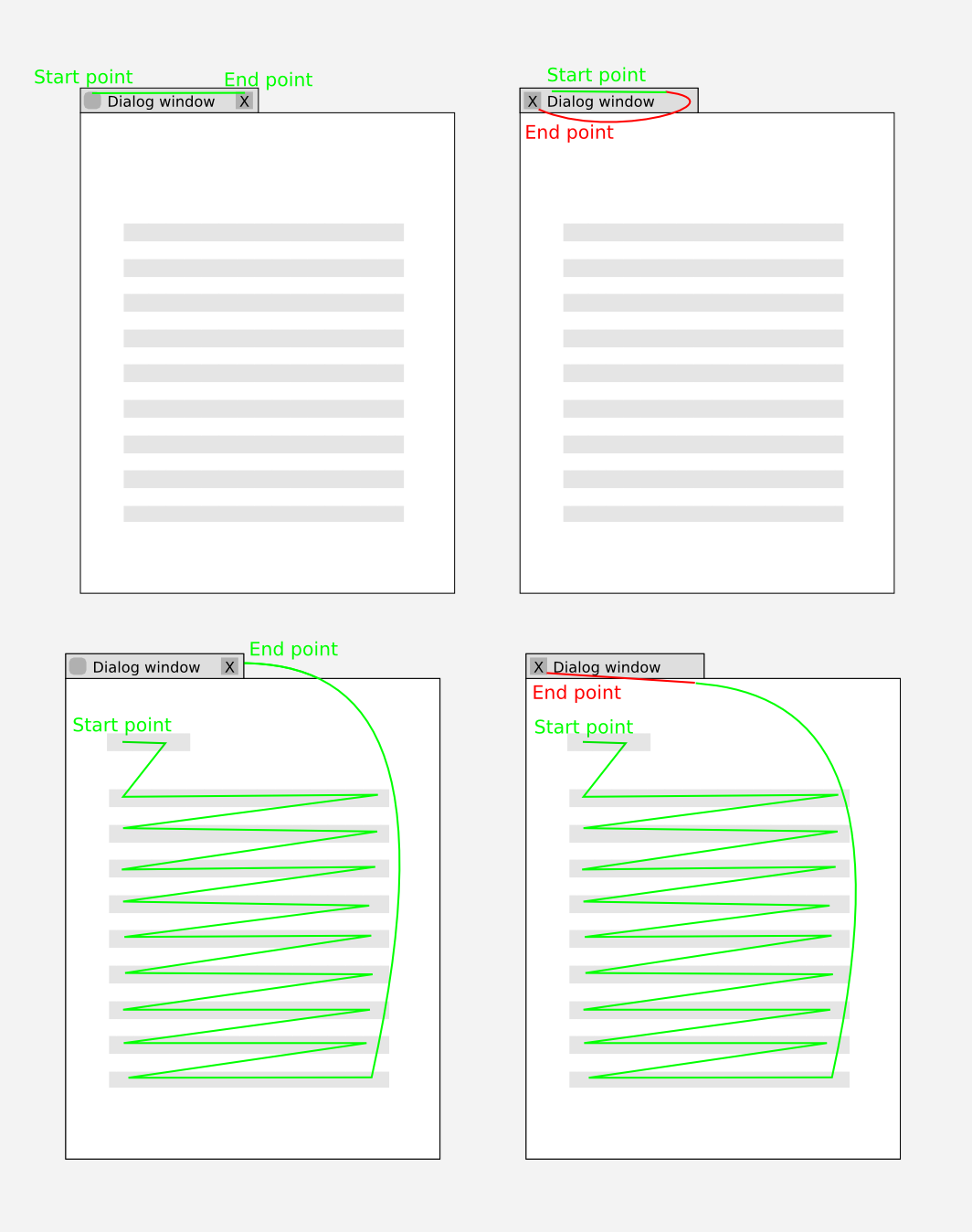
| hills (hills) wrote : | #639 |
- Source SVG. Feel free to play with it Edit (278.4 KiB, image/svg+xml)
After making these pictures I would like to say that left top close button is like:
1. confusing end point with start point in all GNOME interface (breaking user's habits and effectiveness).
2. giving close option BEFORE user read anything (what he/she eventually would like to close if he/she know what it is).
3. driving the wrong way up a one-way street. I mean left-to-right and top-to-bootom culture.
Dear Mark and Design Team, is Ubuntu trying to attract Mac users with this change?
After all, as stated above, this is the area where Ubuntu can be obviously better.
| Pako (elektrobank01) wrote : | #640 |
No, Mac is already exceeded target. Now the target is Montavista and its boot in less than one second ;)
| JD Evora (jdevora-saadian) wrote : | #641 |
Sad news :-(
After so many people felling against this idea and http://
Anyway...
| Jef Spaleta (jspaleta) wrote : | #642 |
Jd Evora:
First of all I think you put too much weight behind Brainstorm as a tool to drive change inside Ubuntu. You actually shouldn't be at all surprised that Brainstorm popularity has very little influence over design decisions. It's never had influence in any technical decision making and no one in a position of authority inside Canonical or Ubuntu governance has ever claimed that it has. Canonical nor the external Ubuntu governance structures make it a policy to rely heavily or to even officially review highly popular ideas in Brainstorm on a regular basis or part of technical decision making or public governance discussion. Were highly popular Brainstorm ideas even discussed in an organized session during the UDS in the run up to 10.04?
The track record of implemented ideas backs up my point. You look really closely at the ideas marked implemented in Brainstorm and they are at best mediocre in terms of Brainstorm popularity. None of the highly popular ideas in Brainstorm get implemented..or even discussed publicly as a matter of technical decision making or governance. Take for example the music store idea. It has a negative voting total and is marked implemented.
It's wishful thinking to suggest that Brainstorm popularity plays an important role in decision making. It doesn't. At best brainstorm is a dumping ground for random ideas. There's no evidence that the voting process correlates with feature development or decision making at all.
| Alexander Karatarakis (alexkaratarakis) wrote : | #643 |
Well brainstorm might not be anything, but its yet another sign that the VAST majority of users oppose the idea. If you think the opposite is true, then plz, enlighten me :].
Its a good thing to allow the button positioning to be controlled through themes/skins. This provides options, which is always a good thing. However, making something the default behavior is a serious matter. Having mac style buttons on windows, while everything else (tabs,etc..) have those buttons on the right seems like a really really bad idea.
Still, the ubuntu team has had some great ideas so far, so i am willing to run with it for the time being. I will probably even keep the default settings and try to see the merits...
| Pietro Battiston (toobaz) wrote : Re: [Bug 532633] Re: [Master] Window Control buttons: position/order/alignment | #644 |
Brainstorm is just a technicality. The point is that
- many users thought of Ubuntu's organization as a "democracy without
burocracy": when you have a nice mission ("Linux for human beings"), a
nice codebase to start from (Debian), a nice group of people and a nice
capital to start, who cares about the exact governing process?! There
are several great examples of BDFL in Open Source.
- instead the difference between Ubuntu and a(n ideal) democracy is not
merely _technical_: they just _don't share the same goals and
principles_ - in particular, Ubuntu has no commitment to do what is best
for the community.
- among the things that they do not share, is the way to communicate.
That's why a very smart marketing campaign, with a nice and friendful
logo, a name with deep meaning, a slogan that talks of humanity... all
that may mislead people into having excessive expectations.
<OT> And that's partly stupid, because in 2010 we should all know what
marketing is. Probably a partial excuse is that in the Open Source world
there is less abitude to those techniques. </OT>
But please don't point at _technical particulars_ of how Ubuntu is not a
democracy, I think it's not the point. It just _is not_ a democracy,
Mark himself stated it clearly, and we have no right to recriminate.
| Ronnie McMaster (ronnie-mcmaster) wrote : | #645 |
@hills You should have added the next line showing your movement to the menu to open the next window or app, which would make the travel to the close button on the right a longer wasted path. With the close button on the left you don't have to go far to open the next application.
Arguments can be made to prove either way is better or worse.
If everyone had used their energies to motivate Mark and his team to add an easy way to adjust the window buttons in the Appearance Applet instead trying to debunk the actual placement of the buttons, then at least and easy GUI HowTo could be made for showing those who wish to put the buttons on the left an easy way to do it. Instead we have to now either give them a full terminal command to put the buttons to the right or a command to open gconf, then walk them through making the change.
I really do not see people coming to Linux or ubuntu looking to find a Windows look-a-like.
| Michael (michaeljt) wrote : | #646 |
This is a bit of a plug, but given that you have switched to OS X-style window buttons by default, you might also look at installing the Gnome global menu applet ( http://
| Alvin (alvevind) wrote : | #647 |
Yes! That is a great idea, Michael!
Gnome global menu applet ( http://
I hope this can be made the default for the new button-
That would really clean up the windows and make even more room for novel interface experiments if that is what Canonical wants.
I say, if Ubuntu is really going to change in the direction of Apple-like UI instead of Microsoft-like UI I welcome that wholeheartedly.
What I do not like (or understand) is taking some bits from Apple (buttons) and some from Microsoft (menu) but without having any real reason behind it other than simply being different.
Either Canonical needs to do real (and I mean REAL) user experience testing months before introducing dramatic UI changes. OR, they need to trust what other companies/
If Canonical thinks Apple has the best UI ideas, then grab those ideas, all of them, all at the same time!
:-)
| u-foka (ufooka) wrote : Re: [Bug 532633] Re: [Master] Window Control buttons: position/order/alignment | #648 |
That would be great, if that won't break the consistence... but it does!
Sadly all non native gtk application have problems with globalmenu... wx
apps have an empty menu bar on their window while the actual menu moved
to the panel, others like oo & firefox simply doesn't care about
globalmenu, because they don't use any gtk widgets (only drawing
functions), and there are other problems, like freezes with acroread.
So that can't happen to globalmenu be default...
On 04/06/2010 04:43 PM, Alvin wrote:
> Yes! That is a great idea, Michael!
>
> Gnome global menu applet ( http://
> is a very good way of avoiding the problem of clicking Close when
> intending to open the File menu.
>
> I hope this can be made the default for the new button-
> themes.
>
> That would really clean up the windows and make even more room for novel
> interface experiments if that is what Canonical wants.
>
> I say, if Ubuntu is really going to change in the direction of Apple-
> like UI instead of Microsoft-like UI I welcome that wholeheartedly.
>
> What I do not like (or understand) is taking some bits from Apple
> (buttons) and some from Microsoft (menu) but without having any real
> reason behind it other than simply being different.
>
> Either Canonical needs to do real (and I mean REAL) user experience
> testing months before introducing dramatic UI changes. OR, they need to
> trust what other companies/
> looking like an imitation.
>
> If Canonical thinks Apple has the best UI ideas, then grab those ideas, all of them, all at the same time!
> :-)
>
>
| Pyramid Technologies (pyramidtechnologies) wrote : | #649 |
Post #647 validates a point I made long ago...that we are going to have to hack workarounds. First, gconf, now this to make sure that you don''t close out of the window instead of hitting the File menu. (Maybe Canonical should move that to the right side and really confuse people ;) /snark)
"Gnome global menu applet ( http://
Post #648 brings up another point I (and others) have about this whole change breaking the UI. Of course Canonical with it's hubris will expect Metacity, Gnome, all GTK applications, programmers and end-users to change for them. Sounds a LOT like Microsoft or Apple's way of thinking.
I still have Ubuntu 8.04.4LTS on one machine, while it will stay that way until it can't work anymore. The other now runs Debian. Hopefully the madness decisions of Livid Lynx 10.04LTS will be reversed.
| Imtiaz Rahi (imtiaz.rahi) wrote : | #650 |
@Pyriamid
alternatively you can use LinuxMint. It has all the goodies of Ubuntu and it has its own great design. Hopefully you will like it.
| hills (hills) wrote : | #651 |
running_rabbit07:
> You should have added the next line showing your movement to the menu to open the next window or app, which would make the travel to the close button on the right a longer wasted path. With the close button on the left you don't have to go far to open the next application.
> Arguments can be made to prove either way is better or worse.
I must disagree. It is impractical and impossible to put most UI widgets or webpage links in single small area of the screen. Moving closer one or two widgets can't bring optimization that is worth the change. In fact, by doing this user's precision and concentration must be increased.
| Pako (elektrobank01) wrote : | #652 |
After all these comments we can conclude that the main difference between the two sides is: Shorter Mouse Movements vs. User's Precision. The first one is a fact and the second one is nothing but exercise and habit.
| Pyramid Technologies (pyramidtechnologies) wrote : | #653 |
Pako,
People are not precise. They are however, creatures of habit.
| Pako (elektrobank01) wrote : | #654 |
Pyramid, Maybe you should ask Mac users about their habits, or at least Rafael Nadal who is naturally Right hander but plays tennis with his Left hand, and by the way is Champion. Let me ask you something. What would happen if you try to wear lenses that will reverse your picture upside-down? If you don't have time to think about it, here is the site that will explain to you this phenomenon.
http://
| hills (hills) wrote : | #655 |
@Pako
Sorry, you conclusion didn't have anything to do with my argumentation stated in #639.
| Pako (elektrobank01) wrote : | #656 |
hills, but there are few users including me that already found advantages in left side buttons. Habits and Precision? After 5 days of using the left side I was able to click the buttons very precise without any error, even with closed eyes.
| Pyramid Technologies (pyramidtechnologies) wrote : | #657 |
"there are few users including me that already found advantages in left side buttons."
Key word here is "few".
There are FEW Mac users compared to Windows users.
There are FEW Linux users compared to Windows users.
there are FEW people willing to adapt to such a change as the button order and location.
Once again.....People are not precise. They are however, creatures of habit.
| Pako (elektrobank01) wrote : | #658 |
Pyramid, quantity is not always quality.
| Requiem Masamune (requiem) wrote : Re: [Bug 532633] Re: [Master] Window Control buttons: position/order/alignment | #659 |
I think Mark first rationale for the change was actually right and
overriding. He needs to clear the right corner to put something there
and he needs to do it 6 months in advance.
I can already sort of guess what it will be. Forget Esfera, it will be
some sort of live facebook chat/twitter feed/location broadcaster/ad
displayer, possibly.
The functionality is there, the calendar panel applet can stay open on
top of the windows already. And it really wouldn't work any other way,
the bottom corners are used by applications with either controls or the
status bar, and the top left side has the menus and the most used
toolbar buttons as well as the gnome menu bar.
So the best option if you want to put an always on top applet is to move
everything to the left, buttons AND title, to make room for it. It is in
fact such an obvious move that it makes sense to piss off almost
everybody to pull it off.
BUT
If I'm right, this is bad news already. Good functionality doesn't need
a preemptive strike 6 months ahead of time just to "soften" the targets,
bad functionality does.
It could be something so bad that people* will complain about it by
itself, let alone the title bar scramble, so Mark is attempting to
separate the criticisms, reordering the title bar now so that the future
complains would be limited to the new gimmick alone.
And of course there is the psychological trick of asking for a lot of
money before asking for less money as to make the second request seem
more reasonable.
So Mark was sincere the first time all along, he needs to make room for
functionality that's so compelling, it has to be introduced gradually.
* When I say people I mean the bleeding-edge, open to change,
ubuntu-loyal beta testing community that didn't like this change.
(And yes I'm still here, for several reason I've not been able to
unsubscribe as I meant to)
--
http://
| Pyramid Technologies (pyramidtechnologies) wrote : | #660 |
For anyone that hasn't left already (such as myself); if Ubuntu turns into spware-
"It could be something so bad that people* will complain about it by itself, let alone the title bar scramble, so Mark is attempting to separate the criticisms, reordering the title bar now so that the future complains would be limited to the new gimmick alone"
This is/would be a totally political move, and a good way to do it to minimize the perceived impact on people. This may also be why Mark and company haven't even given the slighted indication of what the invisible titlebar voodoo may be.
(in case anyone asks: Why am I still posting here if I've moved to Debian? Well, I'm in the lifeboat just watching the Titanic sink is all.)
| BobPendleton (bob-pendleton) wrote : Re: [Bug 532633] Re: [Master] Window Control buttons: position/order/alignment | #661 |
Think about how your grandma would react if she had been using
computers since 1971 and an X11 based GUI with the window buttons in
the upper right corner since 1986. How would she feel if she did an
update, rebooted, and found that the buttons were not where she
expected them to be. And, she also found that the color scheme had
been changed to something hurt her eyes to look at it?
That is the situation I'm in. Believe it or not there are a lot of
people out here who have been using computers and GUIs for a long
time. We have developed reflexes, muscle memory, that lets us know how
to use the GUI without even thinking about it. We have eyes that
require bifocal lenses. It takes a while for our eyes to adjust to new
light levels. Something the new background requires us to do every
time we look at a different part of the screen. We might not see
differences in gray levels as well as we did 40 years ago, which makes
reading gray text on what ever that color is in the Lucid theme a
challenge.
My wife saw the default desktop on a machine I had just installed. Her
reaction, was "You're not going to do that to my machine." Not a
question, a statement. Is she "non-technical"? Sure, if you count
rocket science as non-technical. She is an ME. She can put her stamp
to the plans for a new building and make it legal to build the
building. And, yes, she spent much of her career designing rocket
motors and systems. Computer programmers are among the least technical
of all the technical fields.
Your attitude toward adults is really disgusting to me.
Bob Pendleton
On Fri, Mar 26, 2010 at 5:41 AM, Imre Gergely <email address hidden> wrote:
> @Pietro Battiston: I don't think you can be 100% sure that Debian (or
> any other distro) won't do something in the future you will dislike...
>
> Tech people think that non-techies (your grandmother) will ZOMG what
> happened to the buttons. Just try to explain that she has to click on
> the left now to close the windows and not on the right, and she'll get
> it in notime and forget about it. I have non-tech parents, too, with
> Ubuntu installed at home, and grandparents who learned how to use a
> mobile (at their age).
>
> It's just us who are "too aware" about these things (us, who read these
> bugreports and comment way too much on them). Your grandma will probably
> think, "ummm there's no button here... but there! on the other side,
> that looks the same, let's click it and see what happens. Tadda!" She
> won't care, they've changed it, ok, she'll get used to it. If she can
> use a computer, she will figure it out.
>
> It's still easier than Ctrl+W, Ctrl+Q, Alt+F4 or File/Quit ;)
>
> --
> [Master] Window Control buttons: position/
> https:/
> You received this bug notification because you are a direct subscriber
> of a duplicate bug.
>
> Status in “light-themes” package in Ubuntu: Triaged
> Status in “metacity” package in Ubuntu: Confirmed
>
> Bug description:
> *** As per the design team's request***
> All bugs concerning the window controls are being duped to this master bug.
> All the decisions regarding the position/
> -----...
| scholli (scholli-tz) wrote : | #662 |
"(in case anyone asks: Why am I still posting here if I've moved to Debian? Well, I'm in the lifeboat just watching the Titanic sink is all.)"
distrowatch.com
It's rising ... after publishing Lucid, it still will growing. No Titanic here! Why? Because Ubuntu is cleaning up the ***old*** dust and is the only one with a shiny, modern look. This is what peoples are ***looking for***, apart stability, good selection of applications, nice features like the new indicators etc.
Debian and Fedora are nice, but it doesn't look attractive enough for the new generation folk outside. Ubuntu finally did a radical and very important change... the ***eyes*** eats together with the mound. ,)
| scholli (scholli-tz) wrote : | #663 |
mouth (sorry)
@Bob
Yes with Windows... My first Computer was an Amiga and it was different. It was bad? Nop! You will wonder the quick you can change customs. ,)
| Pako (elektrobank01) wrote : | #664 |
No one, including rocket scientist can't tell which colour is the most beautiful one. There is no most beautiful colour in the world.
| BobPendleton (bob-pendleton) wrote : | #665 |
On Wed, Apr 7, 2010 at 12:38 PM, scholli <email address hidden> wrote:
> mouth (sorry)
>
> @Bob
>
> Yes with Windows... My first Computer was an Amiga and it was different.
> It was bad? Nop! You will wonder the quick you can change customs. ,)
You clearly have no understanding of what we have been talking about.
Step back and try to understand why those of us who are objecting to
this change are objecting to it.
Our reasons are real and valid.
Bob Pendleton
>
> --
> [Master] Window Control buttons: position/
> https:/
> You received this bug notification because you are a direct subscriber
> of a duplicate bug.
>
> Status in “light-themes” package in Ubuntu: Won't Fix
> Status in “metacity” package in Ubuntu: Invalid
>
> Bug description:
> === Master Bug ===
> (As per the design team's request)
> All bugs concerning the window controls are being duped to this master bug.
> All the decisions regarding the position/
>
> === Desire ===
> "Please centre the window title like in previous Human theme, and also re-order the window controls in classic order, positioned on the right side (menu - title - minimize, maximize close)."
>
> ==== Workaround ====
> 1. Only new themes, such as Ambiance and Radiance will have buttons on the left by default. You can continue using old themes, such as Human, in Lucid and those themes will continue to have buttons on the right side (according to http://
>
> 2. To revert to old layout, run in a terminal:
> $ gconftool-2 --set /apps/metacity/
>
> ==== Responses ====
> Canonical Design Team Leader (Ivanka Majic) - 2010-03-10 and 2010-03-17
> http://
> http://
>
> Ubuntu SABDFL (Mark Shuttleworth) replies on this bug report - 2010-03-15 onwards
> http://
> http://
> http://
> http://
> http://
> http://
> http://
> http://
> http://
> http://
> http://
> http://
> http://
>
> Canonical Ubuntu Community Leader (Jono Bacon) response - 2010-03-24
> http://
>
> === Code of Conduct ===
> To maintain a respectful atmosphere, while com...
| Pako (elektrobank01) wrote : | #666 |
@Bob "Our reasons are real and valid" What reason?
| BobPendleton (bob-pendleton) wrote : | #667 |
Your post is nonsense. Nothing I said had anything to do with
"beauty". I was talking about how poor selections of colors can induce
eye strain and make it difficult to use a UI.
I am talking about well established principles based on decades of
experimentation and on the physiology eye and the effects of aging on
the eye.
Purple is a horrible background color because it combines both read
and blue. Staring at purple depletes two of the three sets of color
receptors in the eye. That will cause everything else around you to
appear to be depleted of red and blue. The color sensors are the low
resolution part of the eye. They intensity network that sees shades of
gray is the high resolution part of the eye. If you want people to be
able to read and see details you have to use colors that are strong
divided in intensity, not by color shade.
This is nothing new. It is human factors 101. It is taught to Chefs in
culinary schools so they now enough to make signs and menus that are
usable by their customers.
On Wed, Apr 7, 2010 at 12:51 PM, Pako <email address hidden> wrote:
> No one, including rocket scientist can't tell which colour is the most
> beautiful one. There is no most beautiful colour in the world.
>
> --
> [Master] Window Control buttons: position/
> https:/
> You received this bug notification because you are a direct subscriber
> of a duplicate bug.
>
> Status in “light-themes” package in Ubuntu: Won't Fix
> Status in “metacity” package in Ubuntu: Invalid
>
> Bug description:
> === Master Bug ===
> (As per the design team's request
> All bugs concerning the window controls are being duped to this master bug.
> All the decisions regarding the position/
>
> === Desire ===
> "Please centre the window title like in previous Human theme, and also re-order the window controls in classic order, positioned on the right side (menu - title - minimize, maximize close)."
>
> ==== Workaround ====
> 1. Only new themes, such as Ambiance and Radiance will have buttons on the left by default. You can continue using old themes, such as Human, in Lucid and those themes will continue to have buttons on the right side (according to http://
>
> 2. To revert to old layout, run in a terminal:
> $ gconftool-2 --set /apps/metacity/
>
> ==== Responses ====
> Canonical Design Team Leader (Ivanka Majic) - 2010-03-10 and 2010-03-17
> http://
> http://
>
> Ubuntu SABDFL (Mark Shuttleworth) replies on this bug report - 2010-03-15 onwards
> http://
> http://
> http://
> http://
> ...
| BobPendleton (bob-pendleton) wrote : | #668 |
On Wed, Apr 7, 2010 at 1:08 PM, Pako <email address hidden> wrote:
> @Bob "Our reasons are real and valid" What reason?
Ok, I recognize a troll when I see one. Very funny. Ha Ha.
>
> --
> [Master] Window Control buttons: position/
> https:/
> You received this bug notification because you are a direct subscriber
> of a duplicate bug.
>
> Status in “light-themes” package in Ubuntu: Won't Fix
> Status in “metacity” package in Ubuntu: Invalid
>
> Bug description:
> === Master Bug ===
> (As per the design team's request)
> All bugs concerning the window controls are being duped to this master bug.
> All the decisions regarding the position/
>
> === Desire ===
> "Please centre the window title like in previous Human theme, and also re-order the window controls in classic order, positioned on the right side (menu - title - minimize, maximize close)."
>
> ==== Workaround ====
> 1. Only new themes, such as Ambiance and Radiance will have buttons on the left by default. You can continue using old themes, such as Human, in Lucid and those themes will continue to have buttons on the right side (according to http://
>
> 2. To revert to old layout, run in a terminal:
> $ gconftool-2 --set /apps/metacity/
>
> ==== Responses ====
> Canonical Design Team Leader (Ivanka Majic) - 2010-03-10 and 2010-03-17
> http://
> http://
>
> Ubuntu SABDFL (Mark Shuttleworth) replies on this bug report - 2010-03-15 onwards
> http://
> http://
> http://
> http://
> http://
> http://
> http://
> http://
> http://
> http://
> http://
> http://
> http://
>
> Canonical Ubuntu Community Leader (Jono Bacon) response - 2010-03-24
> http://
>
> === Code of Conduct ===
> To maintain a respectful atmosphere, while commenting please follow the code of conduct - http://
>
>
>
> To unsubscribe from this bug, go to:
> https:/
>
--
+------
| Ronnie McMaster (ronnie-mcmaster) wrote : | #669 |
Bob, your only reason for rejecting ubuntu's buttons is stubbornness. The fact that your grand mother was using a computer shows she is capable of change being that most likely when she was born there were no TVs much less computers. How many people were really using desktop computers in the 70s? Lets be real here. If you guys are really this stubborn how did you manage to actually leave Windows?
With every release there are whiners that scream they are leaving because the sky isn't blue enough in the new desktop background. I would think someone who claims to be a system admin for a company using ubuntu as their system would know how to make the small GUI change necessary to put the buttons back on the left for his whole company at install time.
If you look at the subscribe list to the above right, you will see that Mark is no longer following this thread, so why are you arguing as if you think he will change his mind?
| Pyramid Technologies (pyramidtechnologies) wrote : | #670 |
@scholli
"It's rising ... after publishing Lucid, it still will growing. No Titanic here! Why? Because Ubuntu is cleaning up the ***old*** dust and is the only one with a shiny, modern look. This is what peoples are ***looking for**'
Yes,iPad sales were up initially too. All this demonstrates if that just like Apple users, Ubuntu users are becoming sheeple too because they get distracted by "neat, shiny things that look cool" versus actually being usable and assist in productivity.
@Bob - I hear you. I'm on your side man. MANY here, including Mark, don't get it - or care to even try to.
@running_rabbt07
"How many people were really using desktop computers in the 70s?"
I have been since I started in 1978 at age 11.
"If you guys are really this stubborn how did you manage to actually leave Windows?"
I started out on UNIX, CLUI-based, migrated to Mac for about 10 years (Mac had the min,max,close on the right back then), then went to Windows (min,max,close), and then to various distros of Linux, which until Ubuntu Livid Lynx 10.04, were the same way.
| Pyramid Technologies (pyramidtechnologies) wrote : | #671 |
Yet another voice against this move....
http://
| Jon Elofson (jon-elofson) wrote : | #672 |
Bummer that the design team is doing this after all the opposition from users. Even though I know you can switch the buttons back to the original position, I will not upgrade to 10.04 because I feel this is a fundamentally flawed change. I will likely switch distos. Meritocracy is fine, provided that you display merit. I believe this decision shows a lack of usability merit at the very least. Oh well....All the arguments have been made so there is no reason for me to regurgitate them. Just consider this one more voice in opposition falling on deaf ears.
Now I just have to figure out what distro to switch to....fedora, debian, mint...lots of good choices :)
| Pyramid Technologies (pyramidtechnologies) wrote : | #673 |
@jon..Mint may not be bad, but it's still part of the Ubuntu-strain. better off going with the original Ubuntu steals all of it's code from....Debian.
| bernhard (bernhardredl) wrote : | #674 |
the problem is that theses voices are only the minority.
The most ubuntu users, don't test Beta1 ,2 or follow every bugreport.
they will install the new LTS when its available and after the installation the will be surprised/ annoyed / happy
maybe they will google for it, or they will stick to it, or they will never click Install and eject the live cd.
But to be honest. what to google for? Where to find the gconf tool info?
I have to admit, i'm not that unfamilar with ubuntu and lp and stuff, but my first reaction was, uhh where can i change it.
And i have to say it was not easy to find. A lot of blogs etc, reported the issue, but none of these provided a solution.
So imho ubuntu is acting as a guardian for the user.
Is it so much work to implement a checkbox in the Apperance menu?
Without this checkbox i estimate that 80% of the users, will not be able to switch it to the position they like.
| Pyramid Technologies (pyramidtechnologies) wrote : | #675 |
From Planet Ubuntu in a blog post about Canonical reversing it's decision to have Yahoo! as the default search vs. Google...which now Google will once again be the standard in 10.04LTS......
"No, unfortunately, not that (link gone, but pointed to this bug report) decision. The decision to use Yahoo has the default search engine in Mozilla Firefox in Ubuntu 10.04 has been changed back to Google. Granted, I could care less what default search engine is used in Firefox. It’s a setting that can be changed in a very easy and user friendly manner. I’ve also stopped using MemoryLeakFox in favor of a slightly less memory hog, Google Chrome. What gets me is the comment made by Rick Spencer in regard to the decision:
In this case, choosing Google will be familiar to everybody upgrading from 9.10 to 10.04
Last I checked, familiarity was not a valid or adequate reason for basing decisions on. If familiarity has now become a good enough reason, then I know some other bugs that could use another once-over."
Now my comments.
So Mark, Canonical, you WILL reverse decisions.... ok. cool.
So now I must ask, then if with all of this input from people in blogs, with websites even being created AGAINST your boneheaded move, WHY will you NOT reverse this decision that is about as popular as a 3rd presidential term from Resident Bush aka "W")
| Jonathan Carter (jonathan) wrote : | #676 |
Is there anyway we can have Pyramid Technologies removed from commenting on this entry (or even Launchpad entirely)?
* His behaviour is not in line with our code of conduct
* He doesn't contribute possitively
* He's made it clear that he has no interest in improving Ubuntu
I know I could just unsubscribe from this bug, but this is of interest to me and I would like to be able to contribute without reading all of his abusive useless content.
| scholli (scholli-tz) wrote : | #677 |
I still not sure about the order. The big points of the initial-order was:
1. unique - own face
2. consistence with the close-buttons in the tabs for example (right side)
3. you have to look a second for it (search for it a little bit) before closing ... time for thinking: "you want close really!"
Move them to the left was a good decision:
I. It looks awesome
II. less pushing the mouse to one and other side of the screen
III. It doesn't looks Windows-like
IV. free place for put a new feature
The new order isn't bad at all, but I feel a little bit better with reverse them to the initial-order. Even Mark said he liked the old order much ... maybe we have a change for a new change. :-D
| Paul Sladen (sladen) wrote : | #678 |
scholli: sadly this issue has still suffered from the silent treatment, even during the second adjustment, so there hasn't been any substantial information about /why/ the change could have been made. That's not fixable quickly, and it's not something that I can directly fix personally-
It is however possible to make _purely technical_ arguments for the lastest close-min-max order and why it might be considered superior. This is based on the combinations of buttons that can be simultaneously present:
close (only)
close-minimise
close-
the latest ordering is such that the positioning of the buttons that /are/ present will remain constant (relative to the edge of the window). Both of the previously-trialled orderings meant that the button positions would have altered when the complete set was not present, reducing the potential for establishing muscle memory.
| Mark Shuttleworth (sabdfl) wrote : Re: [Bug 532633] Re: [Master] Window Control buttons: position/order/alignment | #679 |
On 07/04/10 19:42, running_rabbit07 wrote:
> Bob, your only reason for rejecting ubuntu's buttons is stubbornness.
>
This is a straight ad hominem attack, and is completely unacceptable
under our Code of Conduct.
Bob, my apologies for this. Ronnie, please refrain from framing your
arguments as an attack on someone else.
Mark
| Mark Shuttleworth (sabdfl) wrote : | #680 |
On 07/04/10 21:52, Pyramid Technologies wrote:
> Yet another voice against this move....
>
> http://
>
The specific issue he raises there looks to me to be a bug, in that the
entire corner area is being used as a click target for the corner
button, as opposed to just the area of the button itself. I've reported
that separately as Bug #558327
| Mark Shuttleworth (sabdfl) wrote : | #681 |
On 07/04/10 23:34, Jonathan Carter wrote:
> Is there anyway we can have Pyramid Technologies removed from commenting
> on this entry (or even Launchpad entirely)?
>
I've written to Pyramid and asked him to shift his line of discussion to
the Forums, where it would be more appropriate, and to respect the Code
of Conduct.
Mark
| Jon Elofson (jon-elofson) wrote : | #682 |
Had a night to sleep on this. Although I am still opposed to the button decision, I would be remiss to not at least give it a shot. So, I will be trying 10.04 with the buttons in the goofy position and after I run it for a while, I will be in a better position to comment/provide constructive feedback. Ubuntu has treated me well for the last 3 years so I can't give up on her yet. :) Might even get my wife to try it out and get her feedback. She is a "normal" non-techy user. I would be interested to see her reaction.
Ok, serenity now....
| Ronnie McMaster (ronnie-mcmaster) wrote : | #683 |
Mark,
You are right and I apologize for attacking Bob. It was very unprofessional of me.
Thank you for sharing this amazing product and hopefully this new innovation your team is working on will push us towards fixing bug #1.
Cheers,
Ronnie
| Mark Shuttleworth (sabdfl) wrote : | #684 |
On 08/04/10 17:54, running_rabbit07 wrote:
> Thank you for sharing this amazing product and hopefully this new
> innovation your team is working on will push us towards fixing bug #1.
>
You're very welcome, and thanks for your participation and consideration.
Mark
| cornbread (corn13read) wrote : Re: [Bug 532633] Re: [Master] Window Control buttons: position/order/alignment | #685 |
You've got to love the inconsistencies in the ubuntu development team at the moment.
At one end (a search engine) "oh we can't change to yahoo! no one will know how to use the new search engine and will all get lost@!?" and at the other end (the buttons), it's "we'll change them no matter what people want because innovation is good and in another 7 months they'll get to see some of that innovation."
Now tell me how this is a consistent development strategy for a LTS release?
SOURCE:
https:/
| Ronnie McMaster (ronnie-mcmaster) wrote : | #686 |
I am not sure why they changed their minds about the search engine, though I am glad they did. Searching Yahoo for Ubuntu fixes just wasn't working well. Google loves us, so we should love them back.
I did notice that when choosing themes other than Ambiance, Dust, and Radiance, the buttons are moved to the right side of the window, which should be easy to figure out for those who prefer them there.
I just recently upgraded my desktop machine to Lucid and I am impressed with the work that has been done and yes I am keeping the buttons to the left. The decision to move the close button to the far left makes it easier.
Cheers,
Ronnie
| nomnex (nomnex) wrote : | #687 |
- Proper buttons for Radiance/Ambiance Edit (25.5 KiB, image/png)
these are--for me--the proper layout, design, etc. of the button on 10.04 (all themes)
is there a way to have these buttons on the new Radiance/Ambiance themes and how (tutorial, link)?
i have already posted the following, but I am not found of the round "Mac OSX" like buttons and their location on the left. They can be moved on the left using gconf-editor, but how can I change the design?
I quite like Radiance/Ambiance (minus the buttons) themes, and would rather not using the Dust theme only for its buttons.
Thanks
| Bernhard (b.a.koenig) wrote : | #688 |
- Screenshot-Appearance Preferences.png Edit (54.4 KiB, image/png)
There's currently two more bugs with this whole affair:
1) the classical dust theme still has buttons on the left. This looks unintended and some people before confirmed that it is unintended.
2) The homosapien theme displays buttons incorrectly if there is only one button (e.g. "gnome-
Attached screenshots for both problems. Let me know if you want me to file those things somewhere else.
| Bernhard (b.a.koenig) wrote : | #689 |
| James P. Carter (jpcarter) wrote : | #690 |
The following option no longer works as of 04/11/2010
2. To revert to old layout, run in a terminal:
$ gconftool-2 --set /apps/metacity/
Apparently though I had already run the fix in the past, the configuration has been reverted back again for me! Which I had brought up in the past. Ubuntu for humans? Apparently not. Sorry but this is not a small issue... the background of this issue is HUGE. I'm out.
| James P. Carter (jpcarter) wrote : | #691 |
FYI, As of 04/11/2010 the following is also NOT true. I have switched back and forth from various themes... all buttons are on the left... always! Sad thing for Ubuntu is that when the users 'do' upgrade there will be a HUGE uproar. Unfortunately due to the way this issue has been handled or rather not handled you will have lost quite a few "old" testers. No personal attack intended here however the comment I read earlier intending to be a double meaning of clearing out the "old" was obviously made by someone very young and unwise. A person who has been around understands they do not know even half of what is there to know. I'm sure someone much wiser and "older" uttered something similar much more eloquently than I before. I like Ubuntu, I hate to leave however it seems you are ushering us out...
1. Only new themes, such as Ambiance and Radiance will have buttons on the left by default. You can continue using old themes, such as Human, in Lucid and those themes will continue to have buttons on the right side (according to http://
| Bernhard (b.a.koenig) wrote : Re: [Bug 532633] Re: [Master] Window Control buttons: position/order/alignment | #692 |
@James: this could be because you have manually changed the gconf
settings. Either set them back to default or do a fresh install of
lucid. You should be able to change themes and move buttons to the
right. Since you are running a beta release, you cannot expect
everything to work perfectly.
| Dylan McCall (dylanmccall) wrote : | #693 |
On Sun, Apr 11, 2010 at 2:48 PM, James P. Carter
<email address hidden> wrote:
> FYI, As of 04/11/2010 the following is also NOT true. I have switched
> back and forth from various themes... all buttons are on the left...
> always!
Hi James,
Please file a separate bug report for this issue; it shouldn't happen.
However, I should also mention I can't reproduce it here. Keep in mind
that button position is set in index.theme for each specific theme,
which is the file that says "this window manager theme + this gtk
theme + this colour scheme is a theme by this name." (Essentially
responsible for the individual theme choices that get icons and names
in Appearance Preferences). If you use the Customize option on a
theme, it creates a brand new index.theme file for a brand new theme
and it doesn't record a specific button layout for that.
Okay, my explanation wasn't very good, but these steps should give you
a nice picture:
* Select Human theme.
* Note window buttons on right (unless something weird has happened,
justifying a separate bug report).
* Click Customize and go to the Window Border tab. Choose any other
window border, for example Ambience.
* Note that window buttons do not change position.
* Note that your theme, under Appearance Preferences›Theme is called
"Custom" :)
| nomnex (nomnex) wrote : Re: [Bug 532633] Re: [Master] Window Control buttons: position/order/alignment | #694 |
On Sun, 2010-04-11 at 14:50 +0000, Bernhard wrote:
> There's currently two more bugs with this whole affair:
> 1) the classical dust theme still has buttons on the left. This looks unintended and some people before confirmed that it is unintended.
This is a temporary bug, it only affects Dust. it should be fixed on the
beta3 or the official release (=>buttons on the right).
| Bernhard (b.a.koenig) wrote : Re: [Bug 532633] Re: [Master] Window Control buttons: position/order/alignment | #695 |
@nomnex: I couldn't find a bug for it. That's why I asked if I should
file it against gnome-themes-
| nomnex (nomnex) wrote : Re: [Bug 532633] Re: [Master] Window Control buttons: position/order/alignment | #696 |
On Sun, 2010-04-11 at 22:51 +0000, Bernhard wrote:
> @nomnex: I couldn't find a bug for it. That's why I asked if I should
> file it against gnome-themes-
I have read two reviews about the latest changes in 10.04 b2. both were
mentioning the Dust theme "bug" to be fixed for the official release. I
would assume the gnome-themes-ubuntu team are already aware of the
issue. Maybe others could give their opinion?
| Martin Wildam (mwildam) wrote : | #697 |
I was pretty sure that after the community reactions were so negative about the buttons now on the left that beta 2 will already have them back on the right side again.
I read only through the first 50 and last 20 comments or so - I think this should be far enough for switching back! And with this comment there is my vote also for switching back.
BTW: If you want to save mouse miles driven, then shouldn't be the right side completely eliminated? - And all dialog buttons should then be on the left side also, isn't it?
| Rich Wales (richw) wrote : | #698 |
Unfortunately, Mark Shuttleworth has said (see comment #564) that this decision is final and that no complaints or "negative votes" would make any difference.
| Mark Shuttleworth (sabdfl) wrote : Re: [Bug 532633] Re: [Master] Window Control buttons: position/order/alignment | #699 |
James, I think you may need to unset the gconf key. If you set a gconf
key as a user, then that setting stays in place until you change it.
When we update a package, we only update the system-default settings.
User settings don't get touched, generally. So, if you played with the
gconf setting previously, you will retain what you set until you *unset*
that key.
Mark
| Bernhard (b.a.koenig) wrote : Re: [Bug 532633] Re: [Master] Window Control buttons: position/order/alignment | #700 |
For completeness I filed a bug against gnome-themes-ubuntu regarding
the dust buttons still on the left: bug 561756
| Martin Wildam (mwildam) wrote : | #701 |
Well, if the community is so blindly ignored, then I should maybe switch distribution...
I have been a convinced Ubuntu-User but if things develop that way...
I think the community is bringing the most new users. It is not the Windows users that find Ubuntu and then really use it. Everywhere I look, there are only a very few leader types that find things themselves - most use what others already successfully use. And Linux is a lot spread by word of mouth. New users want other users near to them who they can ask for help if needed. The buttons-
I will not go to teach new users about gconf - they should be able to focus on their work. I myself used that the last time about 5 years ago. I remember it so annoying on Windows that after a fresh installation quite every default setting in the Explorer need to be changed to make it useful. Do we want Ubuntu get the same annoyance-factor?
If you include new themes with the distribution that have the buttons on the left - well do it. But don't set such a theme as default.
@Mark: I didn't notice at any place so far a real reason for the buttons on the left. "Encouraging innovation" is good, but there should be reason. For such experimental major changes the very best would be to first have just an optional additional theme that makes use of this. And there are really more important changes in UI design needed, just one that comes to my mind immediately: A confirmation dialog when the user presses the delete key in Nautilus. I am not sure myself sometimes, if I accidently hit delete when scrolling to the end and then have to examine recycle bin if I have deleted something accidently or not. (I know this is off-topic here, but just one of plenty other examples being more important for a good user experience than moving buttons to the left without any reason). And keep in mind that productivity, reliability and functionality is more important than design. For most computer users the computer is not their main focus - they use it but want to focus on their main business or hobby. "New innovative ideas" from my understanding are only such if they solve a problem or bring new possibilities. Can't see that for this button-issue - the opposite is more true.
@Bernhard: Thanks for filing this - I think it is the best solution only having a new optional theme using this style.
| cornbread (corn13read) wrote : Re: [Bug 532633] Re: [Master] Window Control buttons: position/order/alignment | #702 |
+1 to having it as an optional theme!
Definitely the wrong thing to "experiment with" without innovation at hand already. ESPECIALLY ON AN LTS
-- Sent from my Palm Pre
On Apr 13, 2010 12:38 AM, Martin Wildam <<email address hidden>> wrote:
Well, if the community is so blindly ignored, then I should maybe switch
distribution...
I have been a convinced Ubuntu-User but if things develop that way...
I think the community is bringing the most new users. It is not the
Windows users that find Ubuntu and then really use it. Everywhere I
look, there are only a very few leader types that find things themselves
- most use what others already successfully use. And Linux is a lot
spread by word of mouth. New users want other users near to them who
they can ask for help if needed. The buttons-
definitely making the transition for a Windows user more difficult.
I will not go to teach new users about gconf - they should be able to
focus on their work. I myself used that the last time about 5 years ago.
I remember it so annoying on Windows that after a fresh installation
quite every default setting in the Explorer need to be changed to make
it useful. Do we want Ubuntu get the same annoyance-factor?
If you include new themes with the distribution that have the buttons on
the left - well do it. But don't set such a theme as default.
@Mark: I didn't notice at any place so far a real reason for the buttons
on the left. "Encouraging innovation" is good, but there should be
reason. For such experimental major changes the very best would be to
first have just an optional additional theme that makes use of this. And
there are really more important changes in UI design needed, just one
that comes to my mind immediately: A confirmation dialog when the user
presses the delete key in Nautilus. I am not sure myself sometimes, if I
accidently hit delete when scrolling to the end and then have to examine
recycle bin if I have deleted something accidently or not. (I know this
is off-topic here, but just one of plenty other examples being more
important for a good user experience than moving buttons to the left
without any reason). And keep in mind that productivity, reliability and
functionality is more important than design. For most computer users the
computer is not their main focus - they use it but want to focus on
their main business or hobby. "New innovative ideas" from my
understanding are only such if they solve a problem or bring new
possibilities. Can't see that for this button-issue - the opposite is
more true.
@Bernhard: Thanks for filing this - I think it is the best solution only
having a new optional theme using this style.
--
[Master] Window Control buttons: position/
https:/
You received this bug notification because you are a direct subscriber
of the bug.
| scholli (scholli-tz) wrote : | #703 |
In a LTS for custom peoples to use them left - show them that Ubuntu have a new Brand with a new design (CHANGE).
Top-Arguments for left are:
- Gnome 3 (Commando-Bar and Activity are on the left)
- new feature arrives in the perfect 10 (10.10)
- shorter mouseways after a short training
- it looks better
Top-Arguments for right are:
- consistence with the close-buttons on tabs etc.
- it's like Windows - peoples comes normally from Windows or use it in their Job.
But really! If you want change the buttons to the right, you don't need a terminal or have to play with the gconf-editor!
You can do the this change quickly with the theme-appearanc
I never understand why it's so a polemic thematic!? Honestly, I am happy that Mark took that decision and go straightly and seriously with the new slogan "Change".
| Martin Wildam (mwildam) wrote : | #704 |
> Top-Arguments for left are:
> - Gnome 3 (Commando-Bar and Activity are on the left)
But there is another whole bunch of things on the right (e.g. all applications from Autostart, which is for me: Skype, KeyPassX, Dropbox, Shutter and YuuGuu for example. I need all those more often than the applications menu. Things I often use are anyway dragged onto the top panel as quick launch. Further all dialog buttons like ok, cancel etc are on the bottom right, many website's have clickable links (archive, tag clouds etc) on the right etc etc. - The Gnome applications menu is just one of plenty things and only because that is on the left, you want to align everything else that way? - And imagine, that most people start the applications once and then keep them open - many either never shut their machine down just setting it to suspend or hibernate mode - so they basically never need the menu button once all applications are running (ok, I might be exaggerating now a little bit ;-) ).
> - new feature arrives in the perfect 10 (10.10)
Sorry, I didn't get that.
> - shorter mouseways after a short training
This is true IMHO just for a few use cases (that include making intensive use of the applications menu).
BTW: Closing from the left was always possible (just one more click)
> - it looks better
Neither, because if you have many windows open - especially when compiz enabled with some frames are shining throw you have less feeling for window borders - the buttons help here. And it seems more balanced with some button left and buttons right.
> Top-Arguments for right are:
> - consistence with the close-buttons on tabs etc.
Only because of consistence I personally wouldn't rate that even so high, if there are good arguments for moving them to the left.
- it's like Windows - peoples comes normally from Windows or use it in their Job.
This is a very good argument IMHO (not only because helps fixing bug #1) - even in companies where Linux already used on the desktop there are usually some Windows applications needed and they are run through terminal servers etc - so basically every company has a longer transition phase where people need to use both OSes. For support reasons I also have to use windows and already find it annoying that drag and drop with options on Windows is with the right mouse button and on Linux with the middle mouse button - BTW a similar usability issue as the thing with the buttons.
OK, what about displaying the buttons on both sides - left AND right?
Sample: Firefox is one of the most used applications and I configured compiz that whatever edge of the screen I am clicking, a Firefox opens. So I basically go to that edge that is nearest from where I am currently positioned with the mouse. If you really want to reduce mouse miles driven, then you need the buttons on both sides! - And BTW: This is really innovative, because nobody else has it.
Or else other innovative solution: Don't display any button, but as soon as you move the mouse over the title bar display the buttons right next to the mouse. - For this site here for instance the "Post Comment" button is neither on the left nor on the right but as soon as I clicked...
| scholli (scholli-tz) wrote : | #705 |
sudo gedit /usr/share/
sudo gedit /usr/share/
1. ButtonLayout=
2. ButtonLayout=
3. ButtonLayout=
4. ButtonLayout=
(1. - 4. are your possibilities)
"save"
-------
This is a work for 5 minutes and than it's fix. You can change to different themes and if you come back to Ambiance/Radiance you get always your favorite appearance ... In gconf your change get lost; with this it's fix... till the next light-themes-
| description: | updated |
| Paul Sladen (sladen) wrote : | #706 |
Scholli: editing a system data file is _not_ a ideal solution, because it changes will get overwritten any time that a new version of the package ('light-themes') is supplied. Instead; supply a local setting as detailed at the top of this bug report:
gconftool-2 --set /apps/metacity/
Alternatively, if yourself, or another user has tweaked the setting (for instance during this beta episode) then run the following to cleanly return it to whatever defaults are in place:
gconftool-2 --unset /apps/metacity/
| Martin Wildam (mwildam) wrote : | #707 |
@Paul: Thanks for pointing that out and editing the description - It is already a huge amount of reading work to go through all the comments.
In the morning under the shower I thought again of my proposal for displaying the buttons just on hovering over the title bar. The only disadvantage of displaying the buttons only when hovering over the title bar is that it could be irritating that buttons might not show up exactly on the expected position. Why: Let's say they are always displayed left from the mouse cursor position, then if you go to the upper left of the window and there is not enough place left the buttons have to show up on the right side. Knowing that I wouldn't go to the very top left, but anyway - wanted to mention that. Other solution could be to show the buttons in a dropdown-style menu instead. Advantage: If you want to add more entries over time there is enough free space most of the time (not considering really mini confirmation dialog boxes). But going up and then down (in the menu) again means additional mouse miles. :-(
Thinking of all the possible options I also want to mention that there is already a title context menu where a lot of stuff is that I often use. BTW: I use the feature to move a window to a particular desktop more often than I use the minimize button. However, the longer I think of it the more I get to the conclusion that minimize, maximize and close are the essential operations that deserve buttons even although only minimize is really required, because menu button on the left is the same as clicking with the right mouse button anywhere on the title, maximize is double-click and close is clicking the middle (mousewheel) button.
BTW: I have listened to the interview with Ivanka already and today also the answer from Jono Bacon who mentions that they are wanting to use the right top of the Window to place something else in the future. Whatever it is, it could perfectly also go to the left, I would say. One another thing: Putting too many buttons on the window title bar maybe will reduce the space too much for the title. I would put spicy new things to the context menu as they can't be really essential.
| scholli (scholli-tz) wrote : | #708 |
@ Paul Sladen:
Thank you for your professional correction.
| bt90 (butze16) wrote : | #709 |
Why don't we use both styles(left and right)?
Example:
- moving mouse to the right corner => buttons switch from default position(e.g. left) to the right side with the order: minimize,
- moving mouse to the left corner => buttons stay in default position(e.g. left):
close,minimize,
Pro:
- both groups satisfied
- we still have our "change"
Contra:
- don't know :D
PS: Sorry for my bad english ;)
| Martin Wildam (mwildam) wrote : | #710 |
@bt90: This is a really GREAT IDEA! - And the coolness factor could be also given by displaying no buttons at all and only when you get near to the title bar (let's say about twice the height of the title bar) they are displayed left or right depending on which corner is nearer to your mouse.
Another advantage: The full title bar can be used to display the window title.
| scholli (scholli-tz) wrote : | #711 |
@ bt90:
No I think it isn't a good idea. At moment it would be cool, but if the new feature (10.10) will be included we have a problem... you can't reach the new feature-stuff. ,)
A button or a ratio-button for change the side is easier to realize and would be a solution for everybody. For me it's perfect how it is now, but I can't think only what I like...
| Steven (steven3000) wrote : Re: [Bug 532633] Re: [Master] Window Control buttons: position/order/alignment | #712 |
Why not just choose one of the following two solutions:
1) Add a radio button in gnome-appearanc
scholli) with the following options:
Window button placement:
- use theme default
- always on the left
- always on the right
I one of the latter two options is chosen then the theme default will
be overridden by the user's choice.
2) Ship two other themes, ambiance-right and radiance-right whose only
difference is the button placement.
Only a single text file (index.theme) needs to be added.
That will keep everybody happy.
(I know it is possible to customize a theme but that solution might
not be obvious to new users, as simply choosing a theme).
| Requiem Masamune (requiem) wrote : Re: [Bug 532633] Re: [Master] Window Control buttons: position/order/alignment | #713 |
On Wed, 14 Apr 2010 12:51 +0000, "Steven" <email address hidden> wrote:
> Why not just choose one of the following two solutions:
Because it has been stated that ubuntu is trying to be *less*
configurable (Linus might have been right all along)
And because, honestly, I think the move to patch button order support
into metacity was so technically unnecessary, that I'm guessing the move
was not technical at all. I think it might be intended to move the
responsibility to theme makers to pressure them to make their themes
more fit for left alignment, or at least make them develop two versions
of each theme, as it is kinda obvious that mere relocating of buttons
breaks some theme designs.
Or maybe the dev team reasoned that the set of users who want the
buttons in the right overlaps significantly with the set of users who
use themes other than the default.
--
http://
| BobPendleton (bob-pendleton) wrote : Re: [Bug 532633] Re: [Master] Window Control buttons: position/order/alignment | #714 |
On Wed, Apr 7, 2010 at 1:42 PM, running_rabbit07
<email address hidden> wrote:
> Bob, your only reason for rejecting ubuntu's buttons is stubbornness.
You just relabeled my fact based objections as a form of moral failure
so that you could reject them without having to even consider that my
reasons may be valid. You are displaying a form of mental sloppiness
that borders on bigotry. In fact, it is the kind of mental sloppiness
that enables bigotry.
I do not expect you to under accept what I just said. But, please
consider that you are not me.
> The fact that your grand mother was using a computer shows she is
My last maternal grandmother died in the '60. My paternal grandmother
died in the '50s. I was writing about my mother in law. I suppose your
grandmother is in the same age range as my mother in law so you
skipped right over what I actually wrote and interpreted it in your
own frame of reference. It is import to learn to accept what is on the
page even when it contradicts what is in you mind.
Let's see, if your grandmother is the same age as my mother-in-law
then you are about the same age as my son. That means I've been using
X11 on some version of Unix longer than you have been alive. Which
tells me that you can not understand what I am saying because you have
not lived long enough to have the experience of living this long.
It's a funny thing. You can not actually understand an experience
without experiencing it. So, I'll lighten up on you a bit.
> capable of change being that most likely when she was born there were no
> TVs much less computers. How many people were really using desktop
> computers in the 70s?
Many millions if you go by the number of Apple IIs sold starting in
1977. Or the number of CP/M based computers sold starting around 1974.
But, I was talking about when I started using X11 which was in the
middle 1980s.
I did have the fun of using a text based windowing system written in
Lisp on a Dec 20. It displayed on a glass terminal. I think I was
using a DEC VT100. And, of course, I did a ton of applications in the
first version of TurboPascal which also use a text based windowing
system. But, that is not what I was talking about. Wrong decade and
wrong technology. I was talking about X11 on Unix on a 68000 based Sun
workstation and X11 on System5 Unix on several Mips based workstations
developed and sold by Evans & Sutherland and later on 64 bit Sparc
developed by (I wish I was kidding with this name) HaL computer
systems.
> Lets be real here. If you guys are really this
> stubborn how did you manage to actually leave Windows?
Indeed. Interesting question. Why do you think I every left windows?
Let's see. I started working with X11 after the r3 release. (I was our
companies representative to the X consortium and the guy responsible
for getting it running on our hardware.) X11R3 was released in
February '86. Windows 1 was released at the end of '85 and Windows 2
was released at the end '87. No body really used Windows until 3.0
came out in 1990 and no one really wanted to use it until 3.1 "windows
for work groups" came out in 1992. The first version of Windows that
could even be compared to X11 on Unix was...
| Rich Wales (richw) wrote : | #715 |
Let's all PLEASE keep it civil. We can disagree on technical or policy issues without engaging in personal attacks (or perpetuating a toxic atmosphere by responding in kind to what we may perceive as personal attacks by others). Thanks.
| Ronnie McMaster (ronnie-mcmaster) wrote : | #716 |
I recently signed the Launchpad CoC, so I plan to not engage in people's personal issues.
I think the changes made to the themes are awesome. Having the buttons on the left makes for shorter travel distance between closing one window and opening the menu to get the next application started.
| A. Denton (aquina) wrote : | #717 |
"Window Control buttons" -- is that the most important thing to discuss right now? I would rather like to know about these "features" which cant wait until maverik. Further I think it makes sense to package stuff when it's done, tested (and demanded).
| Pyramid Technologies (pyramidtechnologies) wrote : | #718 |
@Bob Pendleton - I've been at this since 1978, so I can relate with everything you've said, as I've had similar experiences.
I think Mark and company have enough data on what most users would like, for it to be min,max,close on the right-hand side, and clearly this is the majority of end-users. (End-users aren't on here. We're programmers, developers, IT geeks, etc) I'm not going to get into a debate, as I think everyone (including Mark) already knows my stance on this as well as my previous points made. I won't repeat them again here and now.
All that being said, I've done my own research and people agree with me for the most part. Some don't care either way, some like it on the left of the window, same goes for not only the button positions, but the order of them as well. It's all over the spectrum, but the vast majority of people I've shown Lucid to vs older versions of Ubuntu, liked it as min, max, close on the right-hand side.
Be all of that as it may...... I think the solution is to make it so people can use any theme (so that probably means making 2 different versions of the same theme, one for left-side buttons in close,min,max and one for right-hand side with min,max,close) so that people may easily choose which they would like. This change of the button order and position is not something within the Metacity window manager or within Gnome, but rather within Ubuntu itself. Perhaps these 2 different GTK themes will give other people who use Debian and other distros the option as well, which may be a bonus of this now-only-
So to reiterate, I think the keep here is flexibility. This should fit right in-line with the core modular basis of Linux as a whole anyway.
Aside from all of the technical aspects of this, it is certainly a social experiment gone wild. Interesting, to say the least.
PS: To anyone who has gone 'round and 'round with me in the past on thus bug, please... just don't. Save it. Save everyone the hassle. This post isn't about any of that. It's about contributing positive data. Nothing else.
| Ronnie McMaster (ronnie-mcmaster) wrote : | #719 |
@Pyramid Technologies,
I can agree with you on liking to see the buttons be easily movable. I have moved them back and forth and changing their order and it appears they have fixed the chopped look that once was an issue after moving them.
It would be nice to see a button switcher that works with the new themes placed within the Appearance applet. With this in place the buttons could be moved from left to right easily.
The next problem is people disagreeing with the order of the buttons, some seem to like the close button on the right of the other two while all are on the left, though I prefer the order they are in now.
| Josh Brown (joshbrown) wrote : | #720 |
I completely understand the need to move the buttons to make space for a new feature, however I do have two objections:
* It doesn't make sense to change them before this 'new feature' arrives, especially on a LTS release
* It looks bad having the minimize button on the outside edge, we should put the close button on the outside edge (like a Mac)
| Ronnie McMaster (ronnie-mcmaster) wrote : | #721 |
- Screenshot of button order. Edit (19.6 KiB, image/png)
Josh, the close button was moved to the far right on April 1st.
| Alexander Karatarakis (alexkaratarakis) wrote : | #722 |
Using the latest beta(beta 2 and all updates i find installed on sight), the order of the buttons is maximize, minimize, close. I this the order its supposed to be?
| Bernhard (b.a.koenig) wrote : | #723 |
On Sat, Apr 17, 2010 at 11:56 AM, Danimoth <email address hidden> wrote:
> Using the latest beta(beta 2 and all updates i find installed on sight),
> the order of the buttons is maximize, minimize, close. I this the order
> its supposed to be?
Check http://
| hills (hills) wrote : | #724 |
| Alexander Karatarakis (alexkaratarakis) wrote : | #725 |
Thx Bernhard, this was the case.
| Martin Wildam (mwildam) wrote : | #726 |
Interesting, how often UI changes although already frozen...
| Baptiste (baptiste13z) wrote : | #727 |
Per explicit request of Mark Shuttleworth: here is "data" on where my mouse pointer rests: _near the right end of the line I am reading_ . This is where it "naturally" goes (yeah, sometimes, when I'm tired, I do read with my mouse pointer, like old people read with their finger). This is also where it is the less visually distracting. The left margin in most applications and web pages is too small to fit a pointer. And having it rest in the menus is impossible as well because of highlighting and risk of misclicks. It is also conveniently close to the scrollbars which I do use, and to the Google bar in Firefox.
PS: I'm a Debian user, so I would normally not care. Except that this egoistic Canonical decision breaks compatibility across Linux distributions. Given the huge impact of this decision on the desktop experience in the long term, other distros will have no choice but to submit to the Ubuntu way at one point, or to fork Gnome. I resent Canonical making such far-reaching decisions behind closed doors.
| Ronnie McMaster (ronnie-mcmaster) wrote : | #728 |
A month late for adding data.
How does ubuntu's buttons break Debian?
@Martin- How do you get the UI has changed during the freeze when there have been no updates released in more than 48 hours?
| Martin Wildam (mwildam) wrote : | #729 |
I thought that UI freeze was already in the beginning of march - just read, maybe that was not true. Then they shifted the buttons to the left and then changed order again.
| Pyramid Technologies (pyramidtechnologies) wrote : | #730 |
"Interesting, how often UI changes although already frozen..."
- Martin Wildham
Interesting indeed.
| Hans Ginzel (hans-matfyz) wrote : | #731 |
There should be a button on "Customize Theme -> Window Border" tab (left from the "Delete" button) for switching buttons position left/right.
| Tory (tory-andrew-law) wrote : | #732 |
why not leave the buttons where they were and put the "new" stuff that Mark speaks of on the left instead!
| cornbread (corn13read) wrote : Re: [Bug 532633] Re: [Master] Window Control buttons: position/order/alignment | #733 |
Because the bdfl pays the bills ;)
What mark says goes no matter what. Every single person in the community could say no and if he says yes it happens.
I have resigned myself to memorizing the gconf command.... Everyone that thinks they should stay on the right should do similar.
-- Sent from my Palm Pre
On Apr 23, 2010 6:50 PM, Tory <<email address hidden>> wrote:
why not leave the buttons where they were and put the "new" stuff that
Mark speaks of on the left instead!
--
[Master] Window Control buttons: position/
https:/
You received this bug notification because you are a direct subscriber
of the bug.
| scholli (scholli-tz) wrote : | #734 |
I say "yes"... and I see that always more and more peoples are agreed with left.
| Requiem Masamune (requiem) wrote : Re: [Bug 532633] Re: [Master] Window Control buttons: position/order/alignment | #735 |
Only because the majority who say no has already expressed their view
and is tired of being ignored.
On Sat, 24 Apr 2010 18:45 +0000, "scholli" <email address hidden> wrote:
> I say "yes"... and I see that always more and more peoples are agreed
> with left.
>
> --
> [Master] Window Control buttons: position/
> https:/
> You received this bug notification because you are a direct subscriber
> of the bug.
>
--
http://
| Pako (elektrobank01) wrote : | #736 |
scholli, I will quote a part of a post from respected computer journalist:
"Here's another quick observation - at risk of "stirring the pot" on the controversy about this change. While working with the RC last night, I realized that I had already pretty much gotten used to the window button location, and it wasn't disturbing me as much as it had been. In addition, I see a small benefit in it because of the way that I normally work with multiple windows, when I Maximize/
| scholli (scholli-tz) wrote : | #737 |
- Appearance_Pref.jpg Edit (43.1 KiB, image/jpeg)
I did updates since Beta1 and I don't have this feature what is shown in the attached screenshot. But now I see that it exists and probably I have to do a fresh install with the final release for get it working finally. But seeing that, everything should be fine now, for everybody!?
| Pietro Battiston (toobaz) wrote : Re: [Bug 532633] Re: [Master] Window Control buttons: position/order/alignment | #738 |
Il giorno dom, 25/04/2010 alle 14.04 +0000, scholli ha scritto:
> I did updates since Beta1 and I don't have this feature what is shown in
> the attached screenshot. But now I see that it exists and probably I
> have to do a fresh install with the final release for get it working
> finally. But seeing that, everything should be fine now, for everybody!?
Probably everybody except that majority perfectly described in comment
735.
But then, you can see this bug is closed, so it is "fine now" by
definition.
| sancelot (sancelot) wrote : | #739 |
instead of revert button, can you simply write "right or left handed interface" (I suppose in this case the scrollbars are on the left .....)
for right handed people try using left buttons with a touchscreen ....
| Alexander Pas (alexanderpas) wrote : | #740 |
Dear Mark Shuttleworth, and everyone else thinking it was a good change to place those buttons on the left side of the window.
Please go read a book on Interaction Design, for example: About Face 3, ISBN 9780470084113
Now, After you have read that book, explain to me, why you want to have the Ejector Seat Button placed right above the Cockpit Lights Switch.
Others, read this blog post to see a short version: http://
| Pyramid Technologies (pyramidtechnologies) wrote : | #741 |
If the pilot ejects themselves, that's not a bug,....it's a feature. There is unused space next to the switch for which you will be informed sometime in the future of a maybe-feature that might happen. Nevermind planes are crashing everywhere and we had to rebuild it on the day of release....trivial things such as bug fixes...err more features, do not matter.
We need more data.
ok..end snarkiness.
I downloaded Ubuntu 10.04LTS final and due to (what I consider) some major issues, I won't install it, but did run the live cd. Parts of it are good, nice, etc, but other parts, (Me Menu, button order/position UI-breaking of themes/
| Jesper Staun Hansen (jesper-staun-hansen-deactivatedaccount) wrote : | #742 |
"Ubuntu does it again". Screwing over its user-base over and over. And for a LTS you get the "Bad Choices Award".
*Change reverted as the first act*.
| Martin Wildam (mwildam) wrote : Re: [Bug 532633] Re: [Master] Window Control buttons: position/order/alignment | #743 |
On Fri, Apr 30, 2010 at 08:19, Jesper <email address hidden> wrote:
> "Ubuntu does it again". Screwing over its user-base over and over. And for a LTS you get the
> "Bad Choices Award".
There is a saying: "Good judgement comes from experience. Experience
comes from bad judgement."
So there is hope that they learn from it. ;-)
I can't see so many major issues with 10.4 (I participated with
testing - although with focus on some particular elements). Anyway my
judgement here is: Thumbs up for the developers, Thumbs down for the
design team. But although I don't like the dark theme (dark themes in
general I find worse for usability) and don't like the button
position, I like the light new theme more than older themes. So it is
either not a complete thumbs down.
--
Martin Wildam
| Martin Wildam (mwildam) wrote : | #744 |
On Fri, Apr 30, 2010 at 09:39, Wildam Martin <email address hidden> wrote:
> I like the light new theme more than older themes. So it is
> either not a complete thumbs down.
But anyway, although I like the new theme, from usability Clearlooks
is better. And this is an issue often designers have: They design for
cool look and not for usability.
--
Martin Wildam
| Avik Topchyan (topchyan) wrote : | #745 |
Dear Ubuntu developers: please make it easy for users to switch open/close/mimimize buttons whether right or left as they prefer. Not all people enjoy it when you mess around with their habits. By providing more choices you will win-win-win.
| Avik Topchyan (topchyan) wrote : | #746 |
I wanted to add to my previous comment: one of the things that bugged me with Mac's interface is the left-side buttons.and their counter-intuitive nature. Windows-style buttons are common, useful, make sense. But I don't like Windows as OS, I would much rather use Linux based OS. I like Ubuntu a lot. But if I am counting on using it for years to come I want to be sure that whoever is involved in developing it does not position it as merely a software project, but rather as a mature platform, something reliable. This requires spending time learning about people's habits, use cases etc. If you don't do this early enough, guess what, users will leave.
| BobPendleton (bob-pendleton) wrote : | #747 |
On Wed, Apr 28, 2010 at 3:38 PM, Alexander Pas <email address hidden> wrote:
> Dear Mark Shuttleworth, and everyone else thinking it was a good change
> to place those buttons on the left side of the window.
>
> Please go read a book on Interaction Design, for example: About Face 3,
> ISBN 9780470084113
>
> Now, After you have read that book, explain to me, why you want to have
> the Ejector Seat Button placed right above the Cockpit Lights Switch.
It has been made very clear by Shuttleworth and others at Ubuntu that
they have not read any such book and are not interested in reading it
and they are not willing to listen to people who have read it. At
least not right now.
Shuttleworth made his billions by creating a company that sold a
highly technical information product, a security certificate, to
highly technical customers for a highly technical purpose. But, he
sold it at a better price and under more reasonable terms than the
competition. That created a lot of value and even though he was not
able to actually compete with the high priced vendors he did create a
business that he could sell to a high priced vendor. Now, he seems to
think that that success qualifies him to create a product for use by
non-technical customers for a non-technical purpose. It does not. But,
the buttons are only the most visible part of his play in 10.4.
The key thing to note about 10.4 is the addition of the music store.
Which is again a business based on selling an information product at a
better price and under better terms than the competition. The music
store is an attempt to monetize Ubuntu in a huge way. It is designed
to both generate revenue and to create a demand for Ubuntu. By
limiting access to the music store to Ubuntu 10.4 and above he is also
making Ubuntu "sticky" for users. the music store is extremely
compelling.
The me-menu is another interesting play. Once you get on Ubuntu, the
me-menu is designed to make Ubuntu "sticky" for the user by making
Ubuntu the primary way you access you social media. If it catches on
it will place Ubuntu in position to monetize access to social media.
It will also place Ubuntu in a position to provide value added
services through the social media sites that drive more users to
Ubuntu.
It is my considered opinion that Shuttleworth is planning yet another
play with the intention of monetizing Ubuntu while at the same time
making it even more sticky. If in the short run he loses 10%, or even
50%, of the current users he does not care. Losing users does not cost
him any money. If he can make $1/year from the users that stay Ubuntu
will be generating 6 to 12 million dollars a year in revenue and he
will have accomplished his goal.
My guess is that Shuttleworth is positioning Ubuntu as a one stop
solution for companies that want to build the next generation of
networked social and entertainment systems. Whether placed in a net
book or a phone a software platform that includes a nice way to get
music and other media as well as a nice way to access all your social
connections and communication the Ubuntu that I see emerging is a
killer application. That become especially true if it is prices low
enough that these devices...
| Mark Shuttleworth (sabdfl) wrote : Re: [Bug 532633] Re: [Master] Window Control buttons: position/order/alignment | #748 |
My motivation is straightforward: to make Ubuntu the most delightful
desktop I possibly can. As, I'm sure is yours. So, we're on the same
side, and I appreciate your thoughts and insights.
Mark
| Jonas Ådahl (jadahl) wrote : | #749 |
Mark, are you planning on making an effort in adding easy way of changing it, for example an option in the appearance dialog? My memory tells me I've seen this kind of setting before, but was probably a long time ago.
| scholli (scholli-tz) wrote : | #750 |
In Germany the feedback about the new LTS is very very positve. Most of the users, not Alpha- Beta-testers are surrprised about the fast, very fast booting and exited about the new and modern Design. Only a low percent in the forums etc. (~ 2-5%) is worry about the new Design or about the position of the buttons. Lamentations about Bugs and the most Hardware don't work "out the box" is very low and not the same drama like in Karmic it was. Lucid is well received here. This is my observation. I remember that in the past it was quite horrible to read always, after every new Ubuntu-Release, that the colors (old Brand) is terrible and it's looking old (bad). Now I read sometimes, somewhere that some peoples liked more the old Human-Theme, but it's only a big minority. The mayority is glad about the new look and feel. Thumbs down for the design-team, what I read some posts before, is really not fair. If you look exactly, you will see the sensibility and good ideas they but in "it". It's normal that peoples haves different tastes: so some peoples like it flat, glossy, outlined, bright, dark, round, modern, comicstyle ... It's impossible to make them all happy. But in my opinion the design-team did something beautiful and modern. It's the first lap of more and more improvements. I give here a clear thumbs up for the design-team and a big "Thank you"! A big "Thanks" to M. Shuttleworth and the whole team. They made all in all a great work. About the buttons: No sinking Titanic here. It isn't a bug, only a decision. At last, but not least: Ubuntu is M.Shuttleworh's Baby.
... thank you for reading. Now I am going to play with my new, fresh installed Lucid Lynx. See you in a new case or new life. :-)
| Avik Topchyan (topchyan) wrote : | #751 |
Mark, are you confirming that the easy switch for these buttons will be available on 10.4?
| Shane Fagan (shanepatrickfagan) wrote : | #752 |
@avetik 10.04 is already out. There is an easy way to switch described in the bug description.
| Douglas Ward (douglas-nc-deactivatedaccount) wrote : Re: [Bug 532633] Re: [Master] Window Control buttons: position/order/alignment | #753 |
It is available. I just did it and it works great. All is back to normal.
On Apr 30, 2010 5:21 PM, "Avetik Topchyan" <email address hidden> wrote:
Mark, are you confirming that the easy switch for these buttons will be
available on 10.4?
--
[Master] Window Control buttons: position/
https:/
| Pyramid Technologies (pyramidtechnologies) wrote : | #754 |
Yes.. you CAN gconftool-2 --set /apps/metacity/
| Avik Topchyan (topchyan) wrote : | #755 |
IMHO, that has to be configured through GUI, like other settings, and not a through a terminal command. Why make life harder than it should be?..
| Shane Fagan (shanepatrickfagan) wrote : | #756 |
@pyramid themes wont break anything and they never ever will. Its a very simple change.
@avetik im sure someone has made a small app that does it but id say there wont be a GUI way made. Its only one small thing just alt+f2 and copy and paste the line in, its not a big deal.
| Douglas Ward (douglas-nc-deactivatedaccount) wrote : | #757 |
I'm not sure he can know. It seems like they will have to catch up. I
don't agree with how it was done but unfortunately it's done. All of the
apps I use look ok now that the buttons are back on the right and in the old
order.
On Apr 30, 2010 6:46 PM, "Pyramid Technologies" <email address hidden> wrote:
Yes.. you CAN gconftool-2 --set /apps/metacity/
--type string "menu:minimize,
what about all of the themes (not the native ones in Ubuntu 10.04LTS)
and various 3rd party applications? Is Mark/Canonical sure that the
current button organization, orde, position, does not break UI on any
themes and applications not included in 10.04LTS?
--
[Master] Window Control buttons: position/
https:/
You received this bug notification because you are a direct s...
| Avik Topchyan (topchyan) wrote : | #758 |
@Shane Fagan: I disagree that this is not a big deal. This is about user-friendly vs. difficult. I don't think that your positioning buttons to left corner by default counts as "innovation". Not providing users an easy way to use it as they find fit is called making it hard on purpose. From design perspective, it is a big deal. I speak as an end user.
| Dylan McCall (dylanmccall) wrote : | #759 |
On Fri, Apr 30, 2010 at 4:07 PM, Avetik Topchyan <email address hidden> wrote:
>
> @Shane Fagan: I disagree that this is not a big deal. This is about
> user-friendly vs. difficult. I don't think that your positioning buttons
> to left corner by default counts as "innovation". Not providing users an
> easy way to use it as they find fit is called making it hard on purpose.
> >From design perspective, it is a big deal. I speak as an end user.
The current situation, as has been repeated many times here, is that
button layout is specified by individual themes. So, the default
button layout, in a gconf sense, is still
menu:minimize,
specifies close,maximize,
the right. From my perspective, this looks pretty logical and makes
considerably more sense than having button layout detached from the
selected theme.
Do you feel this is insufficient? Were you aware of this? Perhaps
something can be done to draw attention to the change.
| Avik Topchyan (topchyan) wrote : | #760 |
Dylan, my point is that the right place for this tweak is not in terminal, but through System -> Preferences -> Appearance. If that would be tweakable from there there wouldn't be an issue. Agree?
| Andrew Davie (andrew-taswegian) wrote : | #761 |
On my upgrade from 9.10 I was absolutely aghast to see the new position for the window controls. I have read the justifications on the various blogs and in the bug reports, and the only thing that I can really say is "what the **** were they thinking?!!" This is, in my opinion, a very serious miscalculation by the team. I have changed the position back to the right hand side as will, I imaging, nearly everyone who can actually figure out how to do it. I think the designers who have forced this on users have, to put it bluntly, pretty much lost the plot. I cannot believe the community, in general, would like this change. Had I not been able to move them, I would have changed back to 9.10 and stayed there. Thank you so much to ALL who have contributed to a great free OS... but please, no more changes like this one.
| soundpartner (michael-soundpartner) wrote : | #762 |
Mr Pyramid Technologies and others...
This is not a personal attack, but many of you have stated that you are leaving ubuntu because og this button-placement. you are welcome to do so, and i am looking forward to not seeing any more post from you in this bug-report. If you are running Debian or an other distro you should put your work-effort there and not here.
However you are welcome to stay if you want to continue to use ubuntu...
the button-placement is following the theme, so if you change to one of the themes other than radiance and ambience the button-placement is on the right But you know what... just to give you a graphical way to change the buttons il make it for you.
edit i HAVE made it for you. take a look at this:
http://
in short: you can install the buttons program in 2 ways. you can manually download it from http://
wget http://
and from now on this bug should be closed and no-one needs to commend it.
1: the default button-placement wont be changed, so there is no need to ask for it
2: you have now got a graphical way of changing the buttons-placement
| Avik Topchyan (topchyan) wrote : | #763 |
@soundpartner, firstly, thanks for the script!
My hope is that some bright mind would not suddenly decide
tomorrow to move these buttons to the bottom of the screen by default.
Eureka! what a great innovation would that be! ;)
| Pietro Battiston (toobaz) wrote : Re: [Bug 532633] Re: [Master] Window Control buttons: position/order/alignment | #764 |
Il giorno sab, 01/05/2010 alle 00.50 +0000, Avetik Topchyan ha scritto:
> @soundpartner, firstly, thanks for the script!
>
> My hope is that some bright mind would not suddenly decide
> tomorrow to move these buttons to the bottom of the screen by default.
>
> Eureka! what a great innovation would that be! ;)
It would free a lot of space at the top for future innovation...
(sorry, I couldn't resist)
| Mark Shuttleworth (sabdfl) wrote : Re: [Bug 532633] Re: [Master] Window Control buttons: position/order/alignment | #765 |
On 30/04/10 18:33, Jonas Ådahl wrote:
> Mark, are you planning on making an effort in adding easy way of
> changing it, for example an option in the appearance dialog?
>
No, quite the reverse, we will make it possible for applications to use
the space on the right of the window title bar.
Mark
| tags: | added: buttons controls window |
| Jonas Ådahl (jadahl) wrote : | #766 |
> ...possible for applications to use the space on the right ...
Is this a part of a redesign upstream, or will it be Ubuntu specific? Also, will it be compatible between window managers, or limited to Gnome applications? Are there any other places concerning this such as mailing lists, general plan or similar you could point me to?
| Mark Shuttleworth (sabdfl) wrote : | #767 |
On 01/05/10 16:15, Jonas Ådahl wrote:
>> ...possible for applications to use the space on the right ...
>>
> Is this a part of a redesign upstream,
We are upstream for the Ayatana indicators.
> or will it be Ubuntu specific?
>
Depends on whether it is more broadly adoped.
> Also, will it be compatible between window managers, or limited to Gnome
> applications?
It will depend on a number of other capabilities in the system, but
should not be limited to Gnome. The Ayatana work specifically aims to
improve the experience across all major desktop environments, we publish
code for both Gnome and KDE as a rule.
> Are there any other places concerning this such as mailing
> lists, general plan or similar you could point me to?
>
The Ayatana mailing list would be a good start.
Mark
| Avik Topchyan (topchyan) wrote : | #768 |
>> or will it be Ubuntu specific?
>>
>
>Depends on whether it is more broadly adoped.
But that's exactly the problem, Mark. What I thought makes difference in Ubuntu is its openness. Instead you are just trying to go the same path as the other guys with "we know what's better for you, ignorant user". It would have been really good if you told the public the reason for the change in the button position. It would have been a much nicer way to do it, if you cared to explain what's on your mind. Overall, it seems that very little thought goes into what would users experience. Thought, your goal was to treat users like human beings.
:-(
P.S. I still think very highly about your Ubuntu in general and appreciate you being such a thorn in the back of Apple and Microsoft. But please don't begin to follow their marketing strategies, because that's what human beings actually hate.
This is my last post here, farewell.
| Ronnie McMaster (ronnie-mcmaster) wrote : | #769 |
Why are you prying for info? If you are interested in what is going on with the right side of the window, then join the group Mark mentioned.
It has been made very, very, very easy to select a different theme with the buttons on the right. I did a clean install of Lucid and all of my downloaded right-handed button themes work flawlessly and the buttons are on the right as they were designed. Though I feel the buttons belong on the left now.
I have two systems side by side, both with buttons on opposing sides. I am not slowed down when I go from one to the other while working and yes I am constantly using both systems at the same time.
| Mark Appier (appier) wrote : | #770 |
On 5/1/2010 11:58 PM, running_rabbit07 wrote:
> It has been made very, very, very easy to select a different theme with
> the buttons on the right.
My student users appear quite impressed with 10.04 LTS on the machines
where it is installed. So far, very few have changed the default
background. Regarding the button locations, many quickly switched to
the "New Wave" which matches the color scheme quite nicely and has the
buttons on the right. As for who prefers the buttons on the right
versus the left, there is no surprise here. The Mac users think the
left side buttons are just wonderful, and many of the rest quickly
switched to a right-handed theme.
From here this looks like it is going to be one of the best if not the
best Ubuntu release so far; most definitely, it's the fastest.
Mark Appier
| scholli (scholli-tz) wrote : | #771 |
Avetik Topchyan wrote:
>IMHO, that has to be configured through GUI, like other settings, and not a through a terminal command. Why make life harder >than it should be?..
"Ubuntu Tweak" can be found, quickly, in the Software-Center. Life can be so easy ... ;-)
| habtool (clive-wagenaar) wrote : Re: [Bug 532633] Re: [Master] Window Control buttons: position/order/alignment | #772 |
On Sun, 2010-05-02 at 12:19 +0000, scholli wrote:
> Avetik Topchyan wrote:
> >IMHO, that has to be configured through GUI, like other settings, and not a through a terminal command. Why make life harder >than it should be?..
>
> "Ubuntu Tweak" can be found, quickly, in the Software-Center. Life can
> be so easy ... ;-)
>
I don't think it is in the main repos, one needs to add the ppa:
deb http://
| willdye (willdye) wrote : | #773 |
While I have a lot of respect for the design team, I strongly believe that default settings in general should do whatever users are most likely to expect -- especially new users. By default, window controls should be on the right, with an easy-to-find method available for moving them to the left.
| Ubuntu-Me (treverplantaginate) wrote : | #774 |
I think it is important to consider not that I an others have gone back to Karmic Ubuntu, or that we left initially due to the User Interface issues pertaining to Lucid's (MacBuntu) feel, but rather the bigger picture. The loss of trust in Canonical's ability to maintain stability over time.
As a long time Ubuntu fan, it is a heartbreak to find myself running away from 'MacBuntu" and once again due to stability issues. While adding options to software is fine. Forcing them upon users will only serve to reduce membership.
Rather then deal with Mark's mistakes directly, and I think I speak for many, I can only say one thing.
After trying Debian I became convinced that it was far better for me. I first ran Debian from a Virtual box. Its like Ubuntu and in fact Ubuntu has its roots there. One difference is Mark is not there, and the buttons are where they should always be.
MacBuntu is not for me, and I know that others might also be reading these posts. I saw many thngs wrong with Ubuntu 10.04. Speed problems and GUI button placement. Ubuntu was a nice ride while it lasted, and for that I am greatful. After running Debian for the first time I was sold in almost no time flat.
They pride themselves on stability and SPEED ! I say this to all Ubuntu fans like myself. If you don't like Mark's button ideas give Debian a test run. Perhaps like I did. In a VirtualBox. Impressive ! Let Ubuntu learn the Microsoft lesson. Seems like many companies seem to need to learn from mistakes these days. Switching the buttons is a big mistake. It got me looking in other directions, and while I have run Red Hat, and Suse, I never tried Debian. Until my buttons changed to the left that is.
If Ubuntu goes to the left and you don't like it try Debian. You will be impressed and I am no longer looking back.
So long Ubuntu ! If at first you don't succeed try try again....
8-P
| Martin Wildam (mwildam) wrote : Re: [Bug 532633] Re: [Master] Window Control buttons: position/order/alignment | #775 |
On Fri, Jul 23, 2010 at 13:23, Ubuntu-Me <email address hidden> wrote:
> Rather then deal with Mark's mistakes directly, and I think I speak for
> many, I can only say one thing.
> ( DEBIAN ! )
My problem with debian the last time I tried it is that I need to do
much more things by hand and they have very old versions of some
programs in their repositories only. - But maybe you are using the
"testing" version and not the "stable".
I tried several other distributions also but had issues with Fedora
also for example. I like(d) Ubuntu for making most things work
out-of-the-box or with just a few clicks. I can't frickle around at
each new user with Hardware xy.
Unfortunately, even with the mobile internet sticks which were used to
work out-of-the-box for me I got more and more troubles lately.
However, I could help them being solved in Lucid during beta - but
this is off-topic here.
The point for me is: It is not so easy to find the right distribution
- either had a hardware lately that only works with Suse (no other
distri tested worked) although I avoid Suse where I can.
In reality there should be more and better cooperation in the Linux
world between distributions. With actions like this - and now we get
back to the topic finally - the Ubuntu team is causing separation and
not uniting forces which would be so important for the whole Linux
community.
--
Martin Wildam
| Mark Shuttleworth (sabdfl) wrote : Re: [Bug 532633] Re: [Master] Window Control buttons: position/order/alignment | #776 |
On 23/07/10 13:18, Martin Wildam wrote:
> In reality there should be more and better cooperation in the Linux
> world between distributions. With actions like this - and now we get
> back to the topic finally - the Ubuntu team is causing separation and
> not uniting forces which would be so important for the whole Linux
> community.
I'd like to hear your justification for that statement. We've:
- built a bug tracker that explicitly lets us share bugs and fixes with
other distributions and upstreams (and is still the only open source
comprehensive hosting platform)
- consistently invited people from other distributions (debian, red
hat, suse) to our conference, even sponsoring them
- supported multiple efforts to converge on open standards across
desktop environments and distributions
You're entitled to your opinions, but simply repeating something you
heard (potentially from a competitor) is a poor way to form or shape
opinions.
Mark
| James Lewis (james-fsck) wrote : | #777 |
I can't say that I initially liked the buttons on the left... and it irritated me that I couldn't move them back, however thanks to this thread I know how to move them, and knowing that I can... I haven't... I think that's a worthwhile lesson TBH, force a change and it will upset people, but if they have the option to change it back, 99% of people won't.
At the moment, it does look a bit illogical... but as I understand it, the remaining section of the title bar will be used for "something else"... so probably the jury is still out on if the eventual outcome will be good... I'm betting it will be.
As for the previous poster suggesting that this is the reason to move to another distribution... IMO, that's ridiculous... Ubuntu has clearly made huge strides in the last few releases and 10.04 is no different... if you don't like the window controls on the left, move them back to the right and chill!
IMO, we should spend more time worrying about getting BTRFS in, and personally I'd like to see a GUI to manage LUKS encrypted volumes & files... so we can steer people away from truecrypt, rather than spending so much effort debating such a simple change as if some buttons are on the left or the right.
| Martin Wildam (mwildam) wrote : Re: [Bug 532633] Re: [Master] Window Control buttons: position/order/alignment | #778 |
On Fri, Jul 23, 2010 at 15:09, Mark Shuttleworth
<email address hidden> wrote:
> On 23/07/10 13:18, Martin Wildam wrote:
>> the Ubuntu team is causing separation and
>> not uniting forces which would be so important for the whole Linux
>> community.
> I'd like to hear your justification for that statement. We've:
> - built a bug tracker that explicitly lets us share bugs and fixes with
> other distributions and upstreams (and is still the only open source
> comprehensive hosting platform)
> - consistently invited people from other distributions (debian, red
> hat, suse) to our conference, even sponsoring them
> - supported multiple efforts to converge on open standards across
> desktop environments and distributions
Don't get me wrong please! - I was really not talking about the
infrastructure and about your community activities! The whole
launchpad is awesome very effective KISS software - Participating in
the Ubuntu community is a lot more pleasureful for me than e.g. in
Fedora/redhat world (at least my experience).
I was talking about decisions like the positioning of the buttons.
This and some other decisions have been taken without coordinating
with the community. I read a lot of Linux related blogs and listen to
a lot of Linux related podcasts. The vast majority of people is
definitely agains decisions like this - changing window control
buttons. I do consider myself as a GTD focus person and mouse miles
driven vastly increased (not just because I was first moving right and
then left only after discovering that the buttons are not there any
more. ;-) )
> You're entitled to your opinions, but simply repeating something you
> heard (potentially from a competitor) is a poor way to form or shape
> opinions.
Again, I was not talking about the general interaction with the
community or the service in general!
I was talking about a few design decisions that have been taken
without really considering the opinion of the community. And I am not
just repeating what I have heard or read elsewhere - it is my very own
experience that I only get confirmed when readin/listening on the web.
I am trying hard to spread the word for Ubuntu and my testing and
intallations done for friends, I do in the nights when family sleeps
and all other work is done. I face a lot of potential new end users
and I am working in IT business for about 20 years (mostly as software
developer), so I think I have some experience regarding usability.
And it is not, that I am not flexible: If you can give me something on
the free space at the Window border that I find awesome useful, I am
willing to adapt. That said, I am quite sure that the new feature
could also perfectly go to the left so the minimize, maximize and
close buttons could remain where they have ever been. And: Why not
waiting with that change until the new feature is availble?
With the current situation I do face either different themes design
broken because they got hit in the cold with the change in 10.04 - oh
and as we are talking about 10.04: It is definitely the worst idea
introducing such experiments with an LTS - I am far from being alone
with this opinion!
But let me come to a very positive...
| Martin Wildam (mwildam) wrote : | #779 |
On Fri, Jul 23, 2010 at 15:36, James Lewis <email address hidden> wrote:
> As for the previous poster suggesting that this is the reason to move to
> another distribution... IMO, that's ridiculous... Ubuntu has clearly
> made huge strides in the last few releases and 10.04 is no different...
I do also tend to think that a few bad decisions (that mostly can be
fixed by configuration) are not enough reason to change distribution.
- Not, when the other distributions do worse (which I tend to think
focusing on my personal needs).
> if you don't like the window controls on the left, move them back to the
> right and chill!
So far, I always changed theme to one that has the buttons on the
right as I don't yet remember how to move them to the left by heart.
> IMO, we should spend more time worrying about getting BTRFS in, and
> personally I'd like to see a GUI to manage LUKS encrypted volumes &
> files... so we can steer people away from truecrypt, rather than
> spending so much effort debating such a simple change as if some buttons
> are on the left or the right.
As far as I have read (not my own experience), BTRFS is still
considered unstable and I have seen a few benchmark results where
BTRFS was faster only in a few of the use cases. From what I have
interpreted, Ext4 could be still the best choice for allround-use, but
I am not into details - there might be pretty good reasons for pushing
BTRFS - however, this is off-topic here.
--
Martin Wildam
| Aigars Mahinovs (aigarius) wrote : | #780 |
The difference between Debian and Ubuntu is that Ubuntu makes all the choices for you, so that you don't have to think about them.
The choices made are made by people that know more about the system than most of us do, so they are very likely are very good choices. However, you might dislike some of the choices - they could be suboptimal to you or your environment. In such cases you can go under the bonnet and change stuff yourself. But still - not having to think about all the other possible choices saves your time for more important and interesting things.
If you find that a lot of Ubuntu choices do not look right for you, then Ubuntu might not be optimised for you or your environment and you would find more power and configuration in Debian, but frankly Ubuntu does have all the same knobs as Debian, they are just not as exposed to the unaware users.
| AquaQuieta (aqua-quieta) wrote : Re: [Bug 532633] Re: [Master] Window Control buttons: position/order/alignment | #781 |
On Fri, 2010-07-23 at 13:36 +0000, James Lewis wrote:
> As for the previous poster suggesting that this is the reason to move
> to
> another distribution... IMO, that's ridiculous... Ubuntu has clearly
> made huge strides in the last few releases and 10.04 is no
> different...
> if you don't like the window controls on the left, move them back to
> the
> right and chill!
I could not agree more...I use lots of different linux distros...more
all the time with the advent of Virtualization... but Ubuntu is by far
the easiest to get setup and configured. Combined with the support
options and the general polish that Ubuntu brings to the table...I
wouldn't want to change unless there was some major instability or speed
issue...and that's certainly not the case with 10.04.
Personally, I hate the buttons on the left...its a major usability
issue for me on a desktop system...but it took all of 45 seconds to
rectify...including the google search!
Besides, the wonderful thing about linux systems is that they are so
customizable...I have to change dozens of things to suit my
preferences.
gedit, I need to install dev tools... and who keeps the default
wallpaper? The list goes on and on...)
In my mind, it doesn't make much difference if the buttons are on the
left...move them to the right.
If there is a complaint to be made, it is that Gnome doesn't provide
good enough GUI tools for customizing and/or creating themes...but
that's case no matter what distro you are using.
Anyway, just my two cents.
--
-------
Jason Remley
International Man of Mystery
<email address hidden>
The Right's view of government and the Left's view of big business are
both correct. --Robert Anton Wilson
-------
| tags: | removed: buttons controls lucid window |
| StefanPotyra (sistpoty) wrote : | #782 |
Hi,
is there a way for an admin to change the buttons back to the right (for all users of a system)? The suggested workaround only works for my own account. If so, can you add it to the description, please?
Thanks in advance,
Stefan.
| pallgone (pallgone) wrote : | #783 |
It's funny how Ubuntu got big by laying emphasis on the community and now you are doing things like this one here.
The movement of the window buttons is just one of many reasons I'm currently wiping out all Ubuntus and replacing them with Debian Squeeze (which is, even if it is testing, much more stable, does regard the GNOME standard, doesn't have ads, IS a democracy, plus the devs don't customize the UI to death).
On a laptop of a friend where Jaunty was installed she was prompted to upgrade to Lucid. I was surprised to hear that. A dist upgrade can break the system: why are you prompting users to do it??? Anyway... she clicked through, the upgrade was rolling. Sure enough afterward the system was broken and I had to fix it up. Lucid had multiple annoying bugs on that laptop too. I took the /home partition over to Squeeze. Went really smooth. One Ubuntu less.
I also don't recommend Ubuntu to other people anymore. I try to hook them up with Debian for their own good as I can somewhat foresee that this is just the beginning of more unpleasant decisions.
Goodbye Ubuntu.
| Ludwik Trammer (ludwik) wrote : | #784 |
For months ago I was commenting here, predicting all the awful things that would happen after upgrading computers in our organization to 10.04, and confronting people with left side buttons layout (look at my comment #526: https:/
Nothing really significant happened. I got on or two people from administration saying that they "can't close a window, because the button disappeared". After I showed them the button on the left side it was the last time I heard about the issue. This also happened when I was already looking over their shoulder, so there is a good chance they would otherwise figure this out on their own.
I also got one person commenting Ubuntu is coping Apple. But the main effect of the whole redesign is that for the first people noticed a new version of Ubuntu. We are using Ubuntu since version 6.06, upgrading computers every six months. For the first time I had people coming to me asking about the new version and it's features.
Nothing terrible happend. I think it wasn't that important.
| bernhard (bernhardredl) wrote : | #785 |
> much more stable, does regard the GNOME standard, doesn't have ads, IS a democracy, plus the devs don't customize the UI to death).
where is ad in ubuntu?
> On a laptop of a friend where Jaunty was installed she was prompted to upgrade to Lucid. I was surprised to hear that. A dist upgrade can break the system: why are you prompting users to do it
i think it depends all on the system configuration. The dev teams are doing their best to enable you to upgrade the distribution.
Don't take it for granted that somebody invests work to enable you a upgrade from an older version.
> I also don't recommend Ubuntu to other people anymore. I try to hook them up with Debian for their own good as I can somewhat foresee that this is just the beginning of more unpleasant decisions.
Despite the windows border issue i'm quit happy with lucid. You get LTS (longer than debian i think) and you get cutting edge software version. Also i think the community in ubuntu is much more "beginner friendly" than the debian community.
| BobPendleton (bob-pendleton) wrote : Re: [Bug 532633] Re: [Master] Window Control buttons: position/order/alignment | #786 |
Ok, I was in the first two or five rounds of this discussion and I
have to say that at this point any further discussion is moot.
The real bug was that Mark and others did not consider the possibility
at people would hate the changed in the UI. And by hate, I mean,
running screaming in the street effigy burning, storm the Bastille,
throw the tea in the harbor, *HATE* the UI. I'm pretty sure they
expected some people to dislike it, but not hate it.
When they realized they had a real problem they fixed it. All you have
to do it to go to appearance in the preferences menu and select the
old human theme and you get all the goodness of 10.4 with a nice
livable theme. They didn't do that at first, no, they gave us set of
instructions that required you to start a command line program and
directly edit a control string. Getting the string wrong could mean
losing the buttons on your windows. It was a pain but it worked. Now,
you just have to click through a couple of menus and click on the old
theme and you are done. What they finally did is what they should have
done in the first case, they put in their new ideas for a theme and
made it easy for people like you and I to keep our old theme. It would
have been nice if they made that an option at installation time, but
they really do want to make Ubuntu look that way.
Now, let me make a comment to all the folks who left Ubuntu and are
not coming back and all the people who are threatening to leave if
this doesn't get fixed.
*SHIT* what you do.
Mark is a very smart person. He wants to make Ubuntu into a true
commpetitor with Windows. He wants to make a few billion dollars doing
it. He has already vacationed on the IIS, maybe he want to build his
own orbital resort. It would be a perfectly logical next thing if he
had the money, who knows. Maybe he just likes being the rich. I know I
like having more money than I need. A fat wallet feels a lot like...
*FREEDOM*.
So why doesn't he care if you leave? Well, are you a customer of his?
If customers leave in large numbers then a company has something to
worry about. But, if you are not a customer then why would the company
care about anything you do? Mark is trying to monetize Ubuntu. To do
that he has given it a look that appeals to a demographic who spend a
shit load of money buying digital goods. Marks last big money maker
was another company that sold a digital good. Those kinds of companies
can make a butt load of money. That demographic also is very
influenced by how "cool" something looks. (BTW, "cool" is pronounced
something like "Khol" where you kind of swallow the "kwo" sound.
Pronouncing it correctly is very important.) So now Ubuntu looks right
to that demographic. He has added the ability to purchase music and to
use all your existing mp3s with Ubuntu. (Did you notice the codexs
included in 10.4?) And, he has provided a way to store your digital
goods online, UbuntuOne is pretty nice and I expect it will become
*awsome* and the music store hidden away in RhythmBox is all most to
good to be true. Even though I am almost 60 I decided to move to 10.4
despite because of those two ...
| Pako (elektrobank01) wrote : | #787 |
@ willdye, and others
"I strongly believe that default settings in general should do whatever users are most likely to expect -- especially new users"
I remember that the main problem about the layout was "The new users will complain and dislike the left side buttons". There are hundreds of new launchpad members every day seeking a solution to their problems on "Ask A Question", so please, the math is simple, ask the moderators of launchpad to find all the issues associated with Left Layout and once we analyze it, it's worth to continue the discussion here.
| Kenneth Loafman (kenneth-loafman) wrote : Re: [Bug 532633] Re: [Master] Window Control buttons: position/order/alignment | #788 |
Pako wrote:
> @ willdye, and others
>
> "I strongly believe that default settings in general should do whatever
> users are most likely to expect -- especially new users"
>
> I remember that the main problem about the layout was "The new users
> will complain and dislike the left side buttons". There are hundreds of
> new launchpad members every day seeking a solution to their problems on
> "Ask A Question", so please, the math is simple, ask the moderators of
> launchpad to find all the issues associated with Left Layout and once we
> analyze it, it's worth to continue the discussion here.
>
>
My biggest complaint is moving between 10.4 and other releases. I have
to do a mental shift and that means a distraction, which means lost
work. It's not that I don't like it, I just think the default should be
status quo, and let the user decide later.
...Ken
| Maia Everett (linneris) wrote : | #789 |
I see no reason to at least make the button placement configurable in the UI.
As it stands, since it's only configurable via a hidden gconf setting, people turn to applications like Ubuntu Tweak, with known security issues, to change it. It would be nice to have a separate UI to specifically configure Ayatana's additions to GNOME.
| Tory (tory-andrew-law) wrote : | #790 |
^^^ I'd say that is very reasonable. Considering that I unfortunately work back and forth between windows and ubuntu, having the buttons on the other side throws my muscle memory out of whack making me less productive.
| Nandan Vaidya (gotunandan) wrote : | #791 |
@ Maia and @ Tory , I believe there is a way from the "Appearance" preferences dialog to move the buttons to the right, without having to mess around with gconf or UbuntuTweak for that matter.
Once you are in the "Theme" tab, choose the Clearlooks theme. This will move the buttons to the right since Clearlooks is unchaged from the original Clearlooks theme.
Then goto "Customize" and select the Ambiance/Radiance controls and the rest of the settings as you wish.
This way I believe the window buttons continue to stay to the right !
P.S. @ Maia If the above procedure does indeed work, maybe you could mention it on your blog, where a few people have mentioned the necessity of using Ubuntu Tweak just for this purpose.
| Alin Andrei (nilarimogard) wrote : | #792 |
@Nandan: that's a lot of explaination for something which could easily be integrated into the Appearance preferences. Also, most users will never discover that on their own.
Here is an easy way (though also not easy for users to find this - if only it was included by default into Ubuntu...): install MWbuttons [1], then go to Applications > Accessories > Metacity Window Buttons and you can directly select a layout for your buttons - nothing more, nothing less.
[1] https:/
| Bhaavan Merchant (bhaavanmerchant) wrote : | #793 |
The issue here is that most people in the world are right handed. For right handed people, it is much more convenient to move mouse to top right or bottom left. Thus this is where windows controls should be.
I personally feel that the move to shift the button to left was just "APE"ing the mac.
Also I suggest have a default installed interface to switch the position of the controllers rather than having people to use gconf / dconf editor.
| Aigars Mahinovs (aigarius) wrote : | #794 |
You are way late to the party here mate. :) With the Unity up and running this change makes perfect sense. The close button is in the top left corner of the screen and is very accessible. I was a skeptic, but now I am converted.
Minor quible: it is not in the very corner but a few pixels off, but I guess to prevent people closing windows by accidentally brushing the mouse.
| Requiem Masamune (requiem) wrote : Re: [Bug 532633] Re: [Master] Window Control buttons: position/order/alignment | #795 |
Just forget it. Ubuntu Design want it this way so it's the greatest
thing ever. Maybe they'll change their minds later and return it to the
right, THEN that would be it's the greatest thing ever.
--
http://
| Pako (elektrobank01) wrote : | #796 |
@ Bhaavan Merchant (bhaavanmerchant)
on ""APE"ing the mac."
Yes, and the launcher on the right is copied from Next OS back in 80's and Apple's design is borrowed from the Braun's electronic devices made in 60's + the system is based (copied) on Unix and Otto motor + 90% of the things you are enjoy today are invented by Germans so that now can be used (copied) by Japanese and others, so your statement about someone copied some others design, is superficial.
| Bhaavan Merchant (bhaavanmerchant) wrote : | #797 |
Sorry, I didnt want to sound accusatory or anything. But for me, the reason I switched to linux was the ability to customize it for me. This Unity is taking more and more of it away from me. From this 11.10 release of Ubuntu, to get my controls on my right, ill need to change theme. For this, ill need to use a gnome-tweak-tool, which will install gnome3 shell as dependency. So to get my unity correct, ill need to go install gnome-shell which was the main thing unity wished to avoid.
My preferred solution would be have a drop down asking user to choose between right and left controls where theme is being selected.
Alternatively, something like a config file in /etc where i just change the value to right.
The hierarchy in dconf gconf is too complicated and not user-intuitive.
Also in favor of right sided controls, I still maintain:
1) It is easier for right handed people.
2) Most people come from a Windows background. This I say from the fact that 90% of OS share is windows. They are used to a convention of right sided windows control. Ubuntu is perceived as a distro to which makes linux transition easy. Thus, right handed controls will only help making Unity more usable.
Again, you may feel that my generalization i wrong or not apt. But I personally have come from a certain background and I find a certain convention favorable and easy. Unity should not force its choices on me without leaving an option to revert back.
| Jonathan Lange (jml) wrote : Re: [Bug 532633] Re: [Master] Window Control buttons: position/order/alignment | #798 |
On Sun, Nov 27, 2011 at 7:25 PM, Bhaavan Merchant
<email address hidden> wrote:
> Sorry, I didnt want to sound accusatory or anything. But for me, the
> reason I switched to linux was the ability to customize it for me. This
> Unity is taking more and more of it away from me.
That's a non sequitur. Linux is still as customizable as ever, there's
just one particular program on Linux that you wish to customize that
isn't very customizable: Unity. No matter how elegant and simple they
make Unity, you'll always be able to swap it out for something with a
lot more knobs to tweak. It is impossible for Unity to subtract from
the customizability of Linux.
| Pako (elektrobank01) wrote : | #799 |
From android to mac osx, GNOME-shell... not a single one can be customized, so why do you guys think that Ubuntu should be everything for everybody?
| nomnex (nomnex) wrote : | #800 |
/mode #launchpad-
| nomnex (nomnex) wrote : | #801 |
/me has unsubscribed
| Pako (elektrobank01) wrote : | #802 |
Spock do something, there is an intruder here!
| Anzan Hoshin (anzanhoshinroshi) wrote : | #803 |
On 28 November 2011 09:12, Pako <email address hidden> wrote:
> Spock do something, there is an intruder here!
>
>
Spock! The computer! Destroy it!
| Pako (elektrobank01) wrote : | #804 |
To all right buttons advocates
Lets say tomorrow Ubuntu officials decide to turn back the buttons to the right and after tomorrow you realize that Fedora fits better to you, or just reinstall all of your computers with Windows because your girlfriend said so and you'll do that with such an easy because you've never pay for Linux, leave Ubuntu and never back again. So, do you think it's fair especially for developers to meet your daily needs and wishes because of this?
You know what? I appreciate Clement Lefebvre has done with Linux Mint or Mark with Ubuntu, he does not PULE for better customization, he build his own OS.
Right is better? Is better my a**!! Prove it scientifically and I'll unsubscribe the same minute.
| Neil Broadley (scaine) wrote : | #805 |
@Pako : you can't "prove" an opinion, which is what left vs right is.
@bhaavanmerchant : You should be able to change theme from the appearance menu - no need for anything else. I typically install "Shiki-Color" from the repo, then switch to that. The buttons will instantly be back to normal.
@Everyone, this bug is now closed. Mark has left the discussion (he's not notified directly of these comments any more), the bug status is "won't fix" and the default positioning is staying on the left. You can still, so far, simply change them back to the right again.
This bug report is now (always was, in hindsight) just noise and I'm un-subscribing from it too.
| Pako (elektrobank01) wrote : | #806 |
I have no pain in my wrist anymore from constantly left-right moving the cursor and 30miles left-right mouse path a year, now is shorten to 2 miles. With a launcher on the left and apps and folders search on the fly, I do my job in 2 seconds. This is proven fact.
| Peng (pengwg) wrote : | #807 |
Button spacing of light theme too small.
The Close Minimize Maximize buttons are too close to each other. Aiming for one and not miss click on another is difficult. The button spacing on MacOS feels better. Also it may looks better too.
Thanks for reporting this bug and any supporting documentation. Since this bug has enough information provided for a developer to begin work, I'm going to mark it as confirmed and let them handle it from here. Thanks for taking the time to make Ubuntu better!