
UI Issues
Bug #489528 reported by
Andrew
This bug affects 1 person
| Affects | Status | Importance | Assigned to | Milestone | |
|---|---|---|---|---|---|
| Simple Scan |
Fix Released
|
Medium
|
Unassigned | ||
Bug Description
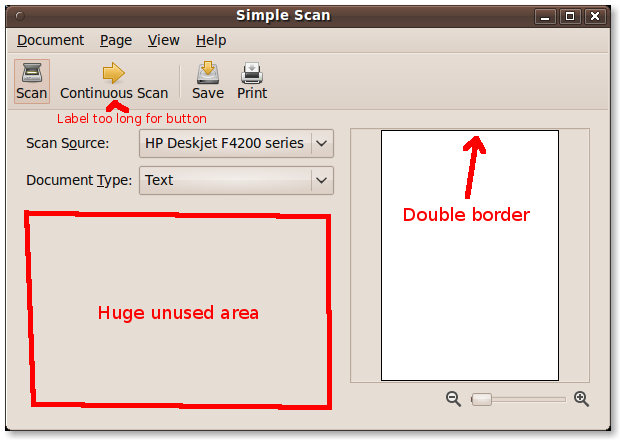
'Save to filesystem' - Too technical, needs to be something like 'Save to file'
Add keyboard shortcuts for items in Document menu
Window Size - The window size is too small by default, needs to be larger
The frame in which the preview is situated needs to have a border
Use icons for the + & - symbols beside the zoom slider
The window title should be the same as the menu item name (ie. Simple Scan)
For discussion:
Is there a need for the Save and Print button to be in the menu and in the content area?
| description: | updated |
| description: | updated |

To post a comment you must log in.
Hi Andrew,
Thanks for the feedback!
> 'Save to filesystem' - Too technical, needs to be something like 'Save to file'
Changed to "Save to File"
> Add keyboard shortcuts for items in Document menu
I've fixed the accelerator keys so alt-T will select this combo box - or do you mean to have underlines on "Text" and "Photo"? Or Ctrl shortcuts?
> Window Size - The window size is too small by default, needs to be larger
Now defaults to 600x400 (can be resized to smaller)
> The frame in which the preview is situated needs to have a border
This is a UI element I am currently struggling with. I want the simple case (a one page scan) to look clean so there is no border. However when you have multiple pages I need to indicate that not all pages are currently visible. If you have good ideas/mockups please help!
> Use icons for the + & - symbols beside the zoom slider
Yes, planning to take them out of Inkscape, low priority bug at the moment.
> The window title should be the same as the menu item name (ie. Simple Scan)
Window title set to "Simple Scan"
> Is there a need for the Save and Print button to be in the menu and in the content area?
I'm thinking I should make it so to the sidebar buttons can be hidden from a preferences dialog - once you know the options it is probably better to use all the window space for the scanned documents and the menus (and their associate shortcuts) for modifying the document. Feedback?