Nautilus file browser toolbar is complicated, needs a face-lift

Bug #386150 reported by David Siegel
166
This bug affects 18 people
Affects Status Importance Assigned to Milestone
Nautilus
Expired
Medium
One Hundred Papercuts
Invalid
High
Unassigned
nautilus (Ubuntu)
Fix Released
Wishlist
Unassigned

Bug Description

*****************
This proposal is post-poned for now , Upstream Nautilus devs want to work on toolbar editor > http://bugzilla.gnome.org/show_bug.cgi?id=42834

The right place for any Comments/thoughts/suggestions regarding the design can be posted on the Ubuntu wiki: https://wiki.ubuntu.com/Design/Nautilus

A Launchpad bug report is not the place for a debate about the design.
Kindly post your suggestions on the wiki page. Your feedback is valuable.
*****************

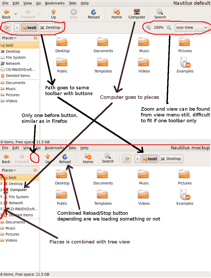
By default, Nautilus's file browser displays a side pane, a status bar, and two toolbars (a "Main Toolbar" and a "Location Bar"), not to mention a menu bar and the content area itself. This presents the user with a huge amount of complexity. I asked myself a few questions while looking at the default file browser:

    1. Back, forward, up, stop, reload, home, zoom, a location bar -- these are the same controls available in my web browser that I know and love. Why do they look so different here? They take up so much more space, and they occupy two toolbars where my web browser needs only one.

    2. What does the Stop button do?

    3. Why do back, forward, up, stop, etc. have text labels? They don't have text labels in Firefox. The icons are good -- I recognize the symbols and understand what the buttons do.

    4. Why do I have "Home" and "Computer" buttons when the same functionality is available and made much more useful in the side pane? That seems redundant.

These questions prompted a very simple rearrangement of the default controls (see attachment simpler_nautilus.png).

    1. It should be at least as simple to browse your local documents as it is to browse the Internet. I've combined the Navigation and Location toolbars into one.

    2. I removed Stop.

    3. I removed labels. The icons are salient and tooltips are available.

    4. I left the home and computer buttons untouched, but removed them in another mockup (simpler_nautilus.png).

What do you think? Can we simplify Nautilus, even if not this drastically?

Revision history for this message
David Siegel (djsiegel-deactivatedaccount) wrote :
Revision history for this message
David Siegel (djsiegel-deactivatedaccount) wrote :

Mockup of a simplified Nautilus file browser.

Revision history for this message
David Siegel (djsiegel-deactivatedaccount) wrote :

Mockup of an even simpler Nautilus file browser.

summary: - Nautilus file browser is complicated, redundant, and ugly
+ Nautilus file browser toolbar is complicated, redundant, and ugly
description: updated
Revision history for this message
David Siegel (djsiegel-deactivatedaccount) wrote : Re: Nautilus file browser toolbar is complicated, redundant, and ugly

This removes the view changer and zoom icons (they are available in the View menu) to give more room for the location breadcrumb.

Revision history for this message
Vadim Peretokin (vperetokin) wrote : Re: [Bug 386150] Re: Nautilus file browser is complicated, redundant, and ugly

Personally, I don't agree with the "lets bypass the gnome default for a
toolbar" idea. I don't find it very comfortable, and leave the icons +
labels in for a reason.

New users have trouble navigating a browser too - it shouldn't be held as
the perfection of usability in navigation. Adjustments are still being done
to it in the current day even (ie, the bigger 'back' button in firefox 3.0)

Revision history for this message
David Siegel (djsiegel-deactivatedaccount) wrote : Re: [Bug 386150] Re: Nautilus file browser is complicated, redundant, and ugly

Vadim, I'm not sure who you're quoting, but it mischaracterizes the spirit of my
suggestion.

It's a fallacy of tradition to assume that Nautilus was carefully designed, and
is good just the way it is, simply because that's how it's configured in GNOME.
If you look in Nautilus's view menu, you'll see that you can optionally hide
most of its graphical elements. The default configuration simply turns all of
these optional elements on. This seems less like a well-chosen default
configuration, and more like the inclusion of everything and the kitchen sink.

We have an opportunity to improve the usability of Nautilus, and we will work
together with upstreams to make these improvements in concert. I am not
suggesting that Firefox is perfect and we should copy it exactly. I am
suggesting Nautilus may be easily improved, and if that's the case, we should
improve it.

Revision history for this message
Vadim Peretokin (vperetokin) wrote : Re: [Bug 386150] Re: Nautilus file browser is complicated, redundant, and ugly

>
> Personally, I don't agree with the "lets bypass the gnome default for a
> toolbar" idea. I don't find it very comfortable, and leave the icons +
> labels in for a reason.
>

I was referring to the fact that the mockup bypasses the gnome default of
big icons + text and instead uses small icon, no text.

New users have trouble navigating a browser too - it shouldn't be held as
> the perfection of usability in navigation. Adjustments are still being done
> to it in the current day even (ie, the bigger 'back' button in firefox 3.0)
>

Was referring to, as it's implied here, the web browser standard:

+ 1. Back, forward, up, stop, reload, home, zoom, a location bar --
+ these are the same controls available in my web browser that I know and
+ love. Why do they look so different here? They take up so much more
+ space, and they occupy two toolbars where my web browser needs only one.

Nothing personal, just my comments on the proposed design.

Personally I feel that the issues identifies might not be applicable to all
users and a proper usability study should be conducted beforehand. Remember
that even the best interface designer is biased ;)

Revision history for this message
David Siegel (djsiegel-deactivatedaccount) wrote : Re: [Bug 386150] Re: Nautilus file browser is complicated, redundant, and ugly

Actually, the icons are the same size! I only turned off the labels,
removed some elements, and moved others around.

On Jun 11, 2009, at 20:12, Vadim Peretokin <email address hidden> wrote:

>>
>> Personally, I don't agree with the "lets bypass the gnome default
>> for a
>> toolbar" idea. I don't find it very comfortable, and leave the
>> icons +
>> labels in for a reason.
>>
>
> I was referring to the fact that the mockup bypasses the gnome
> default of
> big icons + text and instead uses small icon, no text.
>
> New users have trouble navigating a browser too - it shouldn't be
> held as
>> the perfection of usability in navigation. Adjustments are still
>> being done
>> to it in the current day even (ie, the bigger 'back' button in
>> firefox 3.0)
>>
>
> Was referring to, as it's implied here, the web browser standard:
>
> + 1. Back, forward, up, stop, reload, home, zoom, a location bar
> --
> + these are the same controls available in my web browser that I
> know and
> + love. Why do they look so different here? They take up so much more
> + space, and they occupy two toolbars where my web browser needs
> only one.
>
> Nothing personal, just my comments on the proposed design.
>
> Personally I feel that the issues identifies might not be applicable
> to all
> users and a proper usability study should be conducted beforehand.
> Remember
> that even the best interface designer is biased ;)
>
> --
> Nautilus file browser toolbar is complicated, redundant, and ugly
> https://bugs.launchpad.net/bugs/386150
> You received this bug notification because you are a direct subscriber
> of the bug.

Revision history for this message
Vadim Peretokin (vperetokin) wrote : Re: Nautilus file browser toolbar is complicated, redundant, and ugly

Indeed, my oversight. Most of the point still stands though.

Revision history for this message
Mat Tomaszewski (mat.t.) wrote :

David, I like your suggestion of simplifying the default configuration. I think we have to be extremely careful of what we actually change, as it can have a tremendous impact on file browser's usability (and, as a result, on how Ubuntu is perceived).

My call would be to run a series of user tests with various configurations and see which areas could be problematic.

I strongly agree though that nautilus needs to be simpler and deal with screen space better.

Revision history for this message
Mat Tomaszewski (mat.t.) wrote :

This is a high priority papercut, as it affects major area of the UI and impacts most user groups.

Changed in hundredpapercuts:
importance: Undecided → High
status: New → Confirmed
Revision history for this message
Alexander Hunziker (alex-hunziker) wrote :

In my opinion ignoring the gnome setting whether or not to show text labels in toolbars should not be ignored in nautilus. if users don't want text labels, they can set it accordingly system wide.

Personally, I use all of the UI elements in Nautilus regularly. Including the side pane, including the zooming icons. And I value the location bar very much, that's one of the best features of nautilus.

Please don't start overactively simplifying stuff without consensus and it being well thought through. Thanks!

Revision history for this message
Mat Tomaszewski (mat.t.) wrote : Re: [Bug 386150] Re: Nautilus file browser toolbar is complicated, redundant, and ugly

Alexander Hunziker wrote:
> In my opinion ignoring the gnome setting whether or not to show text
> labels in toolbars should not be ignored in nautilus. if users don't
> want text labels, they can set it accordingly system wide.
>

True, but we want a good, simple, intuitive default first, then the
option to change it by adding or modifying features.

> Personally, I use all of the UI elements in Nautilus regularly.
> Including the side pane, including the zooming icons. And I value the
> location bar very much, that's one of the best features of nautilus.
>

So, if they were switched off by default (I'm not necessarily suggesting
they should), you could, according to your suggestion above, switch them
on system-wide.

> Please don't start overactively simplifying stuff without consensus and
> it being well thought through. Thanks!
>

We won't. This is something that needs testing and discussing. Any
opinions and suggestions are most welcome.

Revision history for this message
Sebastien Bacher (seb128) wrote : Re: Nautilus file browser toolbar is complicated, redundant, and ugly

Some comments there:

- GNOME has a preference to display labels on toolbar or not, see the interface tab in the appareance capplet
- changing all the button to don't display text doesn't seem the best move, you might want to change the default desktop option if you think that's really a good idea though
- the buttonbar can quickly have several items by putting there on an already loaded toolbar you will impact on the usability

Changed in nautilus (Ubuntu):
assignee: nobody → Ubuntu Desktop Bugs (desktop-bugs)
importance: Undecided → Wishlist
status: New → Confirmed
Revision history for this message
Jakub 'Livio' Rusinek (liviopl-pl) wrote :

> Why do back, forward, up, stop, etc. have text labels? They don't have text labels in Firefox.

Firefox doesn't respect GNOME's toolbar settings. It's a great achievement that is uses GTK style and icons...

Revision history for this message
Wouter Stomp (wouterstomp-deactivatedaccount) wrote :

I like the mockups. To simplify things further, why not leave out the back and forward button as well? The up button, the directories shown in the browser and the bread-crumb location bar make these a bit superfluous.

Revision history for this message
Daniele Napolitano (dnax88) wrote :

The right way (IMHO) is reduce from 2 toolbars to 1.

About removing strings, just change the priority for Previus and Next items.

Revision history for this message
Ubeer (berendbotjeginguitvaren) wrote :

> 2. What does the Stop button do?

The stop button makes it possible to stop loading network/remote folders and folders with a lot of items: quite handy when you have to browse a lot on the local network.

> I like the mockups. To simplify things further, why not leave out the back and forward button as well?

The back button is pretty handy if you go from a random folder to one in your bookmarks and then want to move back again to that last folder.

Zoom and Change View
I don't use the zoom icons actually, so I can't say anything about that, but the change view option right next to it is a really nice thing (a lot of people nót used to ubuntu liked it when they had to work on our kitchen pc).

Breadcrumb
What can be improved though is the breadcrumb itself: when directory names are long every breadcrumb disappears but the current directory and the arrows. If there could be a cutoff / max lenght of the shown name, that would prevent 'loosing' all the breadcrumbs.

Toolbar Button Labels
About the text underneath the icons: I always disable it, but at my parents pc I did not disable it because they need some more feedback. I can understand that in a (file) browser you don't want it, as well as in a music player (Rhythmbox). In Rhythmbox is an option (Toolbar Button Labels) to follow the Gnome style, or to manually set it. This would be nice to have in Nautilus.
Default can than be off, while preserving the overall style of showing text below icons.

Revision history for this message
beefcurry (jonzwong) wrote :

I like and use everything in the current nautilus tool bar, zoom, location bar, and like the large icons. The options are there if anyone wants to disable items, rather then change it (which I don't think is necessary) we should just make it so it can be edited with ease (like in epiphany).

Having large buttons are surprisingly good if you use them alot, especially on small screens, you would expect smaller buttons to be better since they give more screen space for the icons, but it makes navigating and clicking on them harder. On an netbook the larger buttons work like a charm.

Revision history for this message
Sancho Panza (prashanthr-deactivatedaccount-deactivatedaccount) wrote :

The tabbing functionality in Nautilus is something that I often use. But I always have to use Ctrl-T
to open a new tab or click thru the menus to open a new tab. How about adding a new "new tab" button
to the Nautilus toolbar which would open a new tabbed Nautilus window?

Revision history for this message
Fabien Cortina (fabien.cortina) wrote :

I remember seeing a mockup of Nautilus once (on planet.gnome.org) where the zoom and view controls where moved to the status bar. In place of these controls was a search field.
It's a pretty good idea because it makes use of a mostly unused space to keep functionalities.

(Maybe this was this mock up, although the list/icon control is missing: http://img15.imageshack.us/i/nautilus1.png/)

Revision history for this message
Nicolò Chieffo (yelo3) wrote :

I would also like to discuss the possibility to add other buttons (cut copy past trash): in a filemanager they are useful, and it's really easy to add them (just edit nautilus-navigation-window-ui.xml)

Revision history for this message
Adrien Siebert (asiebert) wrote :

David's second mockup (http://launchpadlibrarian.net/27798051/simple_nautilus_2.png) looks very similar to Thunar interface to me (the file manager of Xfce).
Everyone liking the mockup may want to take a look at the cap attached.

Revision history for this message
Alan (alanloughlin) wrote :

i agress that something needs to be done with the default view of nautilus.
on a 1280x800 laptop screen, the toolbars are taking up a lot of screen real estate.

one other thing that i've noticed thunar has that nautilus doesn't is the "used space" of the viewed folder in the status bar.
I was going to log this as a seperate request, but think it will be worth bundling this with the overall look of nautilus.

Revision history for this message
bruno.braga (bruno-braga) wrote :

That might sound stupid, but I kind of miss the tree view style to navigate into sub-folders, etc, without actually opening the folder itself. This is specially annoying if you have too many files in one single folder (such as logs, etc), which consumes machine resources even though you are willing to go to another place... If you use the address bar, then it is just the same of using the terminal (that's what I'm doing, besides when I want to open images and movies).

Does this sound too much of windows poisoning?

Revision history for this message
Bratwurstler (j-sage) wrote :

@bruno.braga: it does not ;)

I would like to see tree view, too. It's faster and would, in a way, replace the location-bar-thingy, which imo is a bad compromise.

Revision history for this message
Michael Budde (mbudde) wrote :

@bruno.barga and Jänz: To me it sounds like the feature you are asking for is already implemented in Nautilus (see screenshot).

Revision history for this message
Bratwurstler (j-sage) wrote :

ou, weird! thanks michael. O.o never used, but ever wanted :D

however :D

Revision history for this message
ShawnJGoff (shawnjgoff) wrote :

Buttons are too bulky for the breadcrumb. I'd prefer a different widget; something that made them all look like part something, but independent within. If anyone else shares the sentiment, I can make a mockup.

The zoom buttons in the statusbar is a good choice, as is the right-aligned search textarea.

Revision history for this message
Laco Gubík (laco) wrote :

Hi guys,

I think that there should be option to create your own toolbar in Nautilus. Whatever we will put together will never 100% satisfy all users (especially power users) and at the end linux is also about choice.
Evince and Eye of Gnome have this option (if you go to Edit -> Toolbar) and I love it, you can add and remove icons as you prefer.

1. In my mockup, I have removed dropdown menu arrow from Back icon and left only one next to Forward (there is no need to have two).

2. I have removed Up, Stop and Reload buttons, which are not so much used. You can substitute Up with Back and Forward and also you have bellow it breadcrumbs which allow you using one click to get up.

3. I have also removed Home icon which user has in sidebar (together with other places) and I have moved Computer icon into sidebar. In my mockup I have replaced File system entry with Computer, because I do not believe that it makes sense to have both of them next to each other. Plus File system is available from within Computer.

4. I have removed search icon but added search box which will make search more usable and it is well known from web and browsers. Nautilus search is very good so I think we should make it easier to use (especially for search-dominant users).

5. I think that by default nautilus should always show at least one tab. Right now lot of users might not realise that tabs in nautilus exist and that they can use them. I have also added little button next to last tab which will allow user to add new tab.

6. I'm not so sure where to put zoom icons, but I think this is good feature and it adds to usability and accessibility, so it should be visible. In mockup 1 I have added them into tab toolbar and in mockup 2 I have moved them down to status bar.
Alternative would be to have one more thiner toolbar under main toolbar with zoom icons and I would also add there three icons to change view mode (icons, list, compact) because there is no point in having toolbar with two icons.

Please feel free to comment on mockups.

Revision history for this message
Laco Gubík (laco) wrote :

Here is second mockup with zoom icons moved into statusbar.

Revision history for this message
seanh (seanh) wrote :

I believe that Gnome's default for nautilus is spatial mode ;)

Revision history for this message
6205 (6205-reactivated-deactivatedaccount) wrote :

Basically i agree with you, but IMO is much easier simply to hide main toolbar. http://img269.imageshack.us/img269/5613/obrazovka.png

Revision history for this message
bruno.braga (bruno-braga) wrote :

Hi Michael, thanks for the info. Surprises me the fact I never noticed the option to change to tree view. I think this thread still goes other ways anyway, but for me, my problem is solved! :-)

Revision history for this message
fhein (johan-oljud) wrote :

I wish I could right-click the toolbar and select "customize" as you can in Firefox. I hate having to use the menus, or learn keyboard shortcuts, for functions I use frequently (show hidden files and show/hide side pane for example). I also like to switch between icon and list view (and preview, when the file manager has that option) so for me it would much more convenient to have clickable icons instead being forced to use the combobox.

Revision history for this message
antistress (antistress) wrote :
Revision history for this message
kikl (kilian-klaiber) wrote :

I think it's a great idea to have the file browser look like and work just like the standard internet browser. Simplifying and cleaning up the interface is a great idea. But, I do think you can make exceptions. The wording below the icons doesn't distract much and helps the absolute novice. You could include the option to make the words disappear for more experienced users.

But, there is one aspect of the file-browser that differs from the internet-browser, which I find quite disturbing. The search field is not positioned next to the location field and it doesn't have it's own dedicated search-area. Instead, the search field replaces the location area or uses the location area as it's search area, when you press it. I find that quite confusing.

I would suggest implementing the search field just like in the firefox browser and deleting the "icon view" tab from the ui, since this is something you don't really change that often, at least I don't. The icon view could simply be another point in the folder "view".

Thanks for your great work and I hope you achieve your goal in beating OS-X in terms of usability;-) You can make it!

Revision history for this message
antistress (antistress) wrote :

Wow i couldn't say better that kiki (comment 37) : it's a very well-balanced opinion
It would also fix Bug #57210
having the search filed replacing the location bar doesn't look optimum to me

Revision history for this message
Nicolò Chieffo (yelo3) wrote :

Here's my proposal (mixing some of yours):
1. merge main and location toolbar
2. always show the directory toolbar (the one you have when you go to trash) and put some common tasks (new, copy, cut, paste, trash, change view)
3. optionally change the search button with a GtkEntry (you can also put a "filter icon" at left and a "clear icon" at right if you like), and change the name to "Filter" (actually it's a filter and not a search)
4. move the zoom to the status bar, and eventually change its shape to a GtkScale

I would like to have your comments

Revision history for this message
antistress (antistress) wrote :

Here are mines :
1. Place all shorcuts in sidebar (i.e. Computer) - no shorcuts in toolbar.
2. Don't replace the Location Bar with Search field it seems confusing to me (note that GTKFileChooser acts in a similar way but not exactly and i find GTKFileChooser to be less confusing than Nautilus i don't know why)
Maybe a permanent Search Field could replace Home, Computer and Search buttons ?
3. Let the Location bar distinct : it allows to display large paths
4. Organisze the side bar : see http://bugzilla.gnome.org/show_bug.cgi?id=508404 & http://bugzilla.gnome.org/show_bug.cgi?id=576587#c20

Maybe it's more than a papercut ?

Changed in hundredpapercuts:
milestone: none → round-4
Changed in nautilus:
status: Unknown → Confirmed
Changed in nautilus (Ubuntu):
status: Confirmed → Triaged
64 comments hidden view all 144 comments
Revision history for this message
Marcus Carlson (0-launchpad-mejlamej-nu) wrote :

Status update;
I've now completed the combined stop/refresh button and new packages [1] should be available soon. Attached is screenshots of the different toolbar states.

Comments?

[1] https://launchpad.net/~0-launchpad-mejlamej-nu/+archive/ppa

Revision history for this message
antistress (antistress) wrote :

Marcus Carlson :
1°) at present time, using mouse whell forszooming in or out is rather intuitive since you only have to point zoom buttons and to use mouse wheel. No need for combination : keyboard (ctrl) + mouse (wheel)

2°) When i said "please send another mockup with text under icons to see how your idea behave in all configurations. Is the location bar still visible ?"
i wanted to say : "to see if there is enough space on the only toolbar to display both big buttons with text under (=default setting in GNOME & Ubuntu) and "Location Bar" on the same row"
thanks in advance

Revision history for this message
Marcus Carlson (0-launchpad-mejlamej-nu) wrote :

David, whats your comment on the mouse wheel zooming comment by antistress?

antistress, sorry, I forgot that screenshot. Attached now.

Revision history for this message
Donatello (donatellogiraudo) wrote :

Hi.

For the zoom option, it's possible to have an control like openoffice in the status bar?
http://static.blogo.it/ossblog/openoffice-30-beta-1/big_03writer.png

Thanks
Donatello

Revision history for this message
Vish (vish) wrote :

@Marcus Carlson:
Could we *exclude the drop down arrows when inactive* ?
ie. the drop down arrow is shown *only* for any location history having more than 2 items.
Maybe the Up button could be squeezed-in ;)

Also your latest icon-text shows this bug> https://bugs.launchpad.net/hundredpapercuts/+bug/390724 ,
the back button is oddly smaller than the rest of the buttons.

Revision history for this message
Marcus Carlson (0-launchpad-mejlamej-nu) wrote :

mac_v, I've begin talking to upstream too see what they think about these changes before doing anything more.

For the interested I've created jaunty packages [1] to play with.

[1] https://launchpad.net/~0-launchpad-mejlamej-nu/+archive/ppa

Revision history for this message
Vish (vish) wrote :

@Marcus: sure, no problem...

I'v been using your ppa in Karmic, and my observations:

1: I Find the lack of the "Up" Button crippling.
I would even suggest replacing the "Home" button with the "Up" button.
But I have realized there is more space wasted due to the 2 drop down buttons.
We could remove one drop down button and reduce its size , This is allows us to Add the "Up" button without compromising the space.
The single button can function like firefox's drop down menu.

I'v attached a mockup of the idea...

2: You might already be aware of this, but just to bring to your attention.
The Appearance Preferences > Interface > Toolbar Button labels option has no effect.

Revision history for this message
Vish (vish) wrote :

Oh... and before people jump on the "Up" not needed because of breadcrumbs.
"Up" is more useful than the "Home" , since "Home" takes you to one specific folder,
While using "Up" you can go to any parent folder. Without moving the mouse , by just repetitive clicking in one location, which is easier than using Bread crumbs.

Revision history for this message
Psy[H[] (vovik-wfa) wrote :

Agree. And we do not need Home button, since Home is a place and the best place for a place is places :)

Revision history for this message
DM74S (danielsan474) wrote :

Great job Marcus!

Only two things:

1. we could move Home and Search icons to "places" area, we need to free space on main toolbar. I didn't like the double url-bar and search-bar.

2. in Places area, Home reference is ok, instead for Search (icon + "Search" label) we could have an input text field. We don't need to click on a search-icon, open a windows or whatever and digit some text; we could write directly on that field. If Joe wants more, could open an extended search window if needed...

Revision history for this message
DM74S (danielsan474) wrote :

I made some changes on Marcus mockup to explain my latest ideas...

1. for url-bar (a power-user solutions to browse) CTRL-L like firefox and other apps
2. for location I made a mockup but I not so sure that could be usefull. We have already Go menu in toolbar and "less-is-more".

I didn't put my breadcrumb mockup here (take a look to my latest mockup)

Revision history for this message
Marcus Carlson (0-launchpad-mejlamej-nu) wrote :

mac_v 1) About the drop down buttons I agree they take up a lot of space and by using Firefox style you mean right clicking the button?
mac_v 2) Yes I know, I've hardcoded it. Do we want to use the global setting for nautilus? Personally I've never liked it because the applications I used a lot I may just use the icons, but new applications or rarely used I might want to have the text as extra help - but that's off topic.

Anyway, thanks for trying the package! :)

Danielsan474 1) Can't it be psychological to have a Home icon to click if I get lost?
Danielsan474 2) Input textfield in the menu??

Revision history for this message
DM74S (danielsan474) wrote :

on nautilus-human-danielsan.png mockup:

1. like someone wrotes here, HOME is a place so I put this item in left-area (aka "Places" area)
2. I like the two-status concept of Refresh-Stop and I place this icon-button between Backward and Forward icons. If I don't want go back or go forward, I could make just like "a little jump" (refresh) where I am now.

The users-blog-experience gives some hints (think about the breadcrumb). Why don't assume the widget idea too for left-area? A widget for search, places, folders, ecc.

my 2 cents

Revision history for this message
Marcus Carlson (0-launchpad-mejlamej-nu) wrote :

Danielsan474 - ahh, I now see what you mean.

Revision history for this message
DM74S (danielsan474) wrote :

marcus 1) Can't it be psychological to have a Home icon to click if I get lost?

yes, it could be but Home is a place, not an action (go backward, make a jump-refresh, go forward). The same for Search. In fireforx we didn't have a left-area to put these items.

marcus 2) Input textfield in the menu??

No, input textfield in left-area (aka "Places")

Revision history for this message
DM74S (danielsan474) wrote :

Looking forward...

since my left-area concept share some ideas with gnome-shell project, this one should be an optional in long-run. It depend on what a user want to do: click on Activities (gnome-shell) every time or use search-places-folders in nautilus window.

Revision history for this message
Vish (vish) wrote :

@Marcus ,
The Firefox style , i think you got it from Danielsan's explanation... if not, firefox drop-down shows both the Back & Forward locations

Other problems I found
1: The Search button is too close to breadcrumbs , its now easier to trigger this bug > https://bugs.launchpad.net/hundredpapercuts/+bug/57210

2: Right side is very empty.
I have attached a screenshot of my setup [it the same as yours but I'v added separators, before the breadcrumbs ,also i replaced Home with Up, other than that it is the same] > It Shows the emptiness of the right side

To avoid the search bug, I'v added a mockup,
Its better to move it to the search to the right, just to the left of the spinner.
This also partially negates the emptiness of the right side of the browser.

Revision history for this message
antistress (antistress) wrote :

* About the Search button/field :

Danielsan474 said (comment 114) :
"instead for Search (icon + "Search" label) we could have an input text field. We don't need to click on a search-icon, open a windows or whatever and digit some text; we could write directly on that field. If Joe wants more, could open an extended search window if needed..."
It would be a giood idea to save consistency through GNOME applications.
GTKFileChooser already has a good UI for Search : an entry in the sidepane that replace the location field with a saerch field. We should do the same.

mac_v (comment 121) : Moving the the Search button away from the other doesn't seem a good idea to me in terms of usability

* About the location button :
Marcus Carlson : the location perfectly works, i don't think it should be removed

Revision history for this message
Vish (vish) wrote :

antistress wrote: " Moving the the Search button away from the other doesn't seem a good idea to me in terms of usability"

Could you explain why?
But my reasons for suggesting moving search to the right:
The search is not the most commonly used navigation ,
If you use the ppa , you will realize that the browser on the right looks very empty.
   A good design should not cram everything on one side and leave the other side empty. there should be a balance.
The previous search button was the right-most button,in Firefox too ,the search bar is on the right, so this doesnt break anything.

I think the design team should take a look at the present version Marcus has done and make suggestions on the design aesthetics.

Revision history for this message
Marcus Carlson (0-launchpad-mejlamej-nu) wrote :

Upstream has said they won't commit any patch that will change the toolbar and instead encourage working on the toolbar editor. (As I will try to do)

Revision history for this message
Nick Glynn (exosyst) wrote : Re: [Bug 386150] Re: Nautilus file browser toolbar is complicated, redundant, and ugly

Will they not even consider changes to the location of the zoom options nor
the stop/reset amalgamation as those wouldn't really be fixed by an editor.

2009/7/18 Marcus Carlson <email address hidden>

> Upstream has said they won't commit any patch that will change the
> toolbar and instead encourage working on the toolbar editor. (As I will
> try to do)
>
> --
> Nautilus file browser toolbar is complicated, redundant, and ugly
> https://bugs.launchpad.net/bugs/386150
> You received this bug notification because you are a direct subscriber
> of the bug.
>

Revision history for this message
Marcus Carlson (0-launchpad-mejlamej-nu) wrote : Re: Nautilus file browser toolbar is complicated, redundant, and ugly

Feel free to ask them :-)

Revision history for this message
Vish (vish) wrote :

@Marcus Carlson: So does that mean this bug can be closed?
What about your ppa? would you stop working on it?
Either way, really appreciate the effort you took so far for this bug. :)

Also, any links/reports or discussions regarding the toolbar editor work ,would be nice

Revision history for this message
Marcus Carlson (0-launchpad-mejlamej-nu) wrote :

mac_v, as far as I know Ubuntu doesn't want to have a lot of patches to drag along, so continue working on this is just a waste of time, correct David?
But if Ubuntu would like to have patch for this I'd be willing to help.

The upstream bug for a toolbar editor is at [1] and there is an old patch. My plan is to first bring this patch up to date and if I manage to get that far I'll see what I could do after that.

http://bugzilla.gnome.org/show_bug.cgi?id=42834

Revision history for this message
antistress (antistress) wrote :

The upstream bug for a toolbar editor will not solve everything since everybody here seems agree to say that Home and Computer should be only in sidepane and sidepane is not configurable to add Computer

Revision history for this message
antistress (antistress) wrote :

Besides i've never find the Nautilus Search UI to be intuitive. It's very hard to understand as far as i'm concerned.
Maybe the only Search button/entry effect should be to launch a dedicated application (gnome-search-tool today (or a GUI for Beagle/Tracker), Zeitgeist tomorrow for instance) ?

Revision history for this message
Psy[H[] (vovik-wfa) wrote :

Mounted media is already in side-panel, So there is no need for this fake "computer" thing anywhere

Revision history for this message
antistress (antistress) wrote :

indeed

Revision history for this message
antistress (antistress) wrote :

concerning my comment 130, http://bugzilla.gnome.org/show_bug.cgi?id=428568 is related

Revision history for this message
toobuntu (toobuntu) wrote :

To those who advocate removing the 'up' button: I disagree. It was removed in Windows Vista, and someone had to make a shareware app to put it back in. There are those of us who think linearly, and who use the location bar by default. For us, it is a lot faster to use the up button than to use breadcrumbs (which does not fit with the way our minds work).

Please include a preference option for it to be put back in. Even better, allow full customization of the toolbar like Firefox does.

Revision history for this message
Marcus Carlson (0-launchpad-mejlamej-nu) wrote :

> Even better, allow full customization of the toolbar like Firefox does.

Working on it :) For more info see [1] or look at the WIP screenshot [2]

[1] http://bugzilla.gnome.org/show_bug.cgi?id=42834
[2] http://bugzilla.gnome.org/attachment.cgi?id=138712&action=view

tags: added: gnome gui nautilus
Revision history for this message
David Siegel (djsiegel-deactivatedaccount) wrote :

Great work, everyone, but it is clear that this is not trivial to fix, and therefore is not a paper cut.

Changed in hundredpapercuts:
milestone: round-4 → none
status: Confirmed → Invalid
Revision history for this message
seamus (rostiku) wrote :

My two user`s cents:
1. Let the Location bar distinct : it allows to display large paths
and
2. Let the Location bar distinct : it allows to display LARGE PATHS!

Revision history for this message
antistress (antistress) wrote :

i agree with seamus : Let the Location bar distinct to display large paths
Besides :
- improve nautilus search http://bugzilla.gnome.org/show_bug.cgi?id=428568
- Sidebar should categorize items displayed with headings http://bugzilla.gnome.org/show_bug.cgi?id=508404

Revision history for this message
ShawnJGoff (shawnjgoff) wrote :

I much prefer the having the button to switch between breadcrumbs and text url. We're talking about getting rid of redundancy, if we have both, it's just plain horrible. If you use the button that switches the breadcrumbs to the text, it stays that way when you open nautilus next time. Also, if the breadcrumb buttons are changed as discussed above, it will be able to display more path.

Revision history for this message
Nick Glynn (exosyst) wrote : Re: [Bug 386150] Re: Nautilus file browser toolbar is complicated, redundant, and ugly

I dislike the idea of a switching button, it seems indecisive.

If you take a look at the explorer breadcrumbs link i posted previously the
idea is that there is no need for a toggle button, click a location to go
back/forward, double click to convert to text, arrows in between to allow
branching from previous directory.

I do like the idea of moving Computer/Home to the Side Pane though, lots of
space eaten up needlessly otherwise.

I always find I use Up and Back more than I use forward though, might just
be me though :D

2009/7/21 ShawnJGoff <email address hidden>

> I much prefer the having the button to switch between breadcrumbs and
> text url. We're talking about getting rid of redundancy, if we have
> both, it's just plain horrible. If you use the button that switches the
> breadcrumbs to the text, it stays that way when you open nautilus next
> time. Also, if the breadcrumb buttons are changed as discussed above, it
> will be able to display more path.
>
> --
> Nautilus file browser toolbar is complicated, redundant, and ugly
> https://bugs.launchpad.net/bugs/386150
> You received this bug notification because you are a direct subscriber
> of the bug.
>

Revision history for this message
Jeff Fortin Tam (kiddo) wrote : Re: Nautilus file browser toolbar is complicated, redundant, and ugly

I hope you guys are not serious about inflicting this on your users.

If you want to simplify things, the gnome guys already did it for you years ago, with spatial nautilus (you know, the default nautilus mode that Ubuntu specifically patched out to not be the default?), which was the hallmark of simplicity/minimalism/usability* (and is the default in Fedora, from what I've seen).

Crippling the "browser mode" of nautilus (which is for users that can't stand spatial nautilus' minimalism) will pretty much result in angering those users, and usability-conscious people just recommending others to avoid ubuntu desktops because Canonical keeps doing parallel work and doing away with the principles set forth by gnome (ignoring the desktop's toolbar label settings? seriously?!).

Unless gnome decides that this is the new canon that should be implemented on all apps, of course.

Just my warning/2 cents. I don't really care that much on a personal level, in the grand scheme of things, the people will decide if this is a good or bad thing, and I can still use spatial nautilus.

* http://www.osnews.com/story/7548

Vish (vish)
description: updated
summary: - Nautilus file browser toolbar is complicated, redundant, and ugly
+ Nautilus file browser toolbar is complicated, needs a face-lift
description: updated
Revision history for this message
Rich Jones (richwjones) wrote :

If the overhaul is already being done, how about adding this:

https://bugs.launchpad.net/hundredpapercuts/+bug/410082

Trivial fix, adds a lot of power though

Caloy (printafter)
Changed in hundredpapercuts:
assignee: nobody → Caloy (printafter)
assignee: Caloy (printafter) → nobody
Revision history for this message
Kai Mast (kai-mast) wrote :

So waht about this? I really love the way nautilus was changed. Maybe for 10.10?

Changed in nautilus:
status: Confirmed → Invalid
Changed in nautilus (Ubuntu):
assignee: Ubuntu Desktop Bugs (desktop-bugs) → nobody
Changed in nautilus:
importance: Unknown → Medium
status: Invalid → Expired
Revision history for this message
Dmitry Shachnev (mitya57) wrote :

Fixed in Nautilus 3.x / Ubuntu 11.10

Changed in nautilus (Ubuntu):
status: Triaged → Fix Released
Displaying first 40 and last 40 comments. View all 144 comments or add a comment.
This report contains Public information  
Everyone can see this information.

Duplicates of this bug

Other bug subscribers

Remote bug watches

Bug watches keep track of this bug in other bug trackers.